Lumea by Reflect Architecture: A Toronto Eye-Care Boutique Worth Hanging Out In
Comfortable chairs, real plants, and an opaque glass wall.
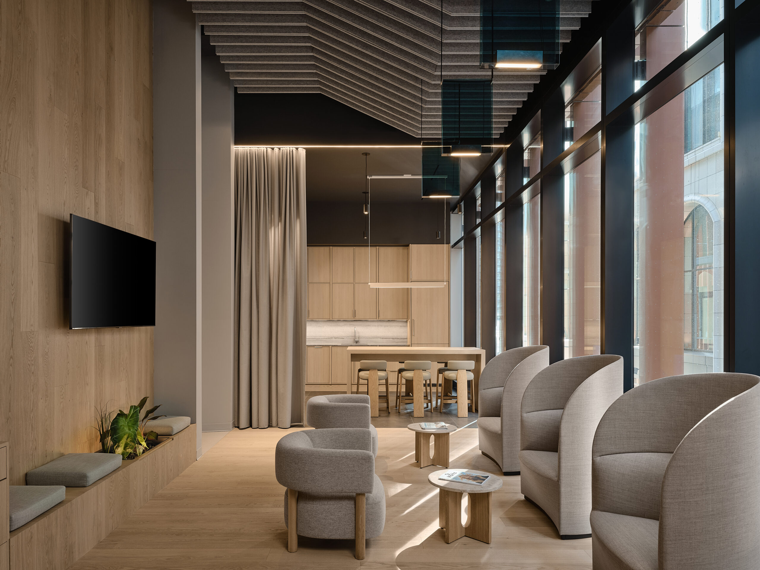
At downtown Toronto’s The Well, a sprawling mixed-use development that opened last November, Reflect Architecture has designed an eye-care clinic that offers its patients an alternative to stereotypical cold, unwelcoming offices. With locations already in Barrie and Vaughan, for its Toronto location, Lumea wanted to create a peaceful space that challenged the negative associations many people have with the doctor and that would stand out in the overcrowded health and wellness industry. To do this, the Toronto-based firm created an interior that is immersive, modern, and tranquil, with natural light, high ceilings, warm wood, a relaxing lounge, and a variety of plants.
“Typically, health and wellness clinics have paid little attention to their storefronts,” Reflect Architecture founder and principal Trevor Wallace says. But for Lumea Toronto, the team considered how they could create both an environment that cared for patients inside and visual interest along a busy pedestrian concourse.
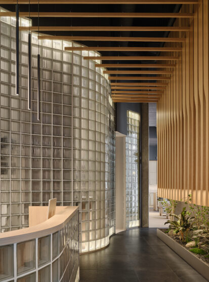
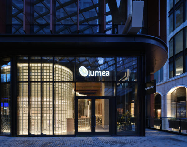
Entering from the terrace level, the reception area blends contemporary industrial elements and moments of serenity. A curving wall of opaque glass blocks, a nod to optical clarity and diffusion, partitions the treatment area from the entryway and creates a soft contrast to the impermeable concrete walls and floor.
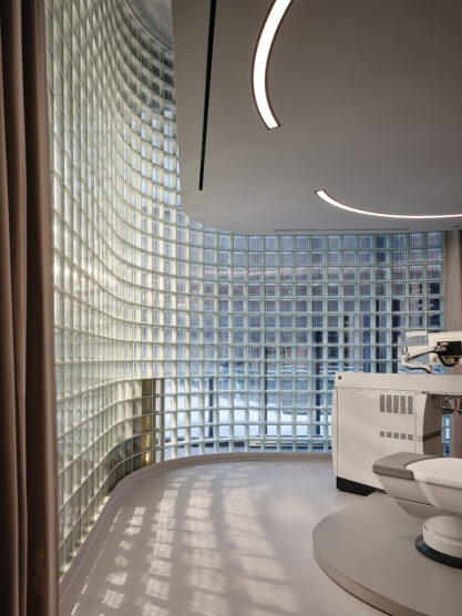
“The challenge with a mixed-use development is that you have limited frontage to play with and few opportunities to stand out,” Wallace says. “Light emerged as a unique and especially appropriate way of activating the face of a clinic that’s dedicated to improving sight. At dusk, the procedure room is lit from within, and it transforms into this glowing glass volume that pedestrians can see.”
For natural elements that imbue a sense of calm, wood slats line the ceiling, and a low built-in planter contains an indoor garden. The treatment room backs The Well’s pedestrian concourse—through the glass, the refractive laser equipment is barely visible, and an interior curtain slides around for privacy. From the entryway, a hallway with the swelling glass wall on one side and wood slats on the other is a transition zone leading to the lounge area.
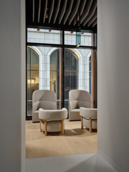
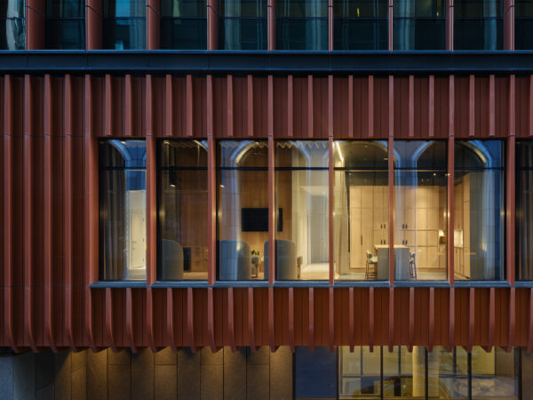
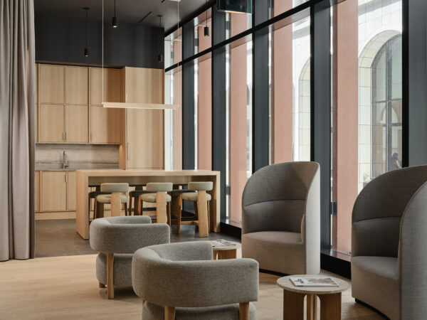
A sun-filled waiting area, intended to give patients a moment of peace before or after procedures, features warm wood floors and walls and floor-to-ceiling windows. Lounge chairs—two rounded with low backs and three plush balloon chairs—offer a comfortable place to relax, and taupe curtains separate staff and patient areas. Overhead, felt panels hang from the ceiling to dampen noise, and green glass Sainte lighting fixtures by Lambert & Fils add subtle colour amid the neutral tones.
Throughout, openness is met with privacy, practicality with artistry, and warmth with coolness for a sense of balance and peace—Wallace notes that the space is “simultaneously functional and experimental.”
He explains, “Throughout the design process, we challenged ourselves to continually rethink why clinics are designed the way they are. We tried to resist convention at every turn.”
Photography by Doublespace.

