-
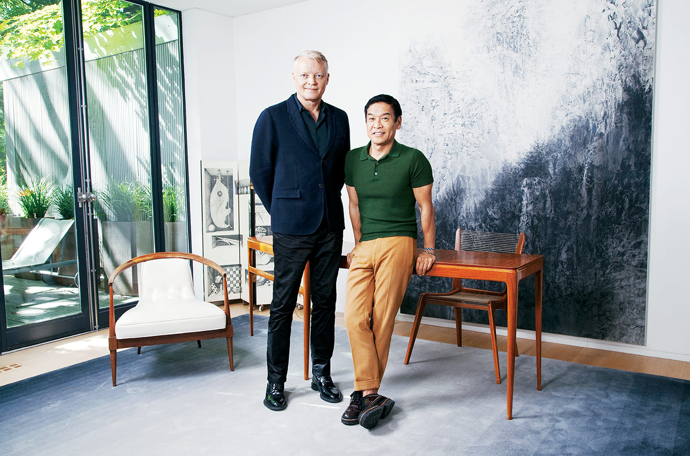
Glenn Pushelberg and George Yabu.
-
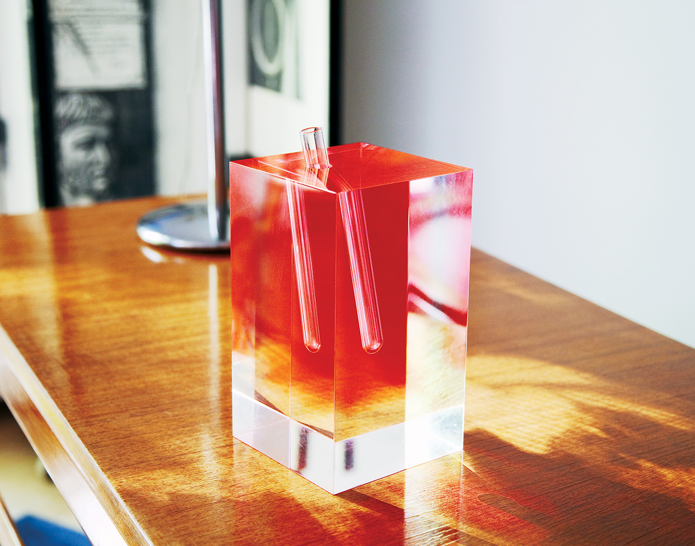
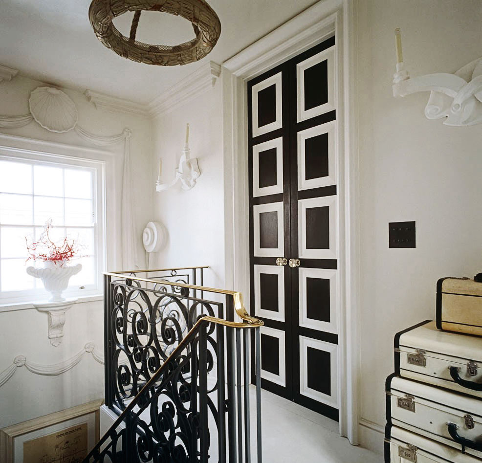
George Yabu and Glenn Pushelberg have residences in New York, Miami Beach, and Toronto (showcased here), and a beach house tucked into the dunes of Amagansett, Long Island.
-
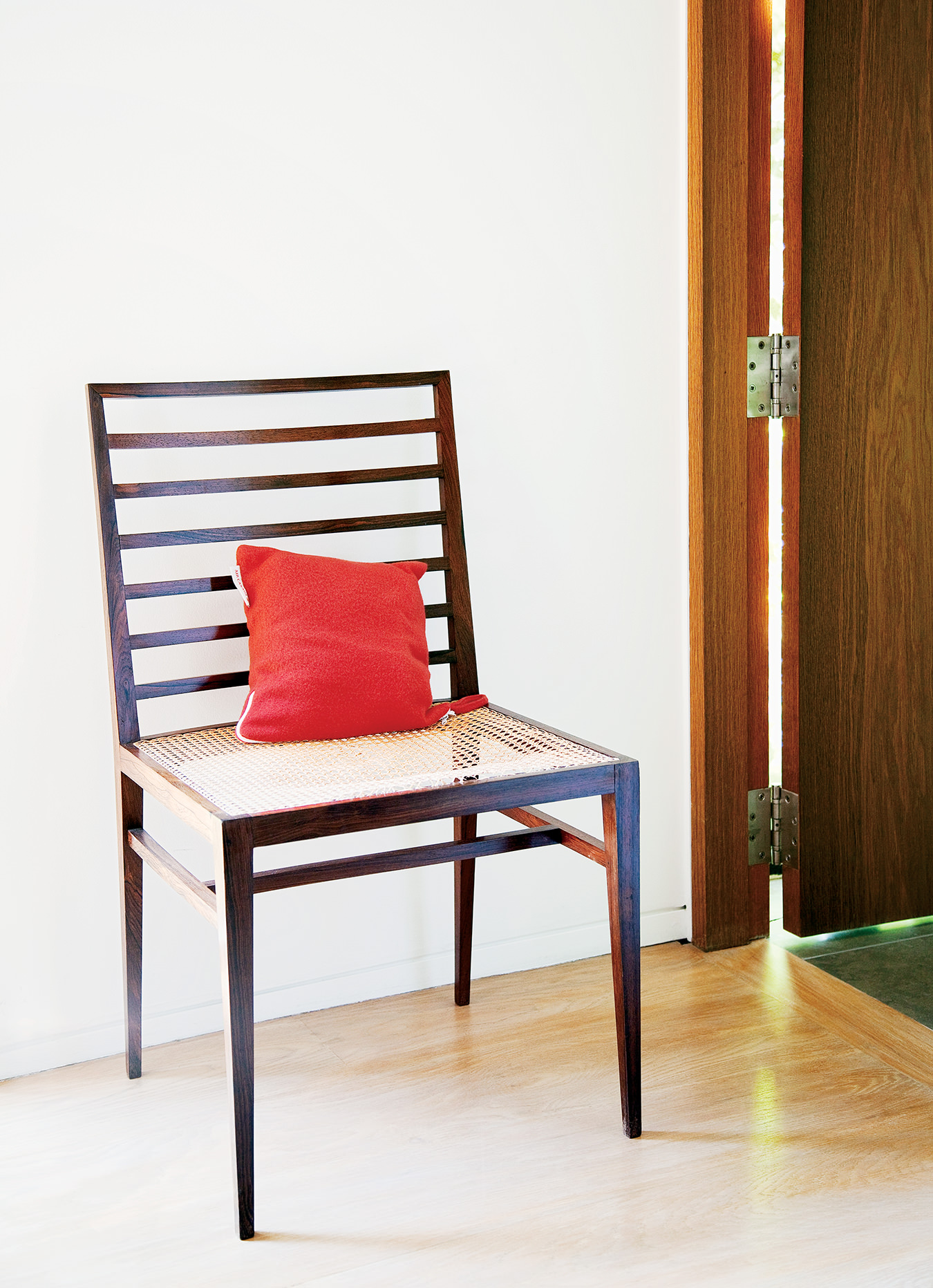
Inside George Yabu and Glenn Pushelberg’s Toronto residence.
-
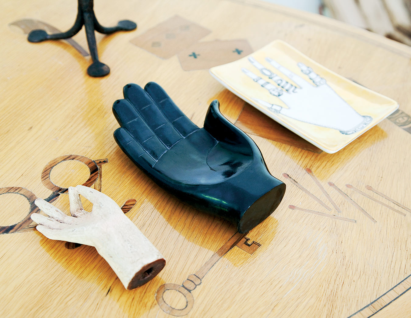
Inside George Yabu and Glenn Pushelberg’s Toronto residence.
-
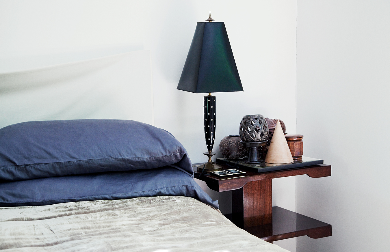
Inside George Yabu and Glenn Pushelberg’s Toronto residence.
-
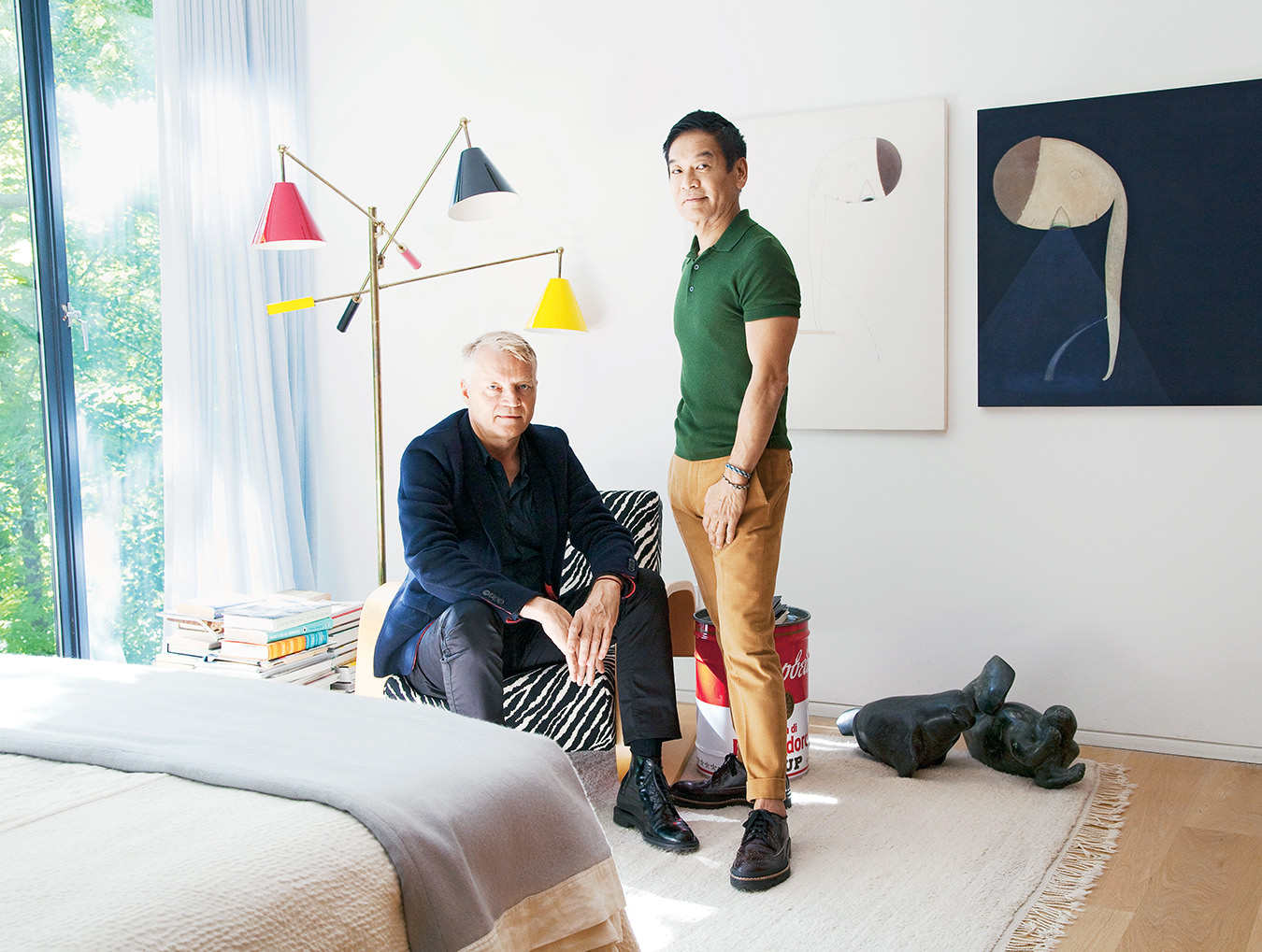
Glenn Pushelberg and George Yabu.
-
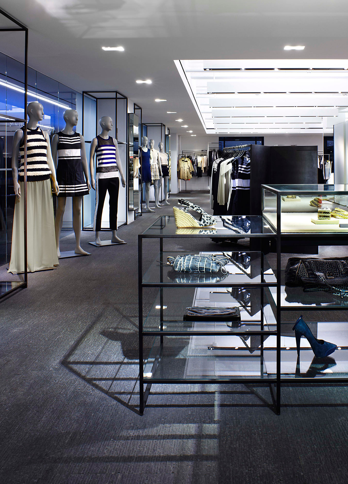
Barney’s Genes@co-op café, New York.
-
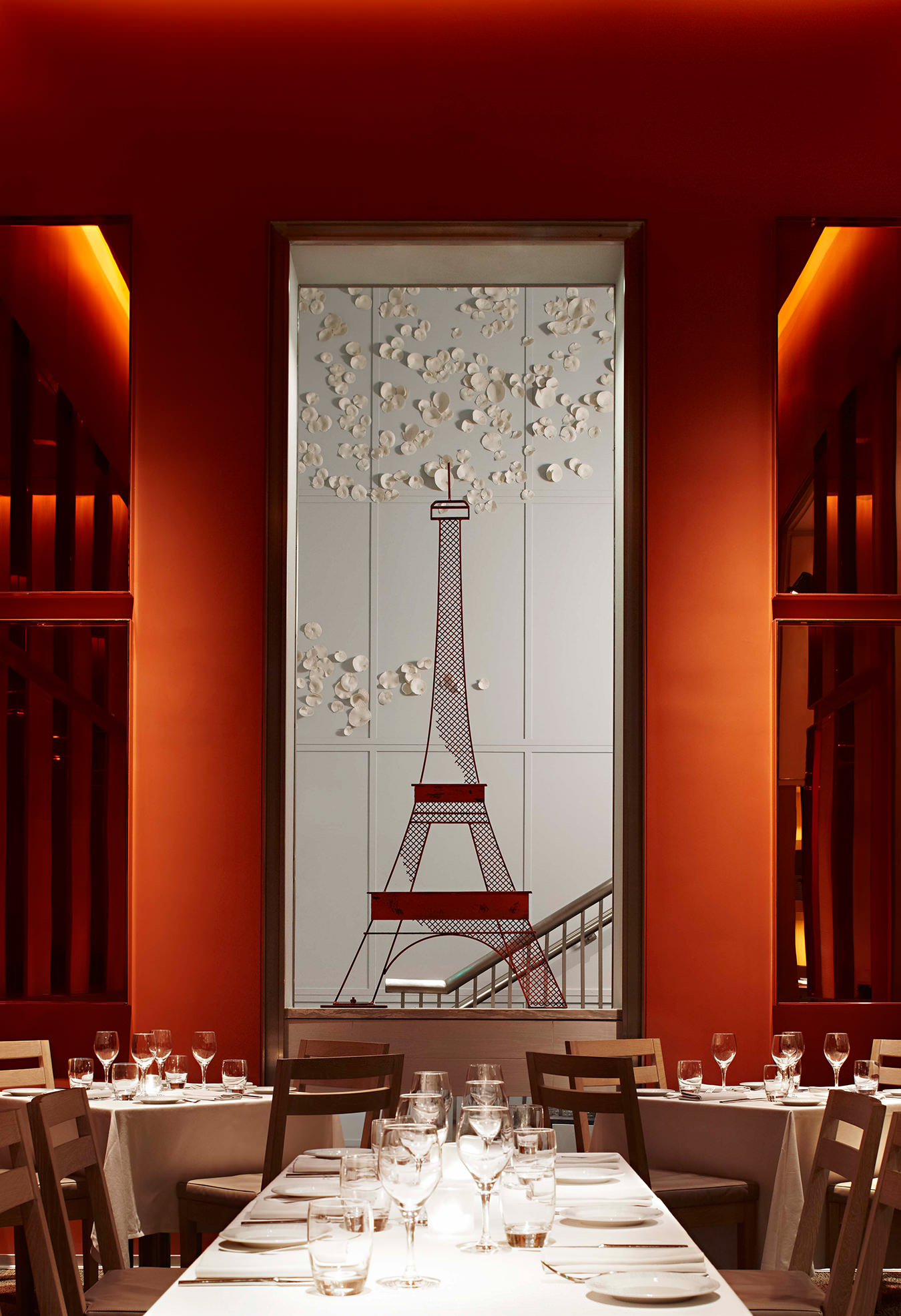
db Bistro Moderne, Miami.
-
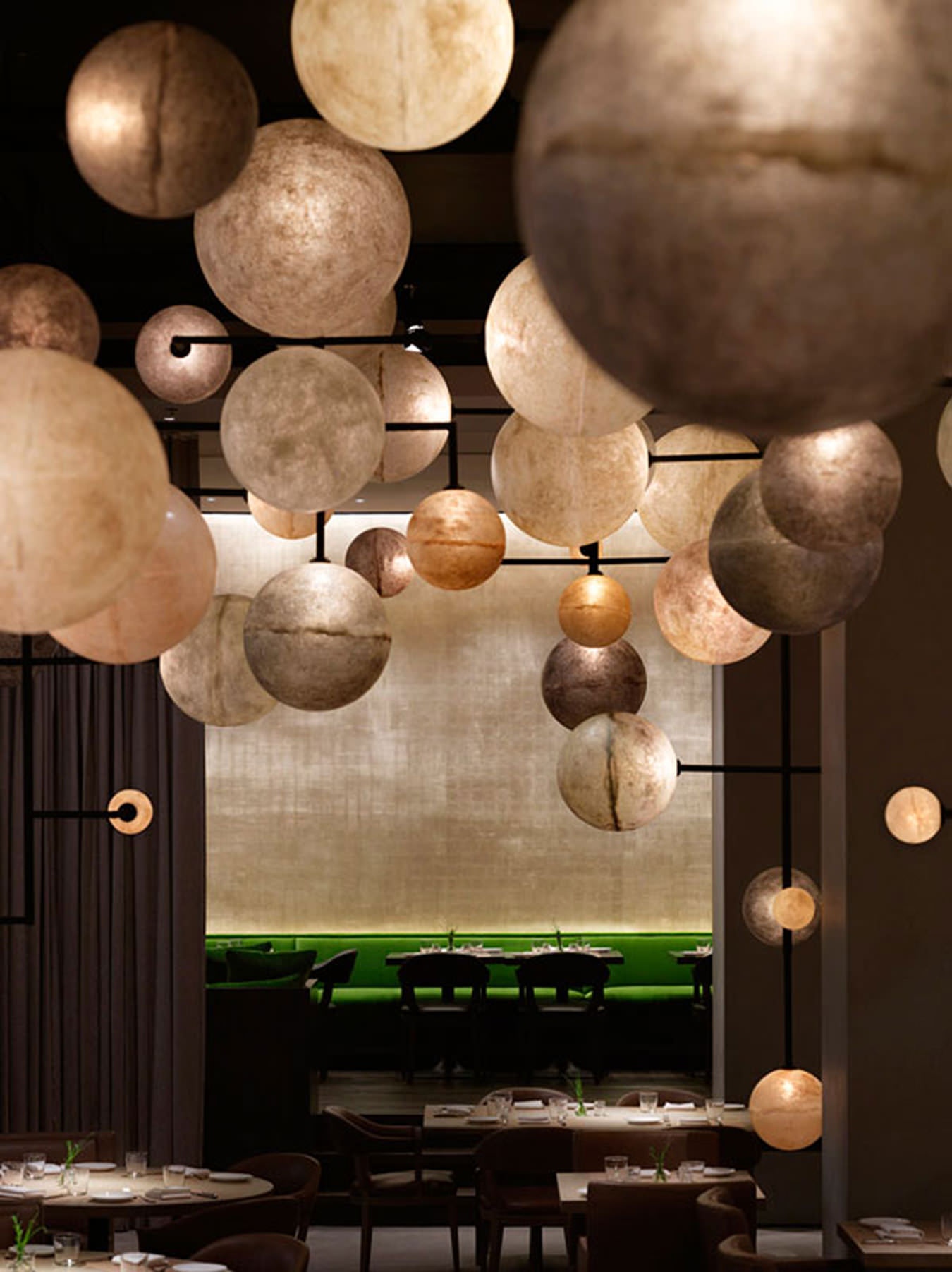
The Pump Room at the Public Chicago.
-
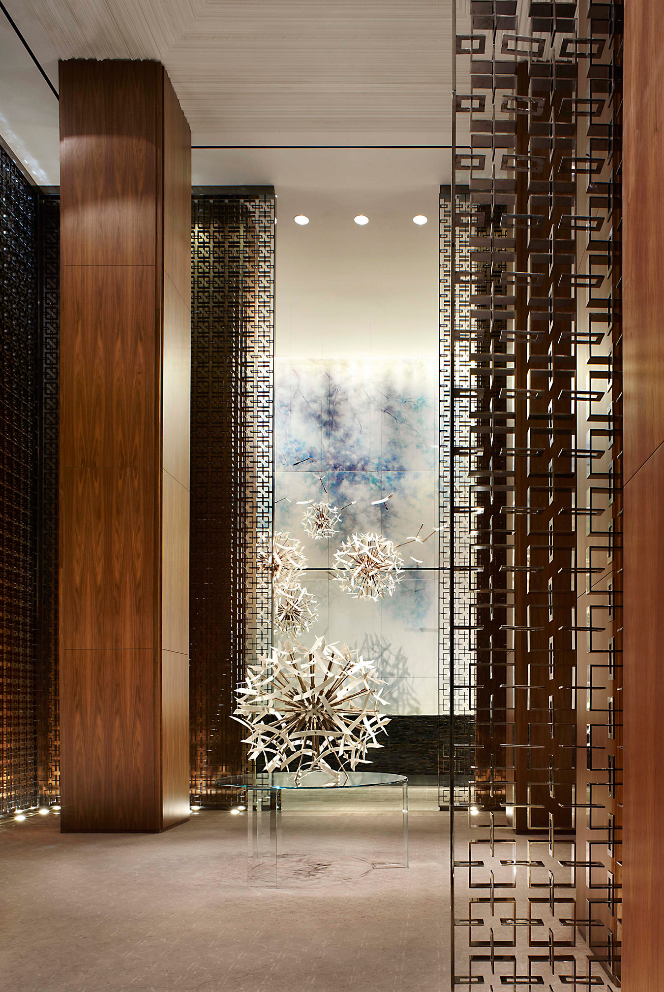
The Four Seasons Hotel Toronto.
-
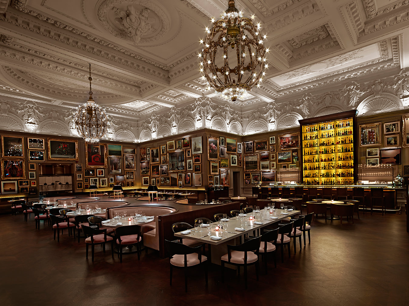
The London Edition.
-

The Room at the Bay, Toronto.
-
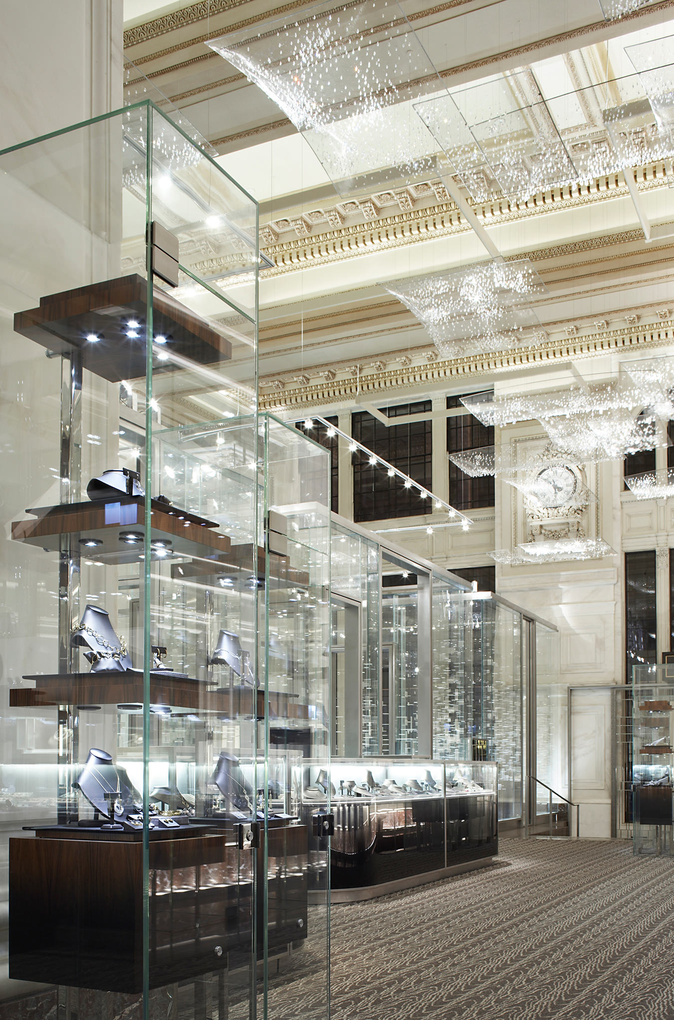
Tiffany & Co. boutique on Wall Street, New York.
Yabu Pushelberg
The creative class.

As twentysomethings during the late 1970s, interior designers George Yabu and Glenn Pushelberg got into Studio 54 by driving down to New York from Toronto decked out in their craziest clubbing ensembles and refusing to queue up at the door. Instead, the two walked down the middle of 54th Street—catching the jaded eye of the doorman—and directly into the club. This was the first time that the partners of Toronto- and New York–based Yabu Pushelberg would experience the hospitality of club-owner-turned-hotelier Ian Schrager. By dawn, Yabu felt at home enough to fall fast asleep draped over a speaker.

George Yabu and Glenn Pushelberg have residences in New York, Miami Beach, and Toronto (showcased here), and a beach house tucked into the dunes of Amagansett, Long Island.
About 25 years later, they would have an opportunity to work with Schrager, renovating Philippe Starck’s Royalton hotel, but they talked him out of altering the property—and out of a job. Luckily, the stars finally aligned, and Yabu Pushelberg has since completed three hotels for Schrager (the latest being the atmospheric London Edition in September), with two more in the works. It turns out those two kids from Canada became the go-to guys for the upper echelons of retail, hospitality, and restaurant interiors. They are to the inside of the international hotel what Renzo Piano is to the outside of the museum.

Inside George Yabu and Glenn Pushelberg’s Toronto residence.
The work of two Ryerson University interior design alumni who wed their nascent commercial (Pushelberg) and residential (Yabu) practices into one Toronto studio 34 years ago is clearly visible and palpable today. They are both 60 now, but they certainly don’t look their age. They’re fit, laid back, and quick to smile, and on any given day you might find them in high-top skate shoes or Converse Jack Purcell boat shoes with rolled-up skinny jeans (one pair bright blue, the other lemon yellow)—and if they’re wearing jackets, they’re definitely not wearing ties. They’re as stylishly dressed and fresh faced as their designs. For these two creative veterans, luxury is a state of mind, not a material.
They caught their first break with the 1985 design of the Toronto Club Monaco store. Soon after came a cosmetics floor for Bergdorf Goodman, and by 1998, they had opened an office in New York and begun to split their time between the two cities. Today they preside over a 100-person staff, and over three decades, they have cultivated a client list that ranges from Tiffany & Co. to Louis Vuitton to Daniel Boulud. In their work, Yabu and Pushelberg tend to articulate luxury through contrasts, as well as through comfort and the casual, strong points of view, tight “editing”, and a savvy mix of art and artisanship. It has brought them success, to say the least: they have clients in 15 countries, and in addition to the shops, restaurants, and residences, they work on 15 to 20 hotels every year (some of which take up to eight years from concept to completion). In the process, they’ve cultivated an enviable list of repeat clients: the Hudson’s Bay Company, Lane Crawford, Park Hyatt, St. Regis, and Four Seasons, to name a few.


When doing multiple spaces for a high-end client, a designer mustn’t stray too far from a well-defined, sometimes historical identity, but must offer distinct experiences in each space all the same. To find direction, Yabu and Pushelberg imagine a character-driven narrative that serves as the basis for each commercial design. It’s not demographics, and it’s not a user scenario—it’s a personal history. “This is a device to explain the design,” Yabu says. “We use characters and an imaginary script modelled around them to help the design team to design and to focus the client on the most important part of the process.”
The two used such a narrative to design the 3,300-square-foot Clement restaurant, revealed this September and new to the mezzanine of the Peninsula New York hotel. The idea was to meld a swank, midtown environment with the eclectic spirit of the downtown art world, but the story of the Clement is really the story of “Chloë”, a detailed figment of the team’s imagination.

The Pump Room at the Public Chicago.
Born into a wealthy Upper East Side family, Chloë lived for a while on the arty but low-budget Lower East Side after studying art at New York University. Upon moving back uptown, she decided to open a restaurant that would evoke both the Upper and Lower East Sides, appealing to both her cultured and creative selves. Thus the Clement became a series of spaces that are visually connected, but with unique moods expressed through choices of art (and artistic finishes), craft, and very particular points of view. This approach not only maps out a fresh design but also allows that design to express contrasts in rich ways. The dining room feels like a New York home, catering to the midtown and uptown crowds and hotel guests while resonating with locals and offering some counterpoint to the surrounding neighbourhood and the hotel itself. The Clement mixes a palette straight out of a cognac snifter, with avant-garde art and homey linen and leather. It’s sumptuous but also cool and comfortable.
The Yabu Pushelberg design approach can be described as “de-luxe-ing”, by which they mean simplifying, paring down, unembellishing. “The consumer is beginning to see ‘more design’ as undesirable,” Pushelberg suggests.
Today it’s tough to imagine a couple living and working together for 34 years, but they make it seem effortless. “There was a time when we were less mature, perhaps, and we had to work at it a little more,” Pushelberg says, “but as time goes on, it has become easier and easier, and more fun. The more we know ourselves, the better we know each other.” Over the years, they’ve each assumed a different responsibility in the practice—Pushelberg designs and liaises with clients, while Yabu guides the design process—but last year they finally delegated the lion’s share of running the business, which has meant that they’re working together more closely again, the way they did in the beginning.

The Four Seasons Hotel Toronto.
Ian Schrager has said he recruited the duo for his unlikely partnership with Marriott on the Edition hotels for their “one-stop shop-ability”: they produce many ideas on many fronts and execute them quickly and effectively. London Edition, the prelude to Miami (opening this summer) and eventually New York, is a historic 1835 building, in which the design team restored original details like wall panelling and elaborate mouldings. In sleek fragments, the public spaces recall the hospitality of a traditional English inn except with modern furnishings instead of the usual overstuffed armchairs and chintz. The guest rooms do precisely the opposite: they frame old-school furniture in a modern room warmly devoid of details. In the lobby and bar, the old shell of the building is paired with an Ingo Maurer sculpture and furniture inspired by American minimalist artist Donald Judd, including emerald velvet sofas that glow in the low light; a khaki, tufted-leather sofa; and communal tables. In the restaurant, the rose, taupe, and tobacco colour scheme takes its cues from paintings by Johannes Vermeer, and the walls are crowded with a Louvre-like profusion of gilded frames containing an eclectic mixture of artworks curated from a private collection.
Yabu Pushelberg is well known for integrating artwork, curated or commissioned, into its interior design. “We are good at drawing out creativity to fit into the context of what we are working on, while allowing room for our collaborators to express themselves,” Pushelberg says. The two have given high-visibility commissions to artists like Toronto’s Dennis Lin and Montreal ceramicist Pascale Girardin. On Yabu Pushelberg’s company Facebook page, you might find an announcement for a Robert Motherwell exhibition or a video on Japanese painter Hiroshi Senju. “Known artists can bring a hotel to another level,” Yabu explains. “We once encouraged a client to invest in a Gerhard Richter, and I’m not sure of the exact value today, but it has increased exponentially. What was something like a $100,000 investment then has huge cachet today.” Right now, they have their eyes on Anish Kapoor (they have a Kapoor of their own, Circular Lacquer Dish (Black 2), at home) and a slew of Asian artists from Japan, China, and India that they would like to bring to Europe and North America. The work adds value to the interiors, but they’re also driven by an interest to facilitate the exchange of art between cultures.

The London Edition.
One Yabu Pushelberg project that suggests art without necessarily hanging it on the walls is the 2010 renovation of the Paris Printemps department store. The retail floors have the bright blankness of a gallery: white marble floors, white surfaces, clear glass tables. Against this backdrop, the clothes are outlined with blackened steel rods forming cubic or rectangular frames around garments and displays, popping them right out for the eye. The thick black outlines clarify an otherwise overwhelming shopping experience. In combination, they also become compositions of gratifying geometric precision, texture, and depth.
The art is a trademark; what the office is less known for is using technology as a design element. Last June, the studio completed a long-standing multiple-floor renovation for Barneys New York, a space of austere lines rendered in lush materials that, like the designers, are extroverts that know how to recuse themselves. But the Barneys job that remains most thought provoking is the store’s first café, Genes@co-op, which opened in late 2011. It was an opportunity for the studio to represent chic through a technology-saturated interior, the user-friendly kind of innovation that frees time instead of killing it. (At each of the 30 place settings, web-enabled with touch screens, the term “efficient consumption” means being able to upload the menu, browse Barneys.com, and even order takeout.) The designers integrated technology in a way not to eliminate multitasking but to streamline it. Asked to define the ultimate luxury, the designers’ consistent answer is time. Their design of the café was a way to make more of it.
Around the same time as the Barneys job, luxury was also finding renewed expression in the designers’ Toronto shop called Avenue Road. Here, the two described their design approach as “de-luxe-ing”, by which they meant simplifying, paring down, unembellishing. “The definition of luxury has changed,” says Pushelberg. “You go into a high-design hotel today and you do not expect service, you expect too much design.” In the latter part of the past decade, each project became more overdesigned than the one before it, until, he says, the materials used to create the retail environment became more luxurious than the product being sold. The belief was that “bigger” design, more material, and more expensive material would increase the consumer’s engagement with, and valuation of, the brand. However, the recession began to chip away at this design-for-the-sake-of-design mentality. “Now the customer sees this excessive, exaggerated store design and questions its utility—in hotel design as well, where overdesigned spaces may compromise comfort or service. The consumer is beginning to see ‘more design’ as undesirable,” Pushelberg suggests. “We see better interiors, and more luxurious design, as more edited. Luxury, to us, is quieter and more enduring.”

Tiffany & Co. boutique on Wall Street, New York.
In their residential work, Yabu and Pushelberg don’t need a character around whom to design a narrative; they have them ready-made. They make fancy spaces livable by paying close attention to how their clients live, which makes it interesting to see the spaces they’ve designed for themselves. The couple have an apartment in one of the Richard Meier–designed West Village buildings in New York, but they also have places in Toronto and Miami Beach and, starting last May, a beach house tucked into the dunes of Amagansett, Long Island. In the beach house, what their domestic space shares with their other designs is a lack of fraught and frivolous detail, but not much else. The bathroom floor is marble, and they mix cocktails on a vintage Italian bar trolley, but everywhere else it’s cushions, fluffy duvets and plush textiles, picnic tables, and a kitchen open to the living room. In fact, it is perhaps the two bunk beds—reserved for guests—that hint at what the two men value most: time to spend with friends. What bigger luxury could there be?
Portrait and residence photos by Jamie Campbell. Project photos courtesy of Yabu Pushelberg.

