-
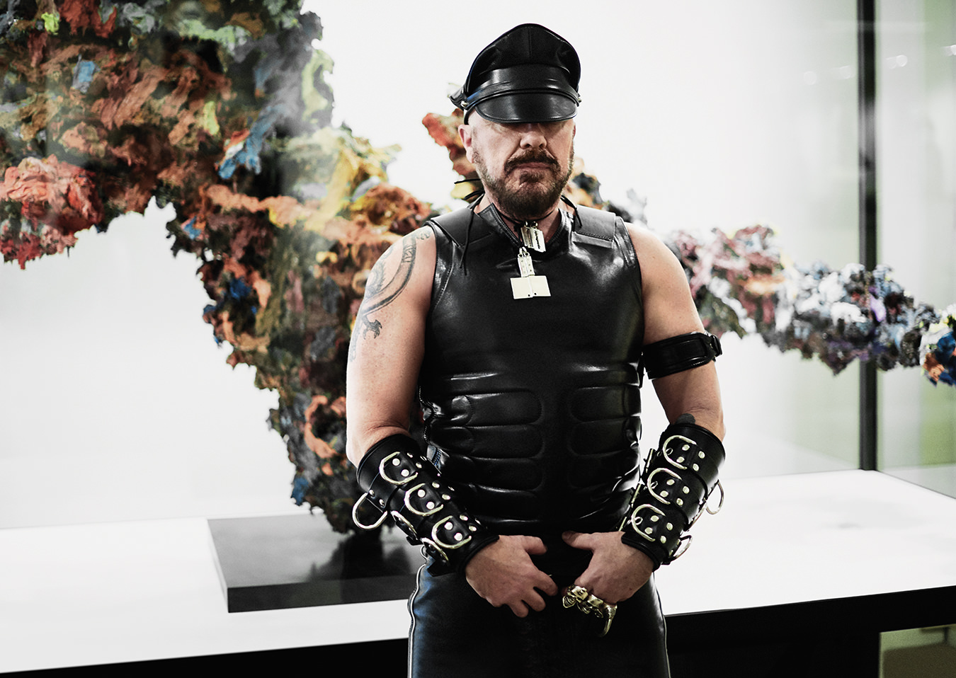
Peter Marino. Photo by Peter Ash Lee.
-
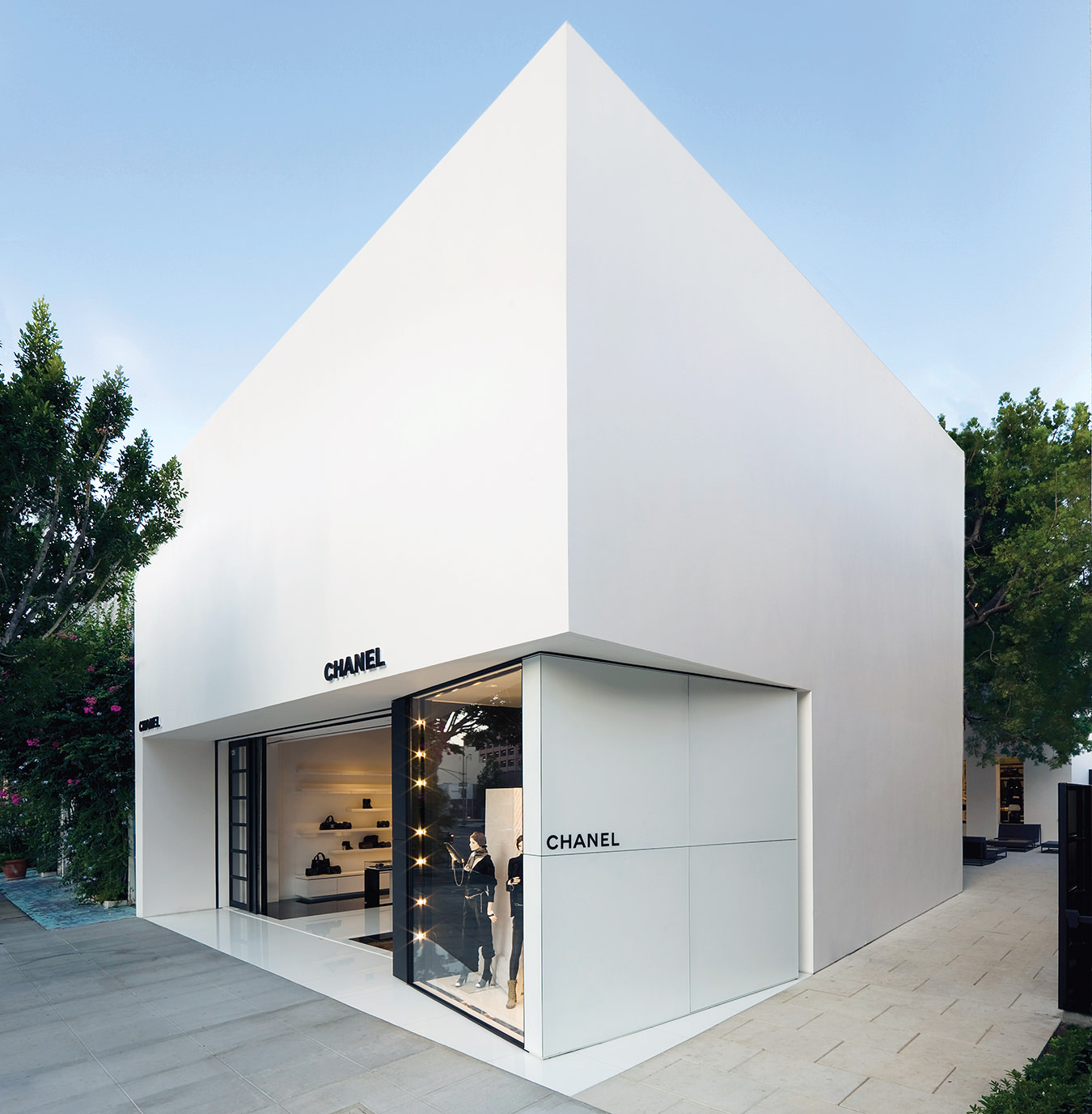
A Chanel boutique designed by Peter Marino in Los Angeles. Photo by Paul Warchol.
-
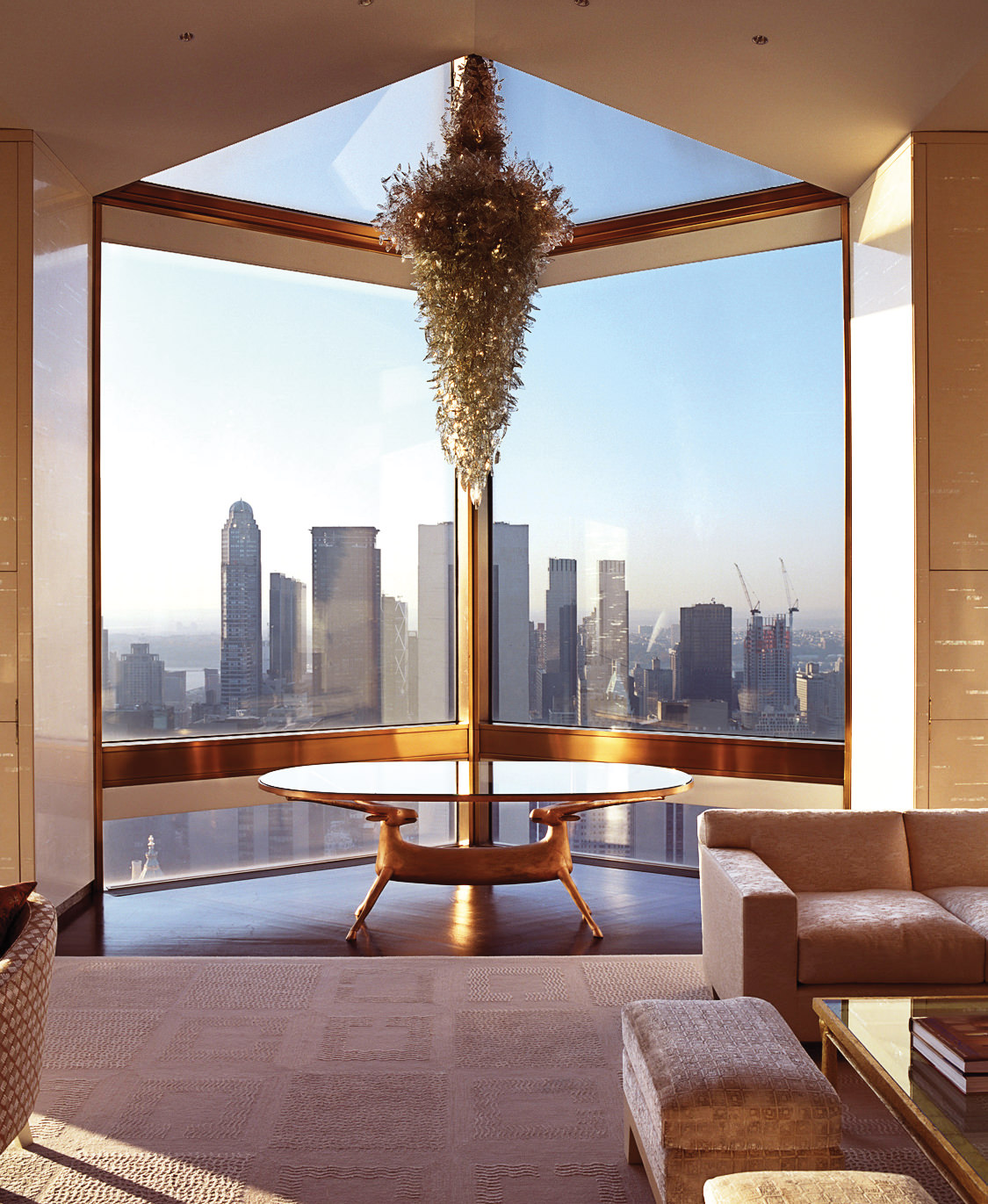
The Four Seasons New York, designed by Peter Marino. Photo by Vincent Knapp.
-
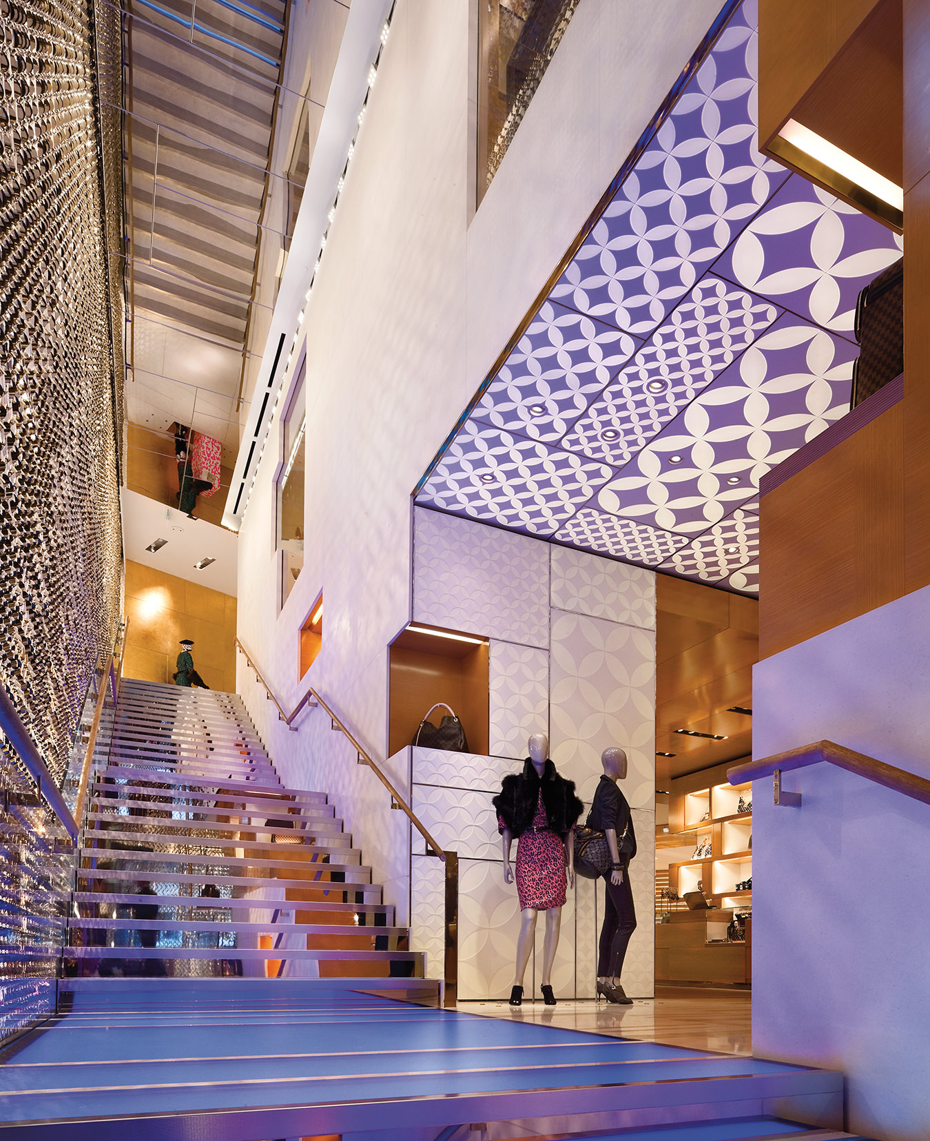
The Louis Vuitton New Bond Street Maison in London, designed by Peter Marino. Photo by Paul Warchol.
-
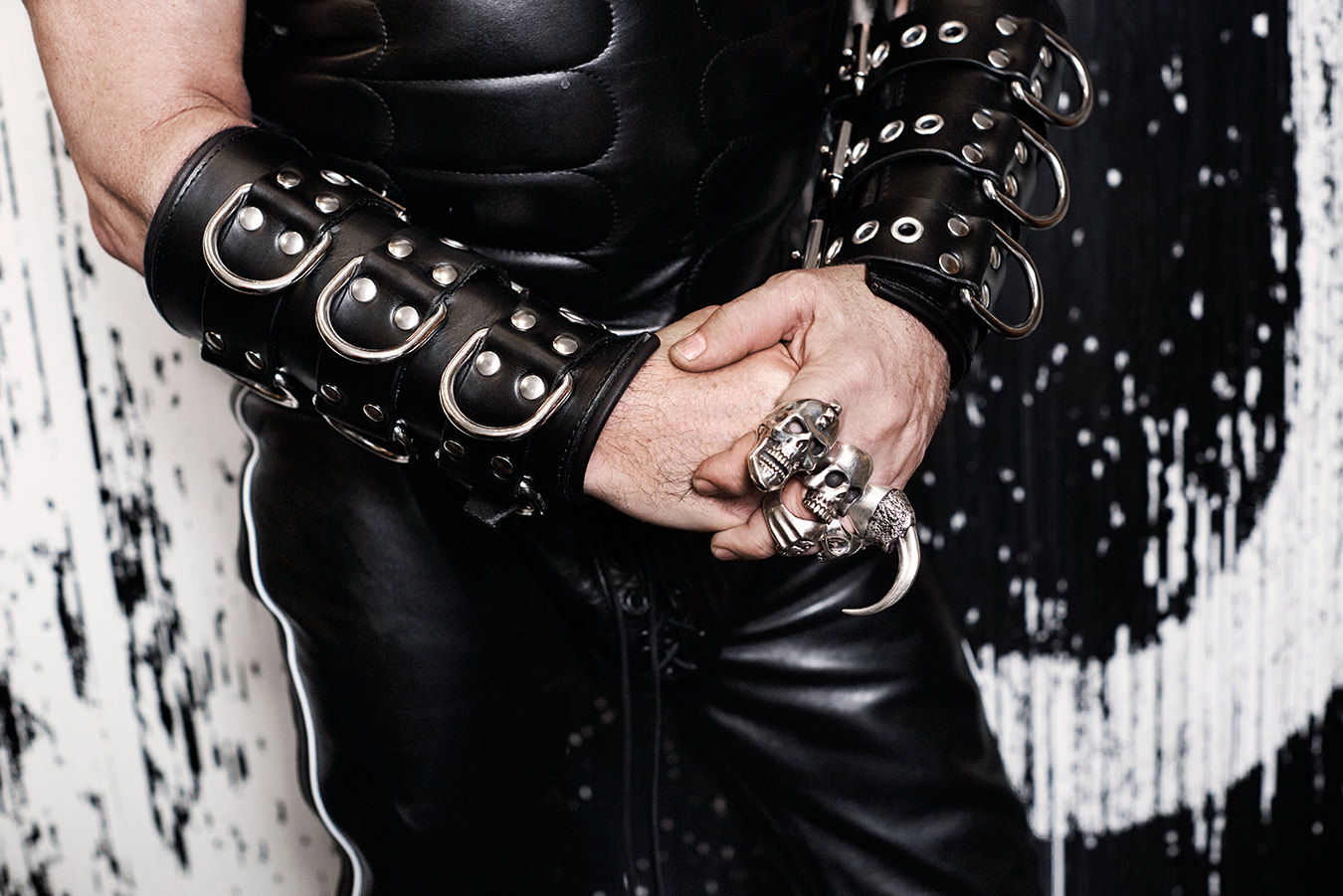
Peter Marino is well-known for his black leather attire. Photo by Peter Ash Lee.
-
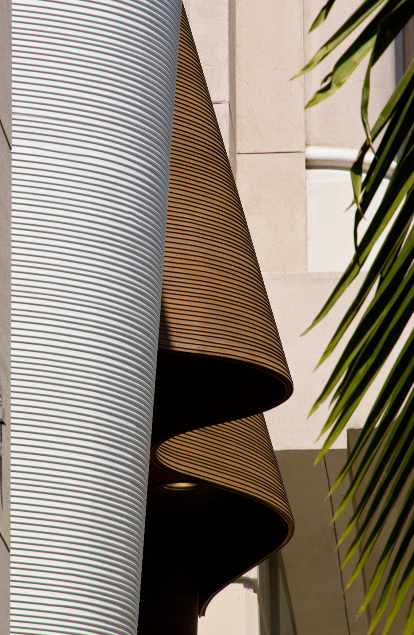
Detail of Peter Marino’s Fendi boutique in New York. Photo by Paul Warchol.
-

Ermenegildo Zegna in Tokyo, designed by Peter Marino. Photo courtesy of Ermenegildo Zegna.
-
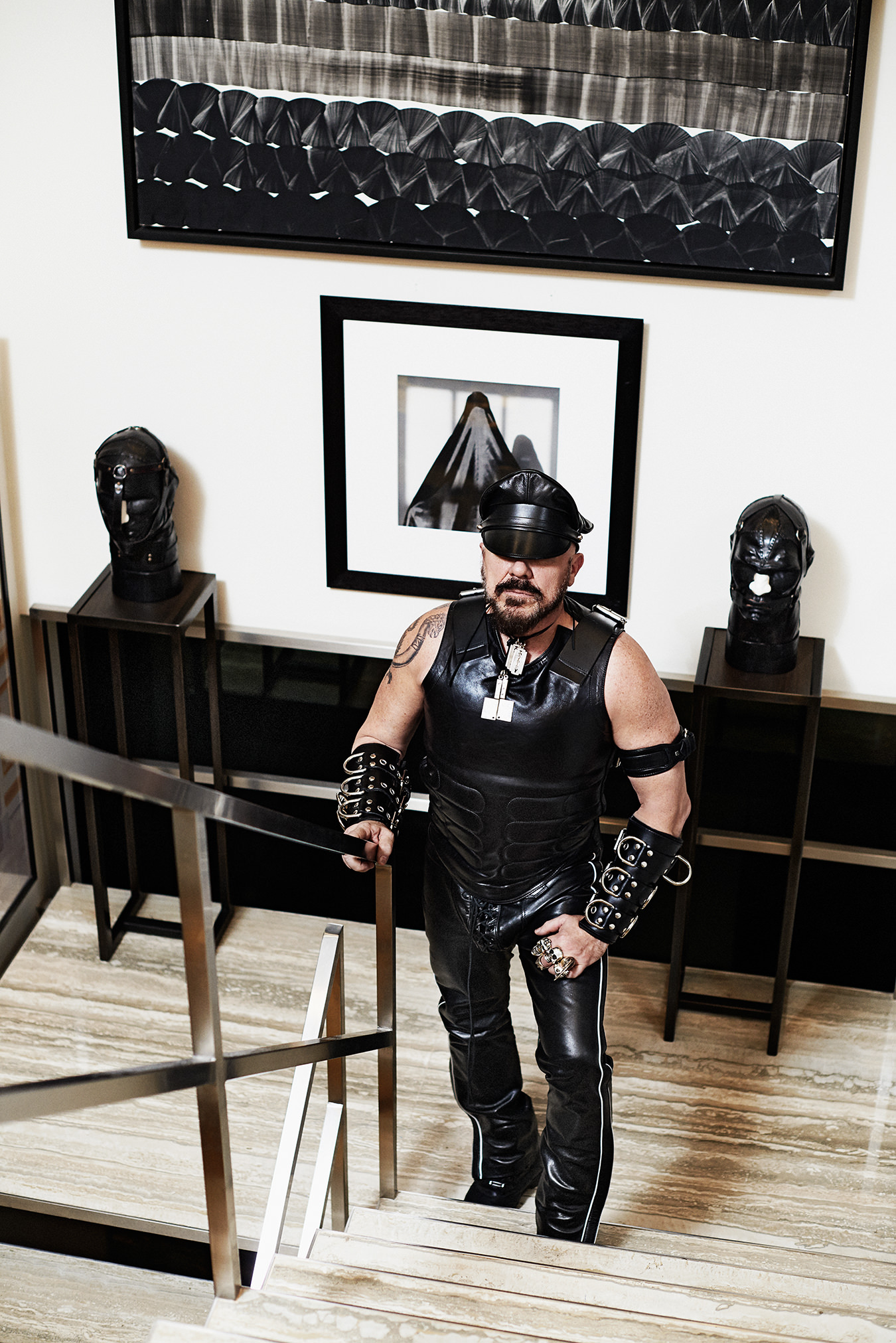
Peter Marino. Photo by Peter Ash Lee.
-
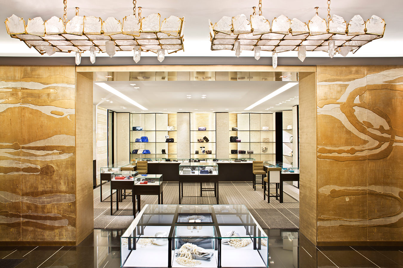
Chanel 51 Montaigne in Paris, designed by Peter Marino. Photo by Manolo Yllera.
-
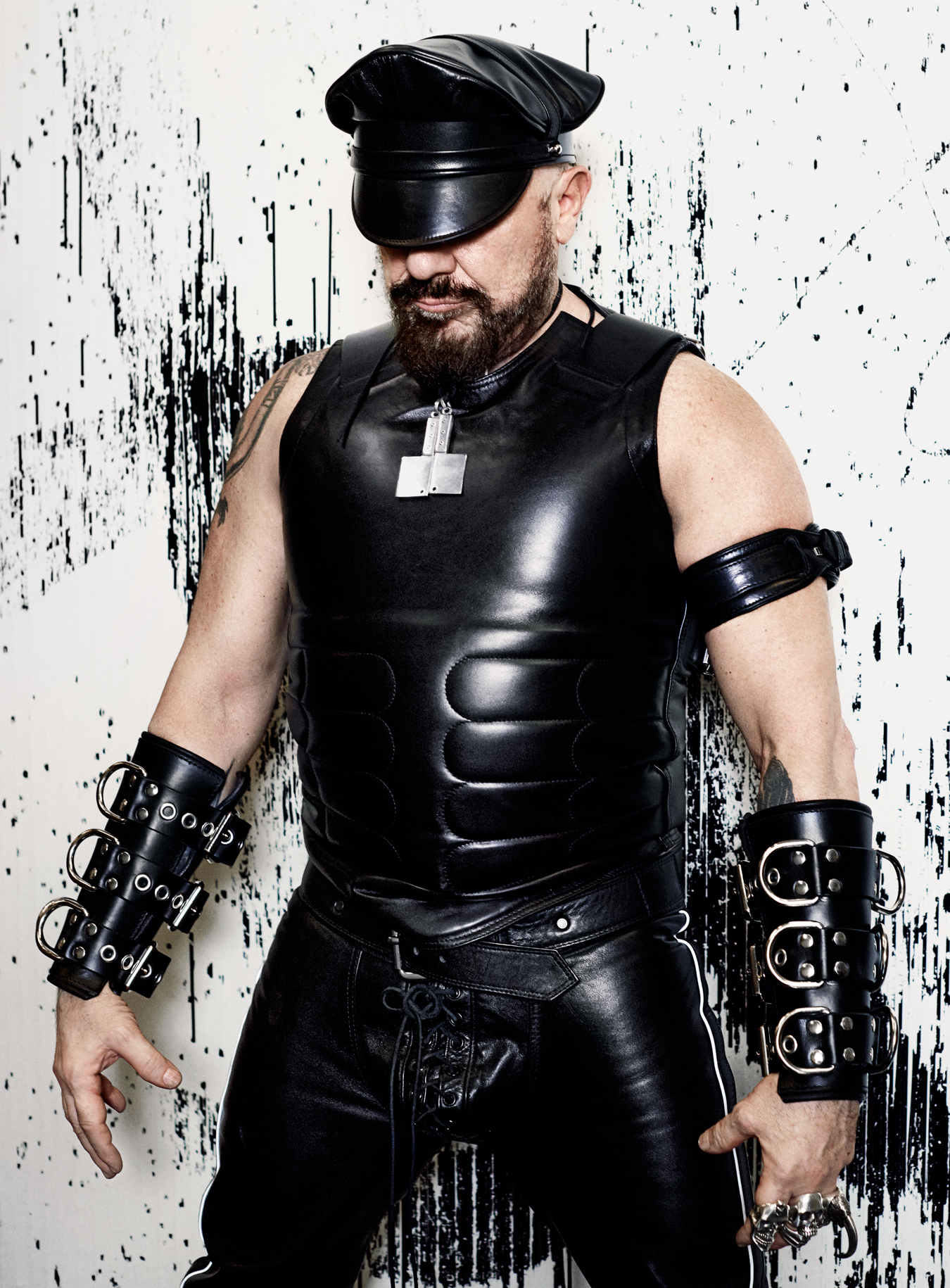
Peter Marino. Photo by Peter Ash Lee.
-
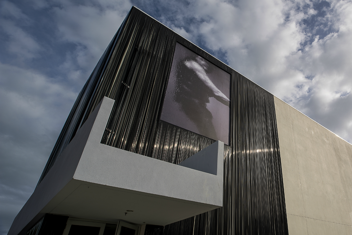
One Way: Peter Marino is on display at the Bass Museum in Miami until May 3, 2015. Photo by Luc Castel.
-
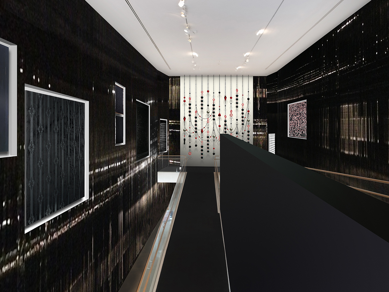
An installation view of One Way: Peter Marino at Miami’s Bass Museum. Photo by Luc Castel.
-
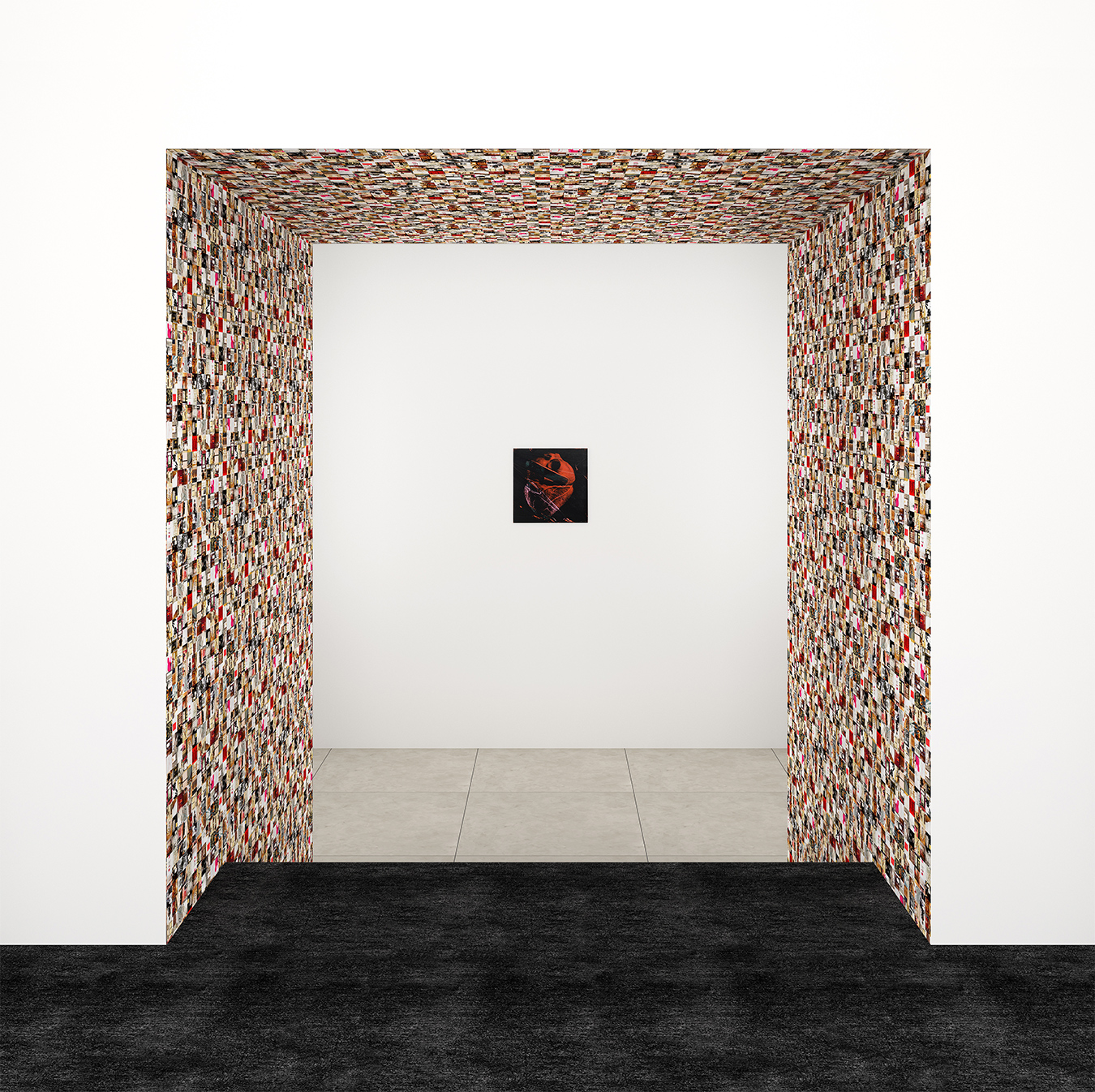
Works on display in One Way: Peter Marino: Guy Limone, Red, Black And Grey-White Tapestry, 2014; Andy Warhol, Human Heart, circa 1979. Rendering courtesy of Peter Marino Architect, PLLC.
-
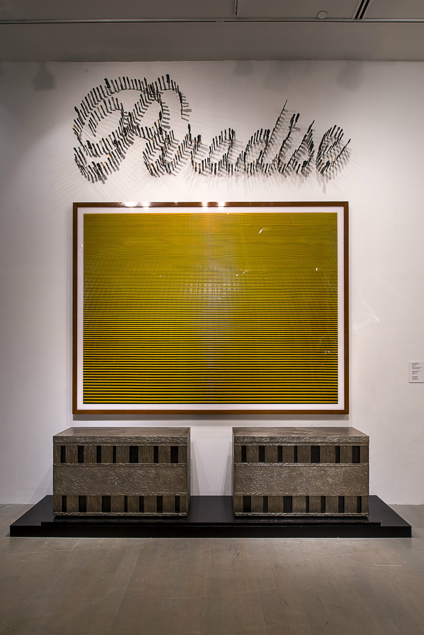
Works on display in One Way: Peter Marino: Farhad Moshiri, Paradise (Maquette), 2014; Andreas Gursky, Düsselstrand, 1996; Peter Marino, Silver Sentence, 2012. Photo by Luc Castel.
Peter Marino
The Marino method.

Architects are, by and large, a fairly reserved lot. Their training is so rigorous that it often renders them a touch over disciplined and indoors-y; the profession is so competitive that it often keeps them that way. With a few notable exceptions, their intellectual radar tends to be highly focused but alarmingly narrow: design, we are to understand, is serious business, and for the serious designer anything that falls outside it is, at best, a distraction.

A Chanel boutique designed by Peter Marino in Los Angeles. Photo by Paul Warchol.
Peter Marino is not one of those designers. “I’ve always been a black sheep,” he says—a description especially apt given his penchant for dark clothing, dark materials, dark paintings, and more. But what really makes Marino stand out from the architectural pack isn’t his taste for raven-hued leather jackets, but his cultural omnivorousness, with appetites and interests that range from high-end contemporary art to antique porcelain, from Renaissance bronzes to mid-century motorcycle culture. He is a collector and a designer, an architect and an opera-lover, and about the only check on his scope of action is his time. “I can only manage one major special project per year,” he says, the rest of his schedule being occupied by the startling volume of work turned out by his Manhattan-based firm, Peter Marino Architect. What few moments he’s able to wrest away from the retail giants and wealthy developers who comprise his client base have been devoted, in the last several years, to such diverse enterprises as mounting operas in his New York apartment (in collaboration with his wife, costume designer Jane Trapnell) and staging an exhibition of his prized bronze baroque statuettes (at Los Angeles’s Huntington Library in 2010).
The year 2014 in particular was—from the perspective of both his practice and his further pursuits—a banner one for Marino, in a way that’s tended to highlight how unique his position in the field really is. Timing it for the annual Art Basel Miami Beach and Design Miami fairs, the designer launched what amounted to a media blitz, with a host of new project debuts and exhibitions that made him a ubiquitous presence during the early-December festivities in South Florida. A show at the city’s Bass Museum called One Way: Peter Marino featured pieces Marino himself had designed—as well as art from his personal collection and five new commissions—and was complemented by a stand-alone stall at the Design Miami tent in honour of his being named the fair’s first-ever Design Visionary award winner. In stylish Bal Harbour, he unveiled a new retail space for Bulgari, and then scooted back down the beach to be the featured guest for a seemingly endless sequence of panel conversations and celebratory dinners. That all these things came together this winter was, Marino insists, largely a happy coincidence (“I couldn’t do it last year,” he says), but the effect seems quite calculated: in Miami, the black sheep was suddenly leading the flock.

The Four Seasons New York, designed by Peter Marino. Photo by Vincent Knapp.
Central to the body of work that’s elevated Marino to his Miami ascendancy has been an impressive portfolio of fashion boutiques for a who’s who of the luxury world. Chanel, Dior, Fendi, Louis Vuitton, Zegna—the list of brands for whom Marino has created signature environments reads like a walking tour of Rodeo Drive, and in many ways he’s cornered the market in what had been a somewhat neglected sector of the design trade. “Twenty-five years ago luxury boutique design was not discussed,” says Marino; with a predilection for premium materials like bronze, leather, and marble, and with a keen sense of how contemporary art can alternately disrupt or enhance a given spatial experience, Marino has become a master at creating spectacular theatres for conspicuous consumption. The increase in his public profile has been accordingly dramatic. “Listen, I get more press than 1,000 other architects,” he says. “People say, ‘How do you do it?’ I say, ‘I don’t. The brands do it all themselves.’ ”

A surprising byproduct of this exposure has been the accentuation of Marino’s uniqueness amongst his colleagues. He is not, by most observers, reckoned among the “starchitects”, those celebrity master-builders like Zaha Hadid, Norman Foster, or Rem Koolhaas whose work is a staple of architecture reviews and academic symposia. His embrace by and of the world of luxury commerce has meant that despite the array of projects his office turns out (and despite the fact that most starchitects are themselves very much creatures of the marketplace), he is typically viewed as somehow outside architecture. “The only people who get [starchitect stature] are the Frank Gehrys,” says Marino—the hyperprofessionalized, hyperserious design business doesn’t know quite what to make of Marino’s self-described “big personality”, much less his enthusiasm for culture both high and low. It’s a condition he finds baffling. “I thought all those issues of commercial versus fine art were over,” he says. “I’m fascinated to hear they’re not.”
That Marino prefers Bernini to the next great thing in design software marks him, paradoxically, as an arch-conservative in a design field obsessed with technology-driven novelty.
Marino’s attitude is a direct reflection of his artistic pedigree. Before he became a major-domo of all things aspirational and glossy, Marino was a card-carrying member of the downtown art scene in Manhattan in the late sixties and early seventies. As a fourth-year student at Cornell University’s undergraduate architecture school, the young Marino returned to his native New York to attend a satellite program the university operated in the city at the time. “Cornell rented a full floor of a building on 17th Street,” Marino recalls. “It was right across from Max’s Kansas City, the art dealers, anything you wanted. And of course, the Factory.” That would be Andy Warhol’s Factory, the combination art studio, movie studio, and industrial-scale workshop for coolness operated by the wig-wearing Pop Art maven. Warhol famously made no bones about the commercial character not just of his artworks, but of his entire modus operandi. “Making money is art and working is art and good business is the best art,” he once said, and Marino (hired by Warhol to renovate his Upper East Side townhouse) seems to have heard that lesson loud and clear. For years after he launched his practice in 1978, before he embraced the biker look and the boutique clients, Marino toed something closer to the conventional design-world line, favouring tailored suits and a prim professional bearing. But in his current iteration, he’s returned to his Warholian roots. Where other designers affect austerity and scholarly reserve, Marino has a frank understanding of his work, and to some extent himself, as a product, and he revels in the complexities and contradictions that ensue.

The revelry was on clear display at the Bass Museum show that opened in December. In creating the exhibition (which runs through May 3) with curator Jérôme Sans, Marino conceived of a progression moving from, as he puts it, “very cold black and white, paintings requiring no emotional response, like Christopher Wool’s, followed by Pop Art, funny and colourful, with some of Richard Prince’s nasty jokes.” From there, the visitor passes through an architecture gallery featuring current and upcoming Marino projects, and then on to a rear space that Marino calls “the treasury room”, including works by Robert Mapplethorpe, followed by “the deutsche galleries”, with work by Anselm Kiefer and other German artists. The final parting image is a leather-clad skeleton, created by artist Erwin Wurm: its title, cheekily, is “Peter Marino in 100 Years”. Like its subject and his outlook, One Way is eclectic, adventurous, and quite unabashed in its sinisterly excessive notion of 21st-century glamour. Perhaps the signal piece of the show was one by artist Wim Delvoye: a portrait of Marino set into a full silver revetment like a medieval Russian icon. “He just did it one day,” recounts Marino. “I said why, and he said, ‘I don’t know—because you’re an icon.’” Here was Peter Marino, product, producing himself and commenting on his own production at the same time.
That Marino should have such a distinctly contemporary feeling for art in the age of consumer culture—that he should be interested in contemporary at all—sits peculiarly alongside one of the other qualities that distinguishes him from many other architects, namely his preoccupation with the art and design of the past. At Cornell, he studied with arguably the greatest architecture historian of the last hundred years, Colin Rowe, and his collection of rare bronzes, including pieces by French and Italian masters like Robert Le Lorrain and Giovanni Battista Foggini, betokens a deeper preoccupation with Western art from antiquity through modernity. It is a background that puts him somewhat at odds with younger designers. Marino recalls recently bringing up Joan Miró with one of his young associates, to which the latter replied, “What’s a Miró?” “It happens quite often,” he says: today’s architects simply don’t have the kind of education that Marino takes as a given, a development he finds frustrating. “The older you get, the more you find people are appallingly uneducated,” says the architect; that Marino prefers Bernini and Michelangelo to the next great thing in design software marks him, paradoxically, as an arch-conservative in a design field obsessed with technology-driven novelty.

Peter Marino is well-known for his black leather attire. Photo by Peter Ash Lee.
Indeed for all his outré style and larger-than-life persona, Marino’s buildings are themselves fairly conservative. It’s not that he believes in bringing back some version of 19th-century beaux arts grandeur—quite to the contrary. “You’re not going to be any good as an artist if you’re retro,” he asserts, and all of his buildings belong very much to their time. His new Bulgari location, for example, is an appropriately jewel box–like interior of metal and glass, unfussy and suitably contemporary. But, as befits his Rome-based client, Marino has appended a marble archway to the façade, bolstered by unadorned cylindrical columns—a reference less to the ancients than to the simplified rationalist architecture popular in the Italian capital during the 1920s and ’30s. In a similar vein, Marino is currently at work on a house for a private client on Miami’s Star Island, a simple square frame reminiscent of Marino’s straight-shooting modernist roots but with a flair all his own. “The house is classic I. M. Pei, maybe SOM from my training,” he says, having been in the orbit of both 20th-century design giants during his early career; but the home’s boxy outside gives way inside to a floor compounded of dozens of colourful pieces of marble, all of them odds and ends scraped up from the workshop of one of his preferred suppliers. It’s just the kind of twist that Marino often deploys to keep his work fresh. “You always mix it up and throw a curve in,” he says.
The fact that Marino is doing a house, much less doing one informed by Pei and SOM, may come as a surprise to many familiar with his work. “Tons of people saw the architecture gallery at the Bass show and said to me, ‘Who knew?’” Due to a reputation built on glitzy retail locations, domestic interiors, and the odd hospitality project, the breadth of Marino’s practice has been oddly overlooked, still another part of his unusual status as a non-architect architect. His studio has done everything from mansions to a medical research facility in New Jersey, and construction is under way on a high-rise condominium near Manhattan’s High Line park called the Getty (so named for the gas station that used to stand on the site). When completed, it will put Marino in the immediate proximity of Gehry, Jean Nouvel, Renzo Piano, and a gaggle of other bona fide starchitects—precisely the kind of company Marino has not, as a general rule, been known to keep.
The Getty was one of the centrepieces of the final element in Marino’s multipart Art Basel coup, the solo booth devoted to him at Design Miami. With all the dizzying variety of One Way, the tightly configured stall made for a more cogent essay on Marino’s aesthetics and artistic worldview. “Three architects did it before me,” notes Marino, referring to the designers who had received similar recognition before the inauguration of the Design Visionary award this past year. “Foster, Koolhaas, and Hadid. Zaha did all white, Foster did very high-tech stuff all over with big TV screens, and Koolhaas did a very architectural-pedagogical demonstration. So the whole world is waiting to see what I’m going to do. Rodman Primack [the director of Design Miami] asked me, ‘Are you going to make it like a Chanel store?’ But I told him, ‘No. I’m going to make it like me.’” And so he did: stuffed with design goodies from the past and present, including a full-sized statue of Marino reflected ad infinitum in a mirrored display, the booth was clad in slick black leather, with straps slung through gleaming metal rings. Seen on the floor of the fair, side by side with displays from hundreds of designers from around the world, it was a defiant statement of Marino’s brash sensibility, his singular sense of self and distinct promotional savvy. “They said we didn’t know you’d have the courage to put the leather on the outside like that,” says Marino. “I said, ‘Dude, if I have the courage to walk on the streets like this…’”
“I don’t have the inhibition thing,” notes Peter Marino, perhaps one of the few understatements to come from this candid architect. Designers have always been packaging themselves for the public, but few do it with such subversive openness—and that, more than anything, may be what sets Marino apart. One of the motifs he favours most, one that glowers down from many of the walls in his New York office, is the skull: another nod to Warhol, who made it one of his favourite silkscreen subjects, the memento mori is more than just a bit of punk iconography. In Marino’s case, the smiling death’s heads are an appropriately dark and ironic emblem for a designer unconcerned by the taboos of his often strait-laced profession, and who’s made a career of flouting them and getting away with it. The last laugh, it seems to suggest, belongs to him.


