With Barber Osgerby, Design Is to Keep
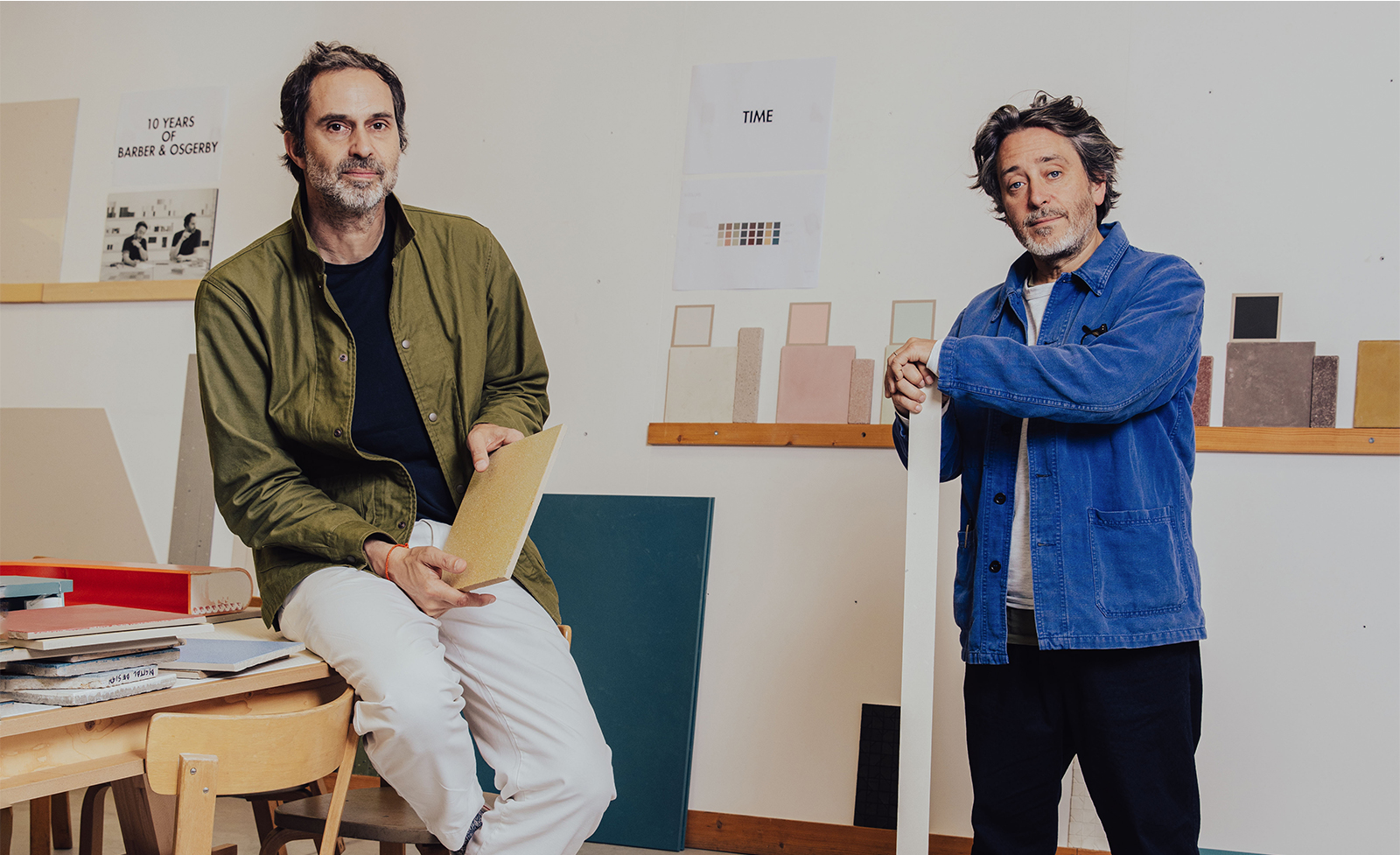
Edward Barber and Jay Osgerby met as architecture students at the Royal College of Art. Today, the design darlings lead the London-based studio Barber Osgerby.
It’s early September, and designers Edward Barber and Jay Osgerby are busy preparing for the upcoming edition of the London Design Festival. The celebrated British creatives will debut a demure version of the Hotaru paper lanterns (first introduced in 2015), as well as the new pasta-inspired Tortello sofa and armchair (only a few months ago, they launched the collection alongside three others at Milan’s premier furniture showcase, Salone del Mobile). It’s not the first time the duo and their eponymous East London studio Barber Osgerby have contributed to the annual event, from the Hotaru Marker pendant light, their first exhibit in 2016, to their Plan Collection of tables and chairs in 2022. This broad output is also a reminder of the English capital’s design network’s “ability to render and animate imaginative concepts within minutes and share them with the world in mere seconds,” according to the designers.
However, the dynamic metropolis has evolved dramatically since the mid-1990s when the pair met during graduate studies in architecture at the Royal College of Art, where Barber trained in interior and Osgerby in product design. “London was a peculiar place,” they recall, emphasizing the lasting echoes of a recession and its related social disparities. As emerging designers, “getting work published and securing coverage were formidable challenges.” While still students at the RCA, the designers were commissioned to redevelop the interior of a restaurant in South London.

Sketch of the Tip Ton chair.
Budget constraints prevented the development of a signature element of the project: a sinuous table consisting of what appeared to be a single surface in a continuous loop bisected by two asymmetrical supports. Building on their architectural training, the design began as a cardboard investigation into the potential of sheet material, eventually ending up on a shelf in their studio after the restaurant was completed. It would be a year before the model was transformed into a full-scale prototype. When searching for a manufacturer, they came across Chris McCourt (owner of experimental brand Isokon, founded in 1935 and known for designers like modernist giant Marcel Breuer) and his workshop in West London, whose expertise the pair was enamoured with. The resulting Loop table became a critical success: it was the first new product for Isokon in over 40 years and partly responsible for the launch of the novel Isokon Plus line.
The Barber Osgerby ethos is to design objects, spaces, and places that marry aesthetics and craft to stand the test of time, transforming quotidian aspects of life into unique experiences that will elevate the everyday.
Garnering acclaim from curators at both the Victoria and Albert Museum and the Metropolitan Museum (it is now included in their permanent collections), the Loop table also attracted the admiration of Italian architect Giulio Cappellini (founder and director of the eponymous Milan-based manufacturer), who met the young designers by chance in London. “Giulio expressed his love for the table,” they fondly recall, “and said, ‘I have to have it in my collection.’” Like any young creatives encountering a major force in their field, the pair were taken aback: “We were dumbfounded. It was a hugely exciting moment for us as he is such a hero of ours.” Following the encounter, Cappellini brought the table to Milan. The rest, as the saying goes, is history.
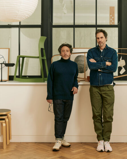
Barber Osgerby’s subsequent ascension in the early aughts came at the end of an intense period of design stardom centred largely on explosive formal and material explorations. The studio’s output has been characterized by a distinct aesthetic softness married with intense attention to materiality, craft, and colour. “We are known for our meticulous selection and use of materials,” they say, “focusing on clean lines and well-balanced compositions” while “ensuring that the designs serve their intended purpose effectively.”
As London’s design culture matured alongside global and technological shifts, so too did Barber and Osgerby’s collaborations with local and international companies. Engaging fully in new methods of production with manufacturers from B&B Italia and Flos to ClassiCon, many of these nascent efforts have become long-term, sustained partnerships, which “have afforded us not only a profound knowledge and comprehension of the creative process but also an intimate understanding of the unique needs and values of our partner companies,” they say. “To quote Milton Glaser,” they add, “ ‘We only work with people we like.’ ” For a pair who have only practised together, partnerships—internal and external—are not only crucial but foundational.
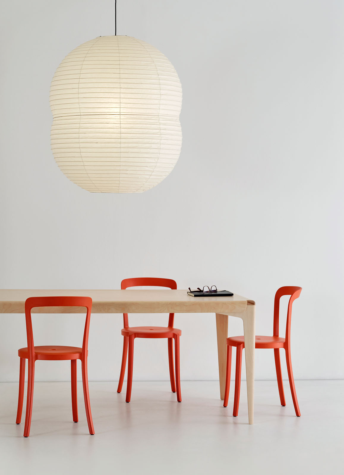
A trifecta of Barber Osgerby designs including Hotaru Double Bubble lantern, Shell table, and On and On chairs for Emeco.
Increasing output led to a need to articulate their multifaceted portfolio more clearly. Hence, in 2001, Barber and Osgerby established Universal Design Studio, an independent but related arm of their main practice focused on architectural and interior environments. “Barber Osgerby,” they explain, “is authored work and very much projects and products developed to answer questions in society” explicitly addressing “how we see the world and what we need to change.” Universal, on the other hand, was conceived as a place for collaboration with brands and individuals. Like its progenitor, the studio has received wide-ranging praise for its tailored and imaginative spaces, including retail concepts for fashion house Mulberry and clothing giant H&M.
Yet entry into the popular consciousness of contemporary design did not come without its share of obstacles. After successful collaborations with Established & Sons in the mid-2000s, the studio was invited to produce a set of limited-edition works for an exhibition by the British manufacturer of furniture, lighting, and accessories. By choreographing a selection of monochromatic colour chips, Iris emerged: a radiating circle of aluminum topped with low-iron glass. “While the concept was simple,” they say of the five gradient-toned high and low tables, “the technical execution posed significant difficulties.” To achieve the precise execution required, assistance from a Formula One manufacturer was needed to articulate each metallic segment. Furthermore, the design required individual elements to be anodized by hand in a labour-intensive and intricate process. As with other collaborative endeavours, it provided invaluable insight into the ever-changing production landscape, manufacturing technologies, and corresponding aesthetic possibilities. In retrospect, it was “up there with our most challenging projects,” they note.
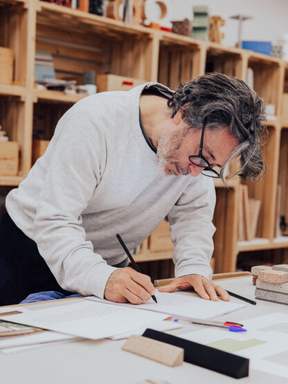
In 2011, the studio released another significant technical and conceptual landmark: the archetypal Tip Ton chair for Vitra. Three years prior, the designers were tapped to help select furnishings for a new school and, during their extensive research, were unable to find suitable options. Instead, they embarked on producing an offering of their own for the Swiss furniture manufacturer, with which they had long been discussing a potential collaboration. After a handful of initial ideas, countless drawings, and approximately 100 prototypes, the signature lightweight polypropylene chair emerged. By shifting the centre of balance and gently sloping the sturdy base, Tip Ton offers users a range of dynamic movements and the ability to tilt forward and back. This functional shift gives the injection-moulded seat its distinctive appeal alongside its stackability and expedient production time—it’s not quite a stacking chair and not quite a rocking chair but something else entirely. “If we could hit on something as interesting as the Tip Ton chair every two to three years, that would be fantastic,” Barber remarks. “Trying to discover a new archetype is really the ultimate goal.”
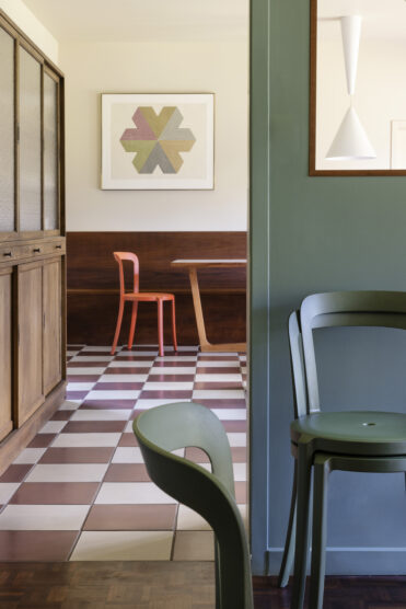
Tip Ton became such a success for both parties that it spurred another innovation. Recognizing the inherent impact of mass-produced solid-plastic furniture, Tip Ton Re—composed entirely of recycled polypropylene—was released in 2020, joining other sustainably minded offerings like the On & On collection for Emeco that translate a career-worth of knowledge into more sustainable means of production.
When London was announced as the host city for the 2012 Summer Olympic Games, an additional career-defining challenge crossed the designers’ desks. The committee tasked the studio with developing a highly functional but emblematic torch to be carried by some 8,000 individuals during the Olympic Torch Relay leading up to the event. An 80-page document soon arrived, outlining the extensive requirements and rigorous ergonomic criteria. “The torch needed to function under various demanding conditions,” the designers say, “including high altitudes, subzero temperatures, 70-mile-per-hour winds, rain, and snow.” Testing both creatives’ technical, conceptual, and practical competencies, the design also “had to cater to torchbearers of diverse ages, ranging from 12 to 100, requiring it to be lightweight, easy to grip, safe, and sturdy.” In true Barber Osgerby fashion, the sinuous final object—hewn from laser-cut aluminum alloy used in automotive and aerospace applications—combined formal grace, technical performance, and signature character.
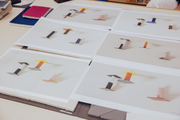
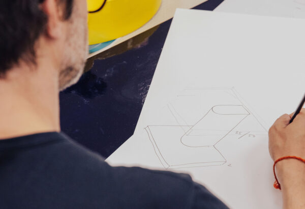
Rivington tables, from sketch to realization.
That same year, Barber and Osgerby reoriented their practice once again with the launch of strategic consultancy Map. Rather than designing material goods, the company focuses on “products for the digital age” by connecting not only emerging technology and its new users, but physical and virtual terrains as well. Inspired in part by a pioneering installation for Sony integrating sound technology into the home, these insights have been sought after by the likes of Google, IBM, and more in the decade since.
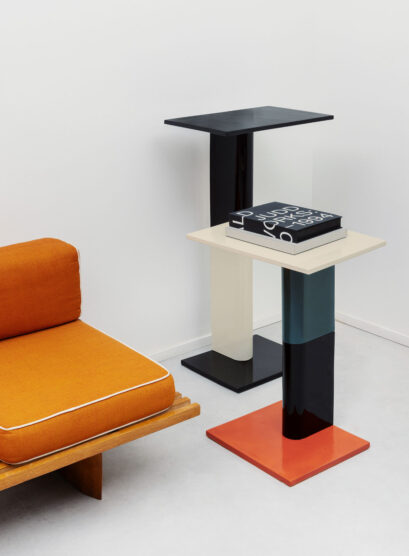
Now entering their mid-50s and managing a team of 85 split between two locations in Clerkenwell and Shoreditch, the designers continue to nurture the longstanding collaborations and incisive vision that have defined their trajectory across nearly three decades. Later this fall, Barber Osgerby will commemorate a decade of work with Mutina ceramics by releasing the Rivington tables, inspired by the nearby bar where both teams would meet and a fitting reference to their own origins with Loop. This commercial endeavour parallels experimental projects—including the recent Signals lighting line for Parisian Gallery Kreo—that further test the limits of industrial processes. And while 30 years of practice have offered Barber and Osgerby countless opportunities to engage radically diverse scales, typologies, and experiences, the duo remains optimistic and excited about future hurdles. “A bridge project has always been an aspiration of ours,” they say, as it exemplifies “beautiful form and total performance.” This sentiment could be seen as the studio’s ethos: to design objects, spaces, and places that marry aesthetics and craft to stand the test of time, transforming quotidian aspects of life into unique experiences that enrich as well as elevate the everyday. Or as they put it: “Design is to keep.”
Portrait Photography by Michael Sinclair.
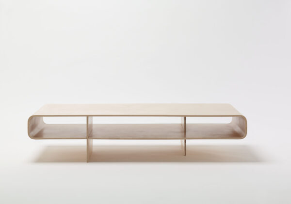
The Loop table was Barber Osgerby’s first furniture collaboration, developed for an architectural project that required a low table incorporating storage and evolving from a simple model of folded and slotted cardboard.

