-
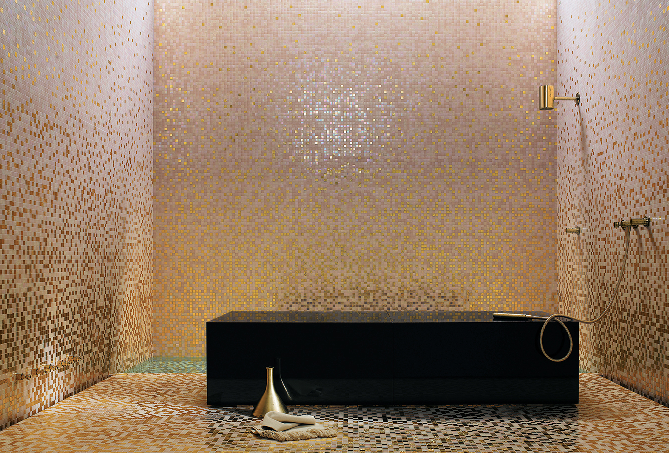
Photo by Federico Cedrone.
-
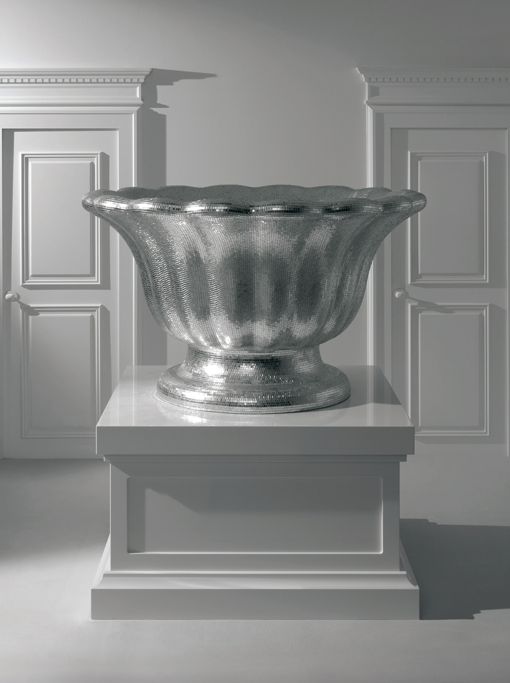
Photo by Paolo Veclani.
-
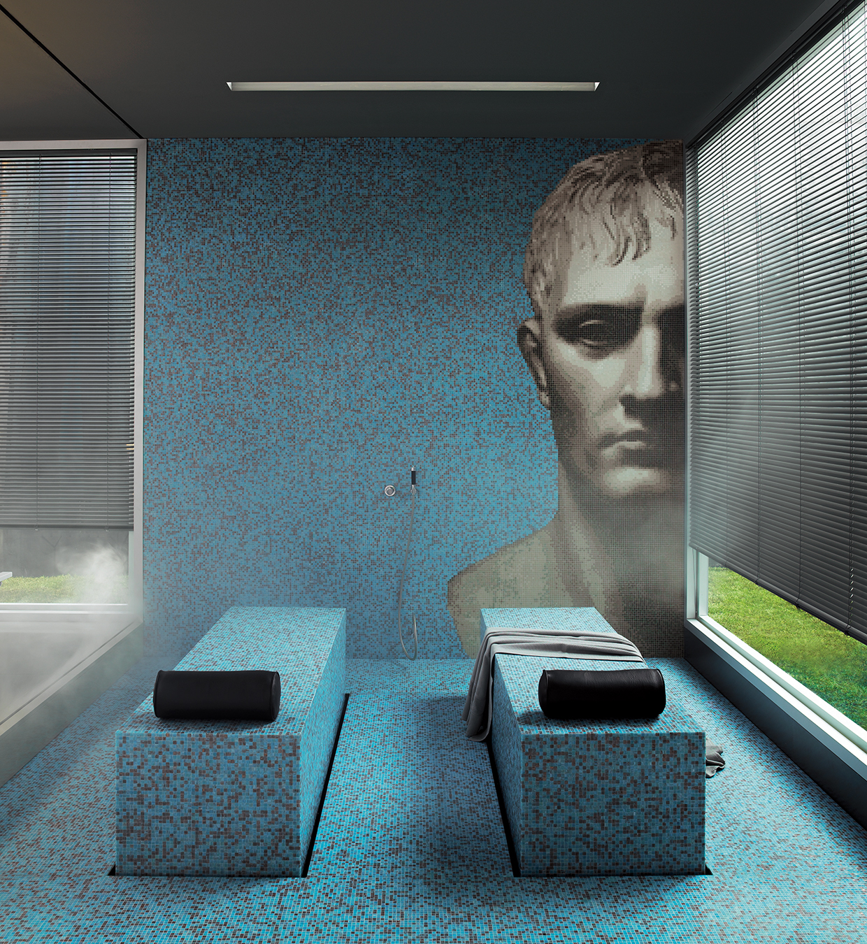
Photo by Federico Cedrone.
-
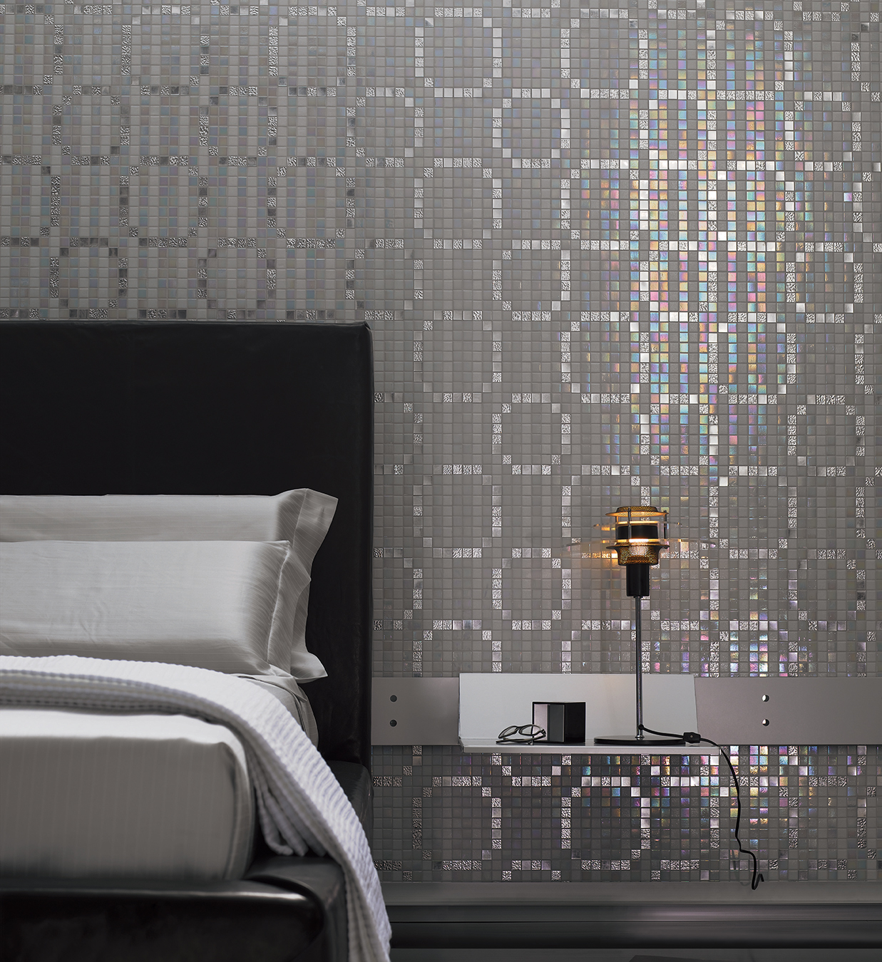
Photo by Federico Cedrone.
The Tiles of Bisazza
Mosaic marvels.
City of watery reflections and limpid light, Venice has a terroir that seems uncannily right for the production of exquisite glass. Nor is it hard to see, given the Venetian passion for decoration, why the area has long been known for mosaics. Indeed, less than half an hour from the Grand Canal is a town named Tessera, the Latin word for tile. Up until recently, this ancient form of adorning surfaces seemed frozen in time. Granted, there were occasional ventures into the subversive, usually in public places—think of Gaudí’s crazy benches in Barcelona—but for home use, mosaic was mostly typecast as a wall or floor covering for bathrooms and kitchens. In recent years, Italian company Bisazza Mosaico has taken a fresh approach that shatters any preconceptions that mosaic is out of step with the 21st century. Utilizing computers and working with big-name designers, Bisazza blends art and audacity into a style that melds comfortably with modern interiors.
Company founder Renato Bisazza got his start in mosaics with a small company “at a time when all was artisanal,” says his daughter Rossella, the company’s head of communication. (Her brother Piero is CEO.) Having launched the company in 1956, Bisazza worked with an engineer to develop machines to produce mosaics, in itself an evolutionary step. “But the computer was the turning point,” says Rossella. Which is logical: enlarged, a digital image comprises thousands of pixels, the small squares serendipitously like the tiles of a mosaic.
The rethink starts at the entrance to the company headquarters in Vicenza, where formal gardens are dotted with meticulous topiary, leaves clipped to a perfection that a closer look reveals as mosaic. Beyond is an immense wall patterned with what could be antique rose-patterned fabric, except that it’s hugely enlarged and again made of mosaic. The wall follows a curve through glass doors and into a reception area where the enormous flowers become background to a pair of tall trees, which are real. Like the 2,000 square metres of adjacent exhibition halls that lead off it, this entrance was part of a major redesign that saw Renato Bisazza’s original factory converted into display space. The reworking began in 2002 with the appointment of architect Carlo Dal Bianco as director of the Bisazza Design Studio, and continues today.
The floral design that greets visitors is made up of dozens of individual colours, except that calling them colours is rather like describing peacock feathers as turquoise and green. Only one centimetre square, each glass tile is a small work of art, like a slice from a semi-precious stone, full of subtle shadings and dragonfly iridescence that contribute extraordinary vibrancy and depth to the finished design. And remember, that floral wall is curved. A major creative goal for the company has been to take the perceived stiffness out of mosaic. Bend it? Treat it like wallpaper? Why not. As well as Carlo Dal Bianco’s in-house team, Bisazza has commissioned works from internationally known designers like Ettore Sottsass and Andrée Putman. These designers “push our borders”, says Rossella Bisazza. “Sometimes they come up with crazy ideas. They are fresh ideas. It’s very important for the company.”
The evolving exhibit in Vicenza destroys any notions of mosaic having limited capabilities. Treated as a flexible skin, tiny tiles envelop a monumental installation, around four metres tall at its peak, that begins and ends with giant profiles of a man and a woman (possibly depictions of creator Fabio Novembre and his wife). Linking them, a track swoops and loops like a roller coaster, with a stylized heart at its midpoint. Meanwhile, Prussian blue at one end, the tiles gradually lighten through cobalt and cerulean to a pure white that shimmers like mother-of-pearl before slowly deepening in hue from delicate pinks to a crimson-and-violet conclusion. Viewed up close, it’s a pointillist painting in glass. “Shading blends” create the effect of dark fading to light, with each row in a sheet of tiles made up of varying percentages of colour. While the math is done by computer, eyes and hands do the fine tuning: in a production area, staff make lightning-quick assessments of tiled sheets as they pass by.
A creative goal for Bisazza has been to take the perceived stiffness out of mosaic.
Tiles are only one component of mosaic. Aware of its visual importance, Bisazza also produces its own grout, and has even developed a clear grout for extremely contrasting patterns. Nor is working with fine mosaic a job for the do-it-yourselfer. Installation is an art to the point where Bisazza has its own school and sends qualified professional installers worldwide to work on assignments.
For one uniquely challenging project, the company’s technical department had to develop a glue and a spatula that could apply tiles directly to metal. When the BMW Group dreamed up the idea of “dressing” Mini cars, it approached Bisazza, because both shared similar status as icons of design. According to a Mini corporate spokesperson, “Through this co-operation, both brands were able to reach new consumer groups. Mini always wants to surprise, and with this co-operation, we were able to achieve this.” Calling it a “surprise” is an understatement when you see the small car, mounted on a wall, the better to expose the ebullient plaid mosaic that covers door panels, roof and hood. In another exhibit space, it’s the visitor who feels miniaturized when faced with Dutch-Belgian team Studio Job’s collection of limited-edition mosaic “Silver Ware” built on an Alice in Wonderland scale. Unlike the Mini, these pieces are functional. The cake tray could be a table, Rossella Bisazza suggests, and the two-metre-tall coffee pot might double as a planter.
While Marcel Wanders’s mosaic Bisazza Motel—complete with vintage automobile, trailer and sauna—is strictly for display, the Dutch designer’s other equally playful pieces fit right into home surroundings. Organically shaped like oversized beach pebbles and patterned in gumdrop colours, his coffee tables and ottomans are part of the Bisazza Home collection introduced in 2006, a venture designed to take mosaic into every corner of the home. Inspired by traditional toile de Jouy fabric, the iconic shepherdess on a swing—considerably larger than life—becomes a motif for a screen by Patricia Urquiola. “Organic Pixel” is a appropriate name for a collection of vases by Jaime Hayon. A smart homage to the classic Venetian mirror, Carlo Dal Bianco’s tall looking glasses are framed in gold mosaic. The same mosaic lines the central cylindrical opening of a circular table by Andrée Putman, bouncing light upward as if from some subterranean El Dorado.
As played with by the company’s design team, glass mosaic is the antithesis of the flat opacity of ordinary tiles. It can be trompe l’oeil: arabesque patterns that look three-dimensional; giant panels that simulate a life-sized fireplace or table. Covering a cabinet front or an urn-shaped lamp base, white-gold tiles evoke Jean Harlow in bias-cut satin. “We are proud to give the idea that mosaic is glamorous. It’s sexy in a way,” says Rossella Bisazza. “It’s much more versatile than you think. It’s a small square tile, but you can cover round surfaces. It has a softness that you don’t expect,” as in a curvy and surprisingly comfortable “soft mosaic” chair upholstered in foam-mounted tiles by Jürgen Mayer, a designer with footholds in architecture, communications and new technology.
Mosaic can cover floors, walls and ceilings with gleaming translucency and visual wake-up calls as Bisazza designers have fun with traditional patterns like plaid, houndstooth and leopard skin. Designs can be as rich and complex as a tapestry or as simple as narrow vertical stripes, except that those stripes shimmer, their appearance shifting with the light. Glass mosaic has qualities that ordinary surfaces can only dream having, of including the ability to reflect colour. Thus, the gold arabesques on a sinuous wall appear to deepen to rosy bronze and copper toward the crimson rug on the dark wood floor. Mosaic is also visually compatible with other surfaces including metal, as in the curved hammered-steel back of a chair with a Mondrian-like mosaic seat.
Mosaic can cover floors, walls and ceilings with gleaming translucency and visual wake-up calls as Bisazza designers have fun with traditional patterns like plaid, houndstooth and leopard skin.
Small tiles add up to big business for Bisazza: in 2007, corporate turnover was 133.6-million, up 13.6 per cent over the year before. Flagship stores now number nine in Europe, the U.K. and the U.S., with the most recent opening in Moscow, and Tokyo scheduled for early 2009. In Canada, the company’s products already feature in a number of high-profile projects including the Air Canada Maple Leaf Lounge in Montreal, Toronto’s Princess of Wales Theatre and super-cool Vancouver night club Republic. Bisazza mosaic tiles will be used for the Shangri-La Hotel in Toronto, which opens in 2011, with the restaurant being one possible site. The Calgary-based Hotel Arts Group has used Bisazza tiles in its hotel pool, and features tall panels depicting classical heads—one of Bisazza’s rare nods to mosaic’s antique origins—in its Olives restaurant. Overseas, mosaic graces the Gianfranco Ferré Spa in Milan, and a trio of spas at the Peninsula, Four Seasons and W hotels in Hong Kong, as well as public seating at the Venice Biennale and prestigious store interiors like the Guerlain boutique on the Champs-Élysées, with its “golden ribbon” staircase.
“Some countries, like France, have a tradition for decoration,” says Rossella Bisazza. While Russia and India both go for the gold, other parts of the world have more minimal tastes. Scandinavia, home to the restrained interiors of Carl Larsson, favours whites and neutrals, while England, cradle of faded chintz, opts for softer hues.
Mosaic is easy to care for and unquestionably dramatic; if there’s a perceived downside, it’s permanence. In Rossella Bisazza’s opinion, customers should indulge. “Sometimes in your life, you need something that gives you pleasure. People should dare a little bit more. I’m not scared of colour,” she says, sporting an orange headband in her russet hair, a matching purse and a chunky amber-orange bracelet. “Treat yourself. It’s a joy. It’s all about beauty. It’s a magic product because of the glass. It gives you a lot of possibilities.”
In any case, the way Bisazza designers use mosaic in the Home collection takes it into the realm of furnishings and accessories, not all of them made of tiles. The company is out to create a signature look. “We want to add more elements,” says Rossella Bisazza. Scheduled to launch in the near future, Bisazza Bagno will feature a Marcel Wanders–designed collection of sensuously curved tubs, basins and accessories with not a hint of tile among them, but displaying the same hallmarks of opulence and modernity. “That will be a turning point,” says Bisazza. “It’s stretching the brand, but in a consistent way.”

