-
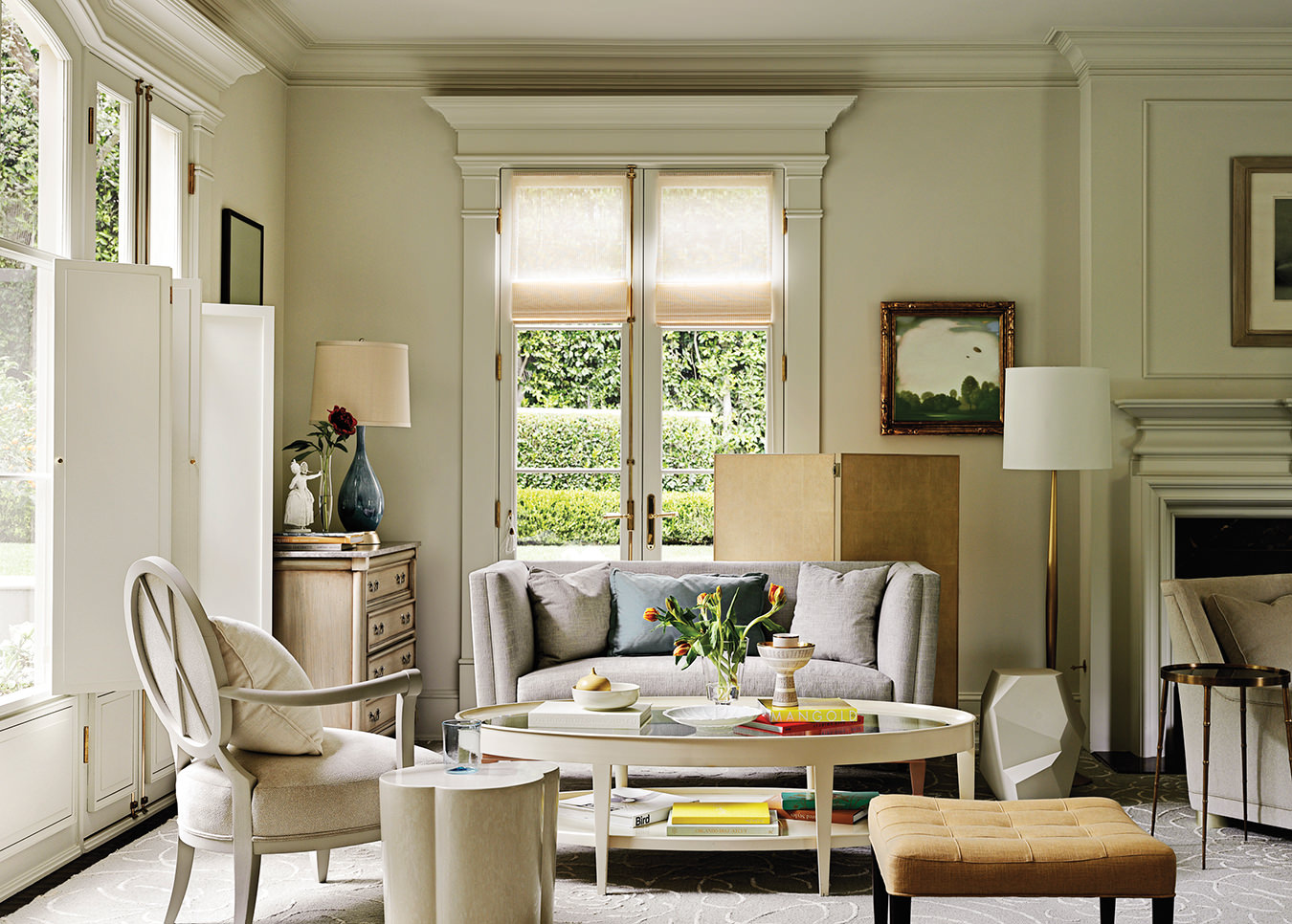
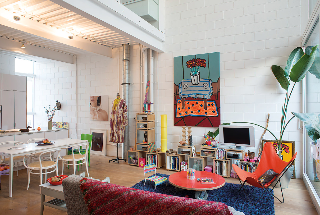
The living room at Barbara Barry’s own residence in Beverly Hills, California. Photo by David Meredith from Barbara Barry: Around Beauty (Rizzoli NY).
-
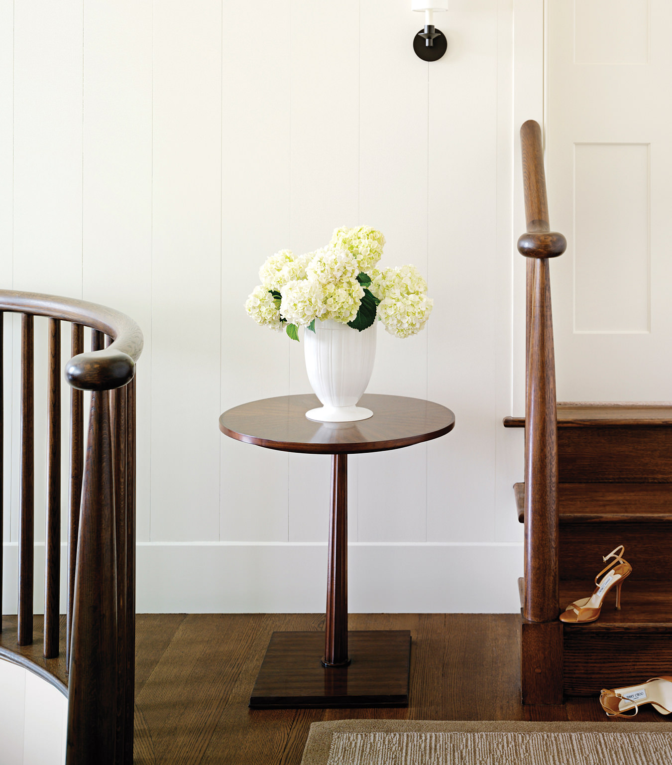
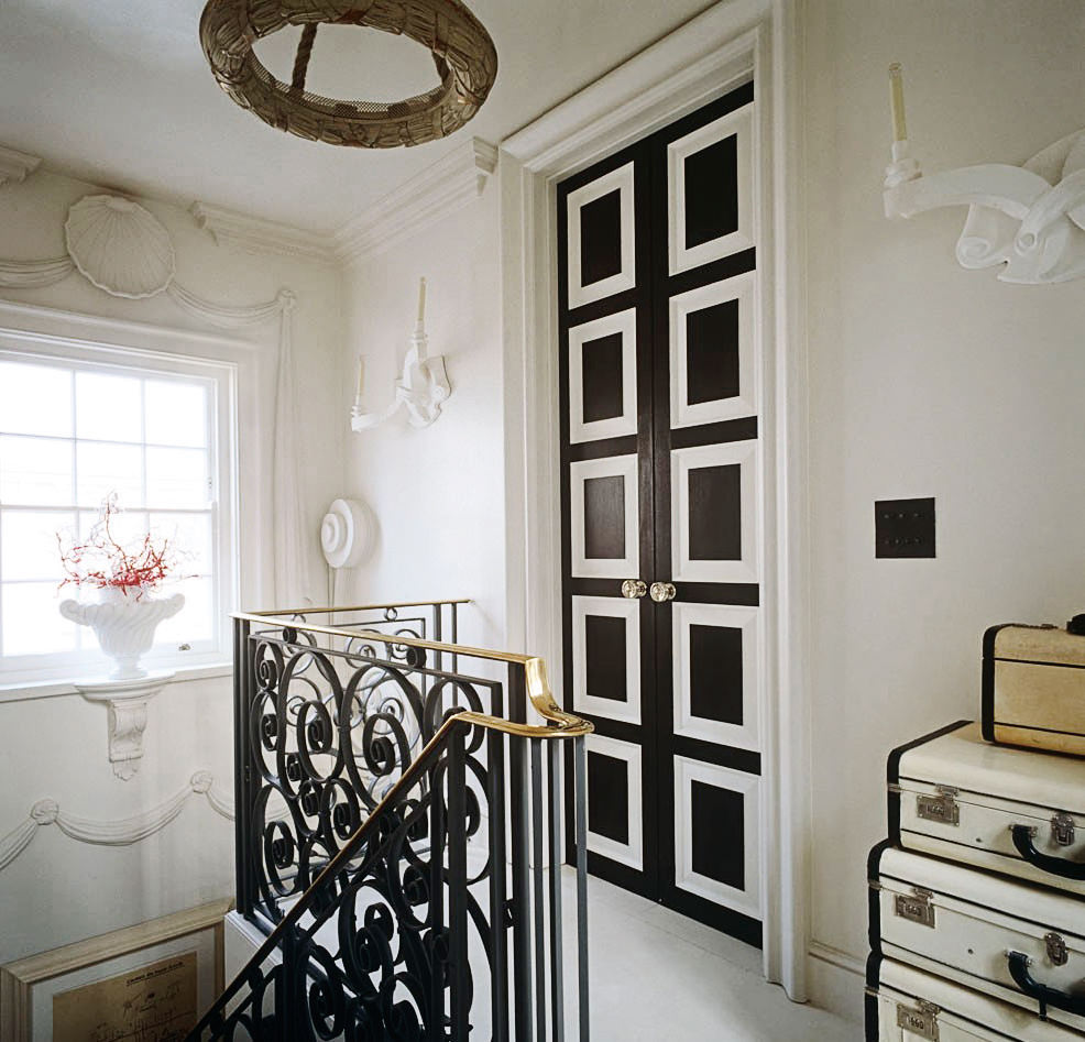
The landing of a Barbara Barry-designed home in Jackson Hole, Wyoming. Photo by David Meredith from Barbara Barry: Around Beauty (Rizzoli NY).
-
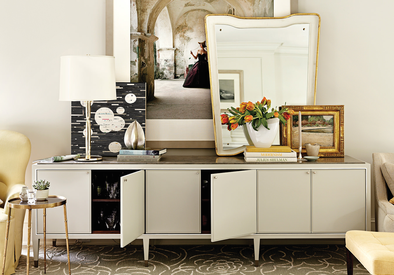
The living room at Barbara Barry’s own residence in Beverly Hills, California. Photo by David Meredith from Barbara Barry: Around Beauty (Rizzoli NY).
-
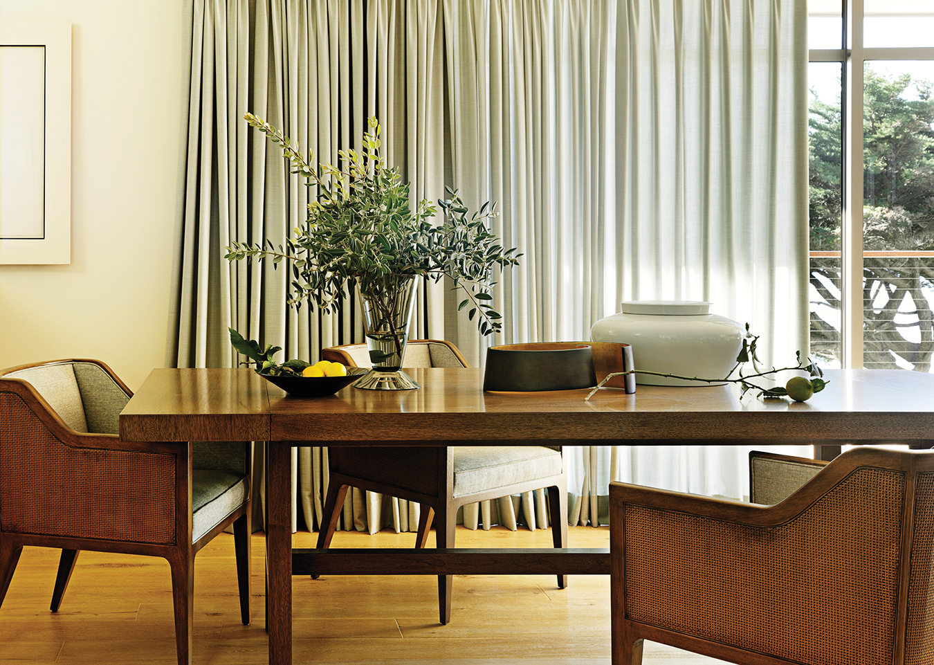
The dining room of a Barbara Barry-designed residence in Malibu, California. Photo by David Meredith from Barbara Barry: Around Beauty (Rizzoli NY).
-
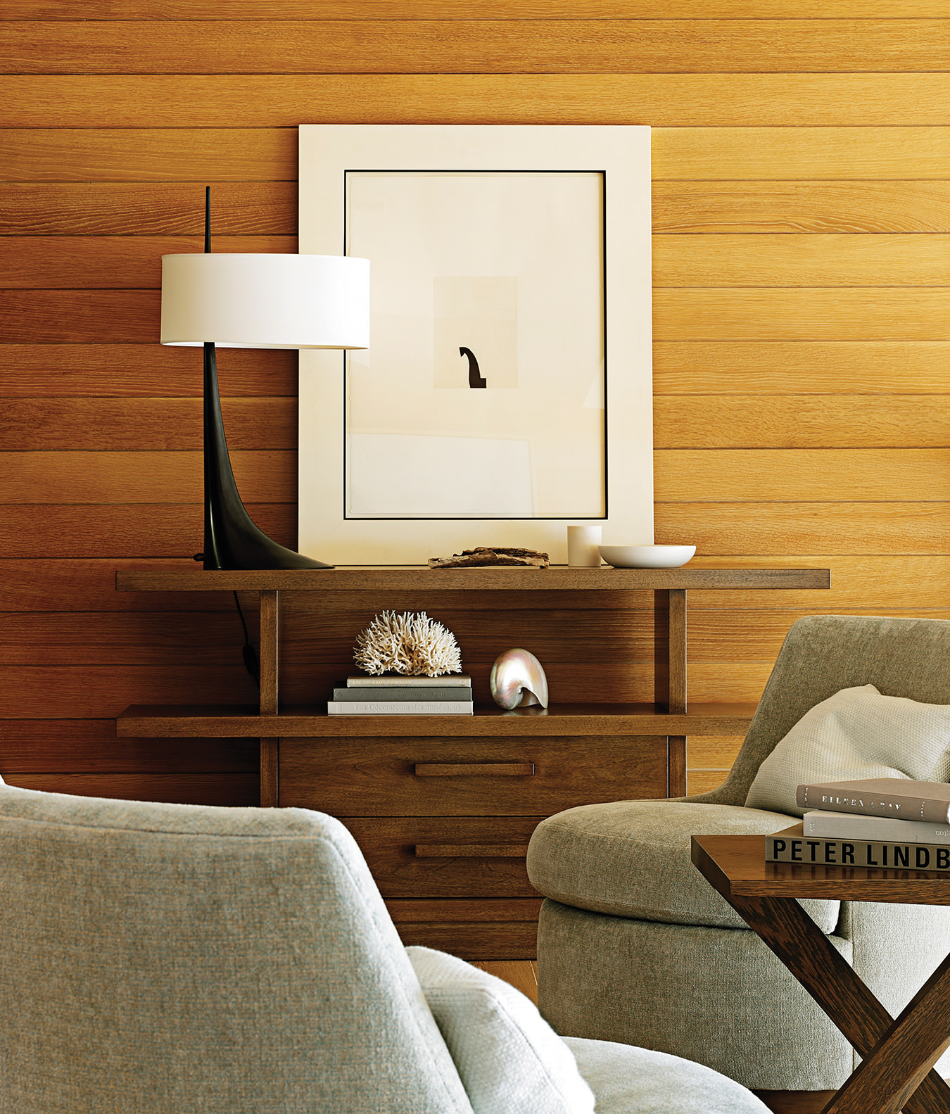
The mezzanine of a Barbara Barry-designed residence in Malibu, California. Photo by David Meredith from Barbara Barry: Around Beauty (Rizzoli NY).
-
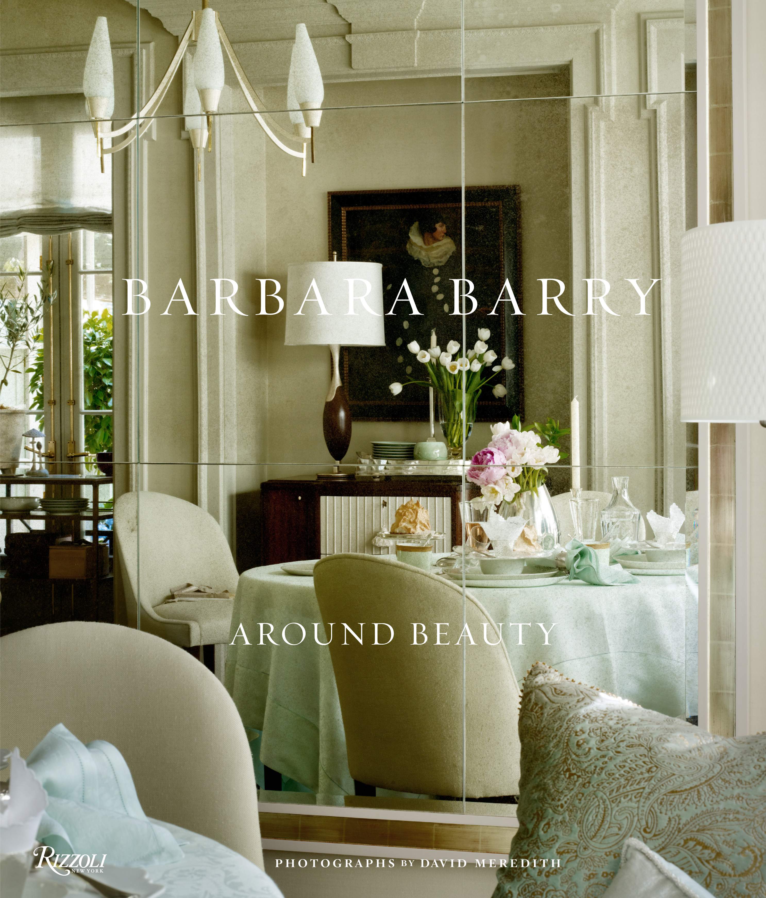
Barbara Barry’s monograph, Barbara Barry: Around Beauty, published by Rizzoli.
-
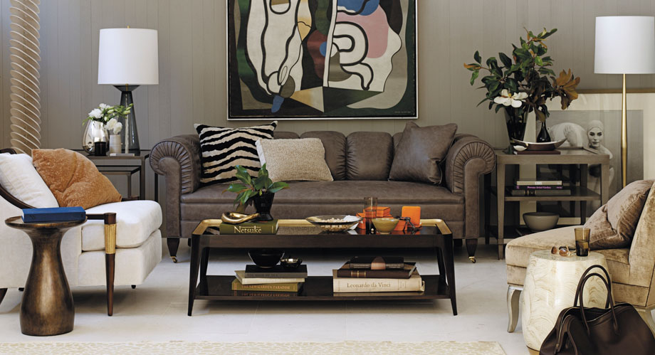
Barbara Barry’s collaboration with Baker. Photo courtesy of Baker furniture.
-
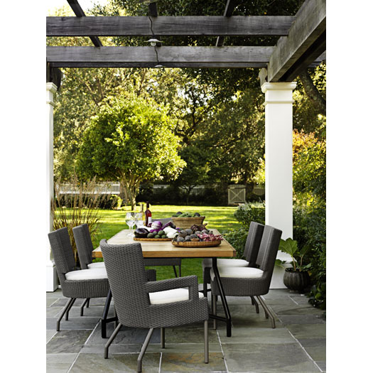
The Barbara Barry outdoor line for McGuire.
-
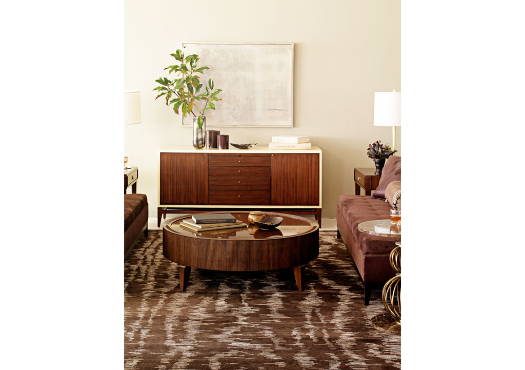
Barbara Barry for Tufenkian carpets.
-
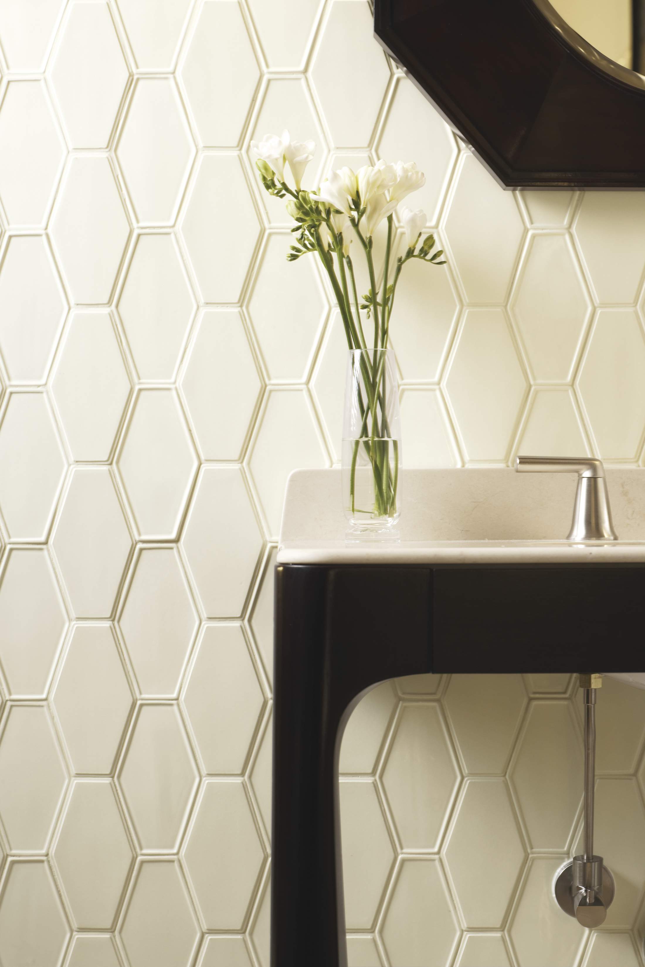
Barbara Barry Kallista Counterpoint plumbing collection and Barbara Barry for Ann Sacks tiles. Photo courtesy of Kallista.
-
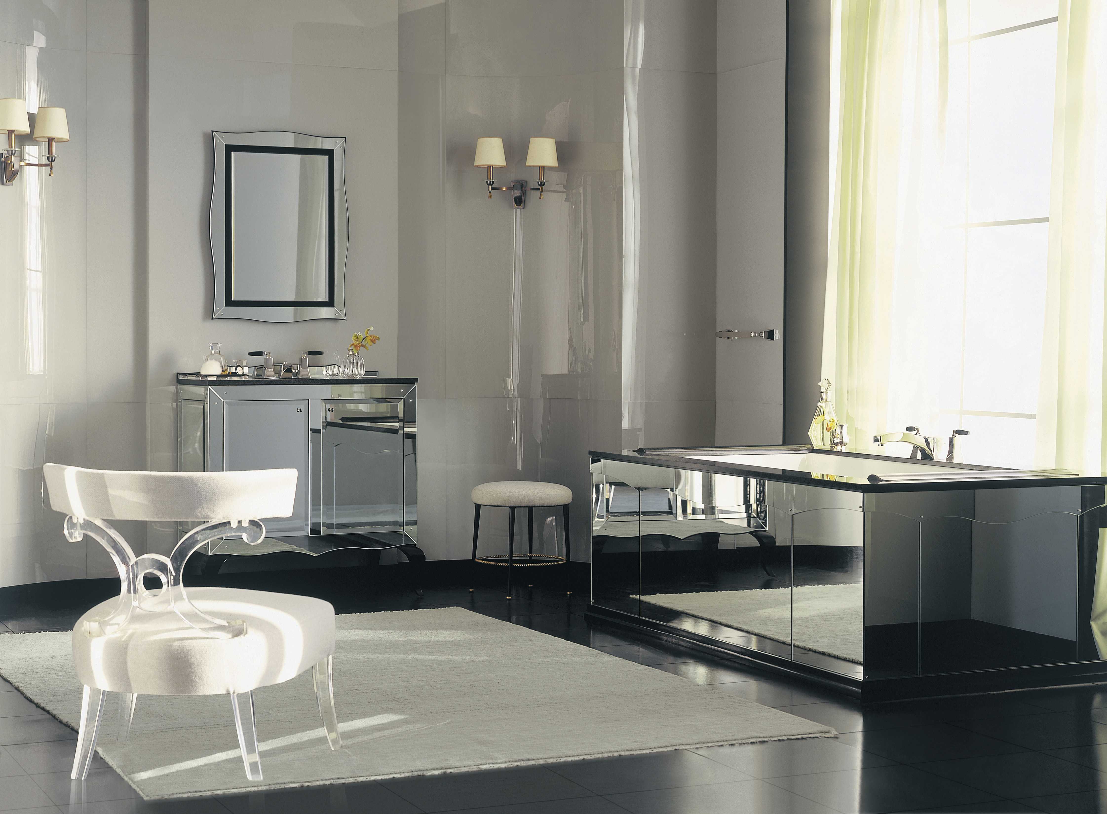
Glamour by Barbara Barry for Kallista. Photo courtesy of Kallista.
-
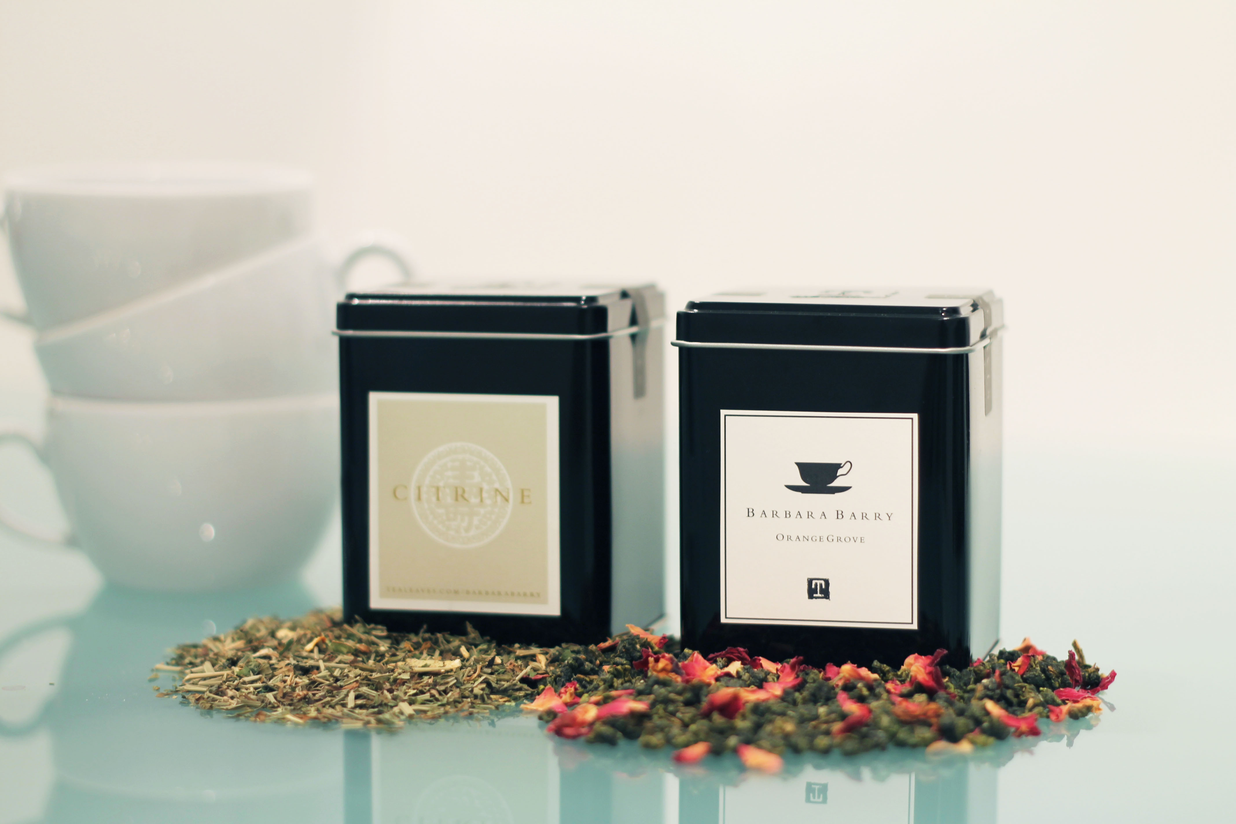
Barbara Barry for Tealeaves.
The Barbara Barry Script
Inside design.
Los Angeles–based interior designer Barbara Barry does not do formal “floral arrangements.” In her world, the arranging bit amounts to cutting the stems to various lengths and letting the short flowers settle around the tall. In this same world, paper is “thirsty” for watercolours, a Mexican fig tree can provide the colour scheme—sage, butter, cinnamon, and celery—for an entire house, and a dining room can quarrel with the garden.
Barry—who has been inducted into Interior Design’s Hall of Fame, ranked by Architectural Digest among the World’s 100 Best Designers, and named one of House Beautiful’s Giants of Design—has done collections for the likes of Baccarat, Hartmann, Tufenkian Carpets, and Wedgwood. Opened in 1985 to do residential interiors, her 12-person studio now takes on commercial design, home furnishings, textiles, tabletops, and lighting, as well as restaurants, retail spaces, private offices, and custom yachts. She does business everywhere from Lisbon to Honolulu, and this year she opened the fourth Barbara Barry gallery in Kuala Lumpur, augmenting far-flung outposts in Singapore, Bangkok, and Moscow.
Last fall, Rizzoli published her first monograph, Barbara Barry: Around Beauty, which contains lushly illustrated anecdotes about inspiration and process rather than a tiresome punch list of projects. In it, her use of California superlatives (unabashedly, gorgeous, exquisite) and L.A.’s metaphysical vernacular (dance of design, presence of absence) is more poetic than specific. In fact, her style is usually described, not just by Barry, in terms that have been worn into meaninglessness with overuse—from Hollywood glamour to casual or California chic, simple or everyday luxury refined, timeless, elegant. However, readers will be rewarded with generous detail, an exuberantly unique point of view, and even some everyday wisdom. Barry will define elegance, for instance, as a state of mind more than materials: “Something or someone is elegant when they are simple and natural,” she says. “When an object, conversation, or product is reduced to its essence, it is elegant, which is easy to write about… harder to achieve. The difference often lies in knowing where to stop.”
Barry herself clearly knows where to stop. In her balanced interiors, elegance looks like Versailles with all the rococo spills wiped up, leaving costly but no doubt clean, usable surfaces that owners can dump their keys on, let their kids sit on sideways, and essentially live in, like real people. In Barry’s world, rooms frame their occupants and their activities instead of burying them in a thicket of ornament or locking them in a museum diorama. For Barry, simplicity is a discipline, and she makes it look effortless.
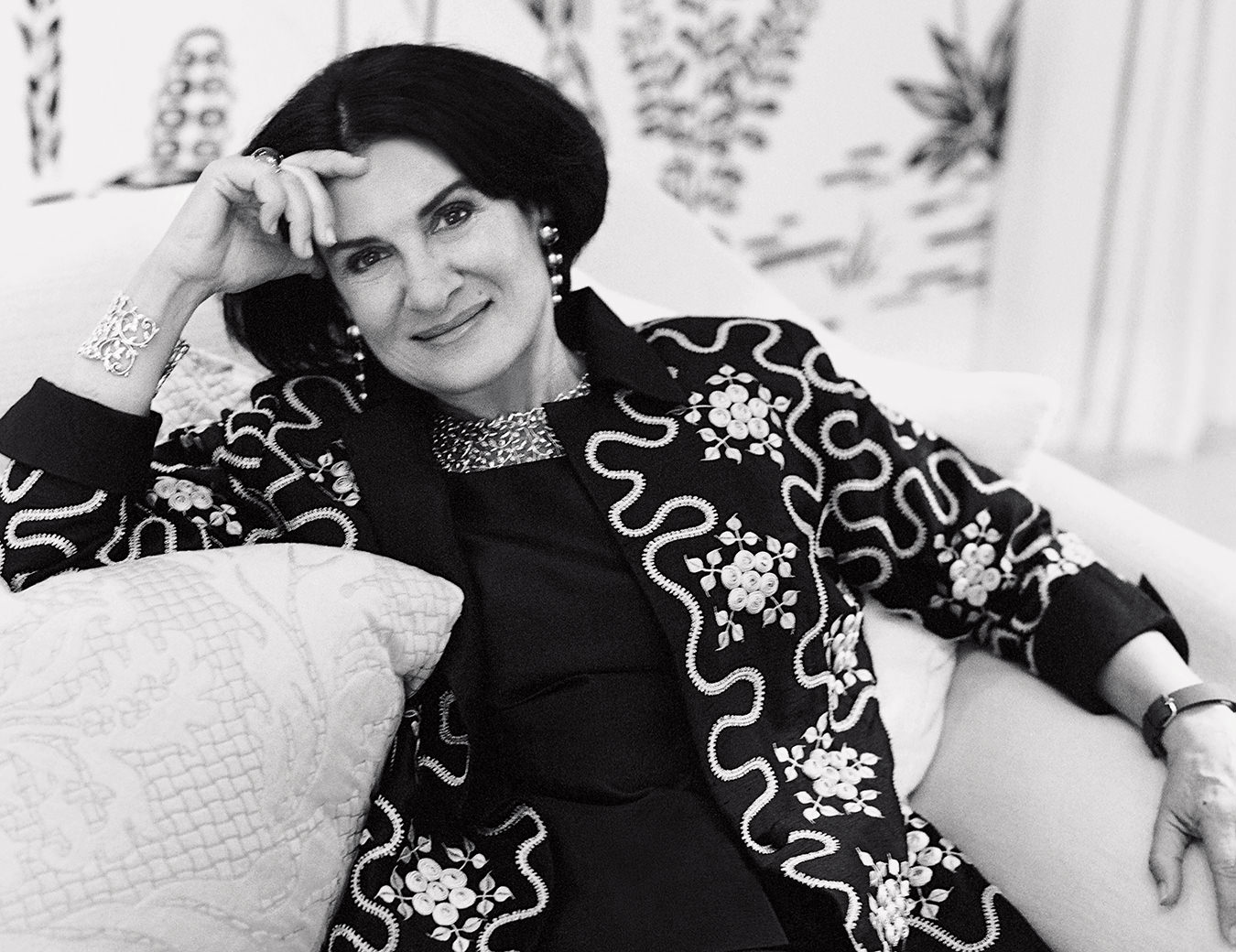
“To me design is everything, or it is in everything,” says Barry, looking effortlessly designed herself in her signature, 1940s Hollywood “twin-set and pearls, cocktails-by-the-pool” fashion. “Design is there whether you are aware of it or not. The way your breakfast is arranged on your plate is a design, the plate your breakfast is on is a design, the newspaper you read or the iPad you read it on are each a design, and that is just the start of your day.”
In Barbara Barry’s world, rooms frame their occupants and their activities instead of burying them in a thicket of ornament or locking them in a museum diorama. For Barry, simplicity is a discipline, and she makes it look effortless.
Barry started by dropping out of art school to study the patrician delights of wine and cheese in France and England before opening a cheese shop on the ground floor of a Mendocino Victorian house in 1976. She sold Stilton and Reblochon, and that olid blue, Roquefort, along with European wine, pottery, and baskets. Customers, however, began to consume the store’s ever-shifting interiors as much as the Pont l’Évêque, and they peppered Barry with interior design requests. (She occasionally returns to these roots, creating a custom blend tea for Tealeaves in both 2006 and 2011.)
Barry’s style is wholly personal, inspired by beloved people and astute observations of place. Her mother, an oil painter, raised her four daughters largely on her own; she taught Barry that style is a function of confidence and that value resides not in things but in one’s appreciation of them. “It’s not about how much you have, it’s about what you have and how you use it,” she says. “Our home was a hotbed of feminism and chaos. My mother was very opinionated, innately elegant, and a closet decorator. Her spirit shows up in my work all the time.”
The girls grew up in Southern California and learned the value of space while sharing a room and a closet of clothes. Barry settled in Beverly Hills in 2008, where she still lives with her dachshund, Oliver. The dual influences of California and nature have meant that Barry’s upscale work is predicated emphatically on its livability, no matter how rarefied the architecture or expensive the furniture. “I don’t link design to trend,” Barry says. “If I did, I think I would lose my way. Instead I look at nature and I look inward to see if what I am working on is something I would want to call my own.” She credits the “constant California light” with teaching her the power of nuance: “You can do a lot less and it feels like more.”
Barry nonetheless tends to do a lot more, which may account for her prolific output. This includes furniture lines for Baker and outdoor pieces for McGuire, fabric collections for Kravet and, this fall, for HBF Textiles, as well as bath accessories for Bed Bath & Beyond, and seasonal bedding sold under her own name.
But despite always being on the move, Barry has been able to master the ritual of slowing down. “I take time in the morning to make a really good cup of coffee, and then I take the time to enjoy that cup of coffee,” she says. “I like to wander around for a bit, pretending I have tons of time, before diving into a typically intense day.”
“I am a designer who decorates, not a decorator,” says Barbara Barry. “Decorating is more about shopping and curating, whereas design is about the construct of things.”
For Barry, choices made when painting, with its emphasis on colour, composition, and (later) details, are much the same as those made while designing a room. She always starts by making watercolour sketches (she is wed to her watercolours and never travels without a $12.99 paint kit and block) because their subtle tints focus her observations, give depth to objects and patterns, and let her explore various palettes and moods.
Her watercolours resurface at full scale in Barry’s final colour schemes, which are usually translucent, petal-soft, harmonious tones or desaturated glows inspired by the colour of foliage washed in light, or deep shades inspired by the colour of milk as it stains her morning coffee. She admires the abstract reliefs of British artist Ben Nicholson, American portraitist John Singer Sargent, and Austrian architect Josef Hoffmann, and she may stumble upon colours during hikes in the L.A. canyons or trips to the farmers’ market. In Barry’s world, an onion skin is a canvas of burnt siennas, autumn yellows, and toasted caramels. Instead of beige, she uses grey as a neutral, calling pale grey “the absence of colour.” She will rarely mix complementary hues, instead generating balance through colour blocking, composing variations on a single family of colours—lime green, yellow green, and blue green—limned unfussily with silver or ivory.
During the reinvention of a mansion in Northern California in 2002, Barry says she took her cues from the colour of the air there, “a shimmery spearmint that translated to a pale celadon throughout the main rooms.” These were complemented with colours that sang of Sargent’s Venice paintings: “buttery” French limestone coloured the dining room while burnished brass and nickel silver highlighted the amethyst tones of the master suite. Barry calls it one of the most luxurious spaces she has ever designed, but the focus was, in great part, on remaking the existing, starchily formal spaces into a real home.
“I am a designer who decorates, not a decorator,” she says. “They are equally valid disciplines, but different approaches to space. I am not a big shopper. Decorating is more about shopping and curating, whereas design is about the construct of things.” (Indeed, the designer doesn’t shrink from technical challenges. The project that Barry identifies as her most gratifying? Plumbing, commissioned by Kallista in 1998 and 2011.)
Barry’s interest in making means that she works with craftspeople whenever possible. She understands lath and plaster, hand-tied springs, horsehair and batting, kiln-dried frames, and hand-rubbed walnut, and she recalls being moved by the reaction of two clients who, after receiving delivery of a hand-wrought iron door, realized the value of the craftsmanship they’d paid for and, no less, the value of decorating in such a way as to keep that craft alive.
Whether one feels an affinity for Barry’s style or not, it is difficult to resist her sensibility, which for all its superlatives and subjectivity is true to itself. She believes that California houses should not pretend that they live in Connecticut and that a window should in no way resemble a party dress. She has mailed her sisters orange blossoms stuffed into plastic baggies, to recall—by their fragrance—the memory of childhood travels with their father. Barry reduces her work to her essence so that beneath the luxury, timelessness, and chic, it is simple and natural. In a surprising twist, elegant is precisely the word to describe Barbara Barry.
Originally published September 18, 2013.

