Wine and Eggs Reimagines French Tabacs for the L.A. Crowd
“It always feels like it’s design therapy time when I do interviews,” laughs spatial designer Adi Goodrich. Goodrich, who is based in Los Angeles, works across disciplines in set design, interiors, and cinematography, as well as photography—her diverse media projects held together by colourful pop-art visuals.
The designer’s latest project is Wine and Eggs, a newly opened natural wine and provisions shop in Los Angeles’ Atwater Village that synthesizes much of her work over the past decade designing sets and experiential installations for such companies as Instagram, Google, and Adidas and creatives like Fleet Foxes and John Legend.
“It’s fairly subconscious–but when you’re a set designer, you’re working with a facade,” Goodrich reflects. “I’m always thinking about the POV of the photographer, director, and the end viewer.” Moving into an interior space, Goodrich refocused her own lens to concentrate on the experience of the customer. “There’s a story there—it’s like creating a film. There’s a beginning, a middle, and an end.”
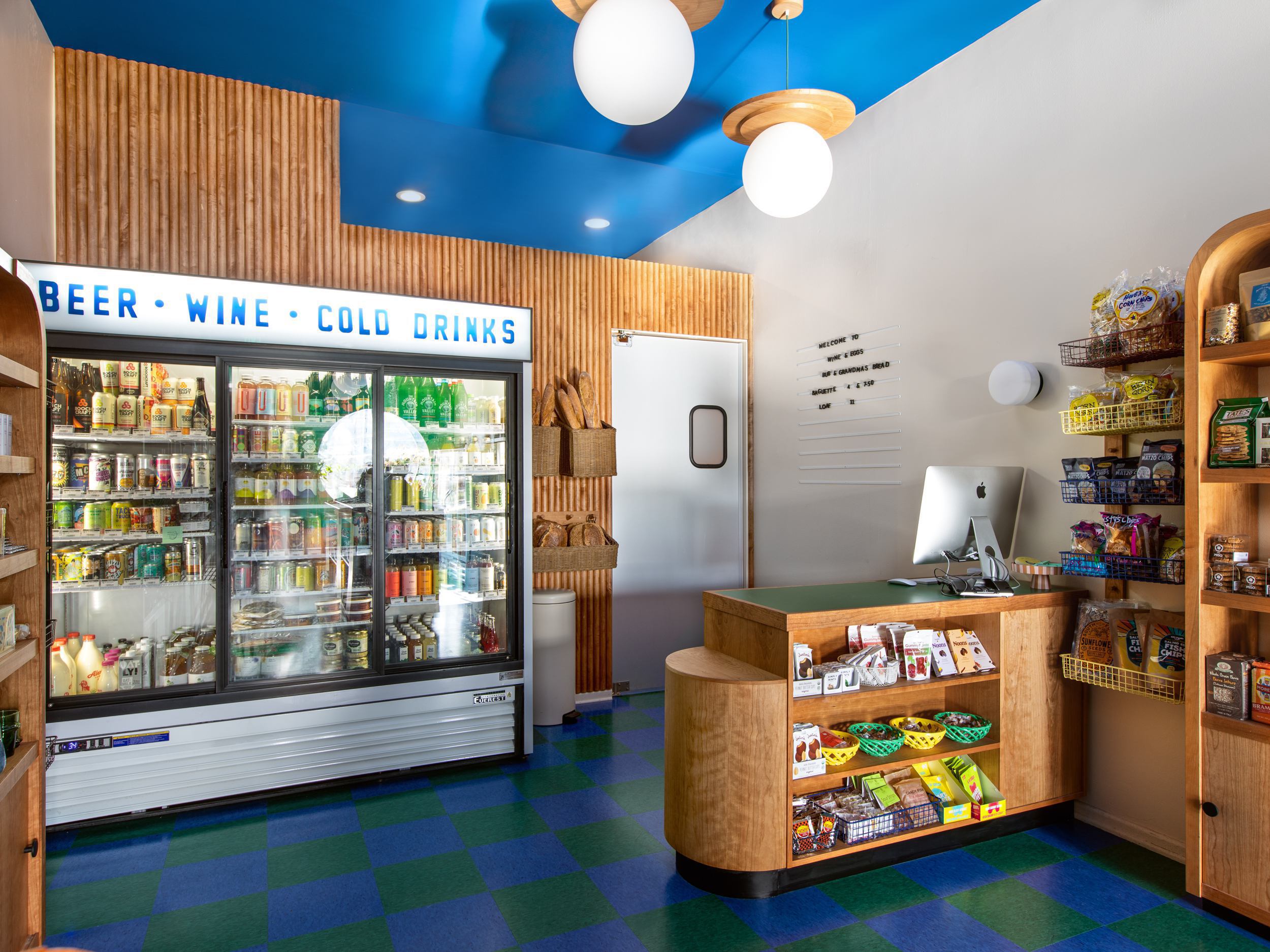
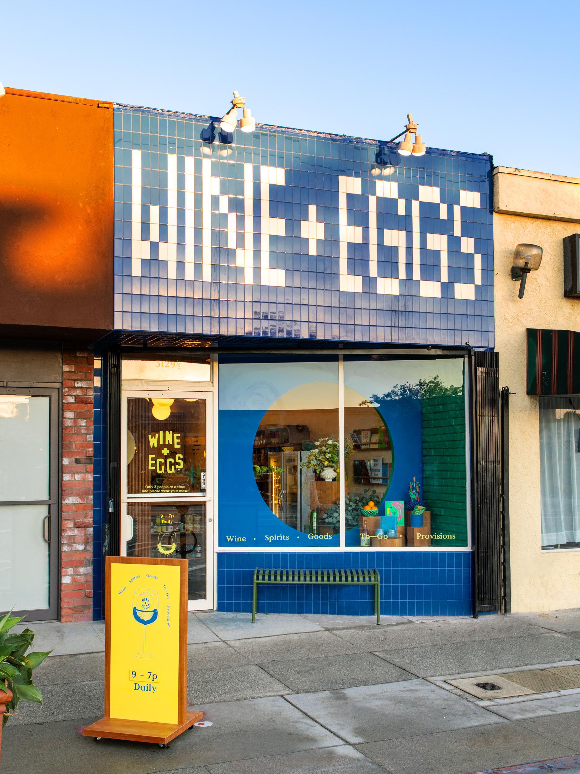
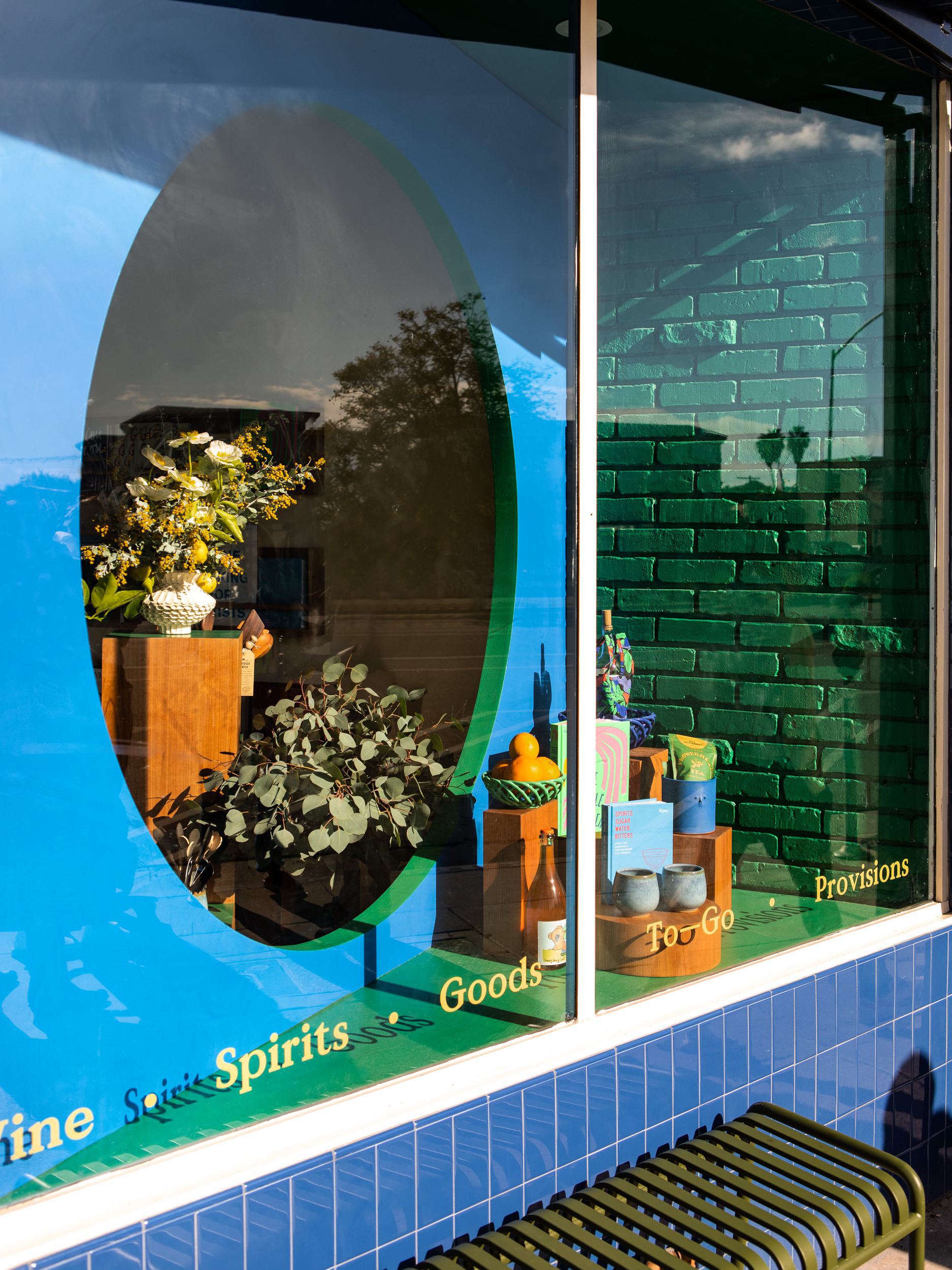
For branding, Goodrich worked with her life and work partner Sean Pecknold (together they run their own studio, Sing Sing) and brought in illustrator Clay Hickson to tackle the logo. But the interiors are all Goodrich, beginning with the view into the store’s circular window that perfectly frames local goods and hand-selected natural wines. The store entrance greets guests with a painterly palette of cream, muddled green, and electric blue. Patrons are invited to pick up a basket and are greeted by a sculptural fixture before being directed to the back of the space with checked flooring and a clean row of pendant lighting.
The small shop is cinematic, but Goodrich went above and beyond to ensure that the elements of the store reflect the artistry of natural wine and respectfully grown food. Each feature was hand-designed by Goodrich. “Rather than getting prefabricated fill-in-the-blanks, we designed everything in the store,” she says.
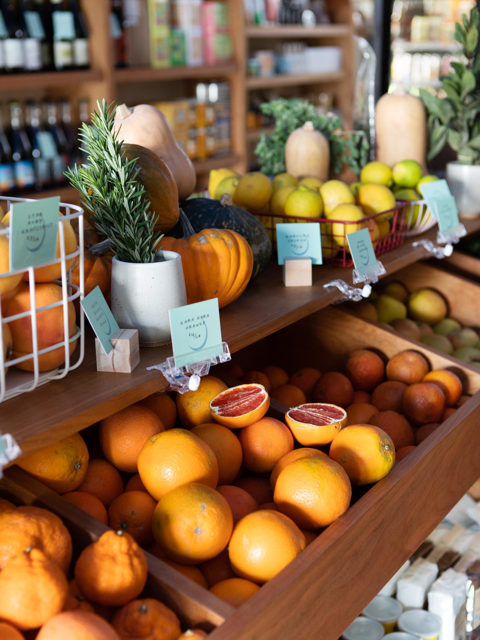
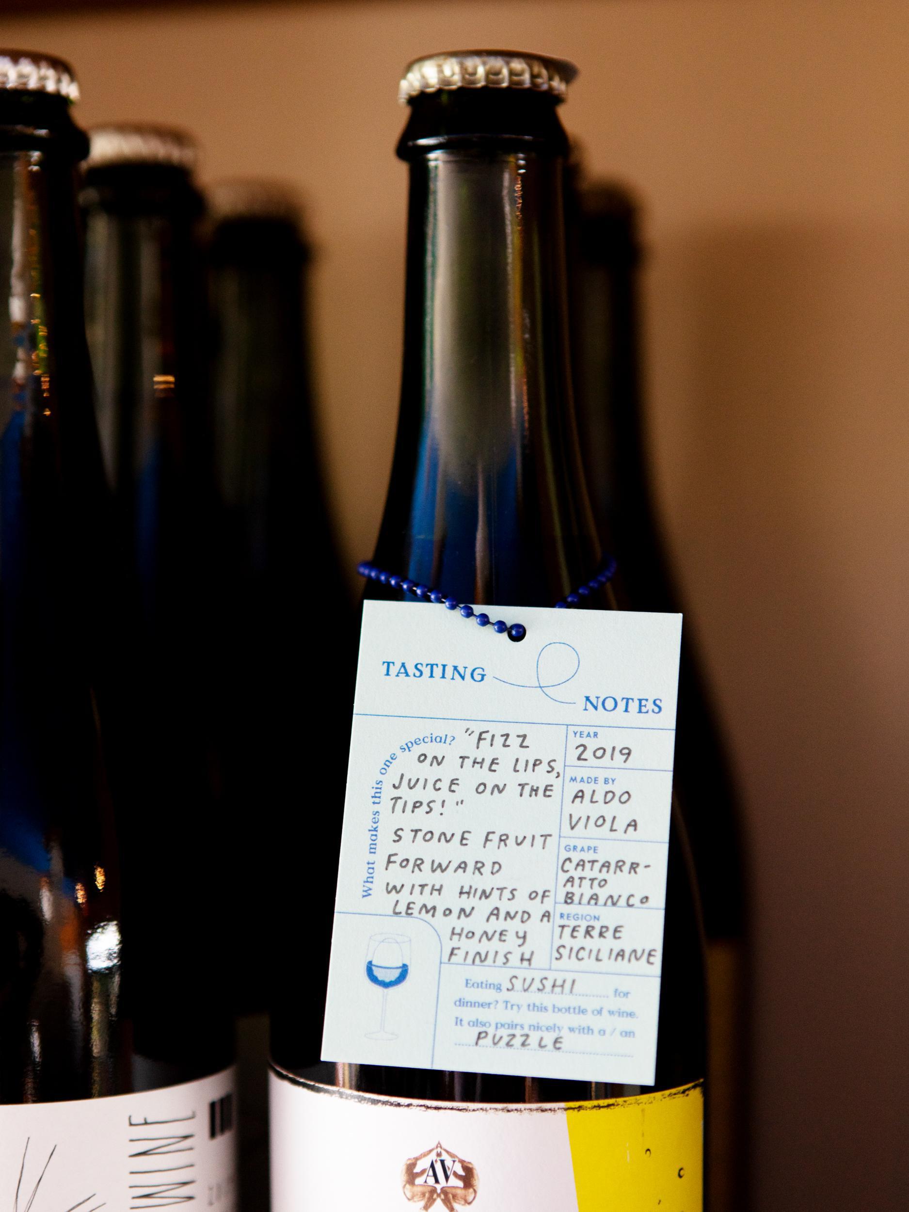
Working with local makers produced small details throughout that are nods to the strong craftsmanship of midcentury tabacs, cafés, and bistros in postwar France. “The details of these places have sort of been forgotten; it’s like they’re clinging on, about to be replaced,” she says. “It’s like this romantic gesture.” Her ode includes custom-made exterior tiles that took four months to produce, orb pendant lighting (evoking the yolk of an egg), and curvy cherry wood shelving inspired by Le Corbusier’s seaside cabin.
Colour is Goodrich’s calling card, and her successful use of it comes by way of close study. “It’s a language that I really pay attention to,” Goodrich says. “I spend a lot of time with colour, and I try to use it in a subjective way. For example, with the store there’s a bright blue and a dingy green. So that makes the bright blue look even brighter and the green look even dingier. There’s a real push and pull to colour.” Goodrich’s work retains that wonderfully surreal, colour-fuelled transportive experience she is known for, just this one also comes with natty wines.
