Contemporary Curb Appeal in Toronto From the Boundary-Pushing Minds of Reigo & Bauer
Clad in diamond-shaped tiles and narrow horizontal windows, this east end home adds modern edge to a leafy, historic neighbourhood.
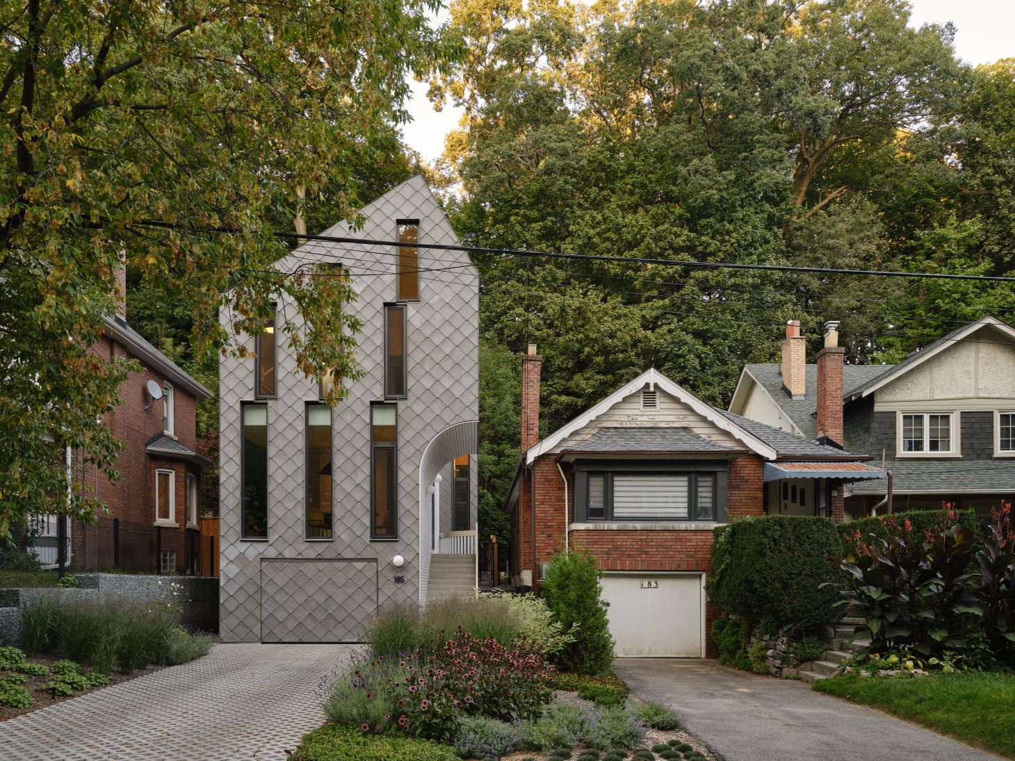
Rising up like the mature trees that surround its leafy lot, this striking modern house isn’t like any other on the block. The building, in Toronto’s Beaches neighbourhood, is the creation of Reigo & Bauer, a local firm known for its restrained yet creative approach to both exteriors and interiors.
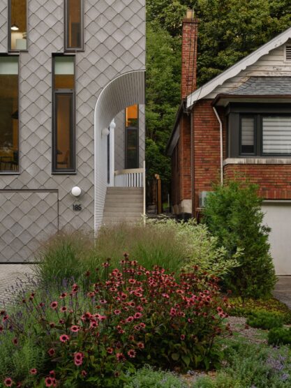
Playing with geometric shapes to achieve jaw-dropping results, the firm clad the home in grey diamond-shaped tiles—even the garage door is fully integrated and disguised—and interrupted the rhythm of the façade’s diagonal lines with stacked horizontal windows. A curved entryway on the south side is wrapped in white concrete boards. This overhang softens the linear elements and offers shelter.
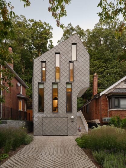
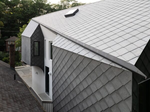
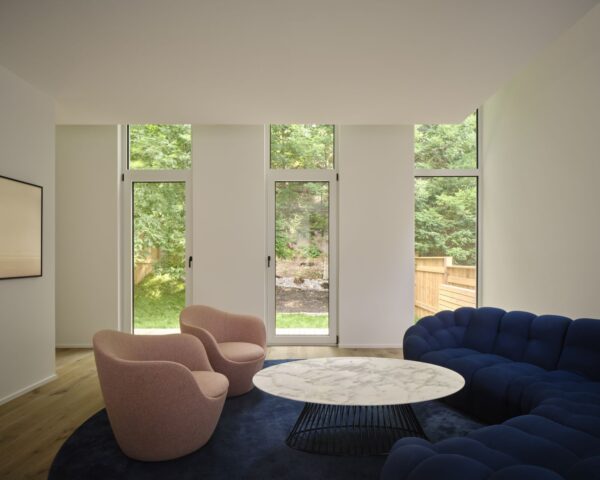
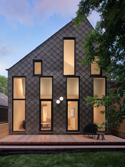
The 2,000-square-foot home’s rear elevation is just as compelling. Once again, vertical stacked and staggered rectangular windows draw the eye up to its sloped roofline. Inside, the living room ceiling angles upward to accommodate these windows and highlight the wooded hill beyond the backyard. The gesture also makes the narrow room appear taller and more spacious than its square footage.
The home’s main-level floorplan is open, except for a central block that contains a powder room, pantry, and concealed storage on both sides. In keeping with the home’s minimal aesthetic, the architects opted for clean, flat-fronted cabinets in both white and glass.
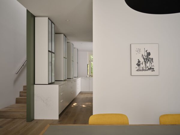
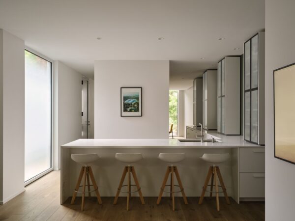
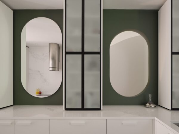
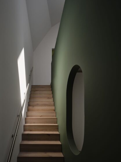
Separating the kitchen from the staircase is a green wall—its rich tone echoes the trees outside and adds vibrancy without acting as a visual distraction. As is their modus operandi, the design team of Merike Bauer, Stephen Bauer, and Victoria Dragoni injected a sophisticated sense of fun with two pill-shaped cut-outs and one similarly shaped mirror between the cabinets. Their effect? To encourage the flow of daylight and reflect a key kitchen sightline.
Upstairs, the green wall acts as a banister for the hallway that connects three bedrooms. It also becomes an important grounding element for the angled ceiling and diamond-shaped skylights, which cast geometric pockets of light along the hall.
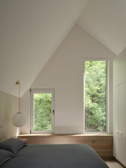
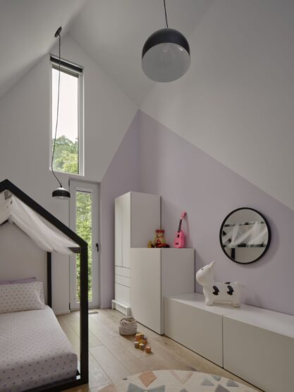
Although most of the home’s remaining walls are white—creating a fresh, neutral backdrop for art, rugs, and furnishings—the primary suite features a warm, clay-coloured accent wall, and one of the children’s bedrooms includes a whimsical splash of lilac-tinted pink.
Pushing the boundaries of residential design, the Neville Park House is a study in making a home stand out from its surroundings while also finding a successful integration point with the neighbourhood’s history and natural landscape.
Photographs by Doublespace Photography.


