-
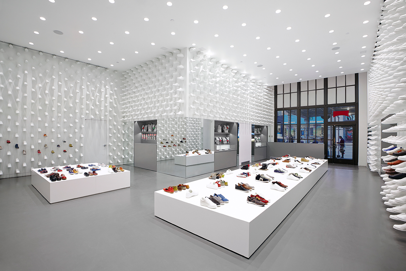
The Camper store interior in New York.
-
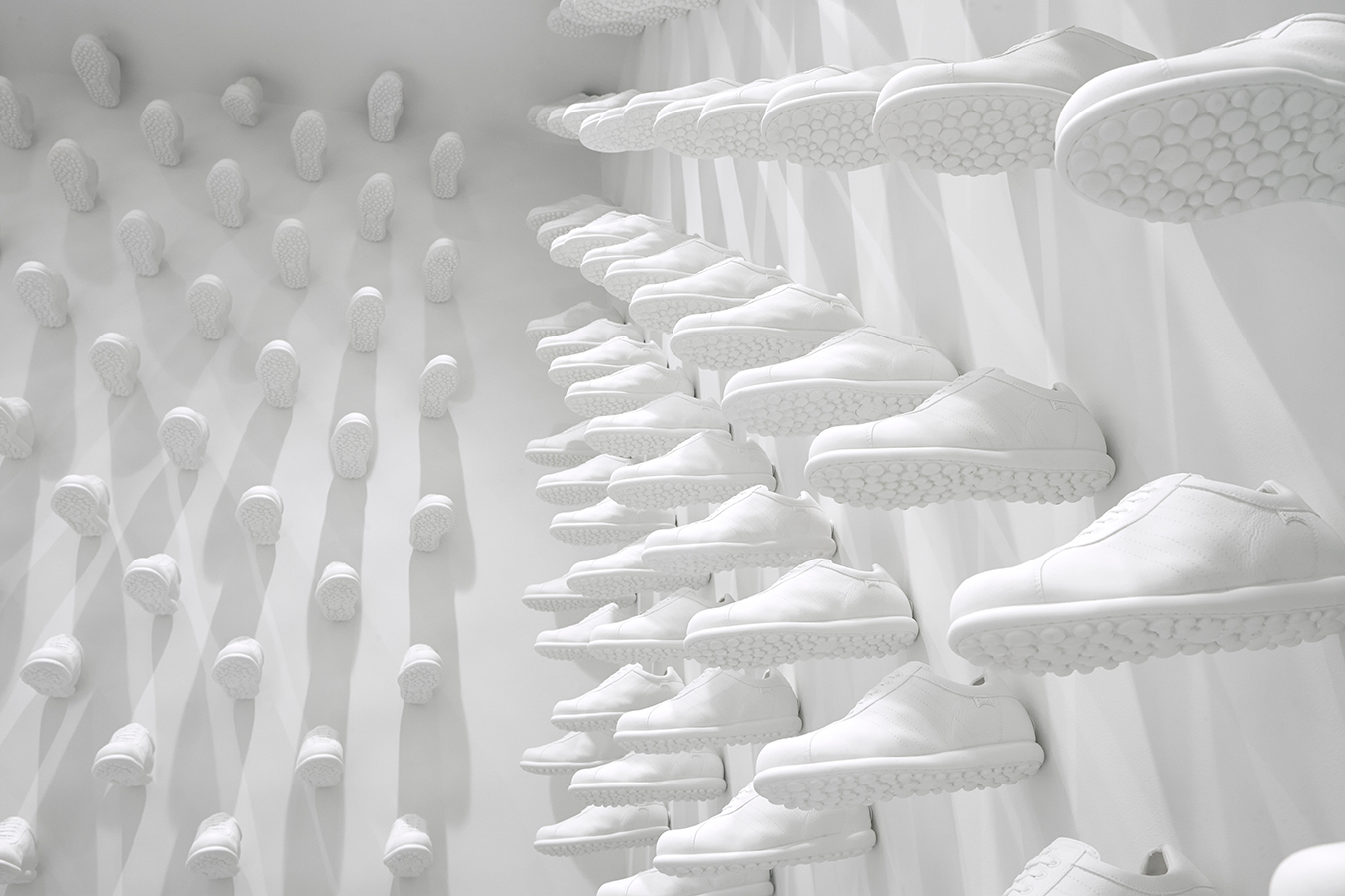
The Camper store interior in New York.
-
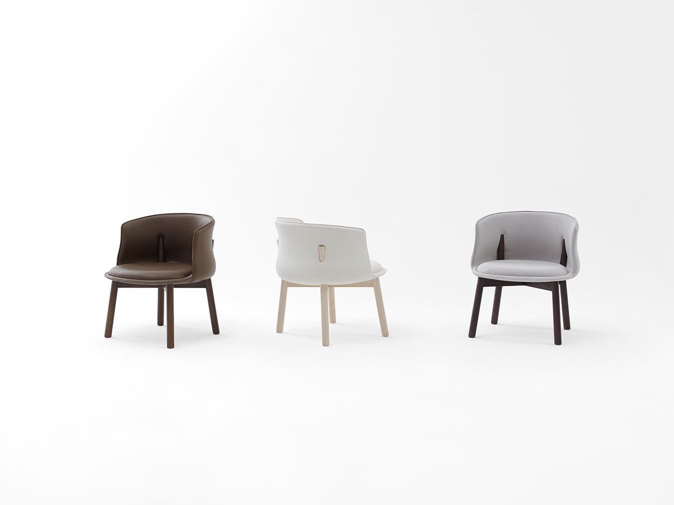
The Peg chair, designed for Cappellini. The chair’s back legs pierce through the backrest to provide lower back support with a nipped-in curve and contribute to its compact size.
-
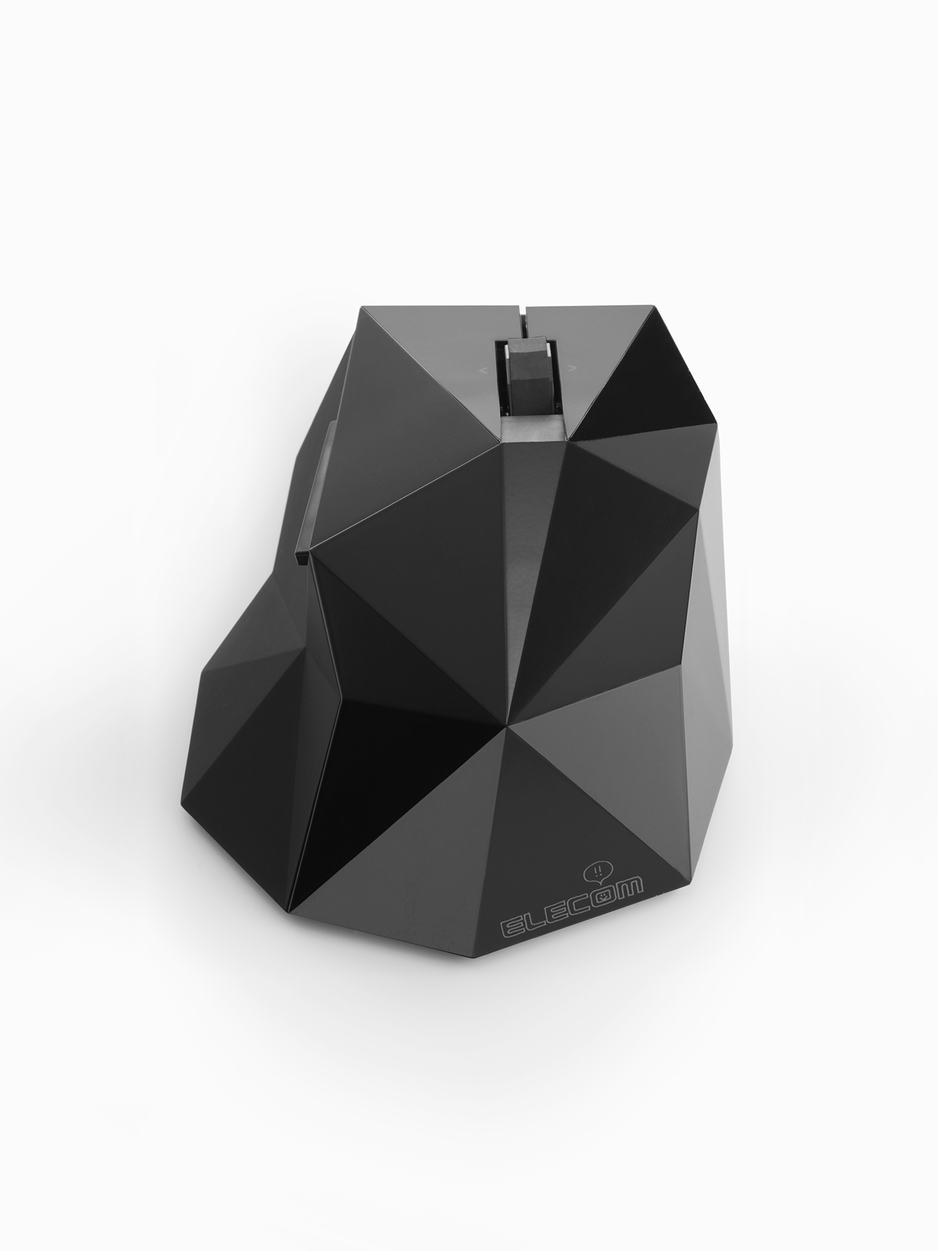
The Orime wireless computer mouse.
-
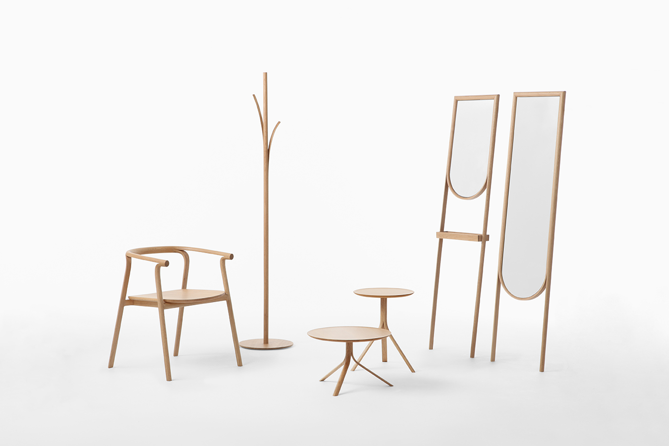
The Splinter collection, designed for Conde House. Each piece’s splinter detail is created along the grain of the wood to create the effect of wood peeling away.
-

The Starbucks Espresso Journey pop-up shop exterior.
-

The Starbucks Espresso Journey pop-up shop interior.
-

The Transparent Lamp features a shade made from protective film that is semi-transparent when viewed directly and transparent when viewed at an angle, creating a soft lighting effect.
-
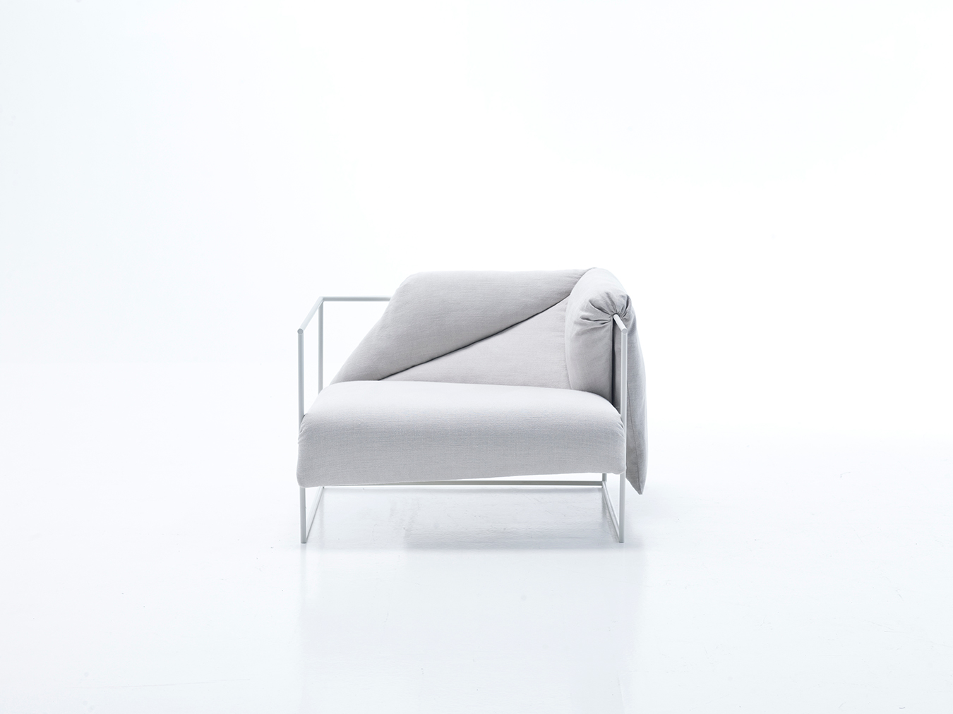
The Zabuton chair consists of a Japanese futon mattress draped over a wire frame, creating a pattern of controlled folds that offer plenty of comfort.
-
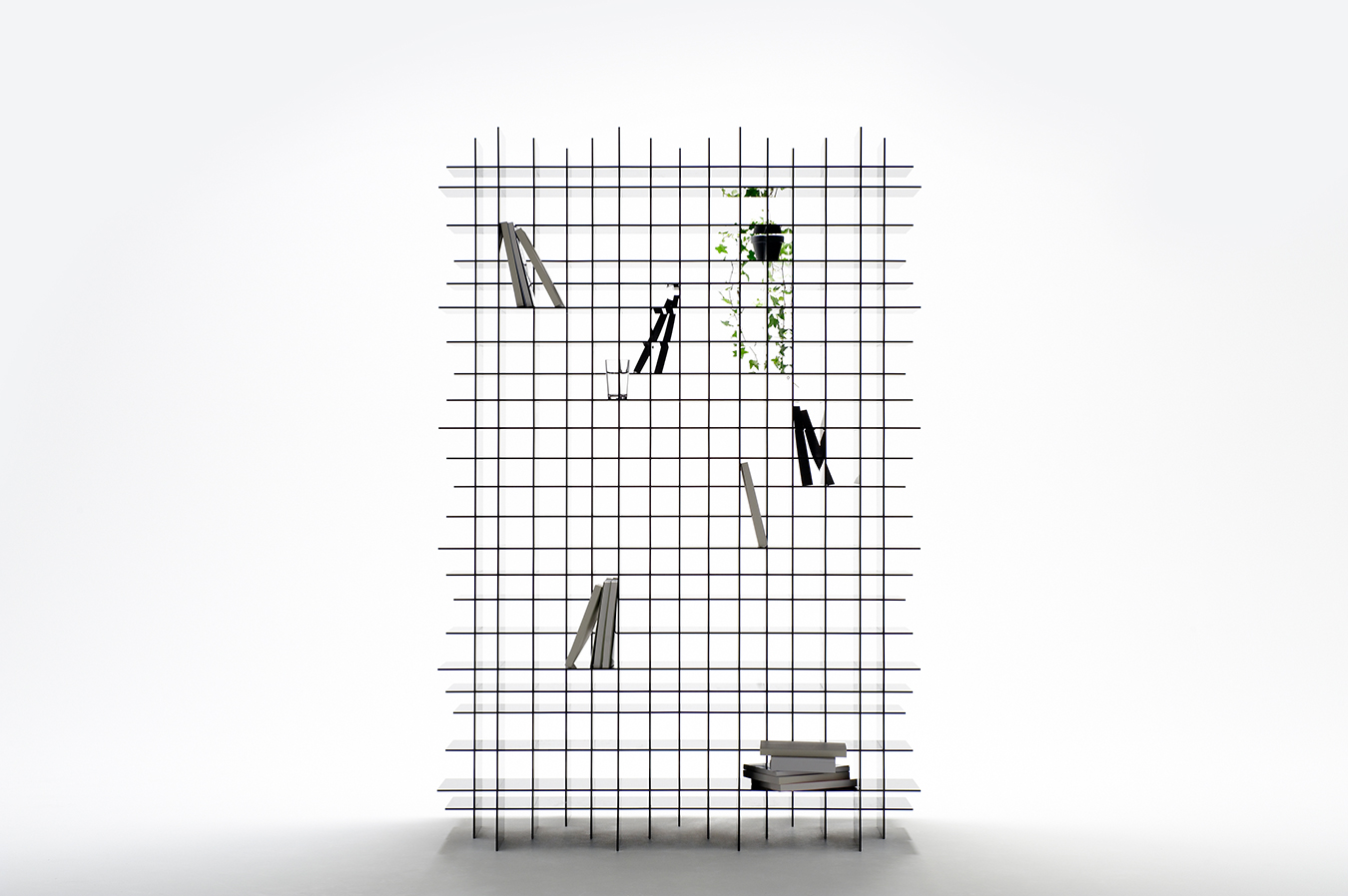
The Scatter Shelf.
-
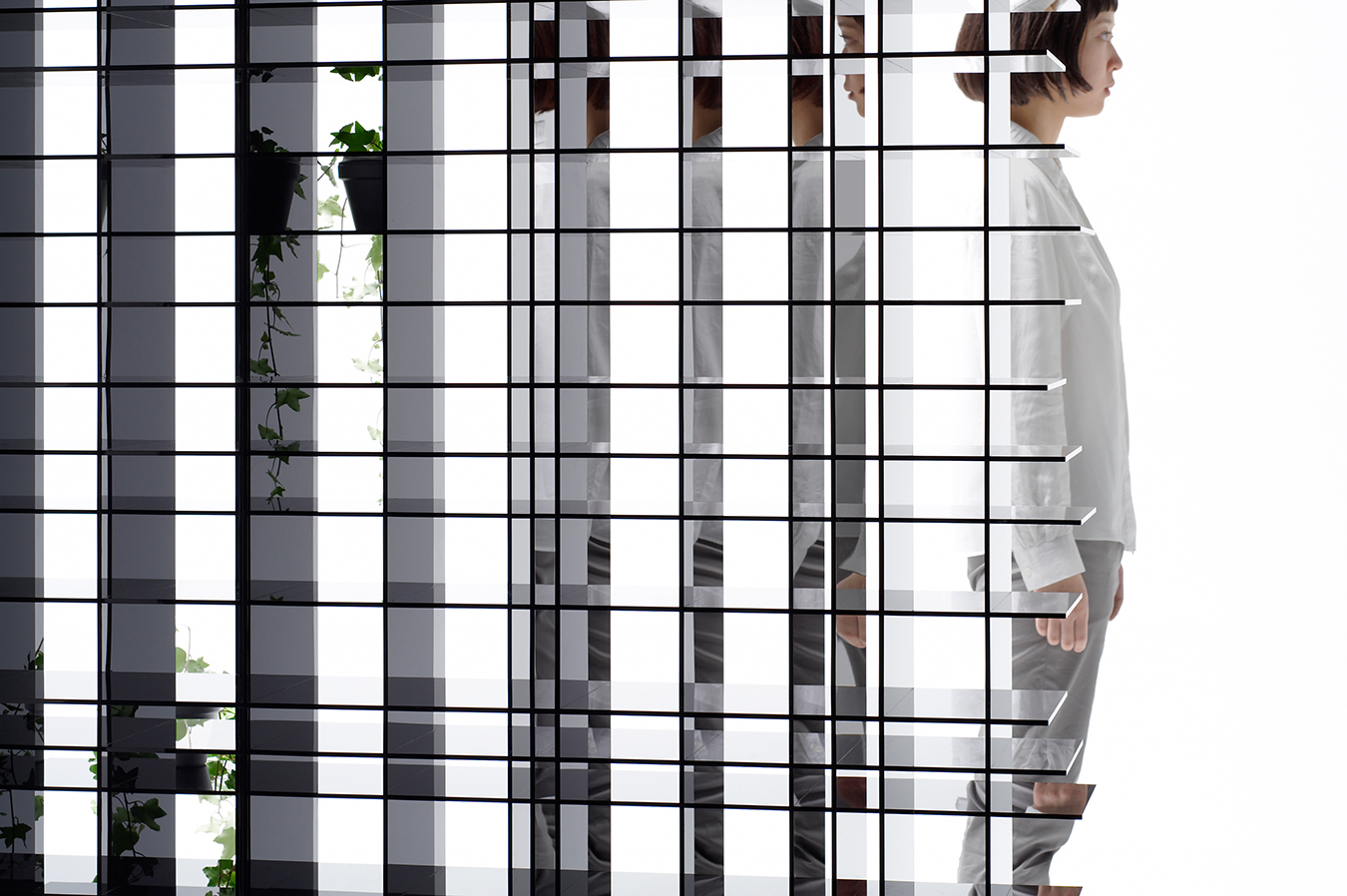
The Scatter Shelf—a practical storage space and optical illusion in one.
Nendo Designs
A selection of projects by Oki Sato.

For Toronto-born, now Tokyo-based Oki Sato, design solutions tell stories. While the use of manmade objects and spaces risks becoming mundane when unimaginative and repetitive, Sato believes that these everyday items and environments have the potential to create meaningful experiences. His designs, as a result, merge utility with quirkiness and charm. These beliefs inform his design process at the helm of Japanese design firm Nendo, which takes its name from a Japanese word meaning free-forming clay.

In an age when you can easily shop online, there is a move to create spaces—particularly retail spaces—worth taking the time to visit, and Sato leads the way with imaginative concepts for clients like Theory, Hermès, Issey Miyake, and Puma. As Iris Benaroia writes, “late last year Nendo turned a shipping container into a Starbucks pop-up shop in Japan; the store, a kind of curated coffee shop meets library, was open for three weeks. The project went like this: Nendo’s designers filled the space with books bearing nine different-coloured covers to correspond to the beverages being served. A consumer could read about a latte, for instance, then trade the book jacket, which could also be attached to a takeaway tumbler, for the drink. ‘I’m always interested in the story behind the product,’ says Sato.”

The product he references ranges from furniture collaborations to large-scale architectural installations—chairs designed for Cappellini, a Stone Garden installation for Caesarstone, for example—and each transcend their basic purpose through clever design choices. At the micro end of the scale, the Orime computer mouse incorporates both digital and analog inspirations: its faceted surface is a nod to folded paper—perhaps, specifically, to the Japanese tradition of origami—and to the 3-D shapes of data renderings onscreen. The grip provided by those very angles adds function to its playful form.
On a larger scale, the Scatter Shelf, created in 2011, is composed of thin black acrylic sheets stacked in a grid formation, creating strength and plenty of nooks to store sundries. When viewed on an angle, the items are reflected in the opaque acrylic, creating a scattering kaleidoscopic effect. At the macro end of the scale, Sato adorned the walls of shoe store Camper in select cities, most recently in New York, with white resin models of shoes, “copying and pasting” the same model over and over to give the space three-dimensional texture. And though his design aesthetic may take to this theme of repetition upon occasion, it’s clear Sato’s design vision is anything but cookie-cutter.
Images courtesy of Nendo.

