Reviving In-Person Culture With a Function-First Office by Laab Architecture
How do you design an exemplary workspace for an office when everyone has their own unique workflow? Laab Architecture’s solution for Canadian ad agency Cossette and its parent company Plus was to customize each workspace for a sleek contemporary office employees will want to come to.
After a stint at a shared co-working space during the pandemic, the company decided it was time to create a central space again, one that was so functional and pleasant that it was worth commuting for. When a 35,000-square-foot floor previously used by Shopify in a downtown Montreal building on Avenue Viger Ouest became available, the plans became a reality with the help of Laab Architecture, a Montreal-based firm founded in 2020 by Michel Lauzon.

Laab didn’t want to rely on the usual set of hip and trendy tropes found in many new offices—like foosball or overly residential-style spaces—which often try to make work a place of fun rather than maximizing efficiency, since getting in and getting out is what’s really important to employees. Instead, it looked to hospitality and wellness spaces for inspiration, using moody lighting, a darker colour palette, and a lounge-like vibe, and focused on staff experience and culture across levels, not just for upper management.
To ensure the spaces worked for the most types of roles possible, Laab designed each area for the needs of a specific team, taking into account its business model, workflow, and creative practices. While some preferred open layouts, others wanted more privacy, and some teams opted for a mix of the two.


At the entryway, an oversized dichroic and mirrored reception desk is a futuristic nod to the company’s colourful logo that stands out against black carpeting and wood-slatted wall in a modern seating area.
The large pods around the perimeter of the floor, which were opened along the exterior wall to encourage more informal connection between teams, include a mix of work-station options like counters, tables, and couches, all bathed in natural light thanks to the floor-to-ceiling windows. A large array of meeting room configurations caters to a variety of needs, from an intimate two-person chat to a 20-person brainstorming session. Down a wood-slatted hallway, numerous recording studios in a hues ranging from white to charcoal have door frames that can be illuminated in red lights to indicate “on-air” status.
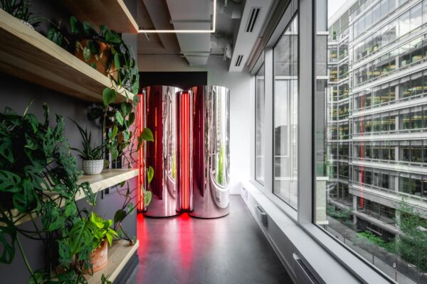
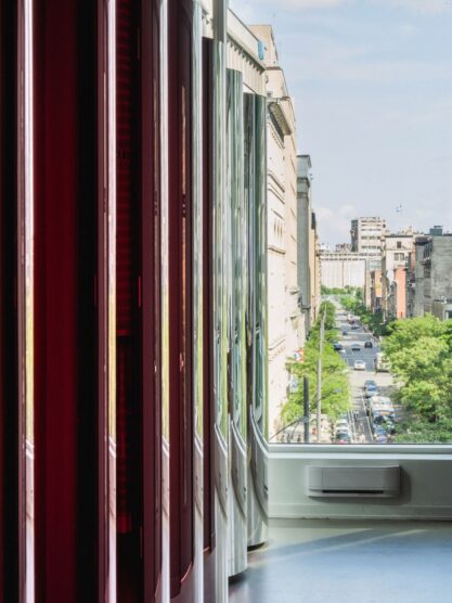
In the bright southern corner of the floor, The Bistro-Park overlooks Square Victoria, claiming the best views. The heart of the office’s social aspect, the bistro offers a relaxed atmosphere with windowside tables, intimate alcove seating, and comfortable couches and armchairs. A wooden cage chandelier hangs above a long, low lounge bar. Light wooden slatting against black walls—continued in the hallways—adds a contemporary Scandinavian influence.

Since the project’s completion, Laab says the biggest operational issue has been that the back-to-work turnout has vastly exceeded expectations, so it can be tough to book a meeting room or nab a seat at The Bistro-Park. When it comes to the goal of making a space appealing enough to draw employees back to the office, it’s safe to say: mission accomplished.
Photographs by Raphael Thibodeau.


