Take Flight With Home RO54 by Arshia Architects
Perched on a hilltop in Bel Air.
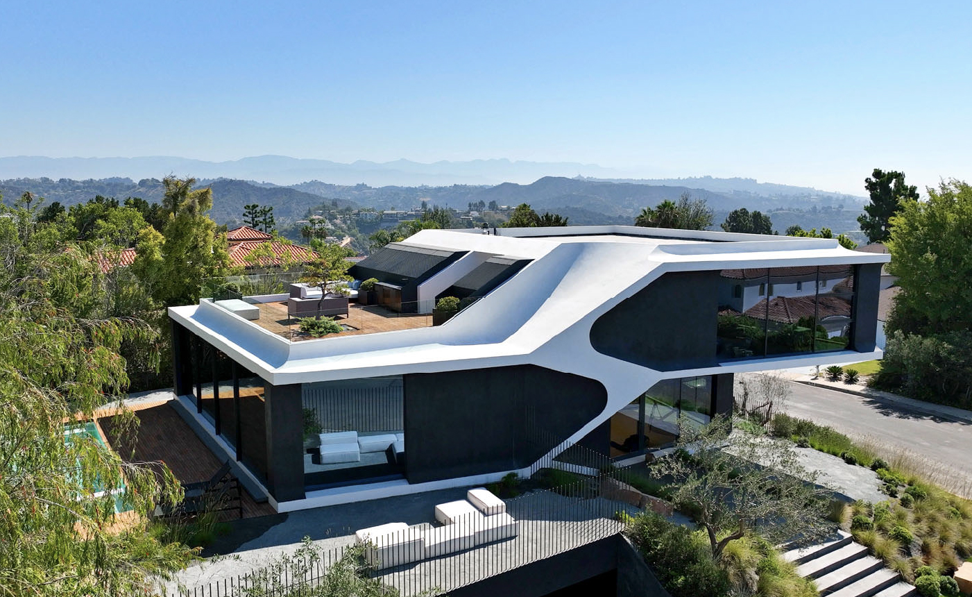
Photo by Yuheng Huang
RO54 began as a box that some out-of-the-box thinking replaced with a home as functional as it is sculptural. Overlooking the Los Angeles basin and the Pacific Ocean, the new build has a dynamic form that looks as if it might take flight. It cantilevers from the top of a buried podium, echoing the shape of the hill as it was before the neighbourhood was subdivided for development. In opposition to the monumental scale of the houses around it, local Arshia Architects pinched, pushed, pulled, and carved the building envelope so it slots into the hillside and looks smaller than it is from the outside while feeling bigger than it is on the inside.
The house replaces the boxy 1960s Bel Air home, plagued with structural failures and poor planning, where the clients raised their sons. The new one will serve as a part-time refuge for the couple and visiting family. With generous glazing down each flank and large openings to the outdoors on each end, it is crowned with a master bedroom and roof deck. Below that are the kitchen and living room, and a large basement buried in the hillside contains the bedrooms and bathrooms, a gym, theatre, library, and laundry. Hardly visible from the street, the bottom floor draws light in via a courtyard, which doubles as a rainwater runoff filtration system, carved out of the platform on which the house rests.
The design brings together stillness and embodied motion, warm and cool, light and dark, soft and sleek. This is visible in its sculptural skin, made from high-density urethane (HDU) foam. The team created 3D scans of the structure, cut the resulting image into digital modules, and sent them to a Hollywood movie prop fabricator. From the digital files, the prop workshop CNC-milled the façade from large pieces of foam and delivered them prefabricated to the site. These large façade elements were then installed, formed, sealed, reinforced with acrylic mesh, and slathered with natural mica plaster to give the house its weather resistance and final form, adding thermal insulation and a dynamic look while helping to cut costs.

Photo by Paul Vu
That sleek precision and almost kinetic formal quality continues inside with the concealment of services and technology. The structural elements holding the 15-foot cantilever merge with the architecture, making it impossible to see how the structure stands up. Mechanical systems blend seamlessly with the gypsum board ceiling panels. Air-conditioner condensers are housed in special enclosures on the roof, while other systems that often clutter ceilings—electrical, Wi-Fi, fire alarms—are flush-mounted.

Photo by Paul Vu
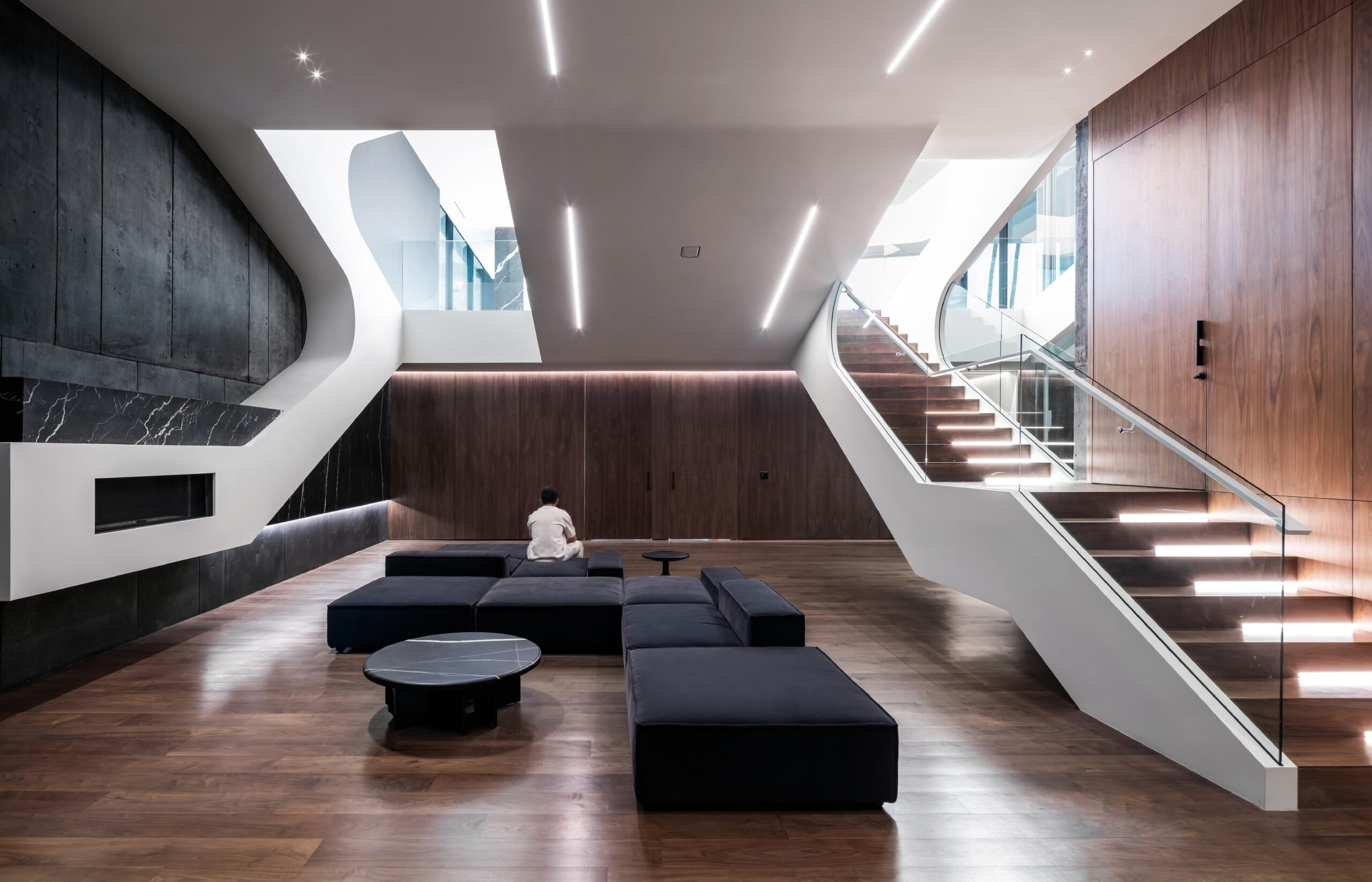
Photo by Paul Vu
RO54 is also a passive cooling system. A reflective cool roof system lessens the urban heat island effect. Energy loss is reduced via a green layer that grows over the buried basement and the raised floors at roof level. The south-facing overhang deepens shade during the summer and amplifies sunlight in winter, while high-flow cross-ventilation, designed to exploit local wind patterns, pours through large openings in two opposite façades.
Most significantly to both form and function, the project diminishes the bulk of an otherwise prodigious structure. Tucking part of it below ground helped break up its mass and created a plinth for the building to “land on.” From there, founding architect Arshia Mahmoodi says, the design’s large cantilever and articulation of form were intended to increase the structure’s buoyancy and airborne quality.
Photos by Paul Vu
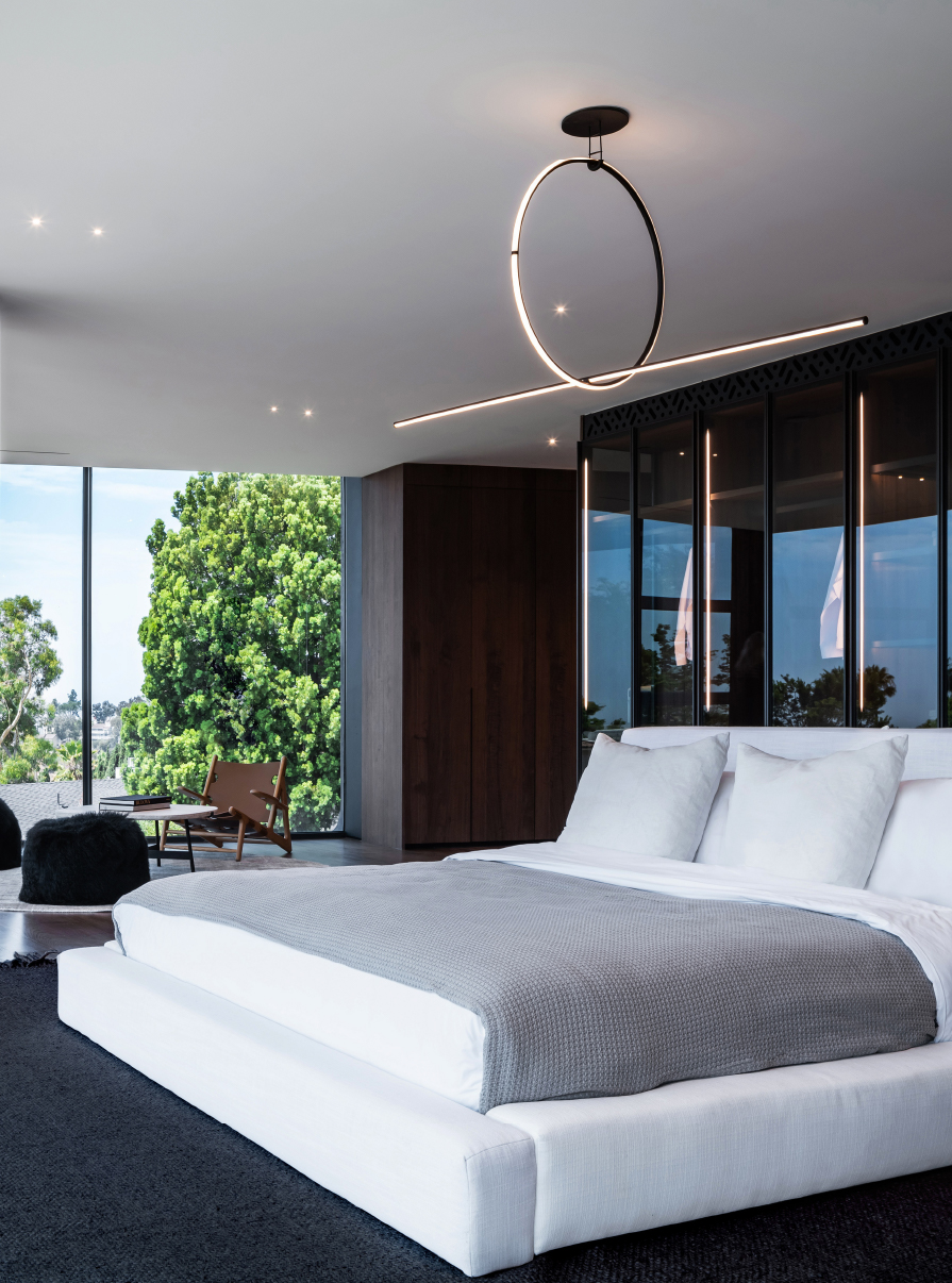
Photo by Paul Vu
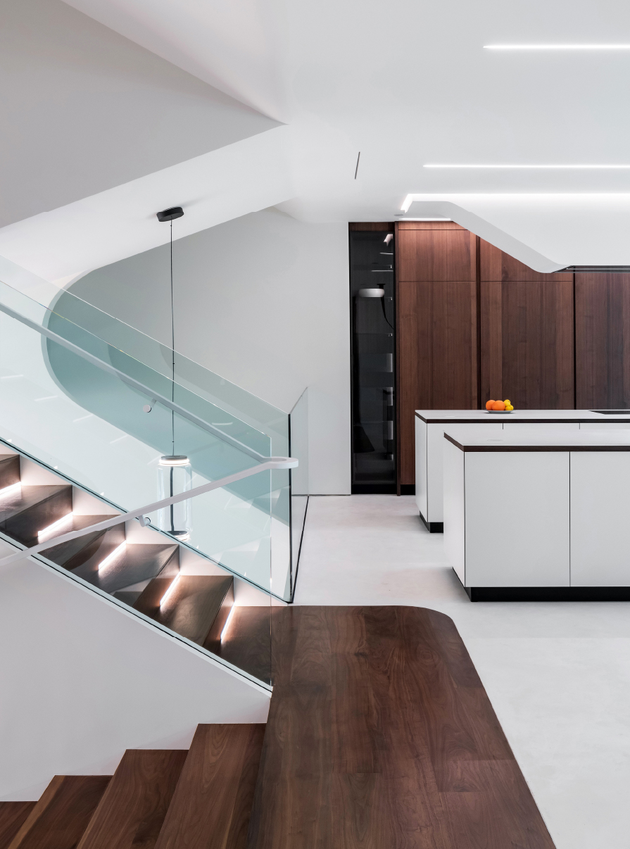
Inside, this meant that the design halved what would otherwise have been whole floor slabs, staggering each vertically by a half-storey on each side. This split-level organization decreased the massive look of a massive house, raised it to improve the views, and diminished the distance between adjacent floors (compared to a stacked system). With floor plates offset above and below, each has what Mahmoodi calls “an engaged connection” with the two nearest plates. The basement gallery has a clear view into the living room. The living room peers through the kitchen onto the terrace. The kitchen gets a glimpse into the master bedroom. The bedroom looks onto the roof deck—and they all also look down. “Visual connection shortens distances and provides a reduction in scale of what could otherwise be a large and overpowering maze of spaces,” Mahmoodi says. “We wanted this accessibility to information and democratization of spaces to be an anchor of the design.” The connections also make the spaces feel lofty even though only two have unusually high ceilings: the 11-foot living room and the basement library, at over 14 feet.
While meeting stringent building codes, these open-plan, staggered, horizontal half-storeys challenge the traditional concept of vertically stacked floors divided and sealed off by rooms. The design also turns each floor into a bridge instead of a barrier. “This allows the floor plates to connect to each other via ligaments—stairs—that stretch over the central void, providing light, sound, and air connectivity throughout the house,” Mahmoodi explains. “Spaces blend into each other seamlessly without hard boundaries and programmatic edges.”

Photo by Renee Parkhurst
Most generously, perhaps, the home embraces its surroundings by means of large open spaces, sliding glass doors along three-quarters of the façade, and lots of (smoke-hued) transparency. “There is little to hide,” Mahmoodi says. “What belongs to the house belongs to the neighbourhood, and conversely, what belongs to the neighbourhood is brought into the house. The architecture demands a change of attitude from its occupants towards the community: to be open, to be known, and to be one.”


