-
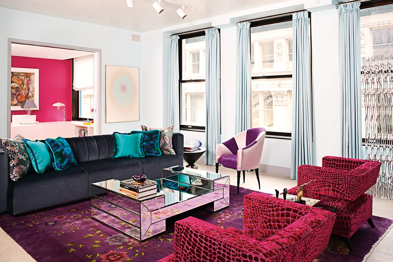
In the living room, a custom-made channel-back sofa covered in Maharam Mohair Extreme sits atop a Chinese art deco rug, with a vintage coffee table clad in bevelled mirror, and club chairs covered in fuchsia velvet.
-
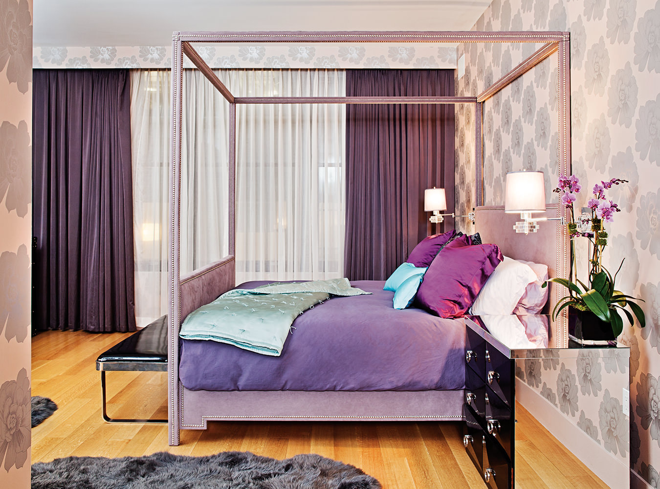
The master bedroom’s four-poster bed with mirrored side tables.
-
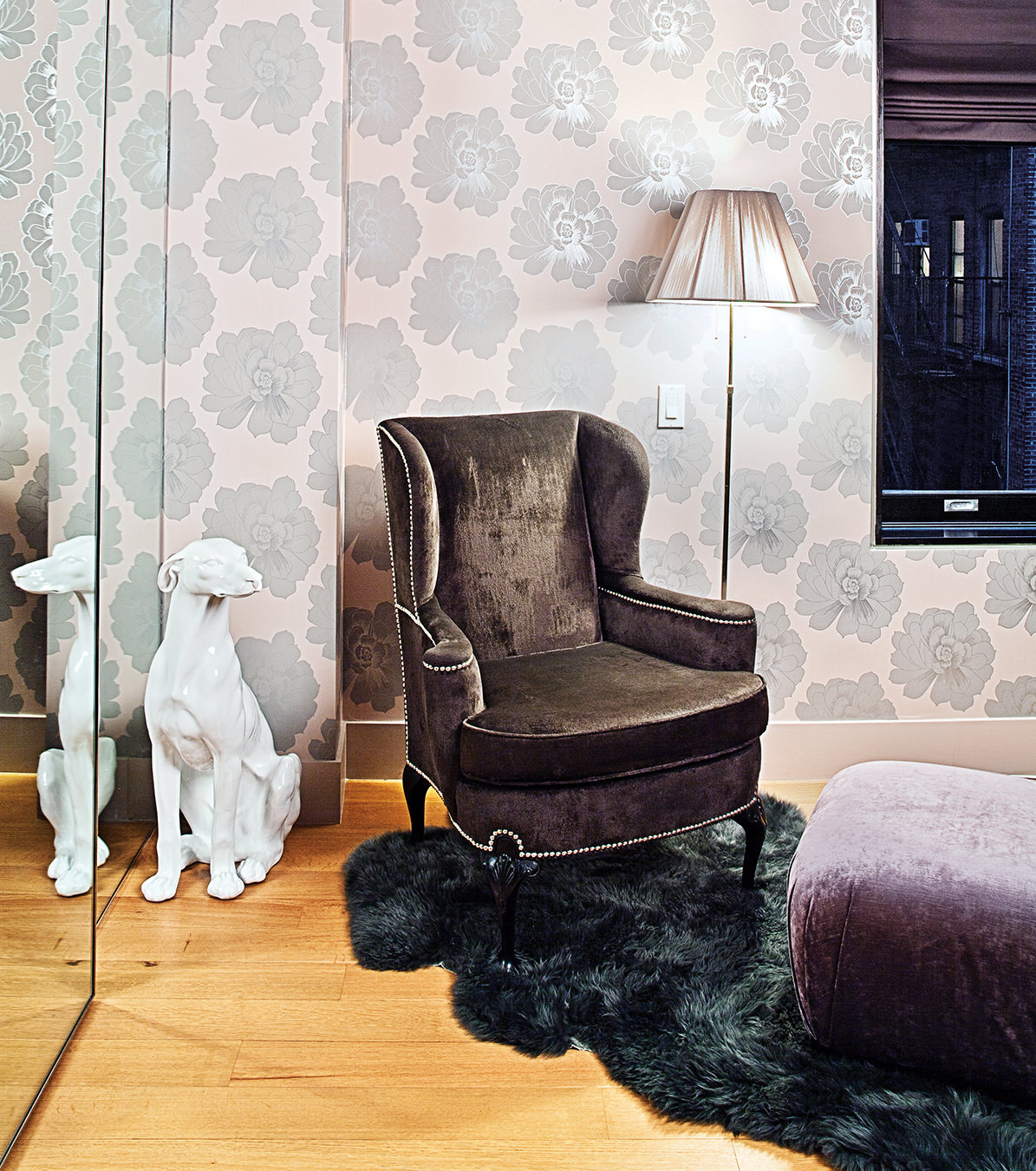
A wingback chair covered in brown velvet and a Karl Springer pouf in a corner of the master bedroom.
-
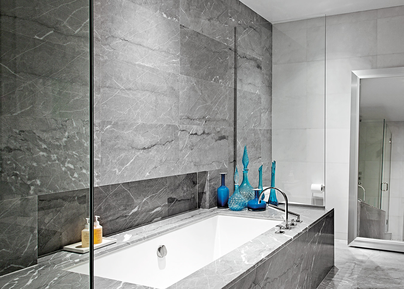
The bathroom, minimally designed with marble, glass, and limestone.
-
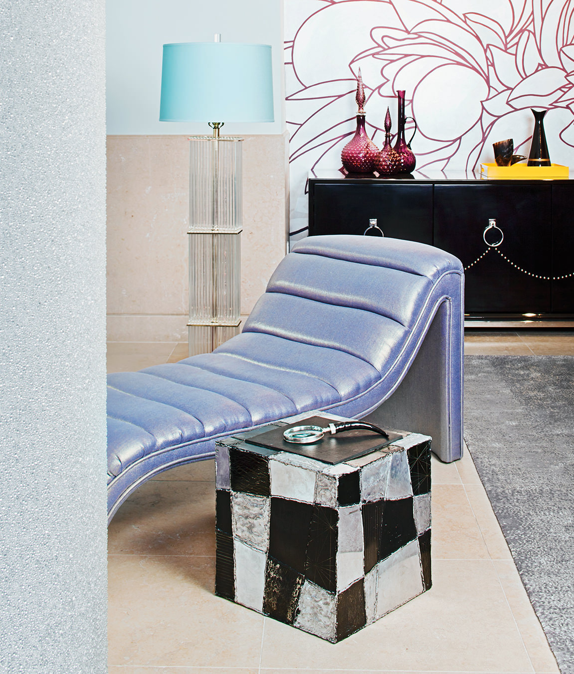
A channel-tufted chaise accents the living room with a handpainted mural behind and an early Paul Evans cube in the foreground.
The Goodman Residence
Rafael de Cárdenas and Architecture at Large.

In the living room, a custom-made channel-back sofa covered in Maharam Mohair Extreme sits atop a Chinese art deco rug, with a vintage coffee table clad in bevelled mirror, and club chairs covered in fuchsia velvet.
Imagine a Manhattan apartment as a jewellery box, with each room evoking a different mood. At some moments, it shouts; at others, it murmurs. Former fashion designer turned architect Rafael de Cárdenas, of New York studio Architecture at Large (AAL), worked with an eclectic array of furnishings, graphical surfaces, and brazen colour to remake the Goodman residence. The loft sits just off Fifth Avenue in Chelsea, south of Madison Square Park and the Flatiron Building, a no man’s land of contradictory cultures, high-end hotels and manufacturing, both hip and democratic. De Cárdenas mixed his own sanguine contradictions in interiors that are an amalgam of hard and soft, stripped down and dressed up, whispered neutrals and vociferous hues and they make the 4,500-square-foot apartment simultaneously masculine and feminine—without feeling noncommittal.

Indeed, flowers blossom over the walls, and the study is ferociously fuchsia à la Helen Gurley Brown, but there is a studded AV cabinet in the living room and a fireplace that lights instantly via a remote control—very Hugh Hefner. This makes it even more intriguing that the inhabitants of this lush dwelling are a dog and his mistress, Sylena Goodman, a former personal stylist who is now an elementary school teacher.
In 2010, the existing apartment was as generic as can be, finished in relatively bland, ubiquitous, minimalist materials. The designer stripped it down, except for a stone floor in one area and a column that anchors the space that was sheathed in a luminous and micro-textural glass-bead wallcovering. The generous size of the rooms meant that it would be possible to showcase larger furnishings, which give the interiors a subtle but larger-than-life air. (“I like large forms that are slightly undercooked as if they were missing a detail,” de Cárdenas confesses.)
In the living room, he placed a custom-made, channel-back sofa upholstered in Maharam Mohair Extreme atop a Chinese art deco rug, facing two cubic club chairs in a fuchsia crocodile-patterned velvet and reflected in a bevelled mirror-clad coffee table. To this was added a Roy Colmer painting that ties into the colour scheme of the furnishings while still recusing itself into the pale blue walls. A Paul Evans cube serves as the side table for a lilac, channel-tufted chaise longue that marks the border between the living and dining rooms. Behind it, a hand-painted mural by James Conran of Chinese chrysanthemums in oversized, magenta outlines on silver leaf, an illustration reflected in the glossy dining room table beneath it. On one side, a swag of metal upholstery studs details a black credenza, which, along with the mirrored table, smoky purple hues, and a voluptuous pendant chandelier by Hudson made of fine-gauge chain, foreshadows the atmospheric bedroom.
In many places, AAL paired graphic elements with solid fields of colour, so that each room has a strikingly different colour scheme—and therefore identity. These choices were largely intuitive: purple chairs, vases, and lounge in the living room, a silver-lined dining room, and the study, a study in hot pink (which means that working there requires no other caffeination than colour). “I went through a fuchsia moment and did it in a few spaces in a row, even though I sort of hate the colour,” de Cárdenas admits. “But I like its tackiness combined with the boxy, tasteful forms of the floating desk and credenza.”

Despite the exuberance of this colour play, de Cárdenas also favours brown with pale cream. In contrast to the high-velocity hues of other rooms, the bedroom features a muted palette of silk-stocking nude colour sexed up with furry rugs and the hard art deco reflections on a monolithically mirrored wall of closet doors and side tables that recede into their own reflections of the surrounding peony-print wallpaper, which appears metallic in certain light. Dominating the room, the purpose-made four-post bed might have been merely romantic had it not been rendered with a lean flourishlessness, an austerity broken only by silver upholstery studs that are echoed in a studded, brown velvet wingback nearby.
Even more subdued and less heterogeneous, the kitchen and bath are both calming spaces, classical retreats into wood and water. In the kitchen, a preponderance of walnut cabinetry alternates with grey Carrara marble countertops. Carrara is used again in the master bathroom—from floor to ceiling—to create a luxe, hammam-like atmosphere. “There’s a fair amount of excitement in the main space and the adjacent office, in colour, form, and pattern,” the architect says, “but the bedroom and grey marble bath are quite serene and introspective with just a nod to the Miami eighties architecture of the rest of the space.”
The work of Rafael de Cárdenas walks a fine line, articulating the zeitgeist, culling the best from the past, and “daydreaming the future.”
De Cárdenas founded Architecture at Large in 2006, and began to do residential and commercial interiors, architecture, furniture, and objects. The office privileges “the strategic over the thematic, the cosmopolitan over the typological, and the atmospheric over the static.” The work walks a fine line, articulating the zeitgeist, culling the best from the past, and “daydreaming the future.” AAL interiors are energetic, provocative without any intention to provoke, and luxurious, even when de Cárdenas works with the most modest of materials—especially in his retail and temporary retail designs. Take, for example, his pop-up shops for the likes of Cappellini and display windows for Barneys New York, which used copious amounts of tape, streamers, and shipping pallets. Or his interior for Cape Town clothier Unknown Union, where inside an 18th-century building, the boutique glows with chevrons and ziggurats of once boring but now candy-coloured display cubes, lacquered and stacked in ombrés of teal, lemon yellow, and pink, and then framed by plain white walls and humble terracotta tile floors.

De Cárdenas’s first furniture collection, launched in 2011 for Johnson Trading Gallery, also made much of banal materials, Memphis movement–like crescendos of colour and form unbound from the soft silhouette of the human body: plywood, expanded metal mesh, and what look like almost instinctual applications of paint. These sharp instincts, untethered from standards (and sometimes comfort), are blunted in his residential interiors, but are still sensible. Some of de Cárdenas’s spaces—saturated with colour and riven by form—seem so graphical as to suggest only the most radical fashion (and therefore don’t suggest fashion at all); other spaces like the Goodman residence, however, look luxuriously dressed and accessorized, and so can’t help but recall de Cárdenas’s fashion background. He earned his first degree from the Rhode Island School of Design and went to work for three years as a men’s collection designer at Calvin Klein. But in 1999, he returned to school at Columbia University and then UCLA to get a master’s of architecture. After graduating in 2002, he worked with inventive formalist architect Greg Lynn before moving into creative direction on experience design projects at special effects production house Imaginary Forces. By 2011, de Cárdenas had been appointed to Baccarat’s first board of advisors, a seven-member panel of designers who were asked to guide the company as it moved into the future.
Today, he says, he still thinks of form as divorced from materiality, which is the way fabrics are allocated to each style in clothing design. There is an element of top-down conceptualizing, and then trial and error vis-à-vis the details that both the fashion and interiors share, and which is wholly intuitive. Though he hasn’t designed clothes in a decade, the architect admits that, just as the fashion was, “in the interiors there’s always some idea, usually a film or a character in a film and a narrative that unfolds.” Just so, there are moments in the Goodman loft where the narrative that unfolds is one of violent masculine glamour recalling the 1980s, Miami, and the chic glare of the drug lord lifestyle.
“A retail interior has to speak to the consumer but not index domesticity; a residential interior for me should index the person who lives there,” says de Cárdenas.
The designer has garnered much attention for his retail interiors, which involve more abstract narratives and rougher mashups of quirky materials, unleashed colour, and texture than his residential spaces, of which AAL has thus far done 15. They are more low-key and luxurious, and not as in-your-face; less iconoclastic in their material choices; and, yes, more livable over the long term. “Residential and retail space are completely different to me,” he says. “They bear little to no similarity. A retail interior has to speak to the consumer but not index domesticity; a residential interior for me should index the person who lives there, whether actually or fictionally. The Goodman loft has details that are more flirtatious than we ordinarily do, but they spoke to the client’s character, which is quite flirtatious and funny.”

That said, in counterpoint to the overt femininity, the team looked to unabashedly masculine furniture forms. The insertion of sharper, darker elements—the coffee table and custom furniture “have a Scarface, cocaine vibe,” he explains, “which is where they took their cues from”—seems to flout the conventions of gender design and move beyond the codes that eternally dictate powder-puff pink for girls and robin’s egg blue for boys. Instead of defying convention, however, de Cárdenas is exploiting it charismatically: sex, in both senses of the word, can add layer and nuance to his work. “I like the difference in gender identity,” he says, “and I hope we never move past it in design.”
As for Goodman, when new people come into the apartment, their jaws drop, but she has become so comfortable in her space that it doesn’t seem extreme at all. With a background in fashion, she wanted something that was full of what she looks for in that field—uniqueness, colour, texture, and inspiration. “There is nothing expected or overdone about my apartment, and there is nothing in my space that anyone else has,” she says. “What a wonderful feeling that this is truly my home.”

