Vancouver-based Designer Emily Danylchuk Creates Dreamlike Interiors
Bold minimalism.
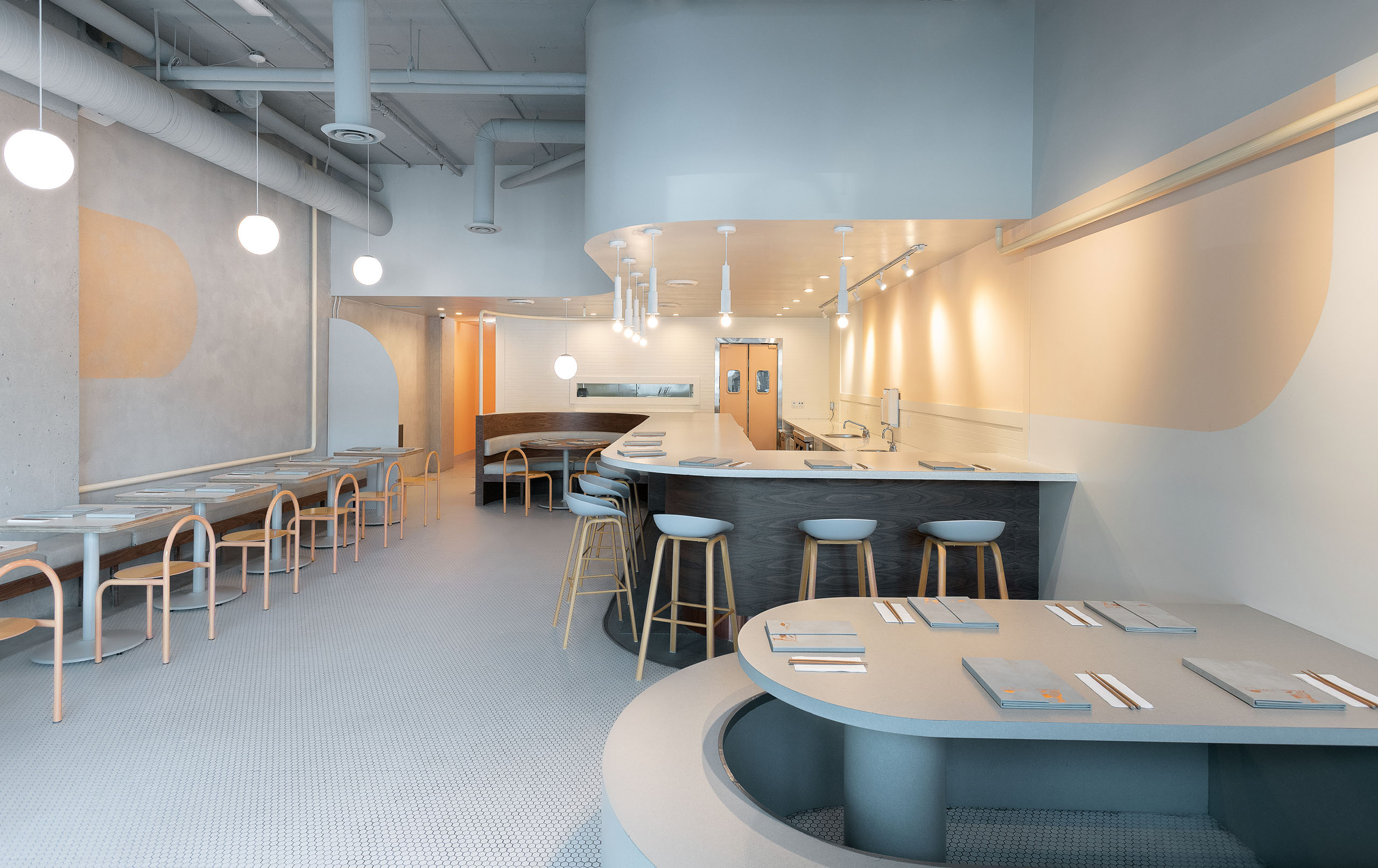
Saku Broadway. Photography by Kristopher Grunert.
Emily Danylchuk is no stranger to mess; she is covered in dust and smiling after digging through samples of onyx at a local stonecutter’s warehouse. “It’s part of my belief system,” she says, “that anything is really possible creatively. It just depends on how much time you want to spend to experiment and research all the materials.” Danylchuk takes the craftsmanship she finds with tradespeople and turns it into streamlined, highly stylized interiors. But despite the untidiness of the beginnings, her work on restaurants such as Saku and the doughnut shop Mello in Vancouver is clean, dreamlike, and recalls some aspects of the digital world in its geometric exactitude and monotone palettes.
Originally from Ontario, Danylchuk has worked in a variety of roles, from fashion to set design, that have exposed her to the full breadth of the creative process. Having interaction at all stages of the design means that the excitement everyone feels in seeing something beautiful come to life can reverberate along the entire chain.
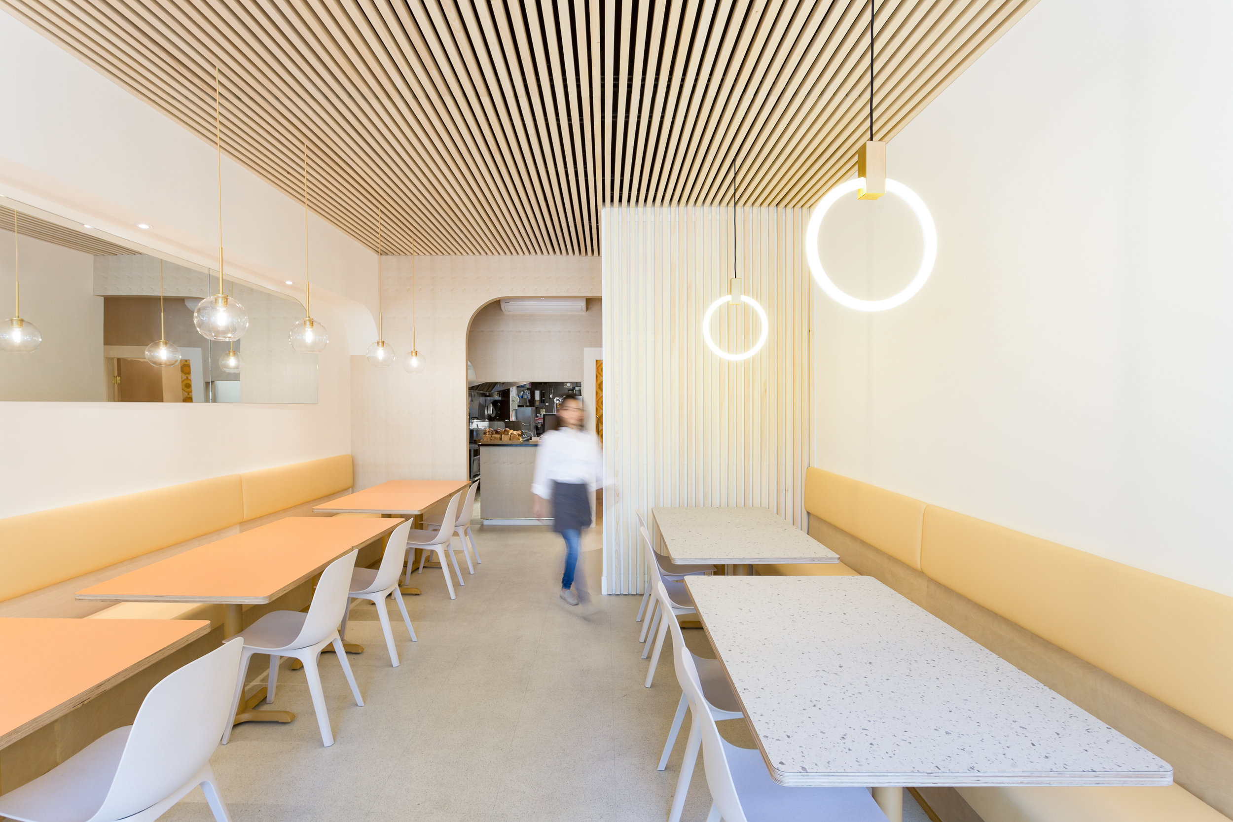
Saku Robson. Photography by Jon McMorran.
The designer says she aims for minimalism with a big impact, which may seem contradictory. However, the unity of lines in a project like Saku creates an overarching sensorial experience comparable to gastronomy: elegant and minimal dishes that pack a flavourful punch, like the fare of the restaurants Danylchuk has designed for. “I try to avoid too many ornate details or clashing finishes,” she says.
Danylchuk designs not just interiors but also furnishings, some of which include the powder-coated, Japanese-inspired chairs of Saku’s Broadway location. The pink of these chairs also appears in the minute swatches of colour on the walls that reflect the half-oval shape of the long bar, ceiling fixture, and front table. “There is a bit of sacrifice that can come with extreme styles,” she laughs when asked whether the chairs are comfortable. This is one of the central tenets of minimalism, and the eyes are certainly the better for it when contemplating the spaces Danylchuk designs.
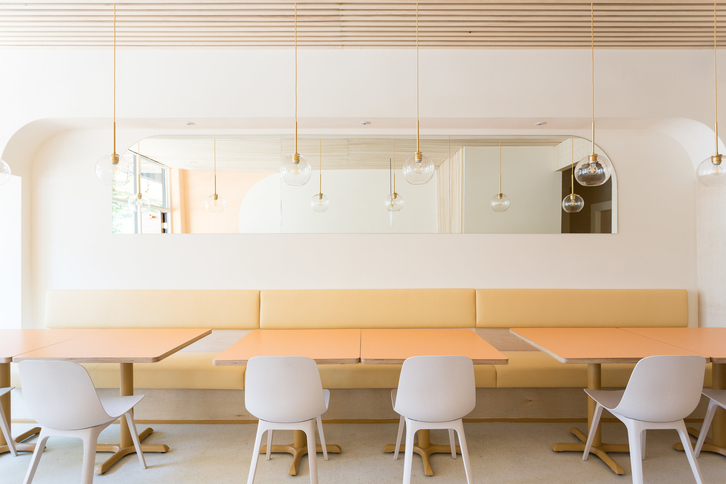
Saku West End. Photography by Jon McMorran.
At Mello, Danylchuk took the pop art potential of ice cream to create an astoundingly representative colour palette. A caramel shade pervades most of the restaurant, spread over the walls, the bar, and the geometric stools. “In North America, we’ve been very tied to square things in design,” she says, “and it feels very limited.”
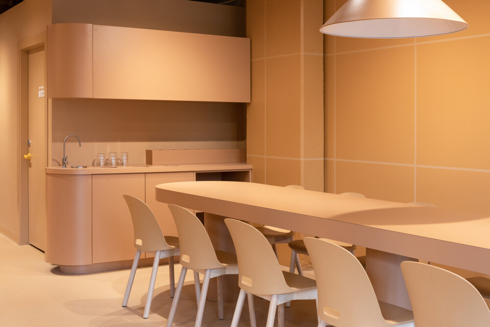
Mello.

