-
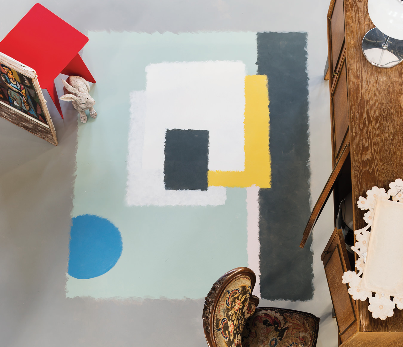
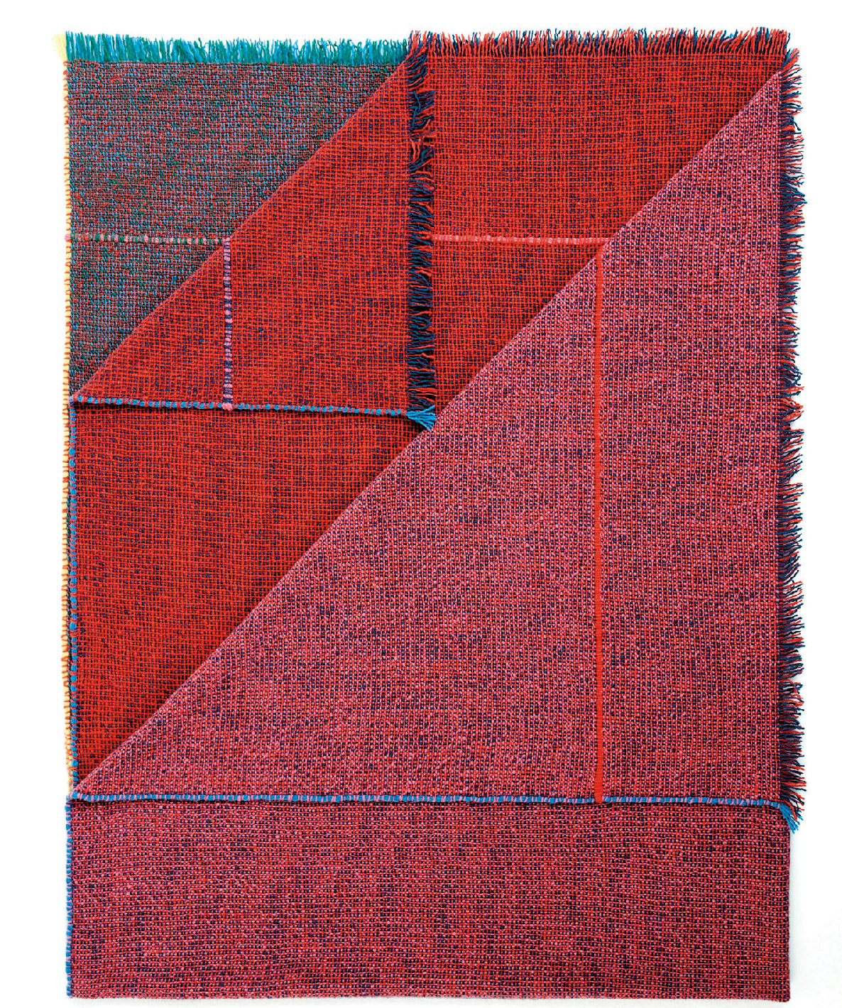
Painted multicolour rug with Farrow & Ball floor paint including Cook’s Blue, Calamine, Green Blue, Babouche, Down Pipe, and Pointing.
-
Farrow & Ball Tented Stripe ST 1351 wallpaper.
-
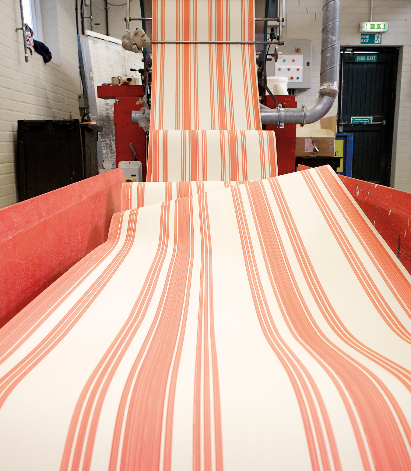
Farrow & Ball Tented Stripe ST 1351 wallpaper.
-
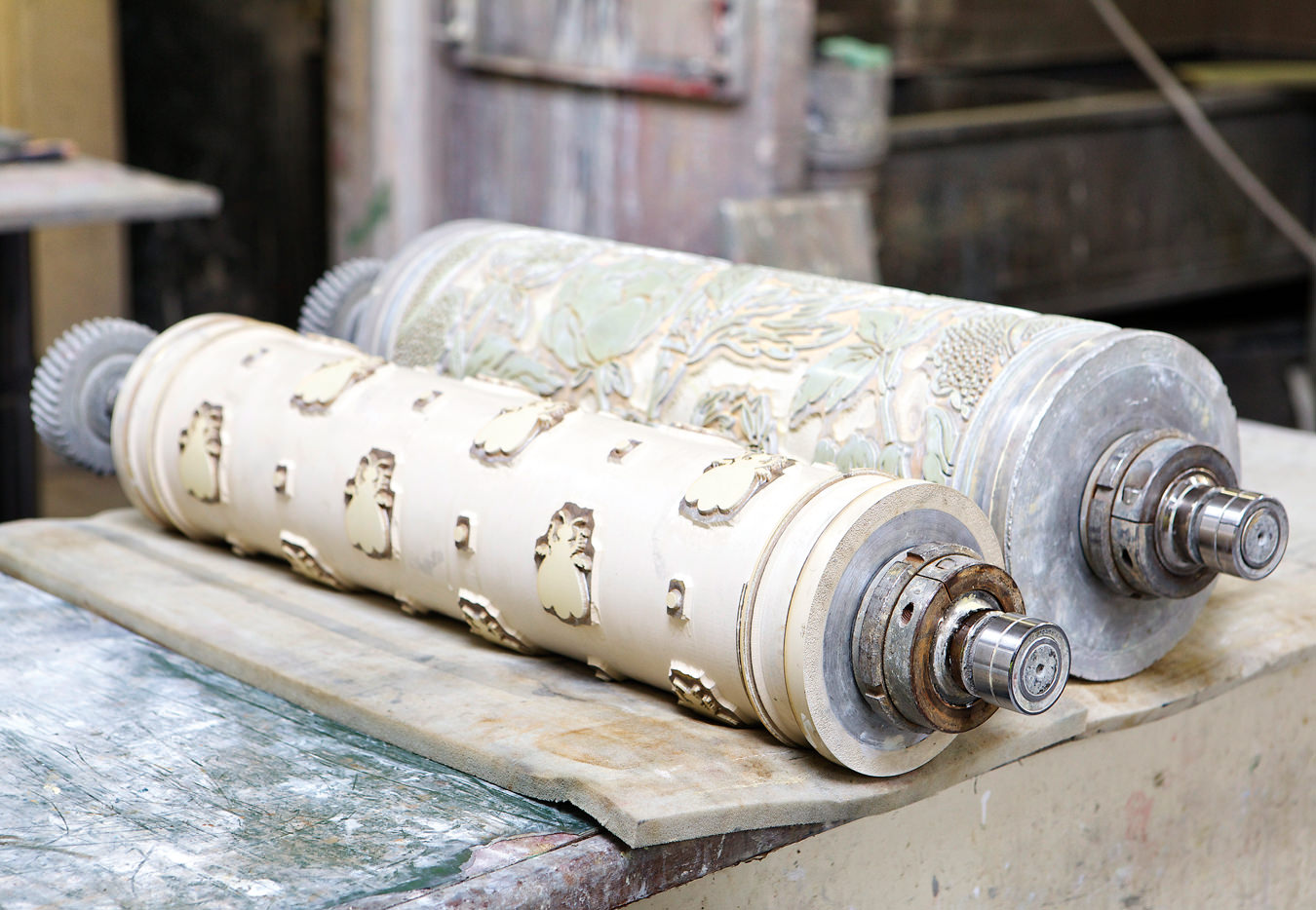
Farrow & Ball pattern roller.
-
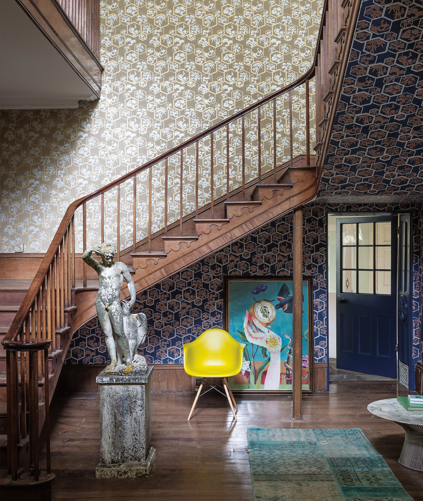
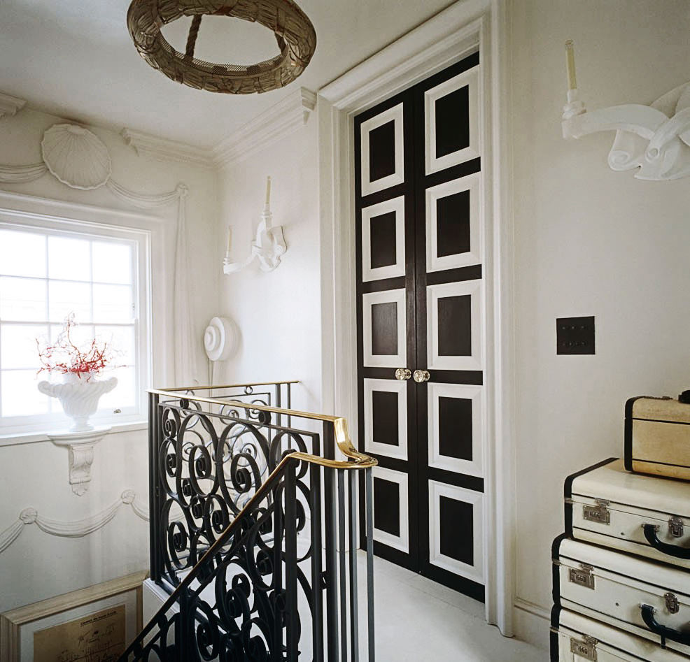
Farrow & Ball Shouchikubai wallpapers; BP 4503 (wall) and and BP 4504 (staircase).
-
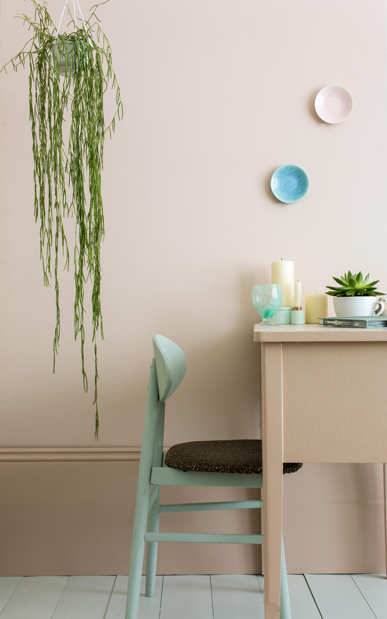
Farrow & Ball Pink Ground.
-
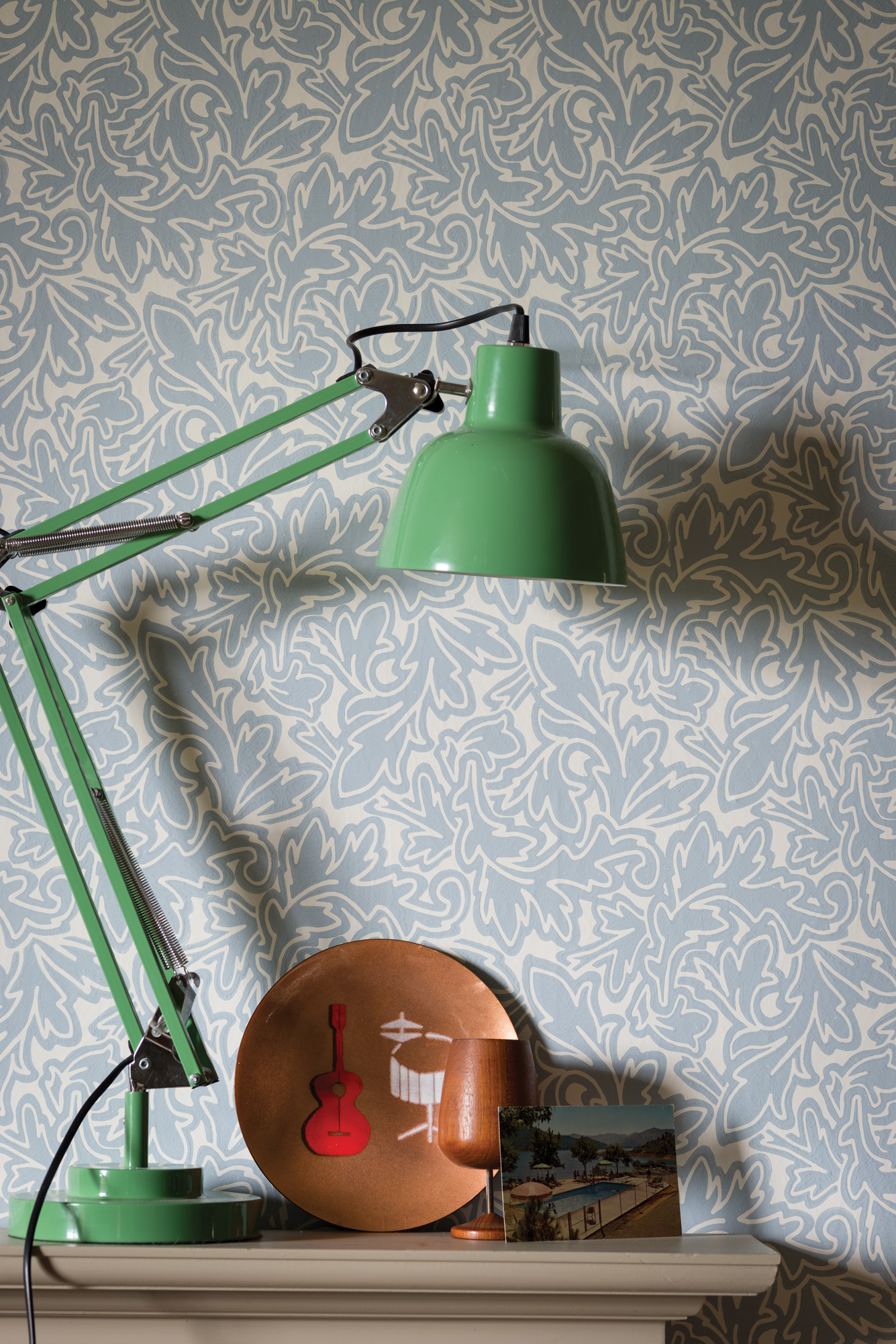
Farrow & Ball Feuille BP 4905 Wallpaper.
-
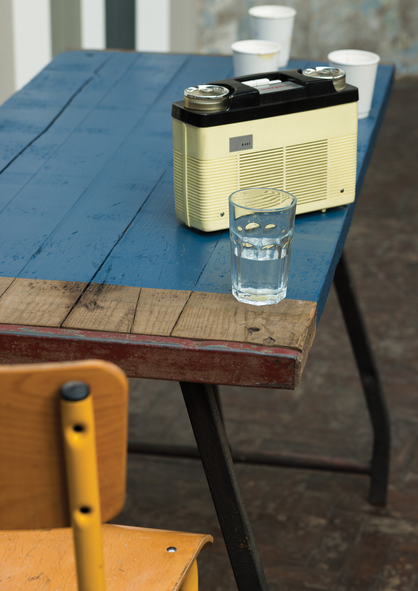
Table painted with Farrow & Ball Drawing Room Blue.
On Coloured Ground
Farrow & Ball.
Prior to Farrow & Ball’s rise to middle-class must-havedom, the paint colours we chose for our homes were largely bright and plasticky, with names that did their best to describe the colour in the pot in front of you. Enter Farrow & Ball, and their traditional formulations poetically titled Elephant’s Breath (warm grey) and Mouse’s Back (grey/brown). Since the start of this millennium, Farrow & Ball has become the signifier of First World good taste. In 2006, the Robb Report named Farrow & Ball one of the 30 most influential brands of the previous 30 years. The brand is so successful, you can tell a Farrow & Ball wall at 20 paces from its ultramatte finish and subdued heritage hue that is famously hard to replicate.
The company has just been purchased by Los Angeles–based Ares Management for a reported £275-million ($505-million Canadian). But in place of glossy headquarters and equally glossy staff, Farrow & Ball’s head of creative, Charlotte Cosby—she of the brand’s Charlotte’s Locks, a strident orange/red—is much lower-key than you might expect. And refreshingly so. As are Farrow & Ball’s rather modest headquarters, which sit on an unremarkable business estate in Wimborne, in Dorset, England.
Cosby’s office (a shared double-height shed building) is just as prosaic, not helped by the gloomy sea mists that have rolled in on this spring day. It is, ironically, in need of a fresh coat of paint. In the back of the offices, meanwhile, is the playroom. Here, the team (including Shamus Pitts, the man who transforms found pieces of furniture or made objects into 3-D glamour suitable for all Farrow & Ball shops) plays about, deciding how to bring their paints and wallpapers to life in an endless round of demand for new displays and new ways of showing their product. There are 52 stand-alone stores currently—not least of which is the Toronto store, the brand’s first international outpost, open since 1999—and more than 900 stockists around the world to consider. In amongst all this, the team must decide on their next collection of paint colours, which are released every two or three years. Today, a small group of creatives are making hot-air balloons out of woven-cut pieces of wallpaper. And Pitts is painting an old wheelbarrow.
“Once I start talking, I won’t stop,” warns Cosby, disarming and honest, revealing how she never had a plan to take over the Farrow & Ball creative role with a world-domineering mindset. Instead, she joined the company in a much quieter way, as one of the marketing juniors, “at just the right time.” It was the mid-2000s, and when the then–creative designer left suddenly, she offered to put the F&B window displays together. Quickly promoted, Cosby has since grown with the company, helping to take it from somewhere that “would just paint a piece of MDF and shoot that for our advertising campaigns to one that now involves £25,000 [about $50,000 Canadian] and a week of intense styling and shooting for a campaign that will be digested by the consumer in a matter of weeks. And then they’ll want something new.”
This speed at which design inspiration is now “consumed” is, says Cosby, one of the trickiest things to deal with today at a decorating company that only delivers new colours every few years and launches wallpaper collections sporadically—the last papers being the modern/historic hybrid French collection released in February.
Farrow & Ball, the hugely influential heritage U.K. brand, has revolutionized the paint and colour industry over the last two decades.
“Trying to keep consumers interested is an incredibly difficult job. People want what they want when they want it. Consumer expectation is huge. We are expected to answer a Tweet within two hours, although people want a reply instantly. Behind all this is the fairly slow nature of how we choose colours. We don’t do trends. Our colours are really, really thought out, and we always have 132, so we have to throw out old ones when we bring new ones in [although any discontinued colour can still be ordered]. Our core colours—our neutrals—are fundamentally about calmness and trying to create a full-stop at home, an escape, which is ultimately what most of our customers want to achieve. I recently met Pharrell’s stylist, and I thought he would have something quite dramatic at home, but he had chosen Bone, a stony neutral. I have no idea how you could possibly work for a paint company with thousands of shades.”
Balancing this idea of calm with the superfast-paced world of consumer design is at the crux of what Cosby and her team do. Farrow & Ball—begun in 1946 by John Farrow and Richard Ball, a chemist and an engineer, respectively, as an industrial company that provided automotive paint for Ford Motor Cars and the British government—began bucking trends as early as the 1970s. Then owned by Norman Chappell, the company resisted the market trend to increasingly plasticize paints by adding more acrylic and less pigment. Instead, it concentrated on that ultramatte finish and original formulations of casein distemper, limewash, and natural ingredients. The renowned subdued take on colour—achieved by adding a hint of black to each colour “so they’re a little bit dustier”—began to appeal to a new customer in search of something more sophisticated and shine-free, and as architects and designers began to recommend it to clients, stylists, and journalists, the brand took off, purely, says Cosby, through word of mouth.
Marianne Cotterill, one of the U.K.’s most successful interior decorators, who has used Farrow & Ball paints for years, says the appeal of the range is about more than just the surprises found within the colour palette. “For me, it’s the Coco Chanel of paint,” she says.
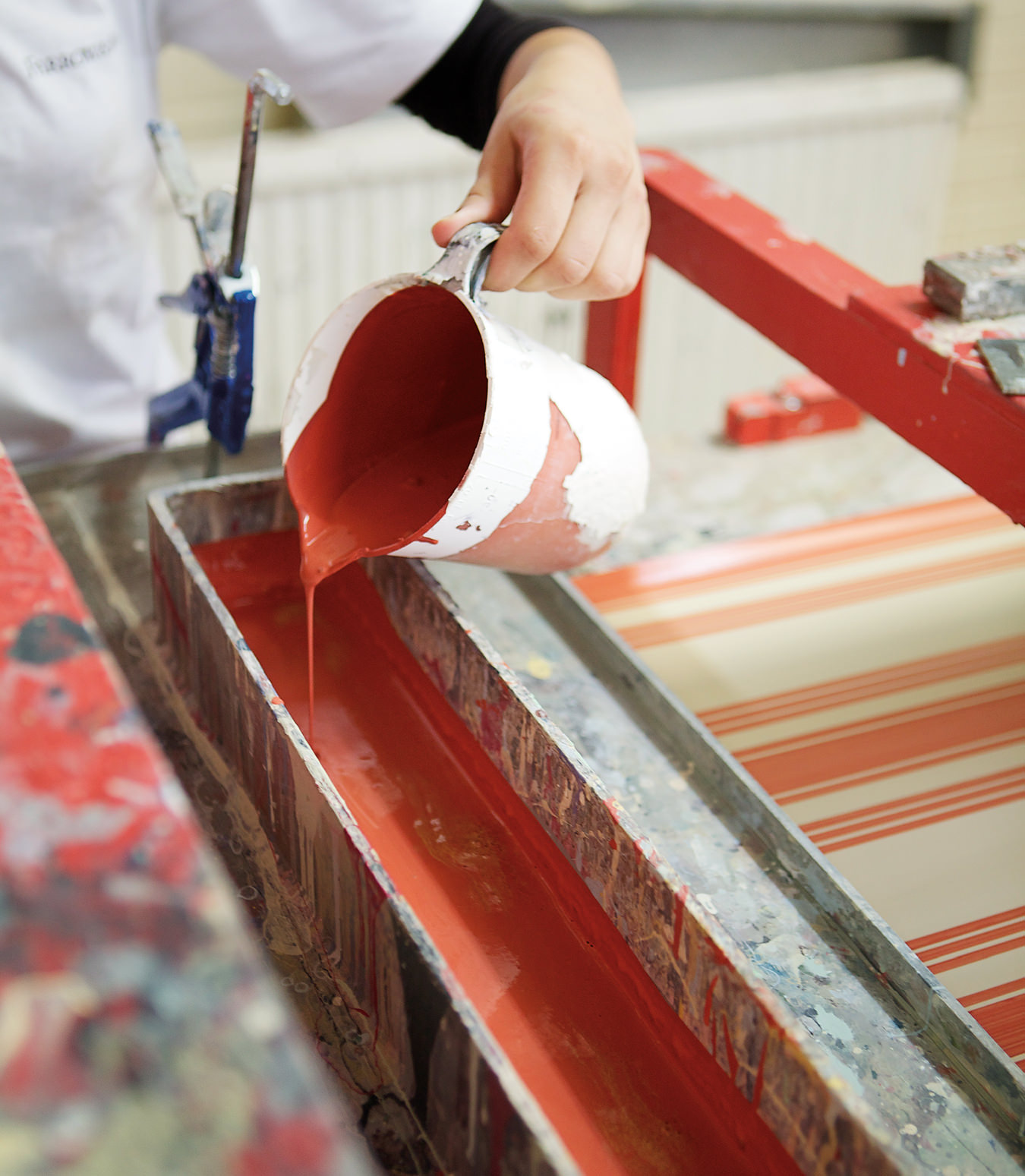
Colours are still mixed in giant vats using traditional ingredients, including chalk and china clay—then rich pigments are added until a shade matches its bespoke formula. Once mixed, it is tested, and if it is within 0.5 of a degree of the intended colour (industry standard is 1 degree), it passes the test. The same is done for coverage. Their printed wallpapers, meanwhile, are rolled and re-rolled several times on traditional raised-block print machines as Farrow & Ball paint colours are poured onto seemingly impossibly long rolls of paper to form the ground colour. Later, the pattern is applied using traditional flatbed block printing, roller block printing, or trough printing methods before the wallpaper is cut to size. None of this is speedy production, nor does the company want it to be. “We want to grow without really growing,” says Cosby. What she means is that although annual turnover has nearly tripled since 2005, now at £64.3-million [about $118-million Canadian], she doesn’t ever wish to get to the stage where she can’t personally answer the letter from the little girl asking if they do coloured pencils in each of their shades. “Somehow our brilliant HR team has recruited a whole load of people who care,” she says.
What’s most taxing, says Cosby, is keeping brand interest in a market where the brand has already peaked (i.e., the U.K.). Their strategy is, surprisingly, not over-trying to thrust the Farrow & Ball brand down people’s throats. There has been the creation of a recent YouTube channel (farrowandballtv), which shows shorts of new wallpapers Tourbillon and Paisley—both inspired by vintage fabrics, resized and coloured—being printed in the factory space just across the road from the creative offices, or of their in-store customer events, and also short films put together on each new colour to show the inspiration behind the choice of shade, so there is always something “new”. Plus there’s a blog, the Chromologist (which focuses on design in general, not just F&B’s world), and lunch clubs and colour talks. Still, says Cosby, “we don’t want to be too easy to get hold of so we’re not relevant anymore.”
We don’t do trends. Our colours are really, really thought out, and we always have 132, so we have to throw out old ones when we bring new ones in.
Somewhat simpler are newer markets, like Germany, where they are discovering what works best for a largely rental market, and they continue to push into North America, establishing creative partnerships with establishments like the Met, and MoMA, where last year Farrow & Ball sponsored the Toulouse-Lautrec exhibition, and this year at the Gardiner for the Women, Art & Social Change show (where backdrops featured Drawing Room Blue, Oxford Stone, and a flattering off-pink neutral called Dimity). The Farrow & Ball colour consultancy home service also went global a couple of years ago. Curiously, what works best in Canada is almost exactly the same as what works best in the U.K., in that best-sellers are dominated by neutrals like All White, Pointing, and Wimborne White; greys and off-blacks are also popular, including Down Pipe and Railings, the sophisticated dark greys. It is the French so far who are most daring, with Cosby’s namesake colour among the popular choices.
As for the secret to how the colours come into being, it is, says Cosby, a question of authenticity, and retaining a local feel to a very international product. “There has to be a story. There has to be a local connection—to nature, to Dorset, to local historic houses. It’s really not just marketing. Ammonite really is the colour of fossils hidden in the rocks on the coastline here, and yes, we had an expert take us out fossil hunting. And St Giles Blue is from an amazing 17th-century manor house in Wimborne, and there really is a blue that bright there.”
As to how they pick their perfectly limited, edited palette, it is just a question of expert eyes and time. “We will literally sit with colours that are a per cent different from each other for days on end, until we all agree. Sometimes we have a bit of a battle, and you’re really fighting for a colour you like. And then sometimes a few days in you will be bored of the one you were pushing. And so we get there in the end. It can take months.”
Whatever the new colours bubbling away in Cosby’s head, they are likely to be influential and surprising, and, we are guessing, there is likely to be a green (Cosby’s own home is overwhelmingly green, blue, and white-hued) plus a couple of brights. And there will be one or two that don’t ever sell well. “Yellowcake, for example, our brightest colour to date [released in 2013], was never intended to be a huge seller, but it’s been embraced really well—it’s a creative colour. We can be more open with our accents.”
Farrow & Ball won’t lose any of their loyal customers over their more daring choices. So enamoured are a number of customers that Cosby and company receive frequent requests for empty tins (which are glossily golden on the inside, stacked high like jewels in the factory rooms) for weddings and keepsakes. They even had a request from a family who wanted to put their mother’s ashes in one—such a fan she had been of their paints. Did they meet that request? “Of course we did. That’s one of the pleasures of working here. We love that people care about colour as much as we do. We’re pleasers here.”
Photos ©Farrow & Ball.