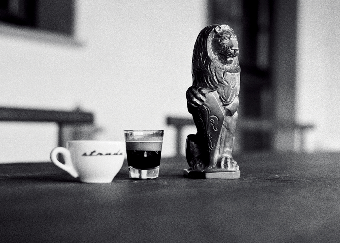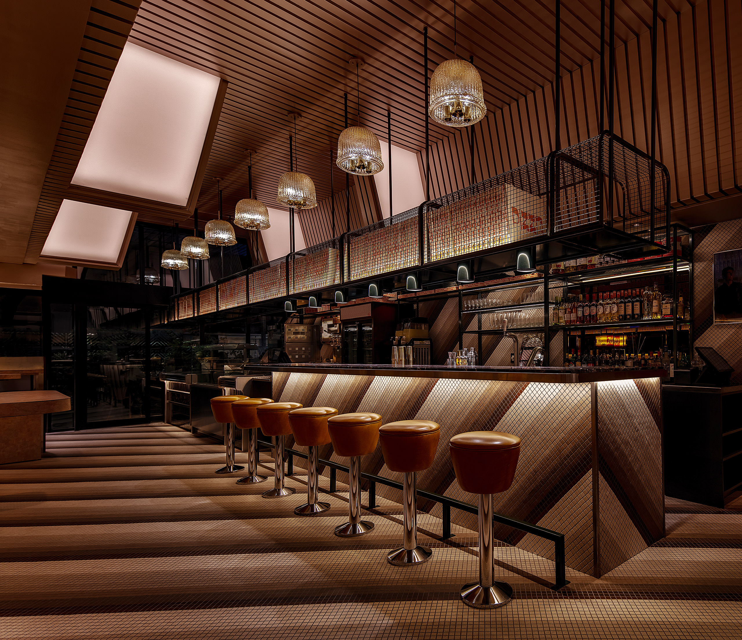
Perron's design of The Gentile Pizza Parlour makes subtle references to the classic Italian cafés in Sicily, where the owners are from. Photo courtesy of Perron.
For Zébulon Perron, People and Context Are More Important Than Form
Space commander.
_________
Zébulon Perron has always been obsessed with details. “One of my first projects was a wine bar, and I remember spending so much time agonizing over every centimetre,” the 49-year-old interior designer tells me over the phone from his Montreal studio. “I remember thinking about all the different situations that can happen in one space. Even though we were using reclaimed materials and wanted a very casual look, the planning had to be laser precise.” That bar, Buvette chez Simone in Montreal’s Mile End neighbourhood, is still open more than a decade later. “It was a huge success,” Perron continues. “It gave me a lot of confidence because the ideas I had about space and planning were totally validated.”
Indeed, Perron’s ideas about space go so much deeper than simple aesthetics. “I was always more inspired by the architecture of Herzog & de Meuron or Peter Zumthor than I was by, say, Frank Gehry,” he says of his guiding principles. “It’s not about form, it’s about the people, and what’s around you. Space should be informed by so many more things.”

Designer Zébulon Perron.
By his own account, Perron grew up in a bohemian household in Mile End. His father was a jazz musician who palled around with Leonard Cohen in the 1960s and ’70s, while his mother is a therapist, whom Perron describes as having once been into New Age. “I mean, they gave us some pretty original names,” he laughs, referring to his own unusual moniker as well as his brother, Willo’s—himself a designer and art director who has created album covers for the likes of Kanye West and Jay-Z and stage sets for Rihanna and Travis Scott.

After attending a fine arts high school, Perron enrolled briefly in Concordia before transferring to UQAM’s environmental design program. He describes that period in the early 2000s in Montreal as somewhat of a wasteland for ambitious young designers like himself. “There was literally no work,” he laments, recalling the hopelessness he felt at his employment prospects. The economic situation in Quebec could have been debilitating for a recent graduate but, in fact, contributed largely to the path he followed. “I was concerned about my future, so I started working while I was studying,” he remembers. “The first contracts that I got were retail stores and restaurants. I quickly realized that working on these kinds of interiors was something that I really love.”
Zébulon Perron has always believed that we can be genuinely affected by the spaces we inhabit.
Those early commissions snowballed into a steady stream of projects over the past decade-plus, mainly in Montreal’s newly percolating nightlife and dining scene. But in recent years, of course hindered slightly by the COVID-19 pandemic, Perron and his atelier have been breaking new ground abroad. At the moment, he’s working on a flagship concept store for Vintage Frames in Miami Beach’s newly opened Goodtime Hotel, as well as a restaurant with a “well-known chef” in New York’s Chelsea neighbourhood (that, he says, he’s contractually obligated to keep mum about). His contemplative approach has clearly won him some fans.
Discussing a recent project, the Gentile Pizza Parlour, which opened in Montreal in 2020, Perron takes me through that process. “I try to show up without any preconceived ideas,” he says of the first step. “I listen to people and say, okay, what are they about? What’s going on? And what I can learn from this process? That becomes the first material we work with.” For inspiration, Perron delved into the family’s history. As industrious immigrants from Sicily, the Gentile family opened their first Westmount eatery in 1959. “We pushed this idea of nostalgia, the family’s childhood memories of running around in their parents’ classic Italian cafés,” he says. During the research phase, he and his team scoured old photos and listened to family lore for hints on where to lead the design. “I didn’t want to create a literal reconstruction of the original café,” he adds. “It’s more an impressionistic idea, where we take different elements to combine them to make something new and more contemporary.”
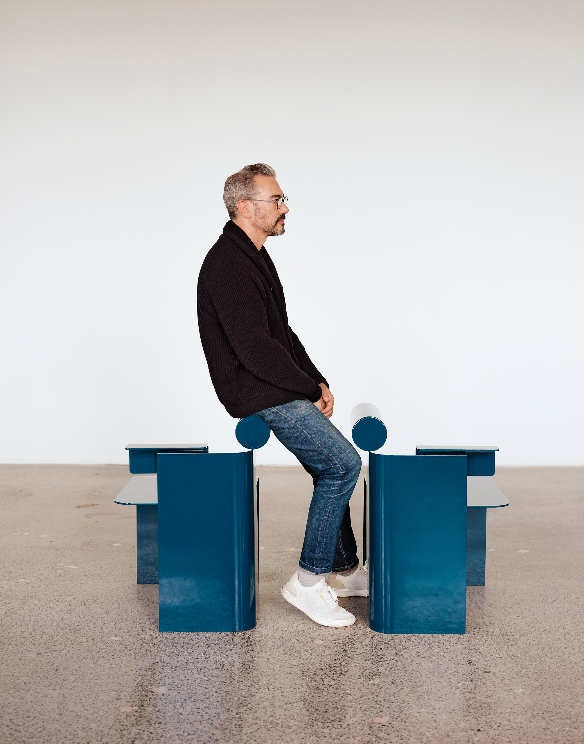
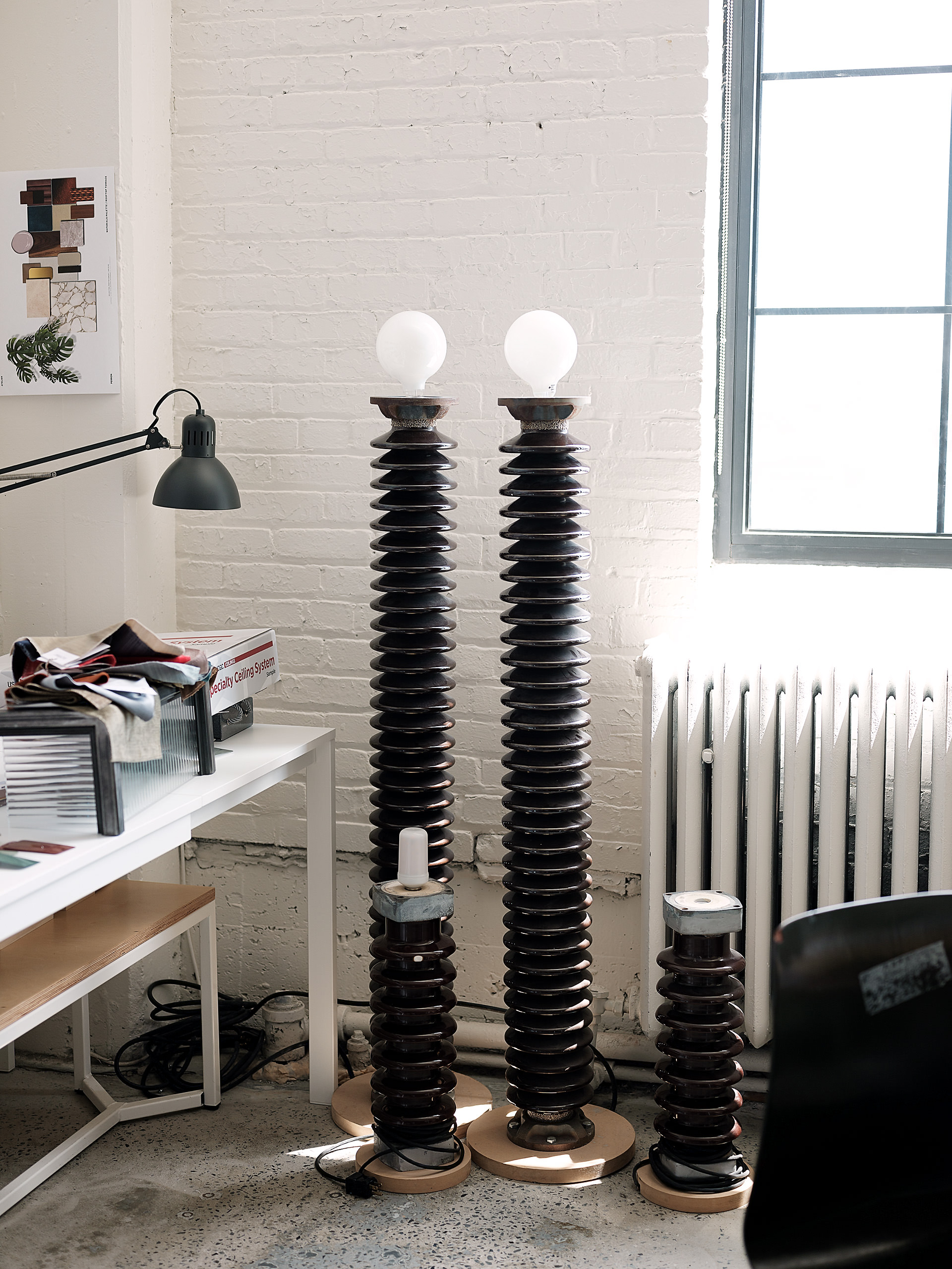
“I pride myself on not having a strong signature,” he says of his unorthodox methods.
In the hallway-like storefront where the original café once stood, Perron’s team stripped back the layers of time and started, mostly, anew. They played with the narrow dimensions, tiling the floor and walls in a repeating diagonal gradient pattern. “Because the space is a single corridor, we thought, how can we visually break it up? So we chose the diagonal pattern as the visual gesture,” he says. One of the original elements Perron incorporated into the new space was the backlit signage that once hung proudly in the shopfront. “We picked out the signs and kept them as lightboxes. It became an interesting architectural feature because of the angles and lines.”
This mix of high and low references is what makes the space work. The bar may be formed of Italian marble and gleaming stainless steel, but just behind it, vinyl wood walls—à la your parent’s suburban Canadian basement—and a standing arcade game to ensure nobody is taking themselves too seriously while sharing a pizza. “People need references and things they understand,” Perron says of the design. “Nobody wants to sit in a pure concept.”

This context-first approach means it’s not always easy to pick out an interior Perron and his studio Atelier Zébulon Perron are behind as the style varies widely from client to client and project to project. “I pride myself on not having a strong signature,” he says of his unorthodox methods, particularly in a moment in which a specific visual identity—recognized largely through social media—can be integral for a designer looking to make their name on the international stage. “My projects are informed by place,” he explains, “the city we’re in, the origin of the project, the client’s ideas, the people we’re going to be serving.”
Another recent project, the restaurant and lounge at the Four Seasons Montreal, resides on the opposite aesthetic spectrum from the pizza parlour. Where the latter’s ironic references and sophisticated details trade in date nights and friendly dinners, the former is engineered for nightlife’s buzz. “The Four Seasons, we really built from scratch,” he explains. “It was a very different process. There, we were really interested in human interaction and the dynamics within the space—the social essence.”
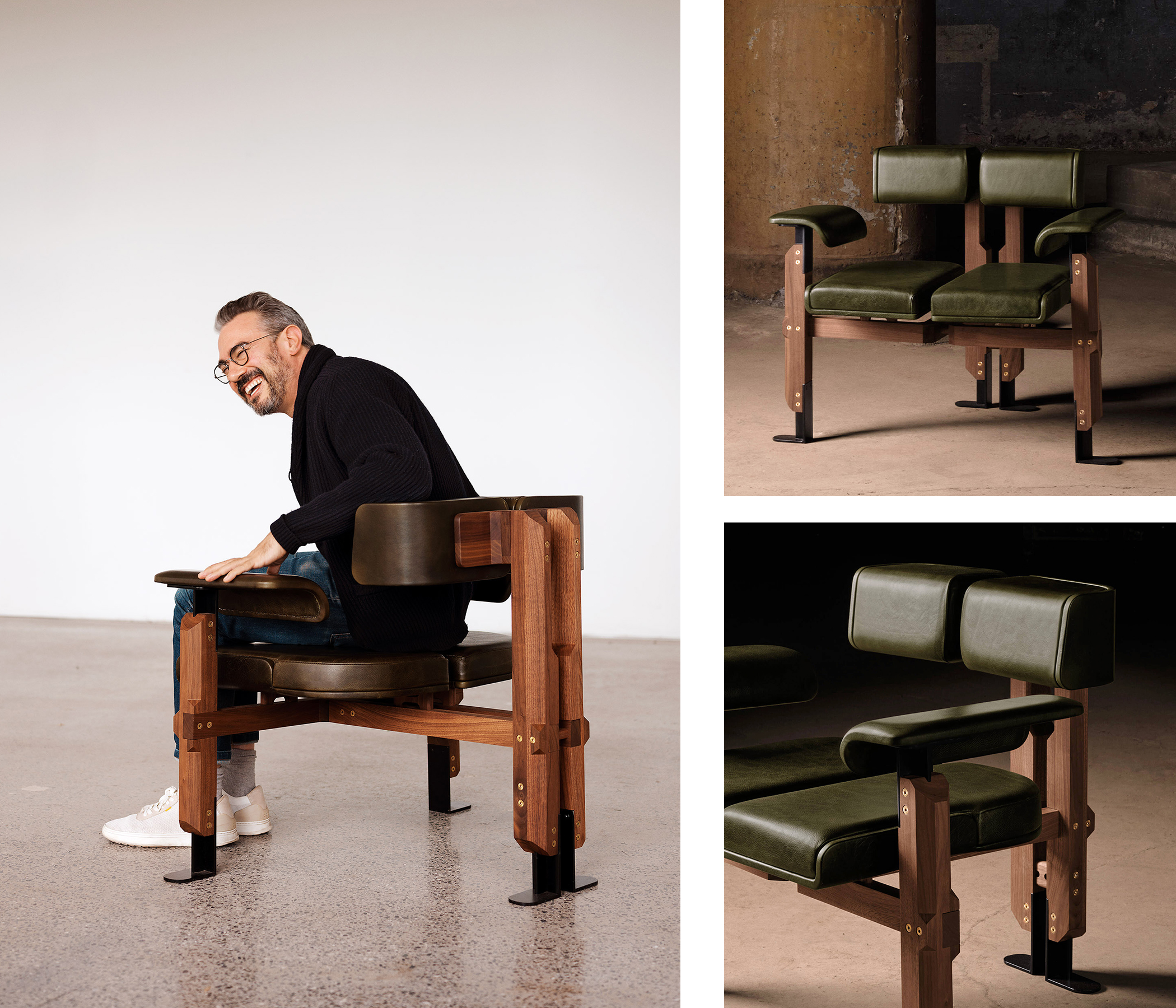
Zébulon Perron’s interior designs are informed by a range of references from his life. Spineless Chair (above) for instance, is inspired by Italian architect Carlo Scarpa’s Brion Tomb. Photos on the right are courtesy of Perron.
Perron divided the layout into two volumes. Visitors arrive in a classic lobby bar. A velvet banquette snakes around structural columns, punctuated by marble pedestal tables and plush ottomans meant to be easily reconfigurable. The palette is light, bright, and effervescent. But just behind the monumental circular green marble bar is a ramp that leads up to “an enchanted forest.” A mural of shadowy foliage lines the low, curved walls and ceiling, creating an intimate speakeasy vibe. “We wanted to make sure we had a varied approach,” Perron explains of the decision to break up the lounge into two separate zones. “We never want one of our projects to ever feel monotonous.”
In 2018, Perron, alongside fellow Canadian designers Samuel Lambert of Lambert & Fils and Quinlan Osborne of Claste Collection, founded the Canadian Creators Collective to promote Canadian design talent abroad. An exhibition titled Fictions featuring eight Montreal-based designers was planned for the 2020 Salone del Mobile in Milan. Though the original iteration was cancelled due to the pandemic, a digital version was live-streamed globally from Montreal last spring. For the exhibition, Perron designed a wood and leather armchair inspired by a trip to Italy to visit Carlo Scarpa’s masterpiece Brion Tomb. Seemingly split into two halves down the middle, the Italian joinery incorporated brass studs that echo similar details inlaid in concrete at the Veneto mausoleum. At first glance, one would never consider a remote Italian burial place by a long-dead architect as its aesthetic forbearer, but it’s exactly this unconventional use of a broad range of references that makes Perron’s objects and interiors so impactful.
“Our privilege as furniture, object, or interior designers is that we are working at the scale where we are closest to people. People touch what we do, they’re immersed in what we do. I really love this scale because this is where I can control the experience the most.”
Perron has always believed that we can be genuinely affected by the spaces we inhabit. “Interior design and similar disciplines are always considered less prestigious when compared to architecture and urban design. I’m often invited to do crits at design schools, and one thing that I often tell the students is that, actually, our privilege as furniture, object, or interior designers is that we are working at the scale where we are closest to people. People touch what we do, they’re immersed in what we do, and what I realize is that I really, really love this scale because this is where I can control the experience the most.”
An anecdote to sum up his approach: I once posted an offhand Instagram story about a restaurant I was having lunch at near where I live in Milan. As it was an inherently disposable medium, I had barely thought about the contents of what I was capturing. But Perron commented, zeroing in on a detail of the design I hadn’t even considered. He liked the way the sightlines into the kitchen lined up with the banquette. Playing the video back, I finally noticed it, too. Yes, I thought, it does look interesting; I was, ultimately, taking a photo of it. It reminded me that how we perceive, move through, and even photograph spaces are such an essential part of the overall atmosphere, and if rendered well enough, we won’t even realize the designer’s hand at all.


