-
Daniel Libeskind.
-
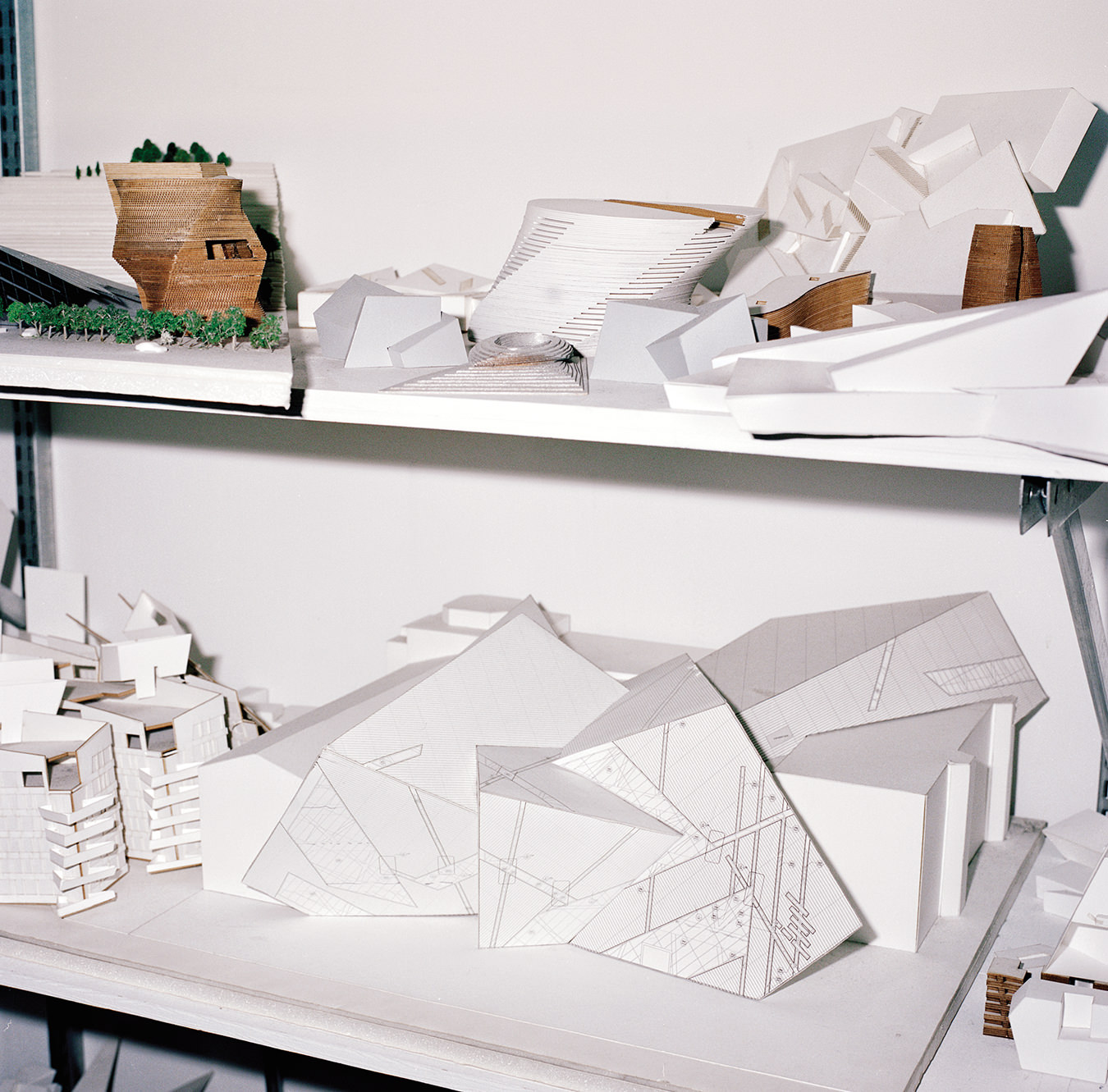
Shelves of architectural models include Toronto’s Royal Ontario Museum, for which Libeskind designed the extension.
-

Libeskind’s desk at Studio Daniel Libeskind in New York.
-
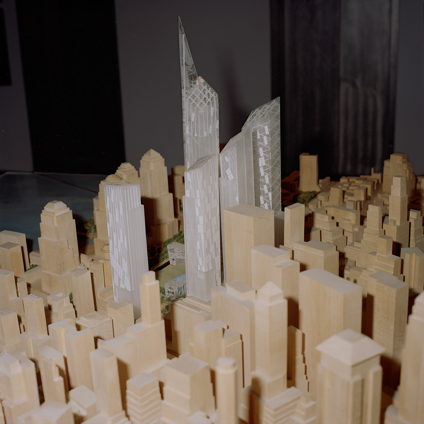
Detail of Memory Foundations, the World Trade Center redevelopment presentation model.
-

Detail of study models in New York Studio.
-
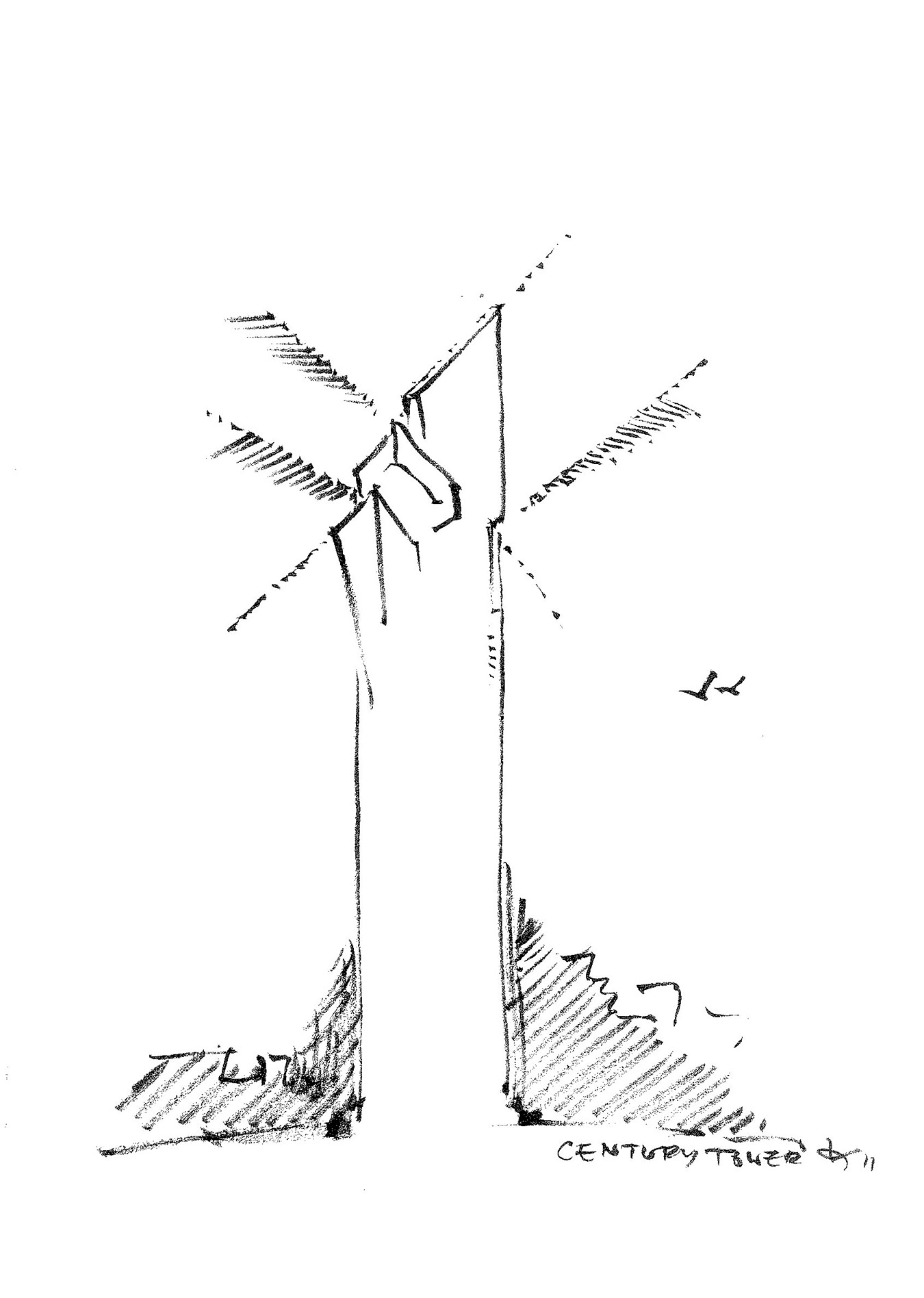
Century Spire concept sketch. Photo ©Daniel Libeskind
-

Century Spire rendering. Photo ©StudioAMD
-

Century Spire rendering. Photo ©StudioAMD
Daniel Libeskind
Drawing a new architecture.
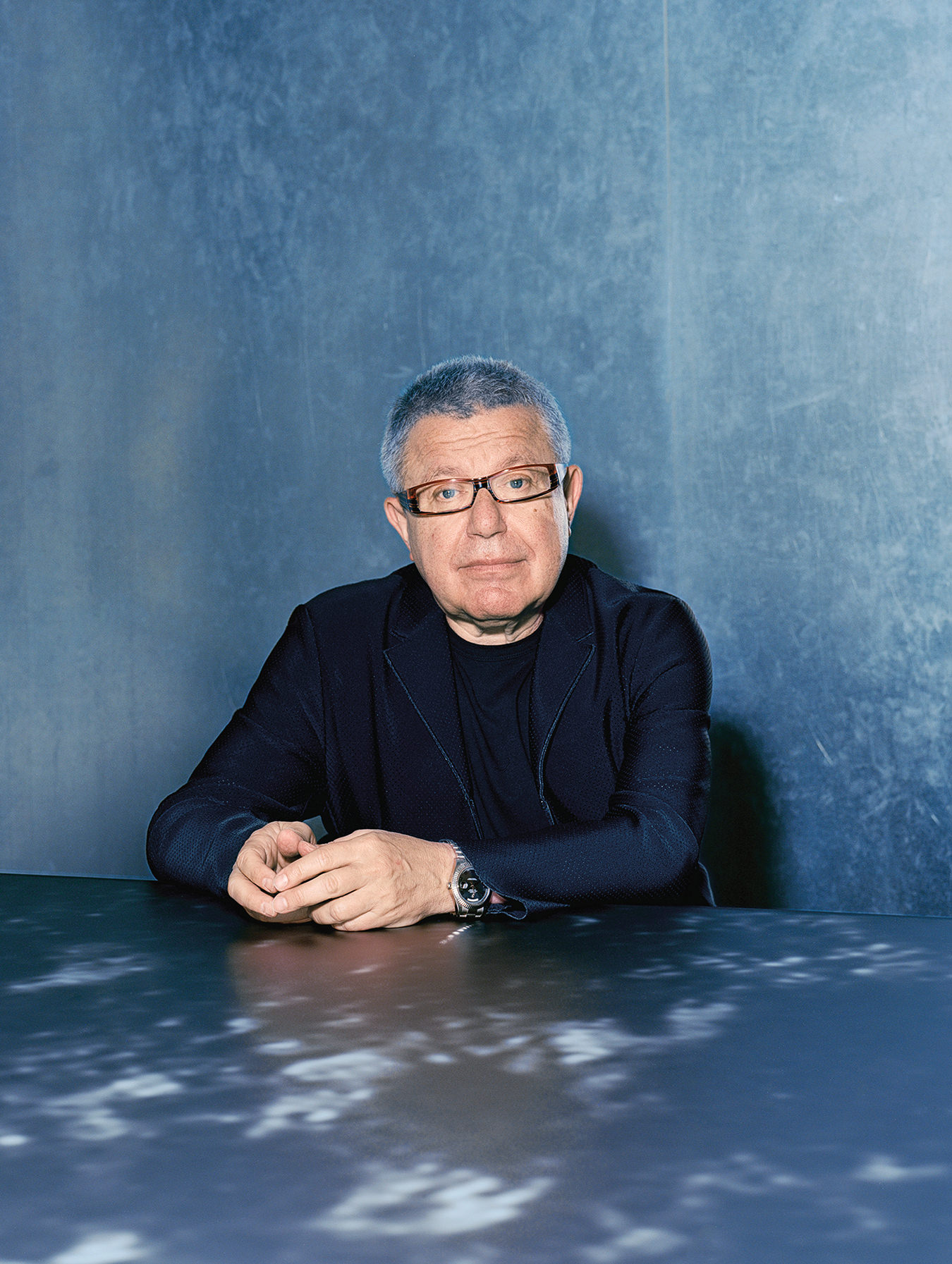
Daniel Libeskind wasn’t even supposed to be in New York. He was supposed to be in Dallas, Texas, for a symposium on urban issues—one of the countless conventions, colloquia, and festivals for which the architect has become a regular ornament over the course of his long career. Only two weeks prior, in early June, he had been in Venice for the city’s Architecture Biennale; before that, it was Manila; the week following, London. But on this very summery mid-June afternoon, Libeskind’s itinerant lifestyle had finally caught up with him, and he was laid low with a strep throat that had him recuperating at home in Manhattan.
“Corb said all you need to do to be an architect is to travel, draw, and read books,” said the designer, referring to the Swiss arch-modernist Le Corbusier. By that standard, Libeskind himself is an architect many times over. In addition to his near-constant globe-trotting, he’s an avid reader, fluent in English and Polish and literate in German and Italian, whose extensive home library (despite a recent cleaning) often lies in vertical stacks around the Tribeca apartment he shares with his wife, Nina. As for drawing, that was the very foundation of Libeskind’s practice when he first broke onto the design scene 36 years ago: his “Micromegas” sketches, begun in 1978, were a complex muddle of lines and forms, images of warped and rent space that confounded audiences at the time. “I thought of them as architectural drawings,” recalls the designer. “Many thought they weren’t.”
It would take over two decades to put paid to the skeptics, but with the completion of Berlin’s Jewish Museum in 1999, Libeskind proved that the radical approach developed in his works on paper could be translated into compelling built structures. “The break came with Berlin,” says Libeskind. The success of that project led to the commission of a lifetime—the master plan for the new World Trade Center in Manhattan—as well as to a host of major commercial and institutional clients. From museums in the Midwest to apartment blocks in Singapore, from a private home in Connecticut to a much-debated extension for the Royal Ontario Museum, Libeskind has expanded his practice into almost every branch of building. Far from being strictly a “paper architect,” he and his 100-person (worldwide) office, Studio Daniel Libeskind, are now one of the most prolific forces in the design world, a sought-after brand on par with such architectural headliners as Frank Gehry and Zaha Hadid.
In Venice, however—amidst the endless bustle of off-site shows, national pavilions, and the buzz surrounding curator Rem Koolhaas’s featured exhibitions—Libeskind had been on hand to unveil something a little different. Or, more accurately, something a little familiar: a new set of drawings. “I don’t think of it as a return, since I’ve always drawn,” explains the designer. “It’s not as if I stopped drawing and then one day woke up and started again.” But besides being his first comprehensive, thematically linked series since the late eighties, “Sonnets in Babylon”—as the new collection is called—is also a departure aesthetically not only from Libeskind’s drawings of 30 years ago, but from any of the high-profile buildings that have emerged from his office in the ensuing decades. If history repeats itself, the “Sonnets” could mark the emergence of a new Libeskind.
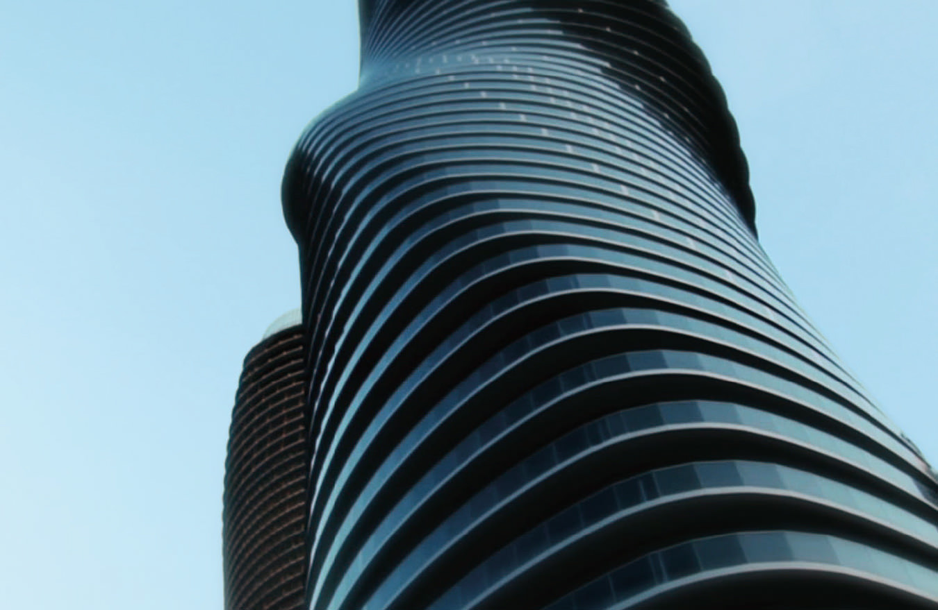
The line connecting the architect’s early abstract sketches (not only the “Micromegas” but the early-eighties “Chamber Works”) to his big-budget buildings is a fairly clear one, and it carries straight through to the firm’s most recent commissions. Libeskind’s stopover in the Philippines, just before the Biennale unveiling, came on the occasion of the groundbreaking for the Century Spire, a new mixed-use high-rise in the capital city’s business-oriented Makati district. A fairly conventional vertical shaft rises for most of the Spire’s 60 storeys—until the very top, when suddenly the form splinters dramatically into three separate square volumes, two of them jutting at odd angles away from the tower. “I wanted to create something that has a different form of impact,” says Libeskind, and in this instance he’s done it using a geometry as striking as it is instantly recognizable: shards, fragments, and voids have long been at the heart of his architectural vocabulary. Especially when seen against the fairly tame Manila skyline, the Spire will read as an emphatic design statement in Libeskind’s distinct handwriting.
The birth of that signature style, as seen through the designer’s early drawings, came at an important moment in the history of contemporary architecture. By the late seventies, mainstream modernism had come to be considered confining, producing nothing but sterile glass boxes; the then-ascendant postmodernist trend, with its cheeky classical references, was entirely alien to Libeskind, who had studied at New York’s Cooper Union for the Advancement of Science and Art under advocates of a more austere and intellectualized architecture, such as the determined outsider (and almost exclusively “paper” designer) John Hejduk. “Hejduk was my protector,” recalls Libeskind—a protector whose renegade instincts sometimes brought him into conflict with the rest of the faculty. Libeskind left Cooper with a high regard for Hejduk’s philosophi-cal approach, but also with a determination to build, and the combination left him somewhat stranded—uncomfortable working in the offices of other architects, but unclear as to what precisely he wanted to do differently. “I was determined to do architecture,” he says. “But I didn’t know when and how.”
Between fellowships and teaching posts abroad, Libeskind was able to patch together the makings of a career through the seventies and eighties, largely through the good offices of his wife, without whom, he says, he may not have made it through those lean years. “I always say up front that I would never do what I do if she wasn’t my collaborator,” says Libeskind. The two met, when Nina was 17 and Libeskind was 20, at a summer retreat in upstate New York for the children of Holocaust survivors. Libeskind’s mother and father had narrowly escaped death in the Soviet camps during the war, before returning to Poland and having their son; they next went to Israel, but eventually moved to the Bronx with then 13-year-old Daniel in 1959. Nina’s parents had immigrated to Canada before the war, but Nina had come with a friend whose parents had been in the camps. In a relationship now lasting nearly half a century, Nina has alternately supported and reined in her architect husband, acting as a check to his aggressive nonconformism. “When she first started working with me, I was nervous because she didn’t appreciate the drawings or what I liked,” says the architect. But it was precisely her non-architectural perspective that would prove valuable. “‘Why is this good?’ she’d say. We’d have a lot of fights, but in the end I sometimes decided she was right.”
Libeskind’s World Trade Center commission was one of many to which the architect brought a psychic charge. It had been a long time since architecture was believed capable of this kind of symbolic content; Libeskind was the one who brought it back.
Bringing Libeskind’s creative impulses into focus certainly helped sharpen his thinking as to how his vexed, intricate drawings could be made real. But Nina’s influence goes further still. “Her background was straight politics,” says the designer. “She understands things that I don’t.” The 12-year process of making his proposal for the Jewish Museum a reality, through political twists and turns that included the fall of the Berlin Wall, was perhaps only possible through Nina’s adroit political handling; she was an even greater asset during the fraught competition for Ground Zero and its long aftermath. That project, still very much under construction just blocks from Libeskind’s office in the financial district, has proceeded under unprecedented public scrutiny, requiring the studio to work in harmony with a host of other designers and countless bureaucrats and contractors. “You have to have a scheme that can garner consensus and that can be built and guided and developed,” says Libeskind—a far cry from the quiet, lonely work of drawing, sitting alone in his apartment or (as in the old days) in one room of the house while Nina looked after their now-grown children in another.
But whether in Berlin, Manhattan, or Manila, the link between the solo creative work and Libeskind’s public buildings is essential. Today, the designer claims his artistic work was and remains entirely unpremeditated—“All my drawings sort of arrive in my mind,” he says—and, indeed, the massed forms, wandering lines, and piled-up flotsam and jetsam of the “Micromegas” may just have been the musings of an underemployed architect still waiting for the big clients to come knocking. But the drawings also seemed to express something essential about the world as it transitioned from the 20th century to the 21st: a sense that the time was out of joint, that history itself was breaking up. The triumph of the Jewish Museum, and to no small extent the reason that Libeskind won the commission for the new World Trade Center, lay in his ability to bring a similar psychic charge to the buildings. In Berlin (as Libeskind himself explained to an incredulous German politician questioning the design), the front of the museum “has no door,” only an underground entrance that forces visitors to undergo an emotionally powerful progress from darkness to enlightenment. At Ground Zero, the tall buildings are ringed around the central void of the former Twin Towers site, evoking a feeling of absence and of community. It had been a long time since architecture was believed capable of this kind of symbolic content; Libeskind was the one who brought it back.
The fact that the architect has continued using the same manoeuvres—the same sharp angles, the same irregular shapes—throughout his burgeoning oeuvre has attracted a certain amount of criticism. A shopping mall is, after all, rather a different kind of a place than a museum to a near-vanished ethnic group, and even an institutional project like the Royal Ontario Museum has faced charges of being little more than a branding exercise, with Libeskind’s brash aesthetic commodified and used as a PR tactic. Certainly Libeskind’s trademark approach has proven altogether more adaptable (not to say more marketable) than any of his early skeptics might have believed. Robbie Antonio is managing director of Century Properties, the company behind the Makati Spire, and he has a keen eye for architectural talent, having recently commissioned a home from Rem Koolhaas. “We wanted to work with Daniel—it was a real aspiration for us,” says Antonio. For him, and for developers like him, a Libeskind project is a major feather in the corporate cap, a selling point especially in a city like Manila where global “starchitects” have yet to make an impact. Just recently, it was announced that Libeskind had been awarded the commission for the National Holocaust Monument in Ottawa—a high-profile, $8.5-million monument designed to take on the angular shapes of the Star of David—that is a joint venture with photographer Edward Burtynsky. Indeed, Libeskind plainly relishes being first on the scene, and the challenges that come with that. But the realities of keeping up with a construction schedule, running an office, and appearing on panels in Milan with the likes of Marina Abramović can all be an impediment to developing as a designer. “Architecture has to change,” Libeskind maintains. “My architecture is changing.”
If Libeskind’s architecture is indeed to change and to grow, the time he’s set aside to produce “Sonnets in Babylon” may be crucial to that growth. As he stood in front of the new drawings in the Venice Pavilion at the Giardini della Biennale, the blown-up images arranged in backlit panels along the length of a curving wall, it was almost difficult to believe that the work was Libeskind’s. The free-floating objects of the “Sonnets” are more organic, more body-like than anything he’s done before. Sometimes they look like the sort of bio-machinery that might turn up in a David Cronenberg film; sometimes they look like the corporeal disjecta membra of a violent explosion. Each is accompanied by a gnomic title—“Before a Pylon: Wait,” “Three Real Denizens of the Deep”—that only compounds its mystery. What do they mean, and what do they portend for his future work? “I don’t really have an answer,” says Libeskind.
“I know these drawings have other spatial possibilities, and I’m now working on a couple of things that predate them but move on a similar trajectory,” he continues. “Drawing is something that leads you on—the drawing knows more than you do, in many ways.” It’s rare enough, in our increasingly computerized age, for a designer to remain invested in drawing at all, and that alone sets Libeskind apart. But what the new drawings suggest, provocatively, is that this architect may yet have another trick up his sleeve: a move away from the gestural, iconic work that’s come to dominate the field, toward something far stranger, more poetic. Not that Libeskind knows just when or how these drawings will percolate into his work. Along with his audience, he’s adopted a wait-and-see approach. “It takes an incubation period,” he says. “Today, architects are very busy. But it’s good to be patient.”

