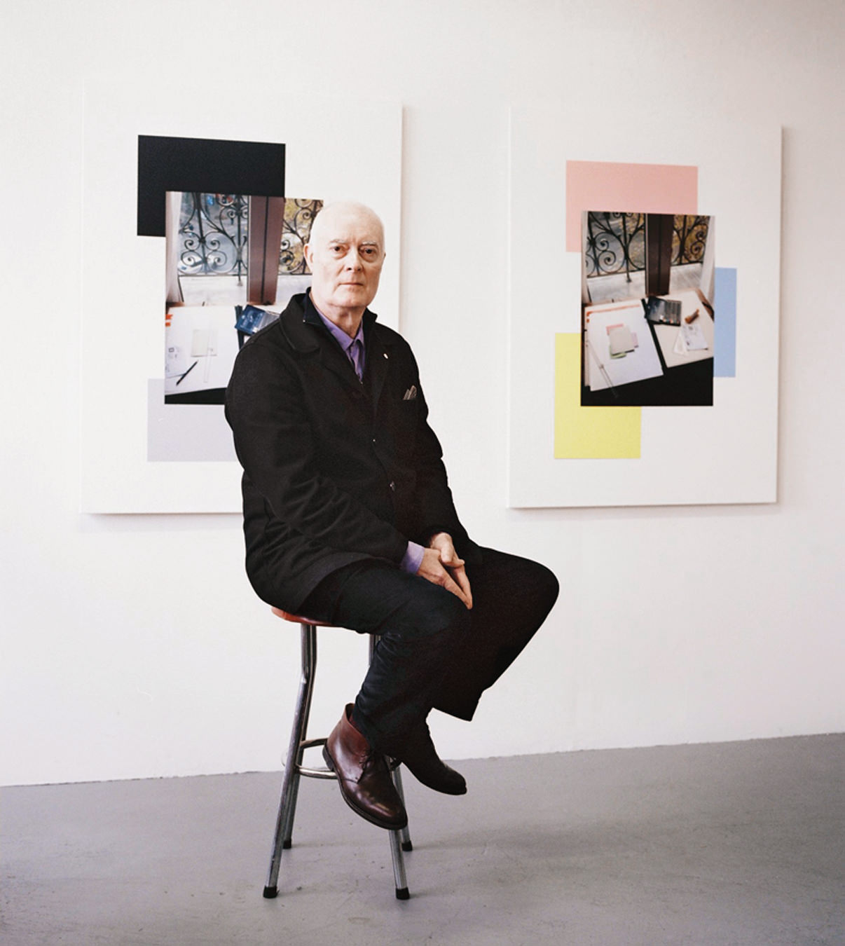
Artist Liam Gillick
Up in the air.
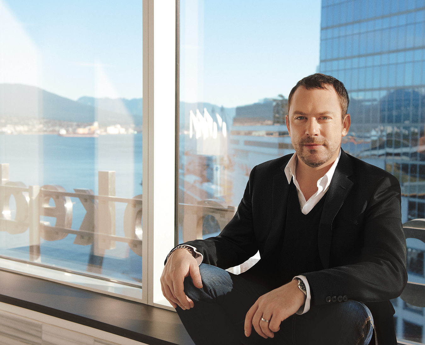
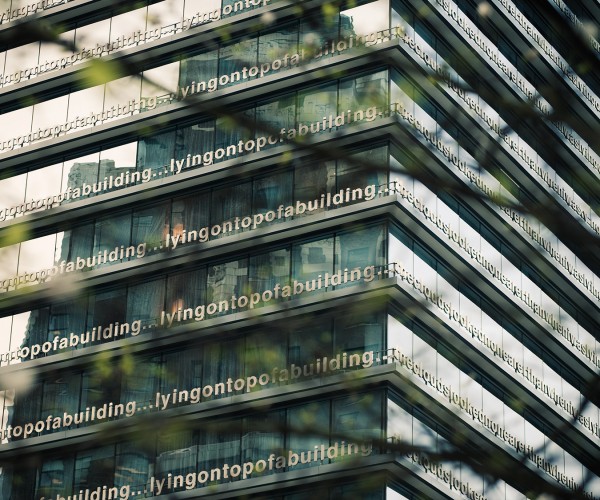
Some weeks before the opening of the new Fairmont Pacific Rim, two people happened to be standing on the sidewalk, looking up at the façade. Wrapped around a corner of the downtown Vancouver skyscraper are letters forming a long sentence that’s repeated on floors five to 22 of the 48-storey structure: “lying on top of a building the clouds looked no nearer than when i was lying on the street.”
Down on the sidewalk, one bystander turned to the other. “Looks pretty cool, eh?” she said.
The man shrugged. “Um, sure. I guess so,” he mumbled. “It’s okay.”
“What could I do?” Liam Gillick says later. “I didn’t want to be an asshole.”
That anonymous woman can be forgiven for putting Gillick in an awkward situation. She could hardly have known that the guy hanging around the sidewalk that day was responsible for the artistic flourish they were both admiring. Still, as they say back in his old London stomping grounds, Gillick was well chuffed. “It was nice, yeah,” he says, grinning.
Gillick’s enigmatic work has been lifting gazes at the corner of Burrard and Cordova for months now. And as the story suggests, he is perfectly happy to let those eyes stay on the work while he quietly sneaks off for a cigarette. He may have been a former classmate of determined art-world super-celebrity Damien Hirst, but the two men obviously learned different lessons about personal brand management. “It’s a different thing than what I was interested in,” Gillick says.
After being selected by Fairmont Pacific Rim’s search committee, Gillick decided on the nature of his installation shortly after his first visit to Vancouver. “It’s a very striking city. The idea of using the text came to me within an hour of being here.”
The Fairmont Pacific Rim is something of a statement itself. At over 800,000 square feet, the hotel/condo development is one of the city’s largest. It’s yet another design from architect James Cheng, already reigning champion of downtown Vancouver courtesy of the Shaw Tower and the even-more-towering Shangri-La.
Gillick worked with Cheng and his team, and found them almost frighteningly cooperative. “I got the impression if I’d said, ‘Let’s turn the building upside down,’ they might have said ‘Sure,’ ” he says.
Gillick may not have turned the Fairmont Pacific Rim on its head, but he nonetheless feels his work might subtly undermine its foundations. “There’s something about the text that is a little bit resigned, melancholy, and also a little bit critical,” he says. “Saying that no matter how high you make the building, the sky is no nearer than when you’re lying on the street—to me that’s a kind of politics. It’s about forms of address. Who is speaking to whom? Is that me saying that? Is it some guy in a bar? Or is it the corporation saying it because they’re going to build it twice as high next time?”
“There’s this feeling of wanting to work in a more public space, but not necessarily while everyone’s staring at me.”
Liam Gillick was born in a London suburb in 1964. His Irish grandfather was a coal miner. “It sounds more romantic than it should. It’s actually a well-paid job,” says Gillick.
“Growing up with an Irish Catholic name, I was never bullied in school. I always thought it was my natural charm, but I realize now they were worried about having their knees blown off.”
Despite early dreams of becoming a crusading lawyer, Gillick took a detour into the art world, enrolling at Goldsmiths’ College in London in 1984. Gillick and his schoolmates shared a dream. “The decision we all made as students,” he says now, “is that we were going to leave art school and become artists.”
It’s not quite as obvious as it sounds. The most famous products of British art schools have always tended to be rock stars. The Rolling Stones, Pink Floyd, Roxy Music, and numerous other pop music giants emerged from the art-school scene. (Gillick’s own classmates included “half of Blur,” he says.) It was a reflection of the fact that, rather than fostering future artists, British art schools had long been the catch basin for creative misfits not cut out for the usual upper-crust professions. “You’d see some of these people like Jagger and Ferry—they used to turn up at our openings and take an interest,” Gillick recalls. “There was no way for them to continue their art-work—they would help make it possible for us to stick it through.”
He has realized his ambition of an art career. But the path of the modern professional artist is not a straightforward one. Some of his ideas for public art have been developed thanks to the luxury of near-certain failure. “I spent three or four years in the late nineties/early 2000s doing speculative projects [along with other work],” he recalls. “They’d pay you a little fee for an idea. And you knew you were never going to get [the commission], because it would go to the local artist from Mönchengladbach or wherever. But you could spend your time thinking about this real place that was not a gallery and not a museum. It was a kind of school. It was a way of avoiding that big problem artists have—I am often trying to avoid the feeling that there’s a direct relationship between what I do and being paid. It gets in the way.
“The big problem for me,” he admits, “was when someone would turn around and say, ‘Okay let’s do it.’ And I’d think, ‘Oh shit!’ That’s when the stress starts, and the anxiety. I’m much more interested in pre-production and post-production than in actually doing the thing.”
These accidents do happen. Self-effacement notwithstanding, they have happened for Gillick with some frequency. One prominent example is the new Home Office in London’s Marsham Street, headquarters of British bureaucracy. “That became an incredible learning process, working very closely with an architect [Sir Terry Farrell] for three years who wasn’t that interested in contemporary art,” he says. “By the end of it, we had almost swapped roles, where he would have a lot of conceptual ideas and I’d be the one saying, ‘No, no, we need to look at the way the structure is functioning and the way we’re sending the stress down the pillars.’ ”
His collaboration with Farrell, completed in 2005, resulted in the look of the building, including a multi-coloured glass canopy and a giant entrance screen made up of geometric designs, providing extra visual impact to Farrell’s low-rise modernist design. No one looking at the building would be likely to identify Gillick’s contribution as a separate artwork, which is exactly the way Gillick wants it. “I have to find a way to make these things normal,” he says. “Not like a big event, not like a groundbreaking object. Increasingly in the modern age, art has become someone to look at. That’s quite a recent phenomenon. Usually art was a backdrop for another activity—praying, or thinking, or admiring someone’s grandparents, or even trying to understand a war or a battle.
“It’s very different from the Anish Kapoor artwork in Chicago [Cloud Gate, a.k.a. the Bean, a mirror-like stainless steel sculpture in the city’s Millennium Park], where you’ve got this big centrepiece, and people go to it and get photographed with it, and it becomes a marker. I’m very interested in what you might call the ‘disinterested viewer’. I want to make work that is a backdrop to daily life.”
So then, how about the big blue raindrop created by Berlin-based artist group Inges Idee for the plaza of the new Vancouver Convention Centre? “Well, I think you need these things in combination,” Gillick avers. “I would never speak badly about a big raindrop.”
He is willing to offer an opinion on the hot local issue of government arts funding. Although this particular project is corporate, Gillick believes government support of all the arts is crucial. “You can’t rely on private corporations to do it. It’s really easy populist politics to cut back on arts.”
Liam Gillick may be hype-averse, but developers and architects who commission such projects like to get attention for them. The unveiling of the new Fairmont Pacific Rim façade featured the expected reception, press releases, and news cameras. Gillick knows it’s part of the job. But still. “I was one of these people in school, if the teacher asked me, ‘What’s two plus two?’, my mind was blank. So there’s this feeling of wanting to work in a more public space, but not necessarily while everyone’s staring at me.”
It’s not all bad, though. The Fairmont people have not overtaxed him, and there have been local delights. “Ian Wallace came to the reception, and I’m a big fan,” Gillick says. “He’s someone who has influenced my work. That’s part of why you do it.”
Gillick was not present for the actual installation of the steel letters. “Once I had established a relationship with the people doing it—it was done [assembled] in B.C.—once it was clear they understood how to execute the idea, I wanted to leave them alone,” he says. “The last thing they need is for me to turn into that teacher who stands there and asks, ‘What’s two plus two?’ They need to find their own way to achieve what needs to be done.”
Besides, Gillick believes it’s best if he stays away. “I’ll compromise before anyone else,” he insists. “There’s this stereotype of artists as free and uncompromising. But when they ask me, ‘What should we do?’ I’ll be the one who says, ‘Well, let’s make it half the size, or use cardboard.’
“My component is part of the building. It’s not unique or special. They need to take care with the bathrooms and take care with the artwork. It all needs to be executed properly.”
Gillick describes his obsession as “the semiotics of the built world. Which sounds kind of pretentious,” he admits. “A good example is the column I used to write for an Australian magazine. [The column] was called ‘Lobby’. I meant it in the political sense of lobbying, and also the idea of the lobby as the place where the corporation rebrands their identity or tries to make a kind of interface. I was always wanting to hang out in the foyer of the National Theatre or a big insurance company.”
The Fairmont Pacific Rim project—a lyrical phrase constructed from stainless steel and wrapped around a skyscraper—seems to represent an odd juncture of poetry, visual art, and architecture. It reflects the man. Gillick’s art practice incorporates many forms, including writing, installations, architectural collaborations, and music. He has also published an extensive body of critical writing on other art. So planning for this project was not just a matter of writing a catchy phrase. “I’m actually drawing the building with the text on it,” he explains. “I’m not just drawing the text. I spent a lot of time looking at the plans for the building and working with 3-D modelling.”
Since the mid-nineties, Gillick has been based in New York with his wife, artist Sarah Morris, and their seven-year-old son (“who has somehow developed a New York accent, even though neither of us has one”). His body of work marks him as one of the most successful young artists of his generation. And yet Gillick’s desire to create works that will become a seamless part of everyday life rather than stand-alone objects has perhaps resulted in a lower profile, certainly when compared to his most famous classmate.
Damien Hirst is the most notorious of the 1980s Goldsmiths’ alumni group, and Gillick says it was not by accident. “He always wanted to be famous, and worked very hard at it. And it worked. It’s very Oprah Winfrey. He works his nuts off because he wanted to be like that. What’s fascinating is that almost every idea that he’s done, he spoke about in art school 20 years ago. And he’s been doing them ever since. It’s something, to have that degree of self-possession.” Considering Gillick’s aversion to hype, his own work also seems to flow naturally from his personality. He can even cite a theory about this. “Barbara Kruger, a very interesting American artist, wrote an article saying that all male artists are either creeps or assholes. And I think he’s an asshole and I’m a creep,” Gillick says with a grin. “We represent the two edges of the Goldsmiths’ years.”
As he said after encountering that stranger on a Vancouver sidewalk, Gillick doesn’t want to be an asshole. He just hopes you might look up once in awhile, near the corner of Burrard and Cordova, and say, “Wow—that looks pretty cool.”
Grooming by Tamar Ouziel, Tresemmé Hair Care, for JudyInc.com.

