Milan’s Playful Hair Salon Awash in Pastel
Valencia-based design firm Masquespacio designs a multi-faceted hair salon in Milan using a pastel colour palette.
Masquespacio, established in 2010 by Ana Milena Hernández Palacios and Christophe Penasse, also created the first We Are Emma location, in Milan’s Brera neighbourhood, for which they chose a slightly wider colour palette of lilac, pale yellow, cream, and grey that embodied the brand’s ethos.
Honing the palette of the original, “In the second, we used yellow and pink, which we think create a strong contrast with each other and clearly divide the space in the retail and service area,” Penasse explains.
While the architects wanted the space to feel welcoming to all, they took a more feminine design approach, with soft pastel colours and curving walls and furniture. “At the same time, we wanted the design to have some elements to stand out, especially through organic forms like with the arches and the service stations,” Penasse says.
The client already had a lot of trust in Masquespacio from the first project, and the most important thing for them was that the design smoothly blended the retail, bar, and hairstyling components into one space that caught the eye of the customer. In creating the design, Masquespacio wanted to embrace the playful and joyful spirit of the brand, using vibrant colours and curving organic shapes. Though they had to simplify the materials and some of the curved elements due to high construction costs, the designers created a contemporary salon with a heavy dose of playful whimsy.
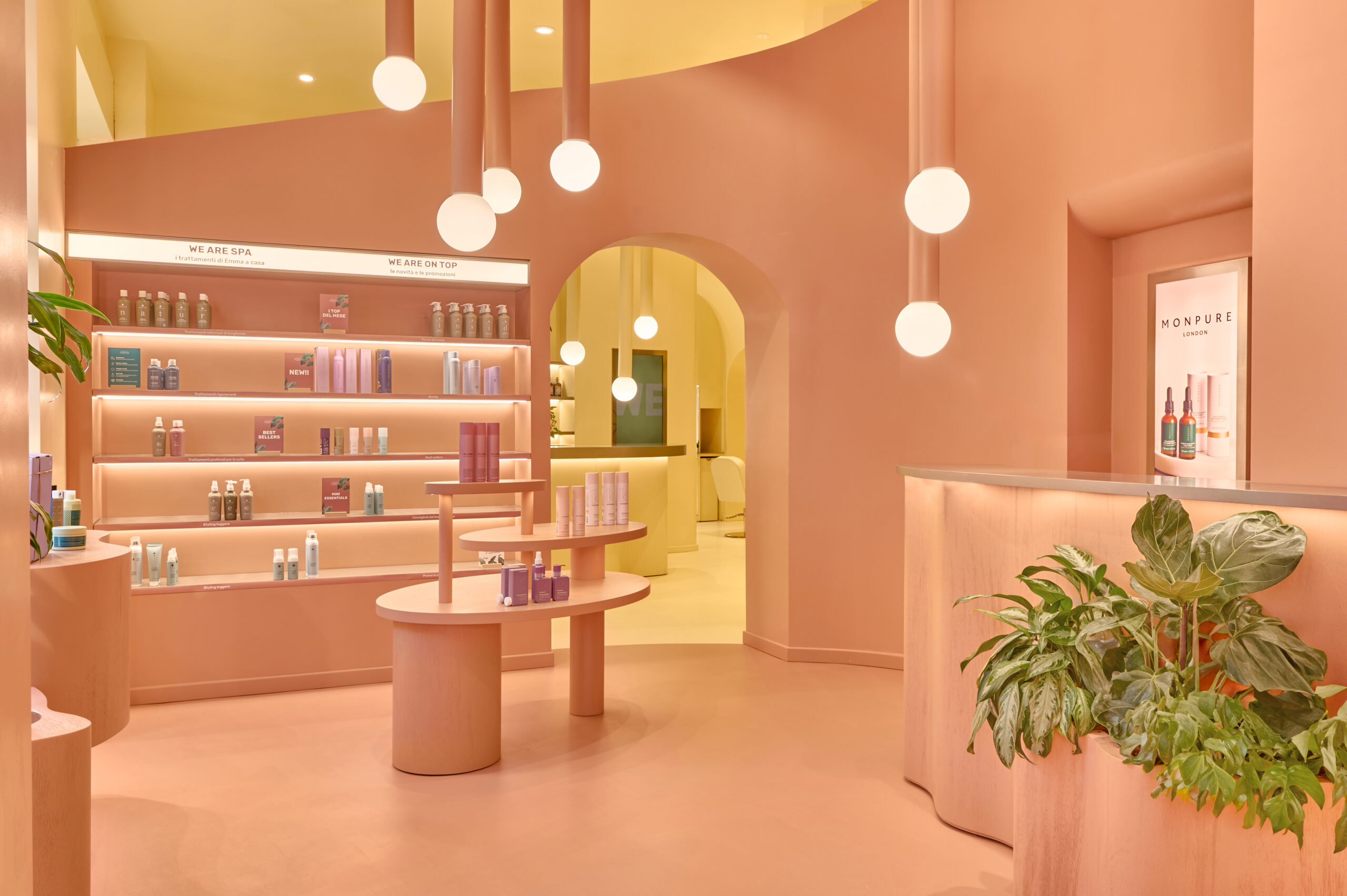
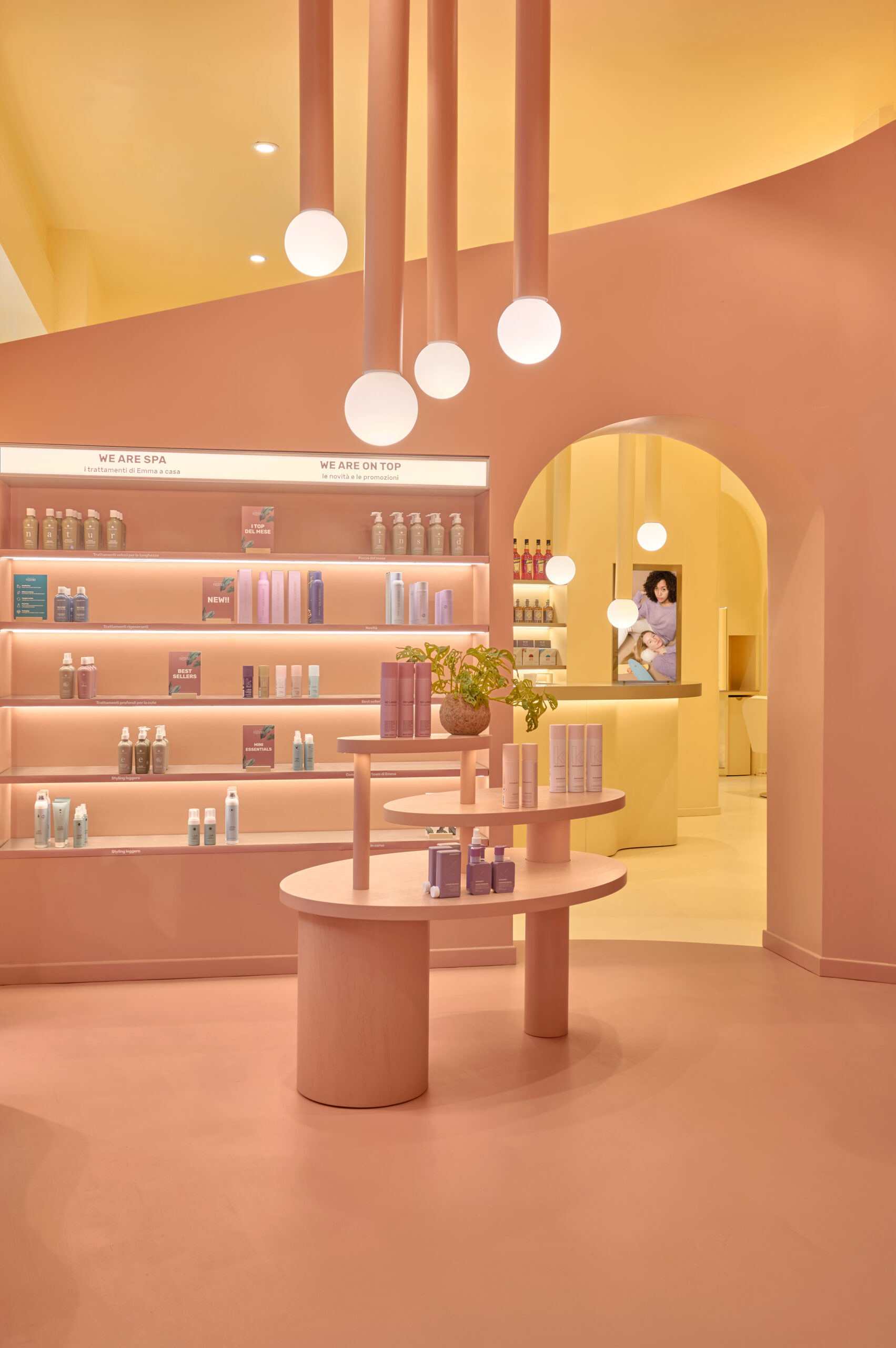
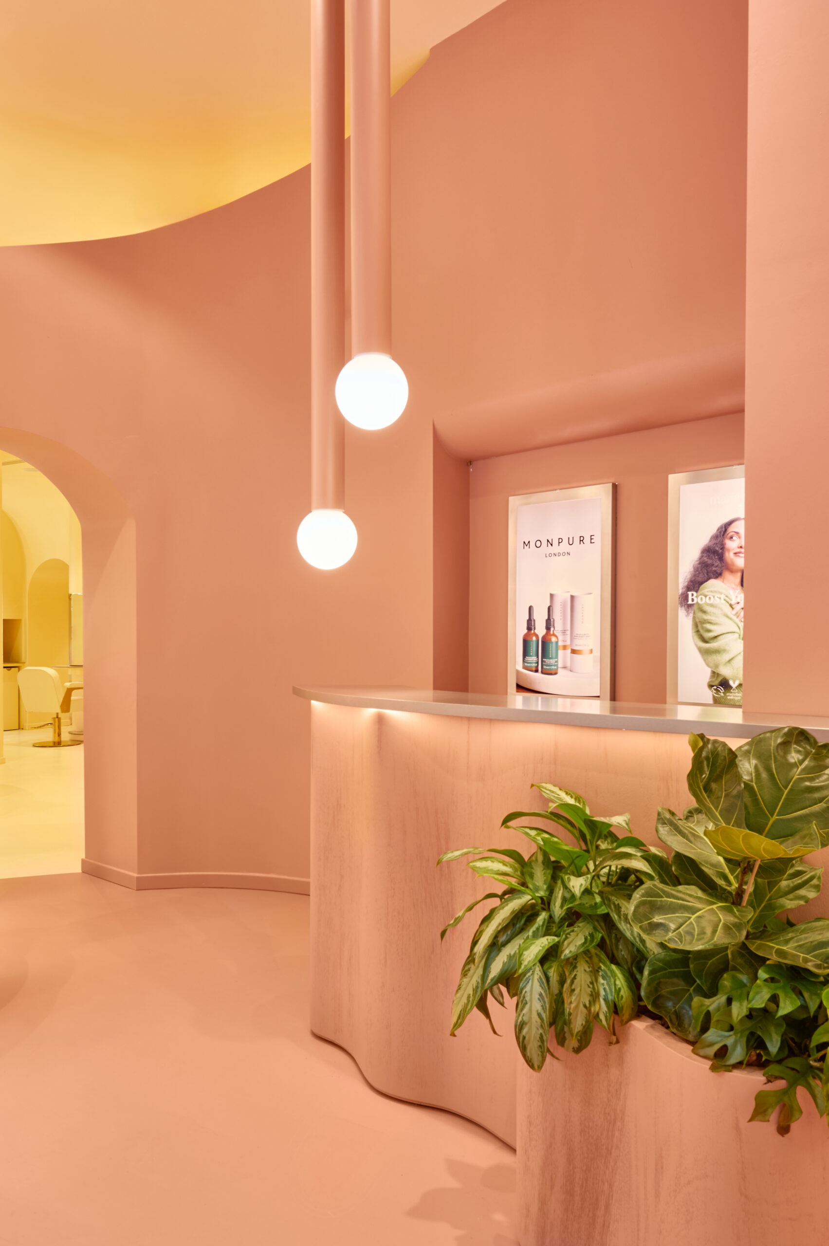
Visitors enter We Are Emma in a world of pink—the retail section of the space in the front features salmon-coloured flooring, walls, and furniture. “It was important for the client to have communication points,” Penasse says. “That’s why you can recognize screens, but also different signage elements in the retail area.”


Oval multi-tiered display and squiggly-shaped podiums dot the perimeter and centre of the curved space, while backlit built-in shelves against the back wall show off even more products. A wavy planter abuts a matching counter, and large rods in the same salmon colour hang from the ceiling, ending in large round bulbs that illuminate the room.
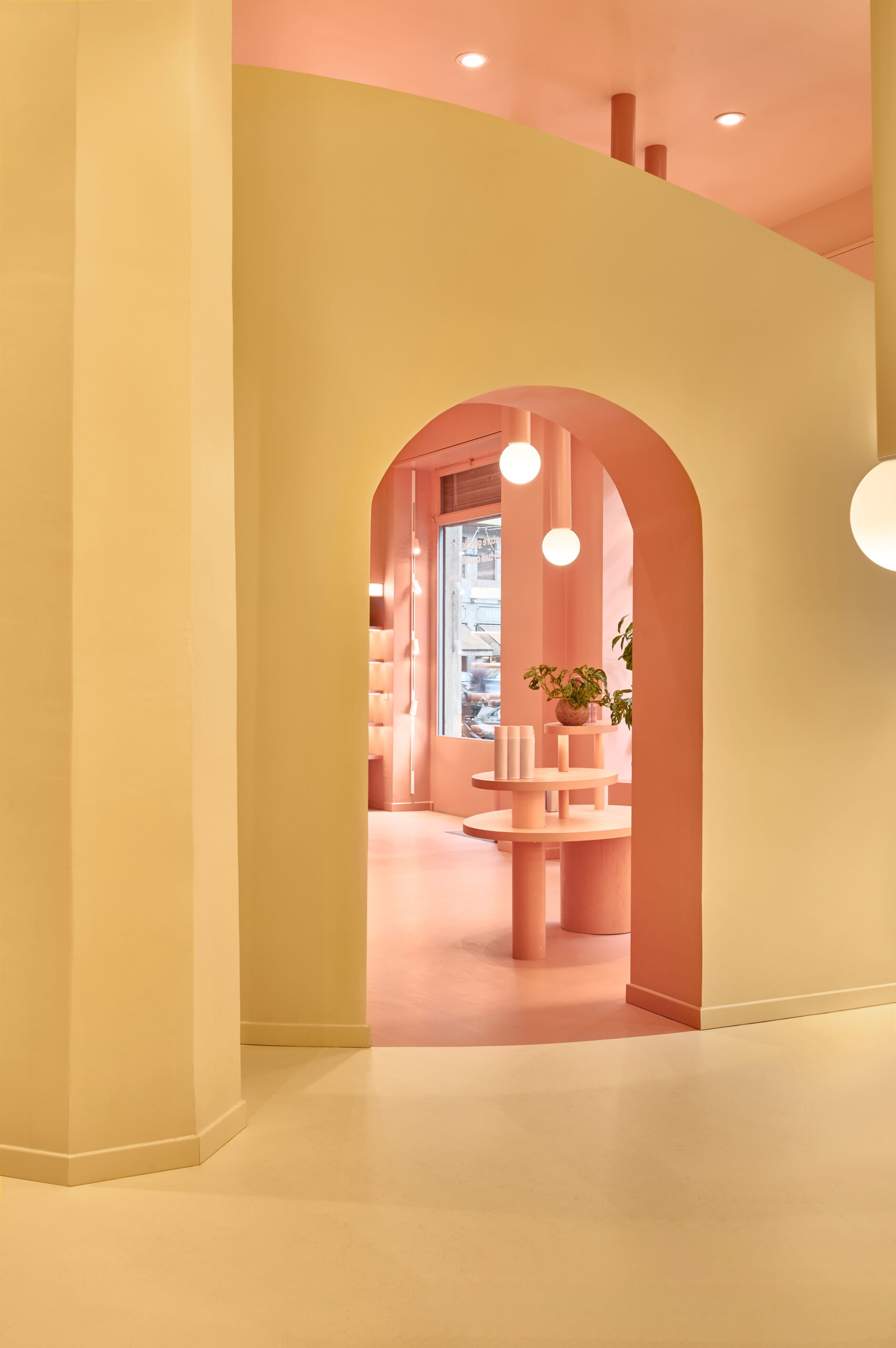
An arched doorway leads visitors into the next area, which has high ceilings, this time awash in a pale creamy yellow. The bar grabs attention first—the same squiggled footprint as the counter and matching rod pendants from the retail room offer continuity as you move through the salon, while the unexpected yellow colour change adds contrast. While some salon treatments include a drink, anyone is welcome to stop in and imbibe.
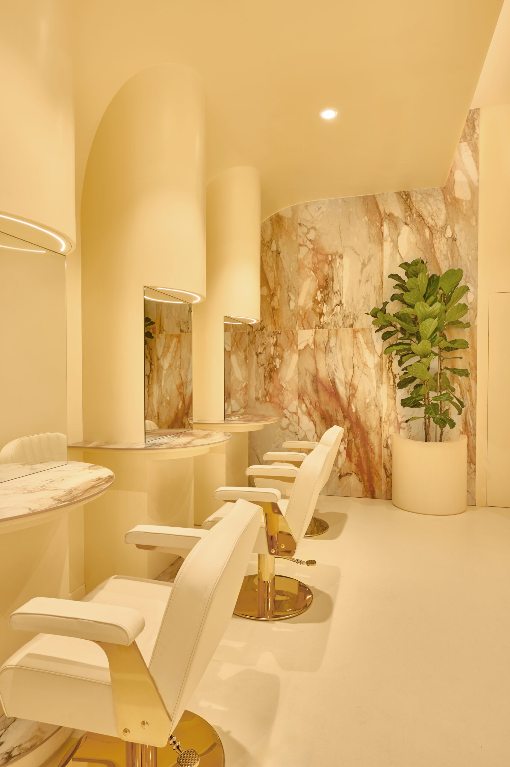
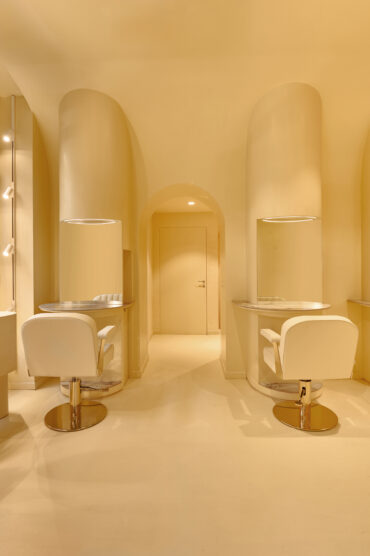
Past the bar, a line of cushy retro cream salon chairs with golden bases face the wall with individual mirrors and lighting. Cut-outs behind each mirror conceal storage. Brown-and-grey-veined marble on one wall and on the counters and kick panels before each salon chair, fold elegance into the playfulness of the pale yellow. A few steps away, a serene washing area by the windows has three reclining chairs, each wrapped in low walls for a bit more privacy.
Though each of the salon’s offerings—retail, drinking, styling, and washing—carves out its own space, they flow easily between one another, encouraging a peaceful, playful, and multifaceted journey through We Are Emma.
Photography by Luis Beltran.