Design Space: Billie Le Kid by Vives St-Laurent
The contemporary design of a Montreal children’s boutique.
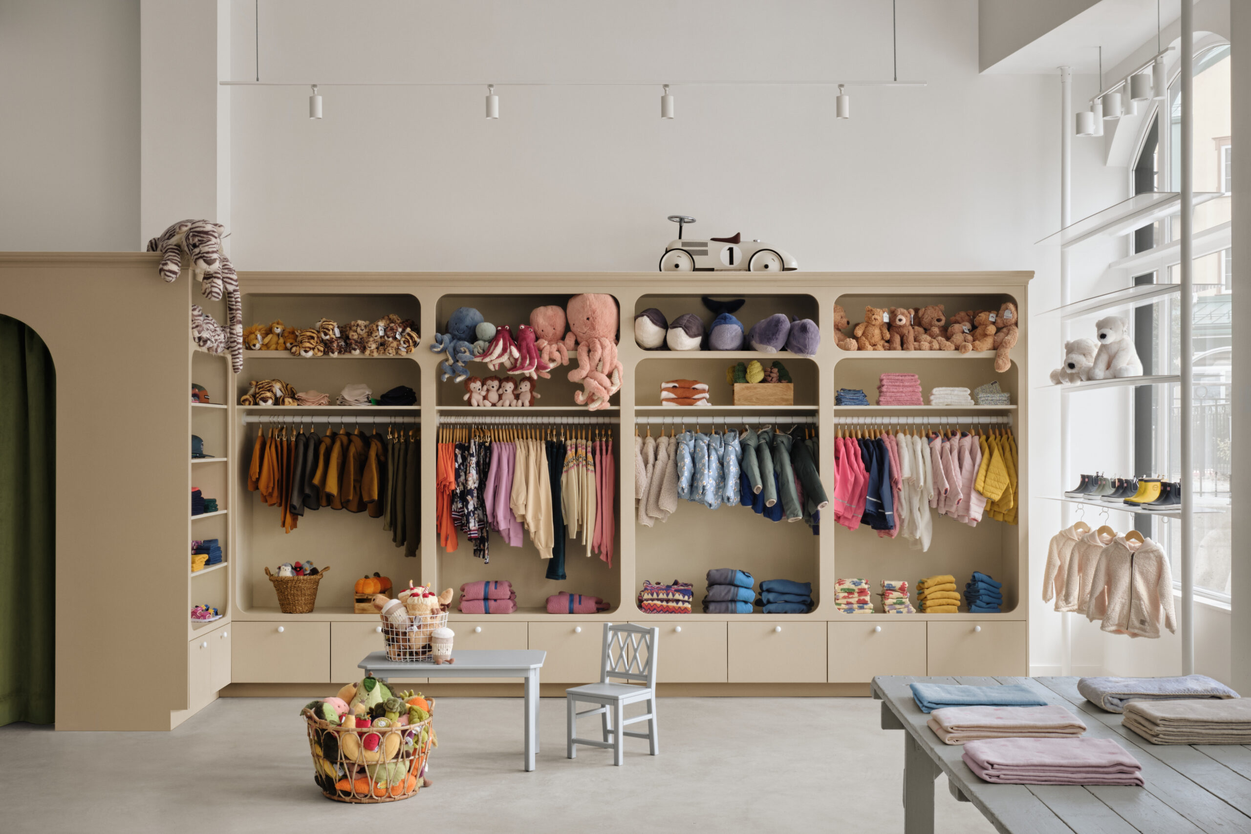
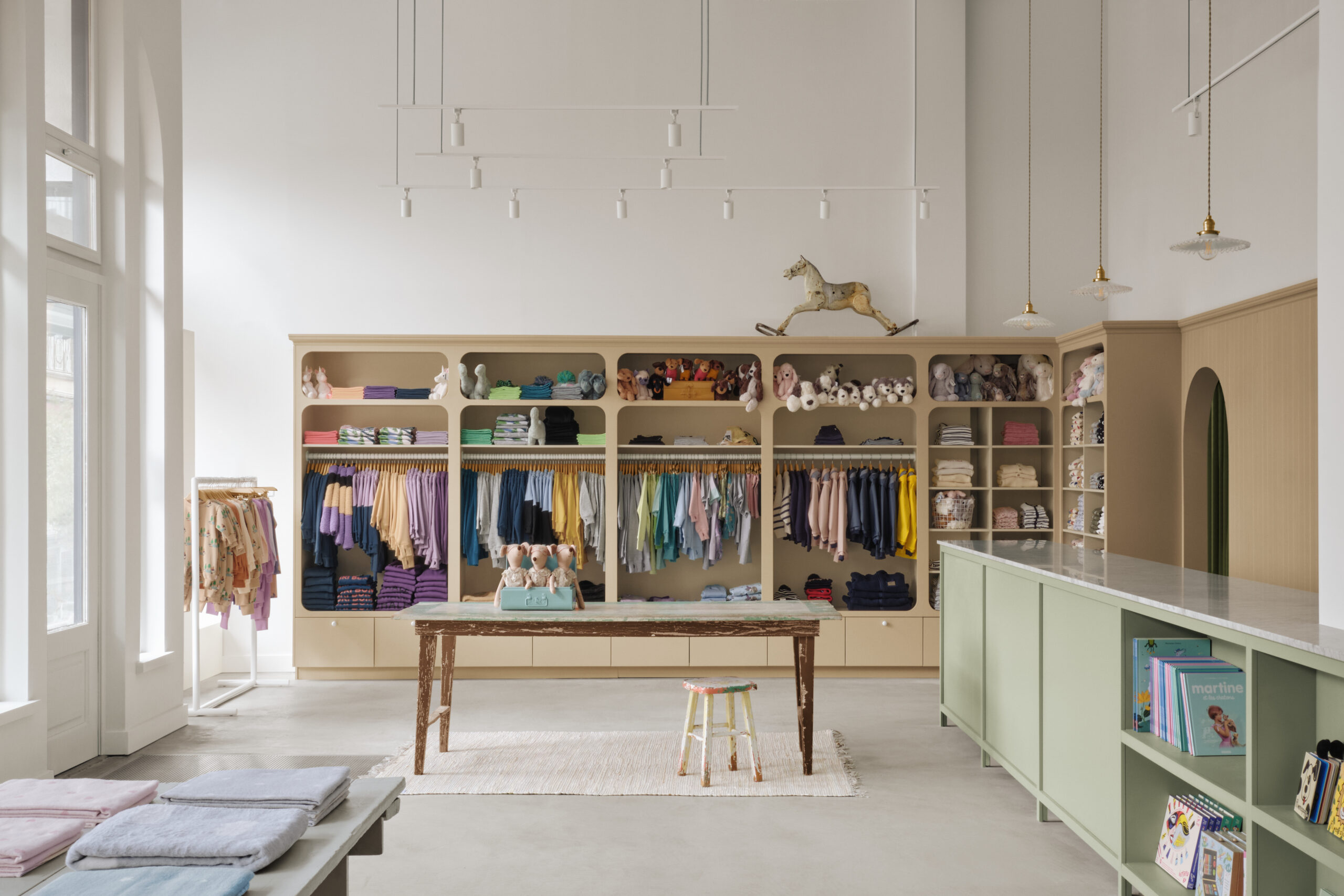
Design for kids brings to mind beds shaped like cars and rugs that double as roadways, but Montreal interior design firm Vives St-Laurent proves it can be so much more. Following the success of the first Montreal location, inspired by Ali Baba’s cave, children’s clothing and product boutique Billie Le Kid has opened a second shop in Mont-Tremblant, designed by Vives St-Laurent in its signature style of understated elegance. A more minimalist approach may seem counterintuitive in a children’s store, but the neutral sand, grey, and sage tones ground the space, allowing the colourful merchandise to pop without appearing chaotic or visually busy. The calm and unobtrusive setting allows the design to easily evolve to meet the store’s changing needs with the seasons or new products and creates a restful moment for kids and parents alike.
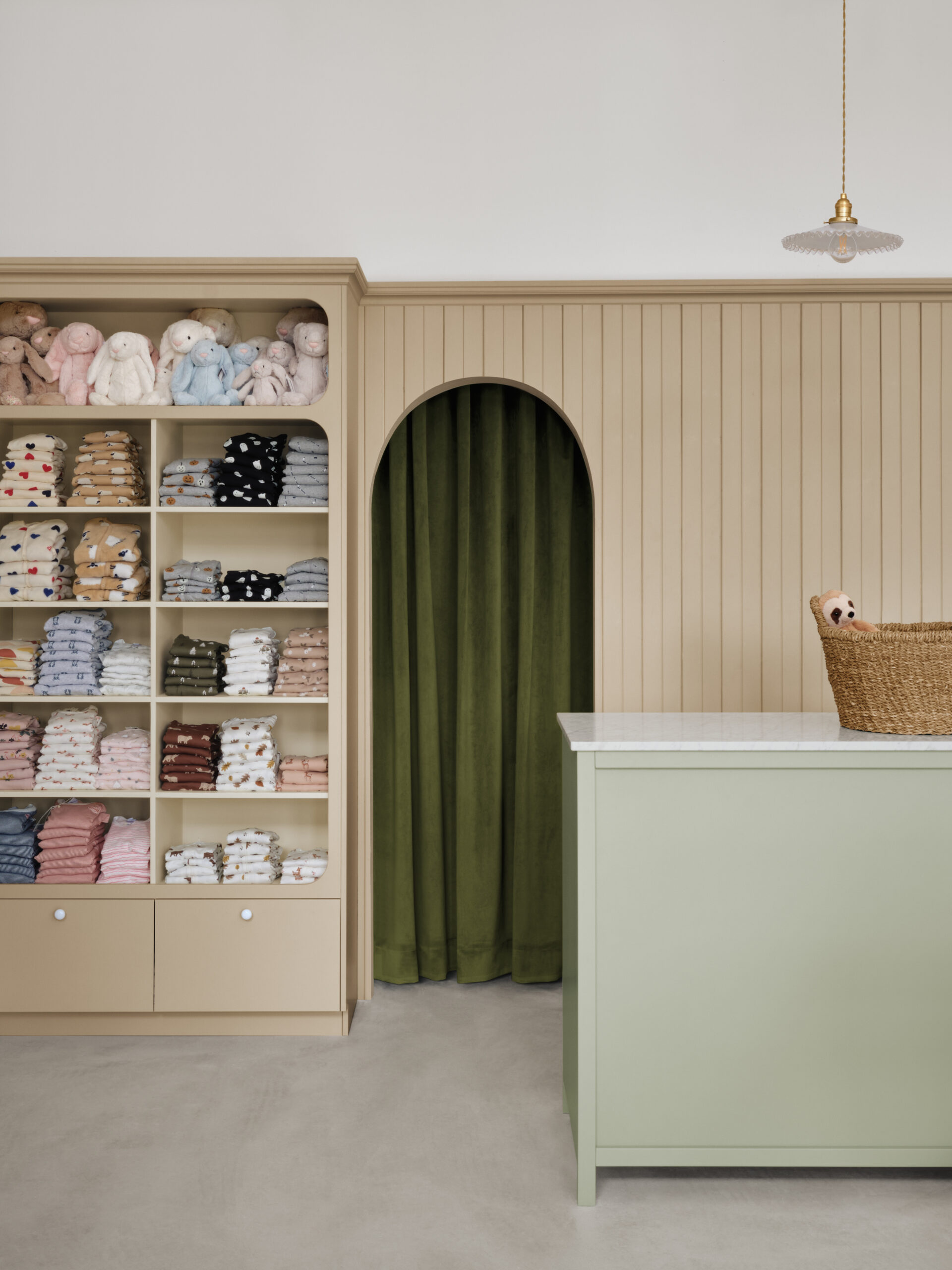
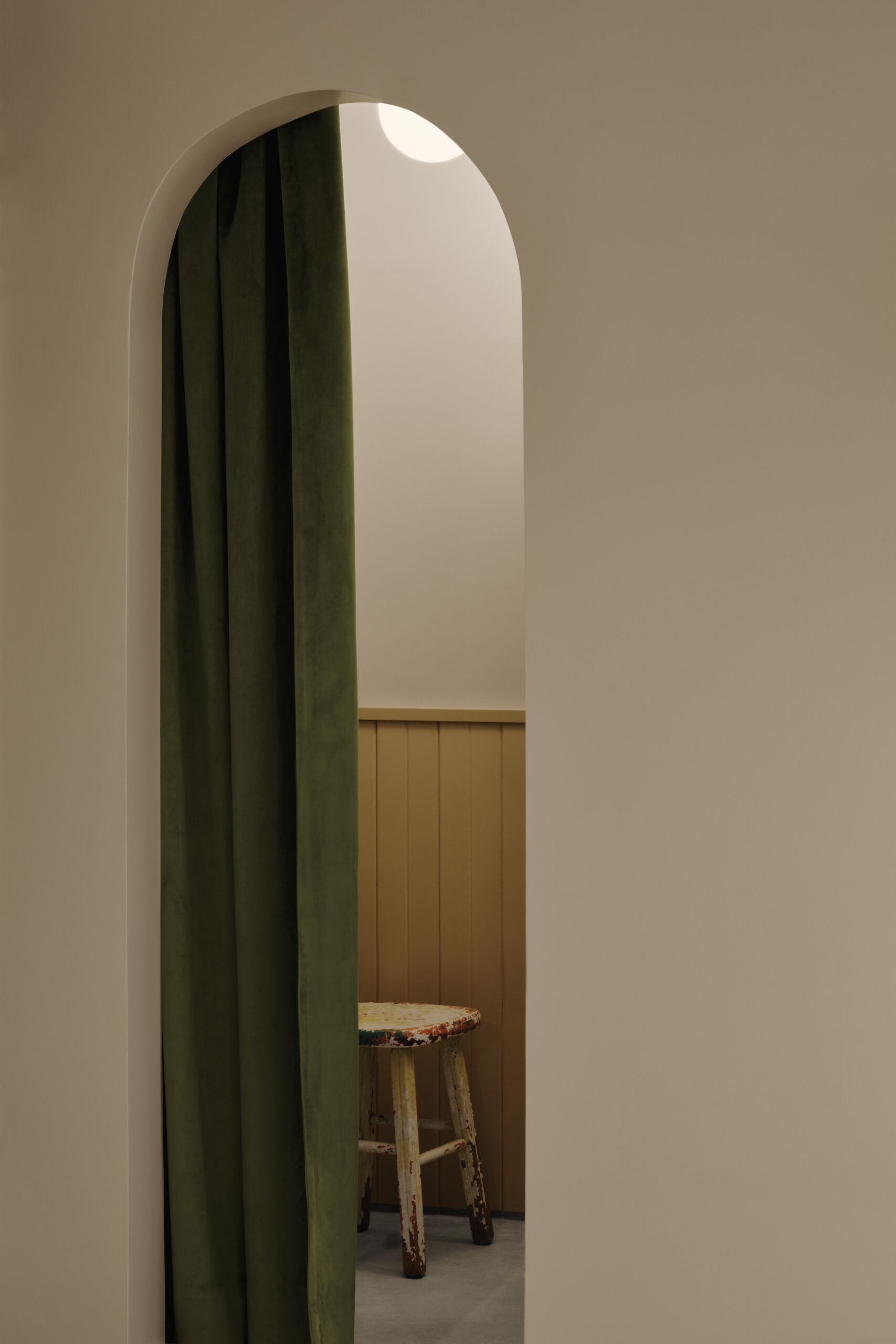
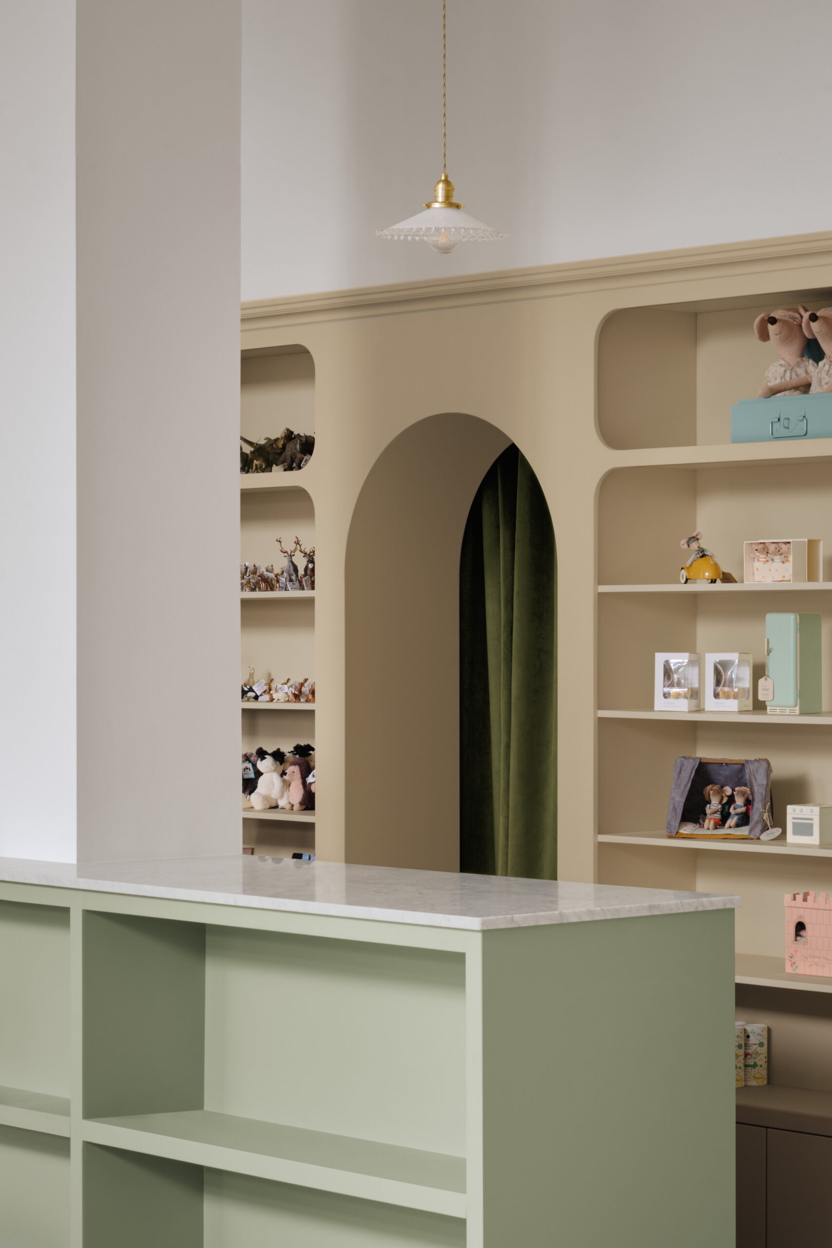
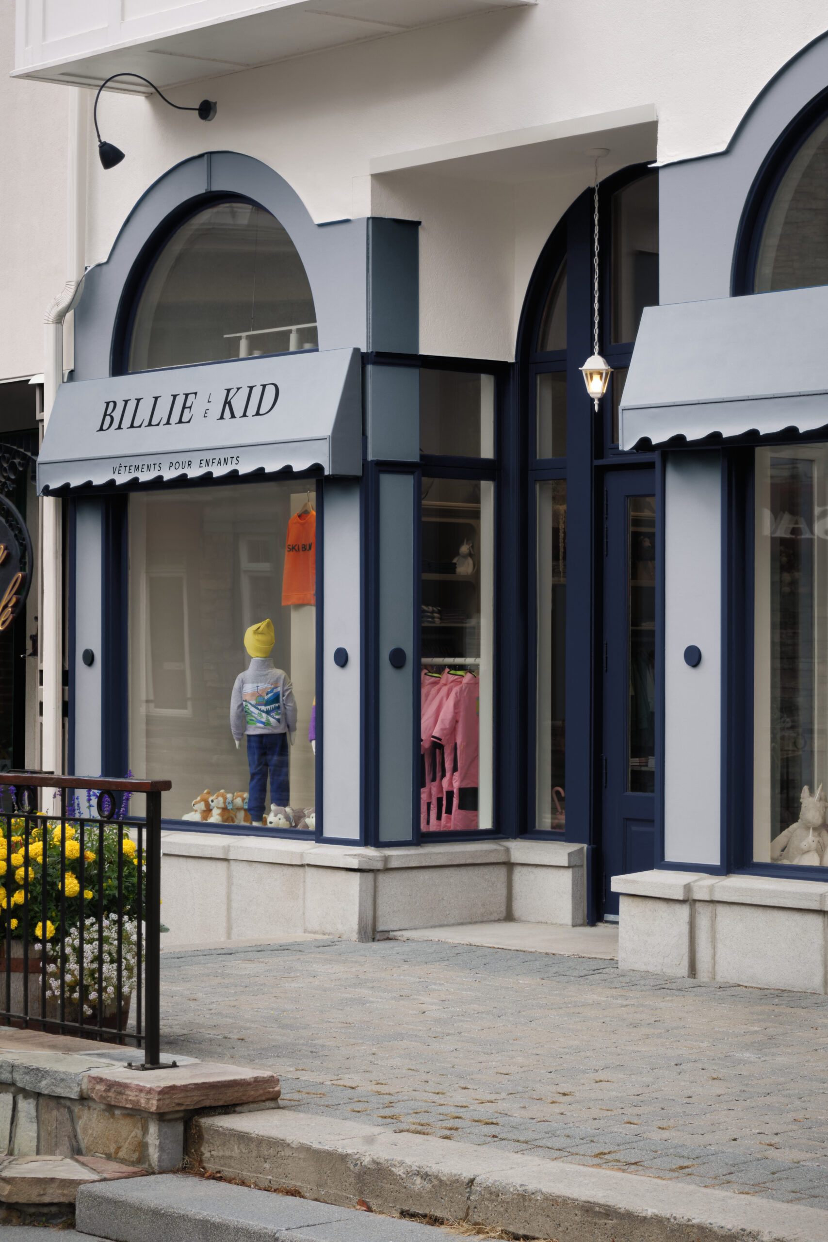
The design was loosely based on a general store, with open shelving, versatile product displays, and a custom awning outside. Along the perimeter, bespoke built-in shelves and hangers are framed with a curved lip that reference the arched doorways, veiled in dark-green curtains, leading to the back and the dressing rooms. The soaring ceilings feel cozier thanks to khaki wainscotting and vertical panelling.
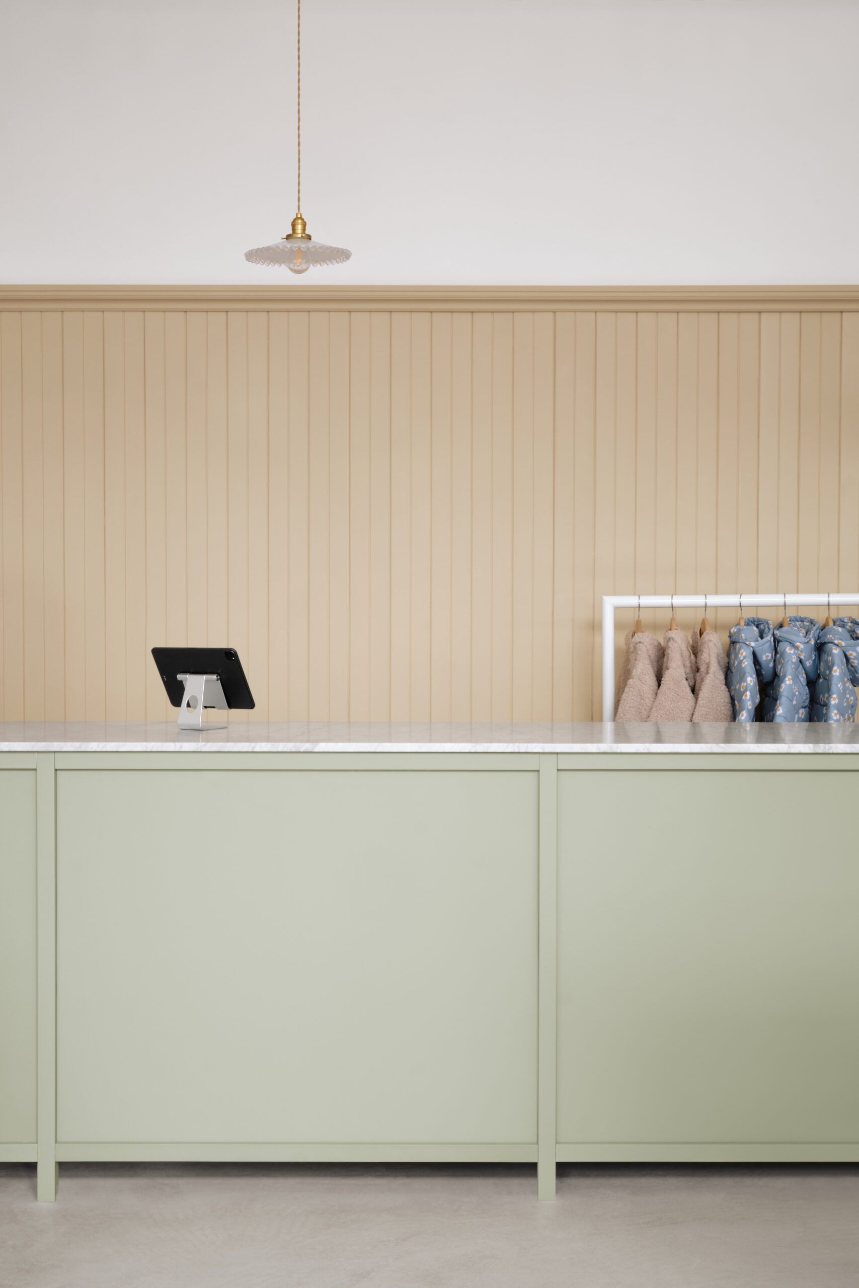
A pale green counter Illuminated by simple gold pendant lights runs nearly the length of the 1,100-square-foot store, offering additional storage for products and a place to package purchases. A few antique pieces, like accent chairs, refectory tables, and home accessories, add layers to the otherwise contemporary shop.
Founded by two friends, Billie Le Kid strips down the visual chatter of most children’s stores to let the products shine in a space as stylish as the kids who shop there.
Photography Alex Lesage.

