The Colourways of Artist Scott Sueme
Curious about colour.
“Such ocular excitement, as ever,” a fan comments on an Instagram image of one of Scott Sueme’s recent works, titled As Above / So Below, comprising four floating wood panels in a pixilated rainbow of colours. “Ocular excitement” seems a fitting description for his work, given his motivation to create and his enthusiastic use of colour and pattern. “It’s sort of based on how I can excite myself,” Sueme says about how he chooses what to paint. “Usually that excitement comes from doing something that’s either risky or trying something completely new to me.” This quest to make work that excites him catapulted Sueme to success in his mid-20s and has seen him through a number of group and solo exhibitions, nearly a dozen mural installations, and a residency in South Africa, all without shaking his seemingly impervious state of chill.
His introduction to art came from skateboarding. Growing up in Vancouver, Sueme says, he was “a handful,” which his parents, a printer and a baker, offset by enrolling him in plenty of sports. He started skateboarding at 14 and became intrigued with its subculture of graphics and graffiti art. “I think playing lots of sports growing up and skateboarding became like the marriage between creative thinking and sport because you’re looking at the world through a different lens,” he says. “You’re kind of looking at a staircase in a different way than anyone else would. And that tied into the culture that was very exciting at that time.”
Sueme applied for a graphic design program at Emily Carr University of Art + Design but a missed deadline meant he ended up in fine arts. “I had a painting course when I was studying, and I found it very, very difficult,” he says. “I struggled with it a lot.” It wasn’t until a few years later, after he left school—“not the right place, right time,” he says of his decision to leave—that the impact of the classes began to soak in.
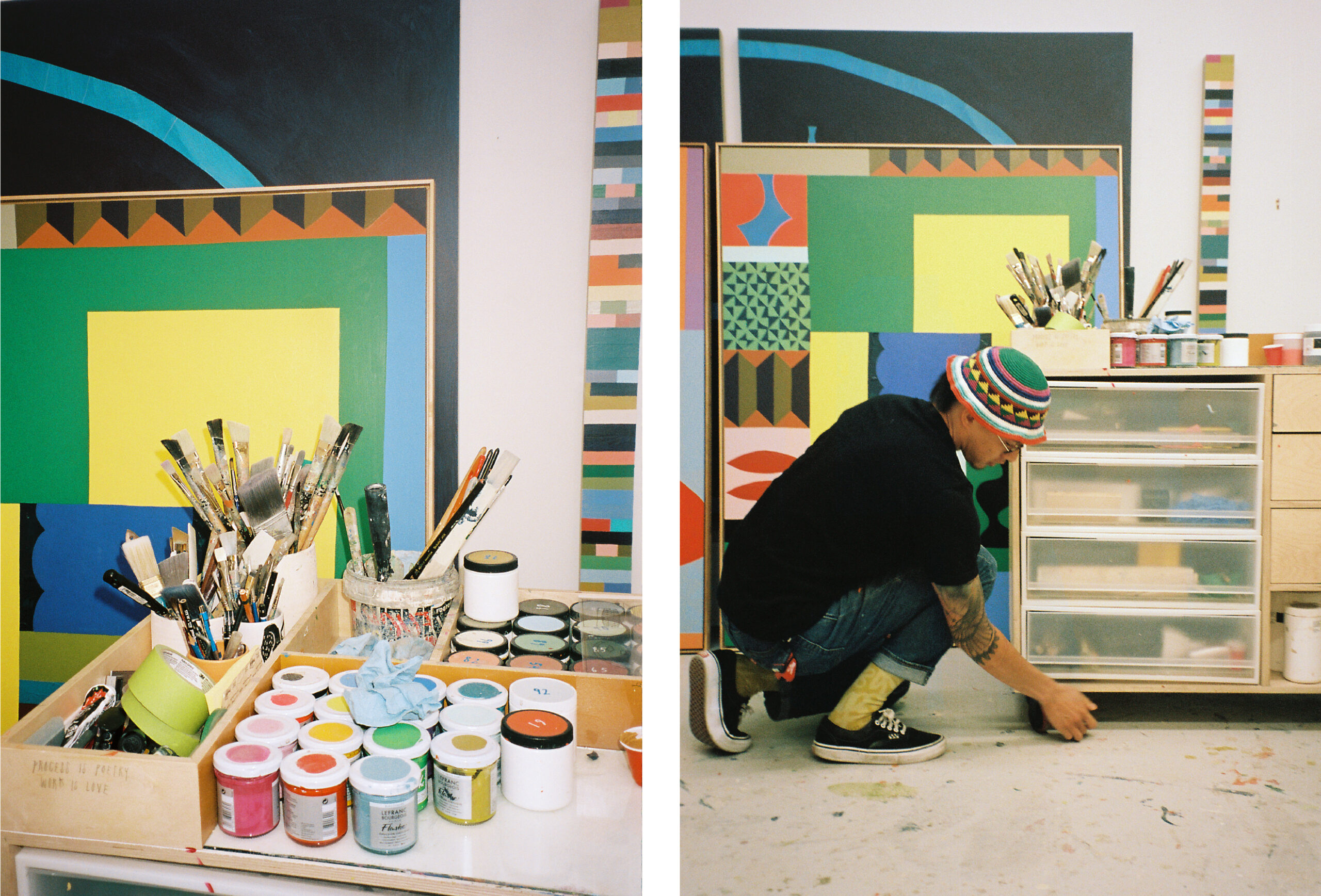
Sueme creates paintings that experiment with colour, pattern, and symbols, like Paris Metro. “It might start with a more pragmatic idea, but then it sort of evolves to take on a life of its own,” the artist says of his process.
“Once I was on my own, and working full time, the urgency was more real for me to try and make something of painting. And that’s how I found my way back.” At first, he took on whatever projects he could to make ends meet—painting signage, creating commercial logos, and whatever other graphic design gigs he could find. He reflects on those three to four years as a big learning experience, with many late nights spent sprawled out in the kitchen creating work with his fellow artist roommate. “We just very, very much loved painting,” he says. Eventually the duo would get a small studio together in the Downtown Eastside—their own art sanctuary—which gave Sueme the space he needed to grow his own practice.
During this period, Sueme attended Art Basel Miami Beach a few times, but it was the underground satellite show in Miami’s Wynwood mural district that was “eye-opening” for him. Seeing industrial neighbourhoods transformed by artists who, like Sueme, had backgrounds in skateboarding and graffiti but also showed their work in galleries inspired him to create that in Vancouver. It’s a mission he’s aptly executed, completing murals and group exhibitions in tandem at an impressive pace. “I wanted to experience doing it all,” he says. These early years of vigorous and enthusiastic exploration were key to finding his place in the realm of professional art and figuring out what he liked.
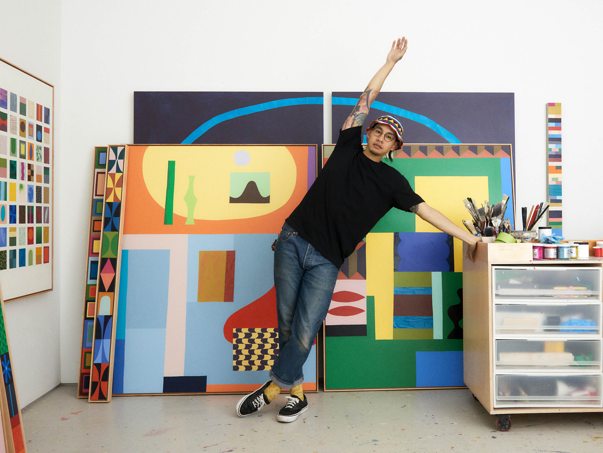
Sueme’s work is characterized by a considered use of colour and pattern, but if you ask, he’ll assert, “I don’t think I have a style.” Still, his pieces have a unifying sense of liveliness, most with vivid asymmetric shapes and objects puzzled together to form dialogues in the language of hue and form. While he crafts mostly in acrylic, his pieces feel almost collaged because of his ability to combine unlikely elements on one canvas. Looking at his creations, whispers of the artists who have influenced Sueme are detectable: the raw and primitive emotion of Jean-Michel Basquiat’s work, the graffiti roots of Barry McGee and Todd James, the gridded colours of Ellsworth Kelly, and the organic shapes of Elizabeth McIntosh (a former teacher of Sueme’s), amongst many others.
“My joy is closely tied to colour and working with colours,” he says, evidenced in the rainbow of canvases that fill his studio. “It’s something that I’ve most actively tried to educate myself [about], all while trying to remain as curious as possible.” The 36-year-old artist seems to welcome this growth, even at the expense of a little discomfort. In one exhibition in Toronto, Bone Broth, he used only “ugly colours,” painting in purples and browns he previously avoided, to challenge his own biases. “I try to build on my own vocabulary with colour and find out what feels comfortable for me and how I can break through that and try something different,” he says.
_________
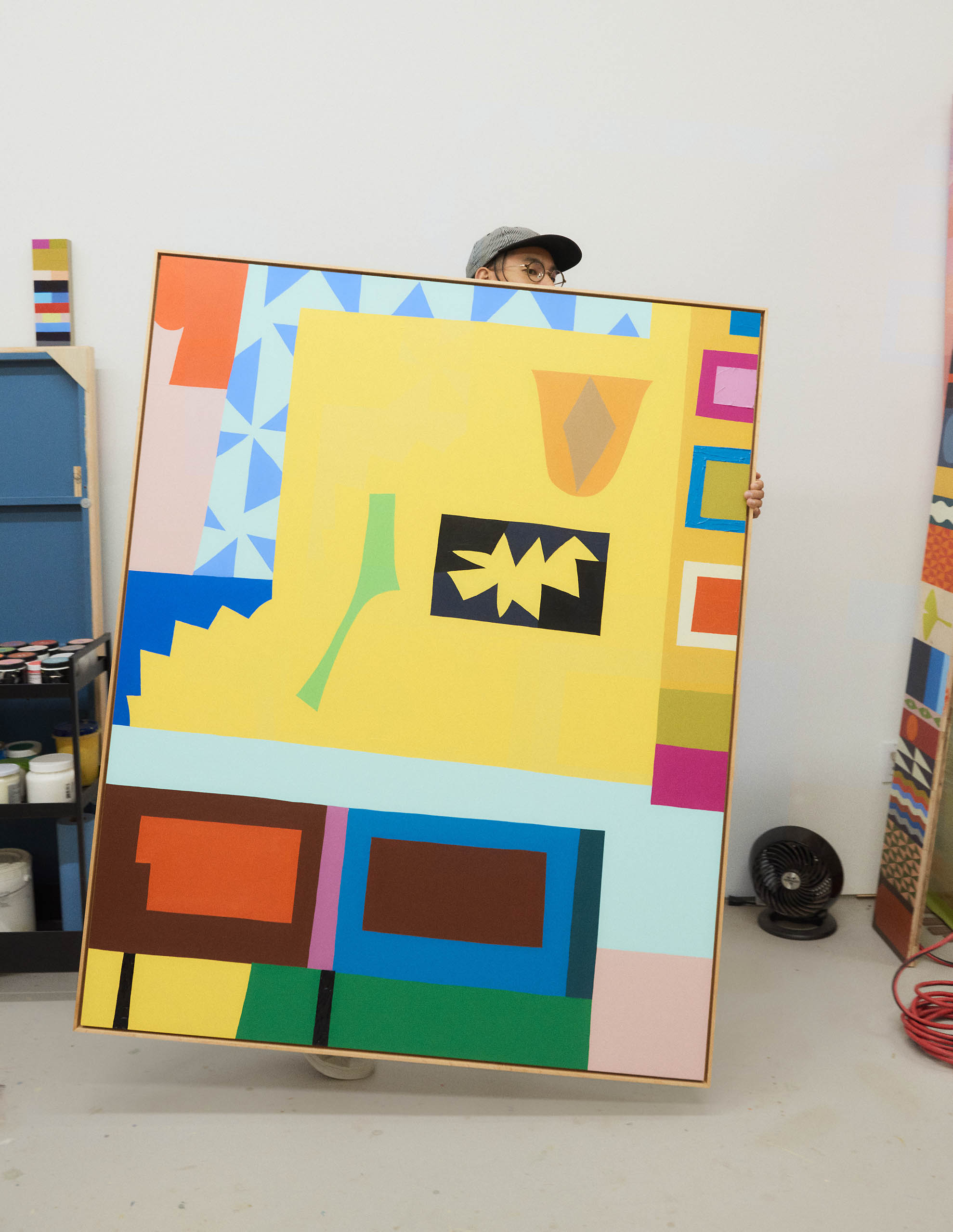
Scott Sueme’s pieces have a unifying sense of liveliness, most with vivid asymmetric shapes and objects puzzled together to form dialogues in the language of hue and form.
Another of his recent shows, at Gallery Jones this past spring, marks a more personal exploration. “The whole exhibition was a very pivotal moment for me in terms of what I wanted to say with my work and the concept of it,” Sueme says, noting it is the largest show he’s ever put together. Assembled over the turbulent years prior, the collection is titled The Garden at the Purple House, for his mother’s garden at his childhood home. Provoked by her decision to downsize due to the upkeep of the house, the show examined the ties between memory and imagination, where past, present, and future appear in a cognitive blur.
“It was a very emotional thing to put it out after two years, but that now is giving me a bit of confidence, but also a bit of inspiration in itself to draw off from that series and figure out how I want to push my work forward,” he reflects. It’s a natural development from his more rigid and abstract early work. “I’ve kind of tried many different hats,” he says. From more traditional New York–style, tech-space graffiti to geometric abstraction to abstract expressionism, the constant experimentation keeps it interesting for him.
In his newer work, he imbues more representational motifs, adding mushrooms, breeze blocks, and Chinese lattice designs that carry nostalgic weight to his pieces in The Garden at the Purple House. “My work is still abstract—you could describe it as that,” he says. “But I think it’s kind of evolving to tell more of a story of almost my subconscious or things that I’m going through and thinking about.”
He points out a large two-panel painting that rests behind him with the working title Collective Unconscious, an arching semicircle with floating shapes and planets inside. “The painting might start with a more pragmatic idea, but then it evolves to take on a life of its own,” he says. “So it’s about how these symbols and these objects are connected to each other in some way, and it’s sort of how in cultures around the world, there’s things that repeat themselves and show up and as humans we kind of have this collective unconscious when we’re on other sides of the planet that we draw from the same things.”
_________
“I’ve been thinking a lot about intuition and what it means to listen to our intuition. It’s sort of something that you have to tease out of yourself.” —Scott Sueme
While he continues to create public art (including a commission by the Vancouver Parks Board to cover a basketball court and most recently a mural installation at Okanagan Crush Pad winery), he’d like to do more. Sueme is also behind a few recent commercial projects: rug collaborations with furniture brand Sundays, and this fall, he was tapped by Canadian bookseller Indigo to reimagine the covers of five of the 28 books rereleased for its 25th-anniversary collection this year.
Still, Sueme finds his work most fruitful when he has the freedom to let his senses guide his practice. “I’ve been thinking a lot about intuition and what it means to listen to our intuition,” he says, referencing Anne Lamott’s book Bird by Bird in which she describes gently nurturing one’s intuition like a small flame. “It’s sort of something that you have to tease out of yourself.” He’s been spending most of his time following that intuition in his East Vancouver studio, which he shares with a few other people. Out of the front space, he runs Layout Art Supply with his studio mate and business partner, ceramic artist Billy Cheung. Another crossover with his skateboarding roots, the small boutique art shop, which the pair founded in 2011, specializes in high-quality spray paints imported from Barcelona but also carries other supplies and art books.
Represented by Gallery Jones (in Vancouver), Mayberry Fine Art (in Toronto and Winnipeg), and Uprise Art (in New York), Sueme sends pieces all over the world. In October, his work was shown alongside notable American multidisciplinary artist Alex Proba’s in Subterranean Murmur at Uprise Art’s Lower Manhattan gallery. He has an upcoming exhibition alongside Cheung at Odds and Ends contemporary art gallery in Hong Kong titled Chips Of The Old Block.
There’s something innately relatable about Sueme’s work, an almost childlike kneejerk attraction that settles into a more evolved perspective on the human experience. In simple shapes, colours, and patterns, he taps something that looks and feels like an approximation of emotion in its rawest state. And really, emotion is all Sueme wants for his viewers. “I hope they feel something. I think that’s the goal,” he says. “If they feel horrible about it or really great or something emotional, I think at the end of the day, whether it’s good or bad, it means you’re doing something.”
Sueme doesn’t intend his work to be perfect. He wants everything he makes to maintain a handmade feel, not overly manufactured, with slightly askew shapes and flawed patterns. He draws parallels with the folk art movement, which often goes unrecognized in the art space. In unpolished lines and crude forms, the movement embraces the beauty of the unrefined, the gritty, the misshapen, and even the ugly to connect on the most basic level.
“I want people to kind of see that, in the aesthetics of my work, it’s not something that’s hiding anything or is unachievable or mysterious in that way,” Sueme explains. “I want it to look like anyone could do it.”