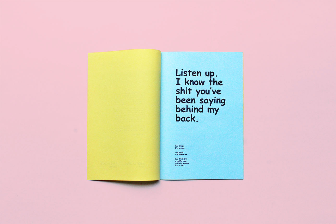
The Universal Disdain for Comic Sans
Appreciating the not-so-hidden language of typography.

Telemarketing calls. Elevator music. White zinfandel. Small, overly loud, overly groomed dogs. If you’re looking for something to hate in this world, you certainly have no shortage of options. But few things elicit as much antipathy—that unique mixture of disgust and disdain—as Comic Sans.
If, like most North Americans, you own a computer, chances are you’ve come across the woefully inartistic and ridiculously misused typeface (the more precise term for what most of us label a “font”) at some time during your digital life. Originally intended to give a more approachable, less stuffy feel to a software package that was in development, Comic Sans has been included with most Microsoft-based operating systems beginning in 1995.
Since then, it has attracted no end of critiques, and more than its fair share of rancour. The official backlash started in 1999 when professional graphic designers Holly and David Combs wrote a manifesto urging designers to unite and denounce what they saw as a crime against the craft. Since then, both typeface and reaction to it have spawned numerous articles and commentary, from both industry professionals and would-be cultural critics. Over on Facebook, you can find a thriving community of haters. Two Dutch DJs started a tongue-in-cheek celebration of Comic Sans that takes place on the first Friday in July each year. The hashtag #comicsans offers a near-daily catalogue of visual missteps featuring everyone’s most hated typeface. A quick Google search for Comic Sans T-shirts returns a drenching of hipster irony, ranging from the barefaced (the words Comic Sans in the middle of a bright red prohibition sign) to the alliterative (“Friends don’t let friends use Comic Sans”) to the entertainingly malicious (“You are the Comic Sans of humans”).
Of all the things upon which to heap your derision, a typeface seems an unlikely target. Then again, in an age increasingly shaped by what appears in writing (whether in print or on screen), the decision of which typeface to use in a given circumstance is not one to be taken lightly. Like the scribbled name at the bottom of a cheque, type has the ability to communicate a lot more than just information. Pick the right typeface and your message becomes more persuasive, more compelling, more eloquent. Pick the wrong one and your message can quickly become off-key, off-target, off-putting.
Few things elicit as much antipathy—that unique mixture of disgust and disdain—as Comic Sans.
It’s something the business world has known for years. Corporations have spent heavily to create custom typefaces that become the “face” of the business itself: examples include AT&T, General Electric, Airbnb, and Google. When organizations get this wrong, the public can pounce: if you were in London during the run-up to the 2012 Olympics, you’ll know exactly what we mean. When corporations change their typefaces, loyal customers can react with scorn—IKEA’s unexpected decision to swap the much-loved Futura typeface for a more web-friendly Verdana spawned a font fiasco and sparked a grassroots petition urging the company to rethink its errant ways. Even the letterforms you’re viewing on this page have been carefully chosen to communicate something special about the words—and, one hopes, the ideas—they convey.
Never judge a book by its cover, we are told; it turns out only a fool does not judge it by the typeface in which it’s printed. Psychologists from New York University have shown how perceptions of information can change according to the typeface by giving over 100 test subjects a satirical article in either Arial or Times New Roman. Subjects rated a stronger emotional response (positive or negative) to a New York Times article presented in the latter. And researchers from MIT did much the same, tracking readers’ facial expressions when they read a passage from The New Yorker designed with poor typography—a bad font, crowded lines, and cramped graphics made subjects feel worse and perform worse on cognition tests. A group of researchers from Williams College in Massachusetts examined the cognitive effects of type, finding that test subjects could remember significantly more about pretty much any subject when they read the information in an unfamiliar typeface.
To some, such research confirms what is common sense: content matters, but how content looks matters even more. In an age when handwriting has largely gone the way of VHS tapes, typography is more than just an aesthetic choice. Rather, it’s the body language of the printed word—the wry smile, the fatherly timbre, the empathetic nod that communicates a dimension of emotion, tone, and personality—that transcends mere ink on a page or pixels on a screen.
The great irony of typography is that it forms the foundation of every communication you will ever read or write, yet in its most sublime expression, it remains nearly invisible. Indeed, this is what is so grating about Comic Sans: rather than subtle background details of proportion and geometry, there is an obvious, overt statement of emotion. The medium has overwhelmed
the message. 
_________
Never miss a story. Sign up for NUVO’s weekly newsletter here.


