Chart Obsessions: How Our World Gets Reduced as We Do
Last writes.
Because it has become so easy to write anything and have it seen by countless individuals on one of the microblogging sites, diagnoses of graphomania—the pathological impulse to write—have bubbled up from critics and social commentary. But during the pandemic, I have noticed another, more benign impulse: the eye-watering compulsion to use charts and graphs to understand reality. In elections, in the march of COVID through the human biome, x/y axes, metres, and all sorts of other graphical instruments become the main characters of our digital lives.
It is understandable, this constant looking to charts, because unfortunately, the world is not. More people with more opinions gleaned from the ever-branching tree of human invention mean a world that keeps getting bigger and harder to wrap our heads around. Taking into account recent civilization-altering events that ripple through the chain of globalized relations, today’s world is complex.
Many people have communicated a similar sensation: waking up during COVID and immediately checking the Google graphs that chart in relatively simple lines the disease’s cases and deaths. Those interested in politics stared at the increasingly complicated gauges measuring the midpandemic elections in Canada and south of the border as if looking hard enough at the data would change it—a magical approach to something we are told is cold, hard fact, a 1:1 representation of reality. It became clear our understanding of the world was more and more falling into the hands of increasingly confused and probably underpaid graphic designers and data analysts.
In a famous one-paragraph short story, “On Exactitude in Science,” the literary sage and Argentine Jorge Luis Borges depicts a map with an exact scale of the real world that “coincided point for point with it.” The idea was to show that our graphical depictions of reality tend toward reality themselves, but if they reach it, the concept becomes absurd. In the story, the map turns to tatters and is forgotten, along with the discipline of geography itself.
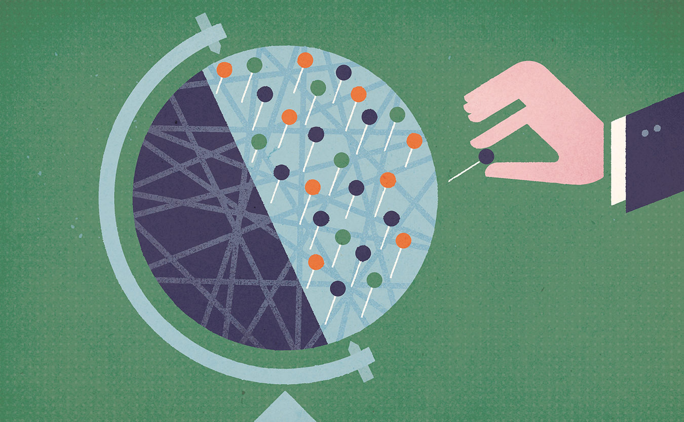
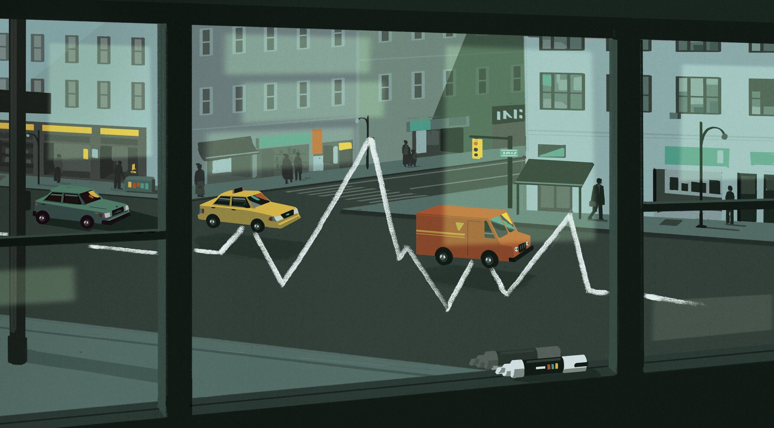
In the social sciences, the first thing students learn is human behaviour can be studied in a rigorous if inexact way. The second is that statistics are never truly raw, and how they are collected and presented tell stories too—of the desires of the analyst or designer, of the institution they represent. But these shortcomings don’t get to the heart of the presence of graphical data, the esteemed role they have come to play in our daily life as time and breath tick forward toward unknowable futures. Sure, the “wonks” with their extensive graphing chatter in the background using baroque systems, but the rest of the population must make do with the few simple graphs that are supposed to somehow represent to us the state of massive tragedy, of actual lives—and deaths.
Of course, as in business, the cult of measurement stems from the belief that measuring something allows us to control it. With data collection and modern administration, this ambience of modelling and control pervades our everyday lives. But as with those who increasingly monitor us, the data only ever tell part of the story. In other words, as we reflect on the sadness that remains even when we know what’s going on, the lack of understanding should be generative. We are not our data; we make it. And the emotional measure of time can hardly be captured purely in data—we need words for that. Even poems pale when compared to the enormous diversity of humans and feelings alive on the Earth, a totality that quickens the heart with its enormity, its many-faced beauty.