Design Space: PJ.Lobster Barcelona by El Departamento
A monochromatic optical boutique that gets playful with texture.
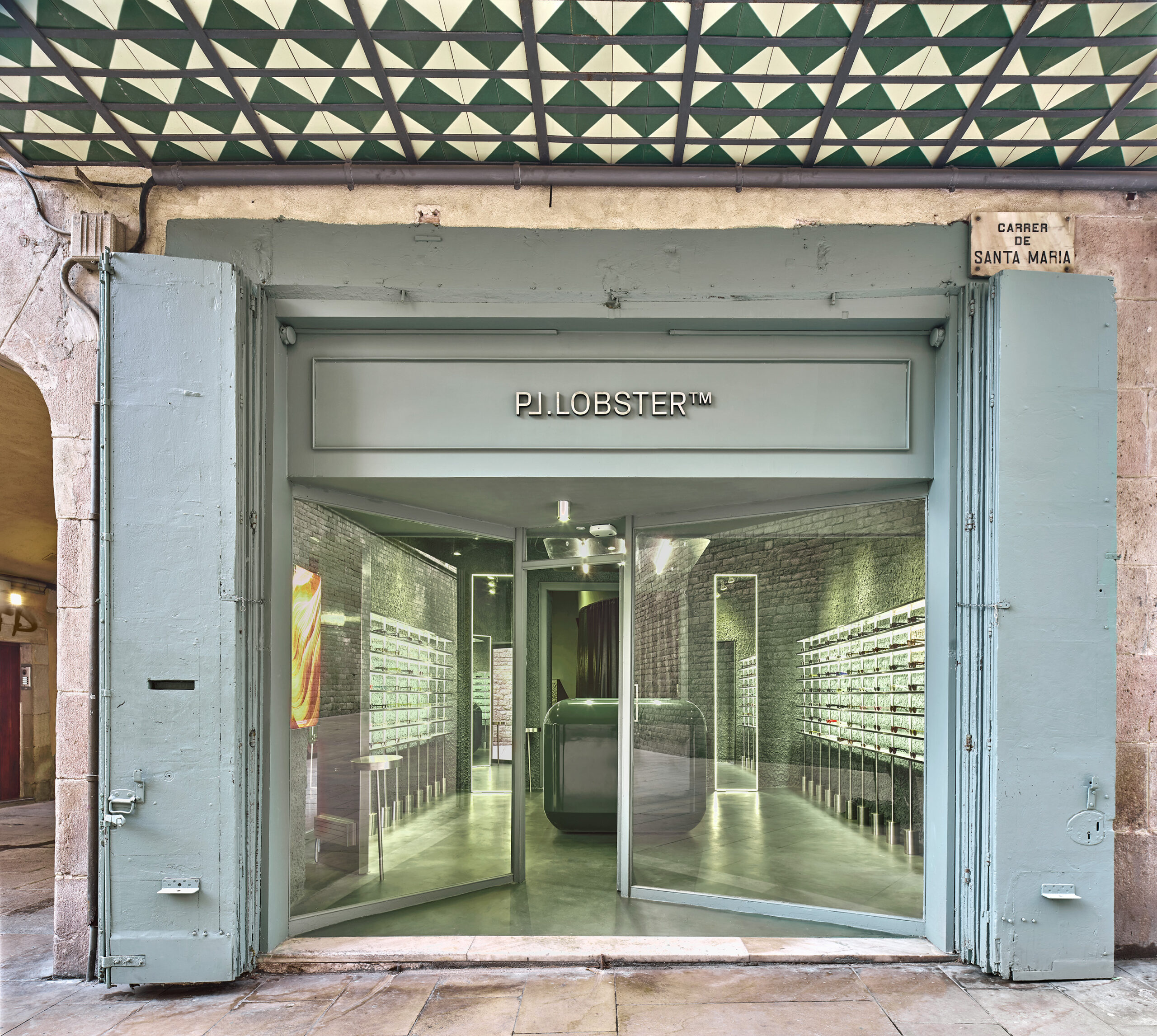
In Barcelona’s Fossar de les Moreres square, a few steps from the cathedral of Santa Maria del Mar, a 430-square-foot optical boutique adds personality with texture for online-turned-omnichannel retailer PJ.Lobster.
Made using local materials and craftspeople, the Barcelona PJ.Lobster, the fifth location designed by Spanish architect and interior design firm El Departamento, offers a new focus on the brand’s technical aspects, an evolution from its previous fashion emphasis. To reflect this, the clients wanted a simple, clean, and minimalist interior, a challenge for El Departamento, which typically gravitates toward maximalism.
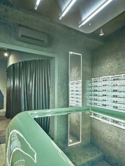
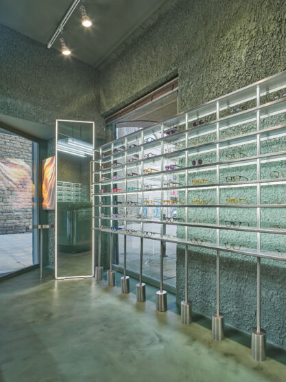
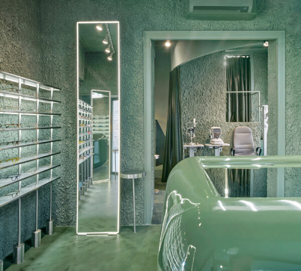
As El Departamento founders Alberto Eltini and Marina Martín researched how they could approach minimalism in a way that was authentic to them and their style, they embraced the idea of texturized minimalism, which combines clean lines and simple colour palettes with an abundance of textures. To reflect the technicality of the optometric machines, they also added elements of what they call “raw high-tech,” modern and futuristic designs and silhouettes and shiny finishes.
For this PJ.Lobster, Eltini and Martín were inspired by the 1977 short film Powers of Ten directed by Charles and Ray Eames, which zooms steadily out from a man at a picnic in Chicago until it reaches the outer edges of the universe, then all the way into a proton of a carbon atom inside his hand. Intrigued by the macro versus the micro and the patterns throughout both, they created a space that plays with scale and textures that exist in the natural world in all sizes.

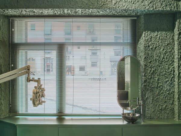
Eltini and Martín opted for a pale green monochromatic colour scheme that is timeless—the muted-sage exterior of the store in the historic El Born neighbourhood could well be a green patinated copper—while also warm and welcoming.
Upon entry, the oversized shiny, rounded cube table in the middle of the small rooms draws immediate notice. Custom stainless steel open shelves with heavy cylindrical bases display the brand’s wide range of fun eyeglasses. Several floor-length mirrors framed with corded light are accompanied by sleek stainless steel side tables and provide a place to try on the frames.
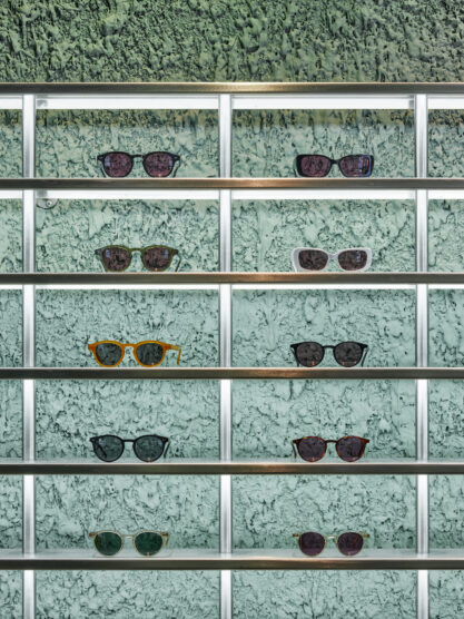
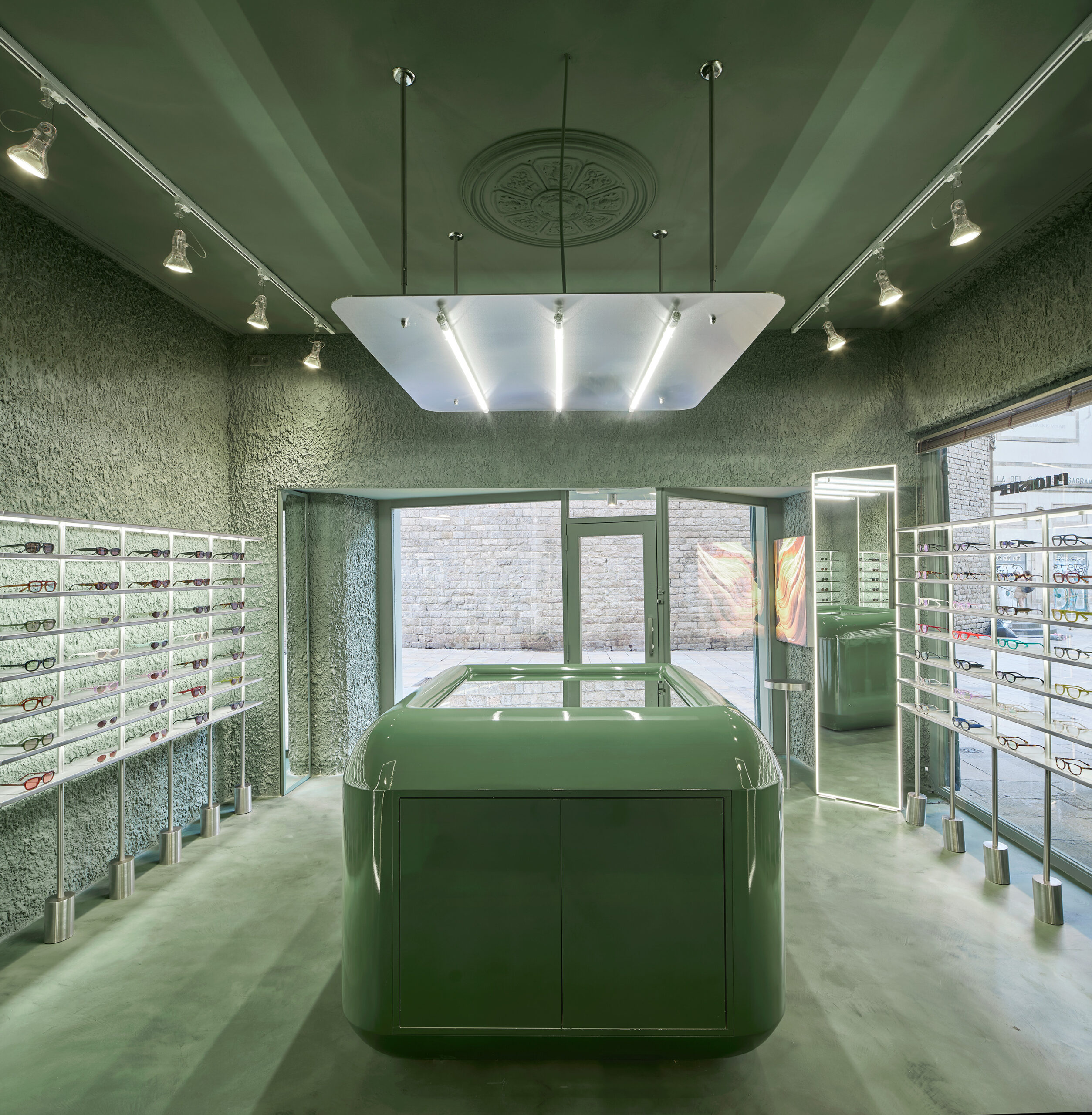

The walls’ irregular textured stucco, the large fibres resembling the tissues of a leaf, is so thick its additional drying time delayed the project’s completion. Smooth microcement on the floor is washed with green. On the ceiling, two rows of spotlights by Barcelona lighting designer Marset run either side of a flat pendant light with three illuminated rods created by La Departamento.
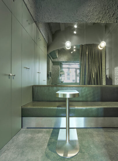
The back room is a cozier contrast to the entry, with soft carpeting, built-in cabinetry for storage, and small green vegan-leather banquette. A matching leather curtain separates the waiting area from a modest but comfortable exam room. By creating distinct zones within the small square footage, the designers prioritized a personable customer experience, an important detail for the brand as it adds bricks-and-mortar stores to its established online presence.
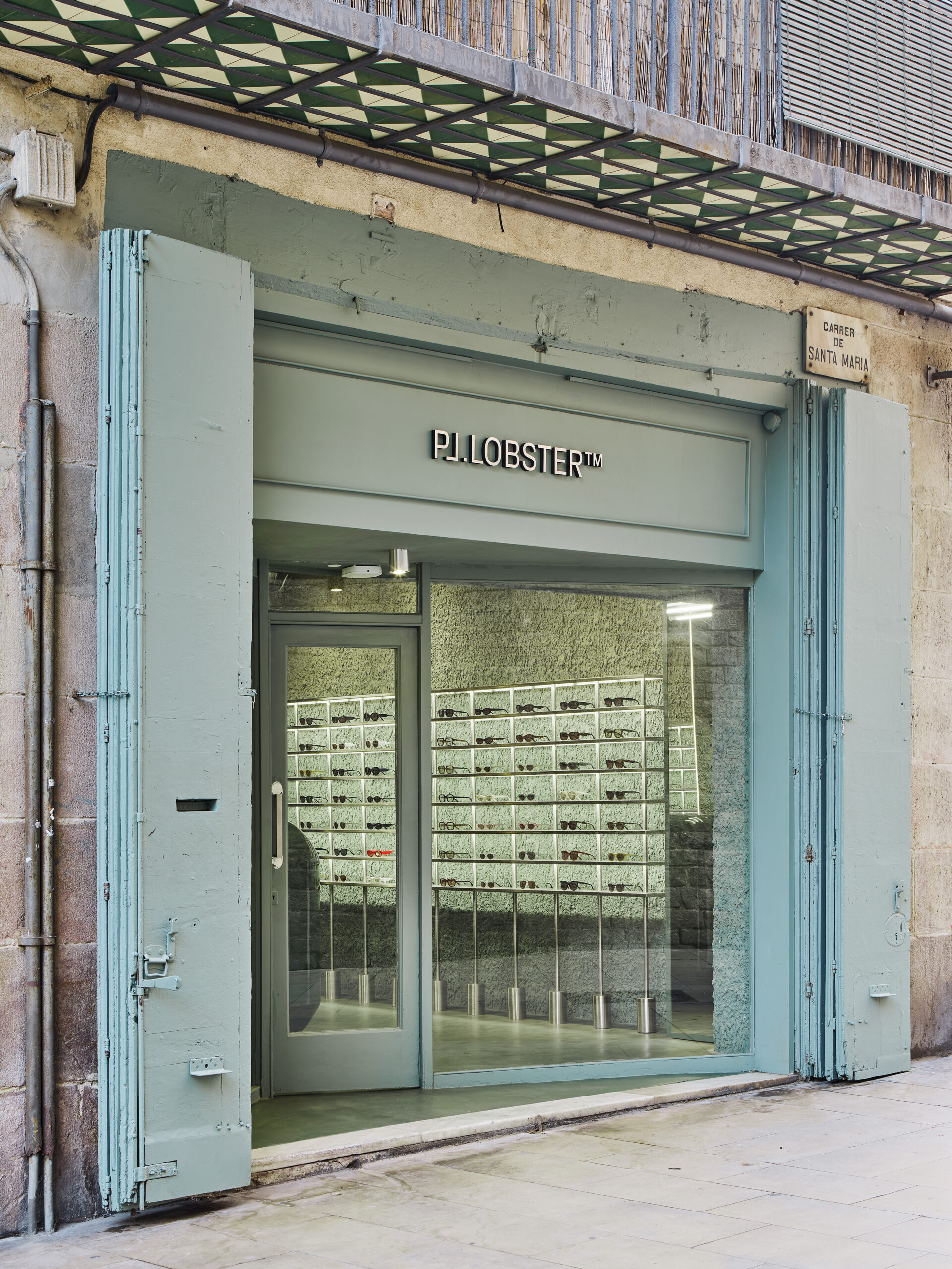
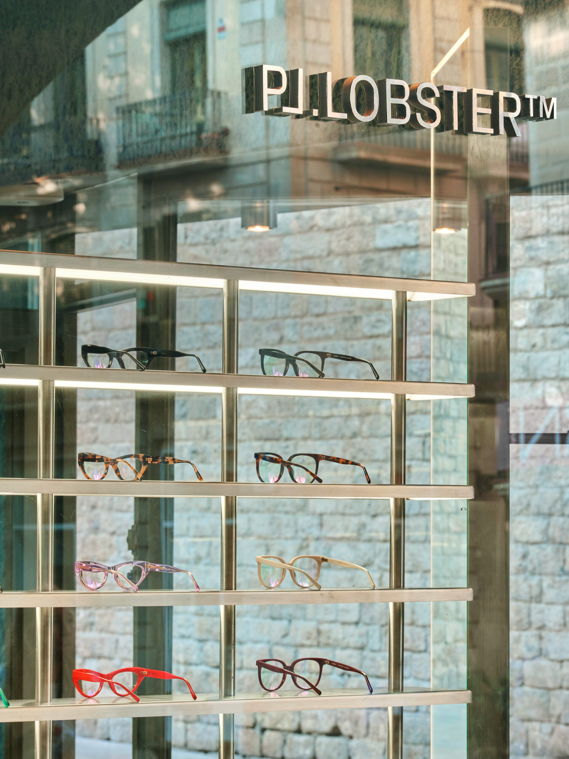
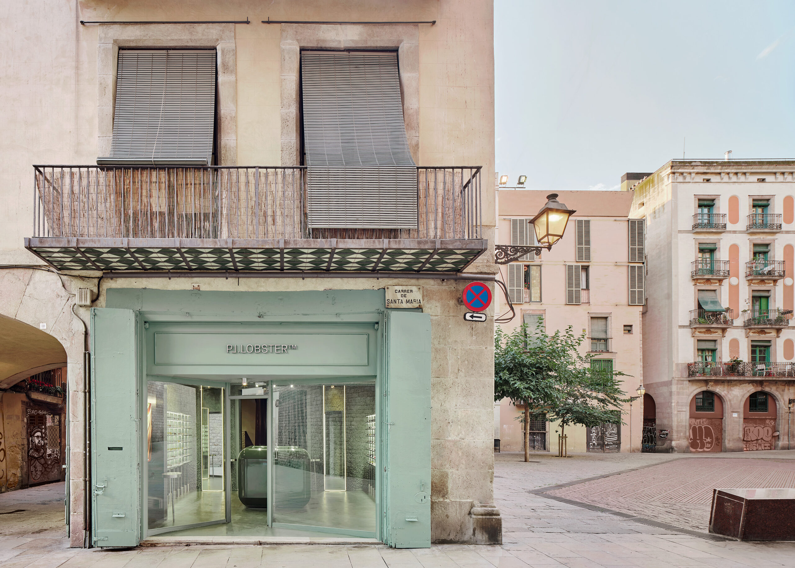
By drawing on the principles of both texturized minimalism and raw high-tech, El Departamento establishes a well-balanced contrast in the space that adds a dynamic visual interest while preserving the simplicity necessary in a space providing medical care.
Photography by José Hevia.

