-
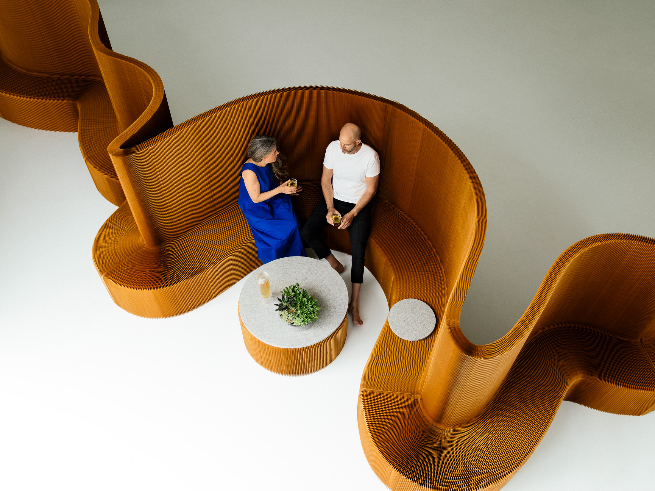
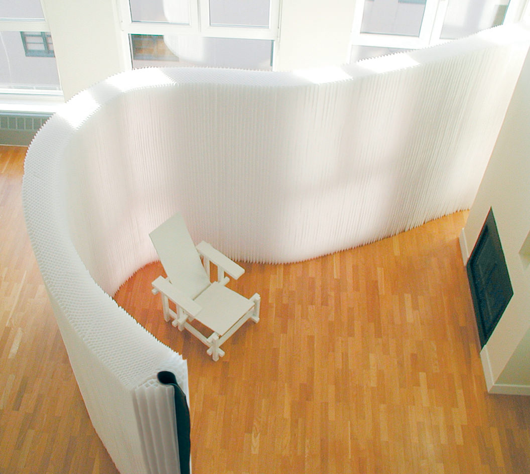
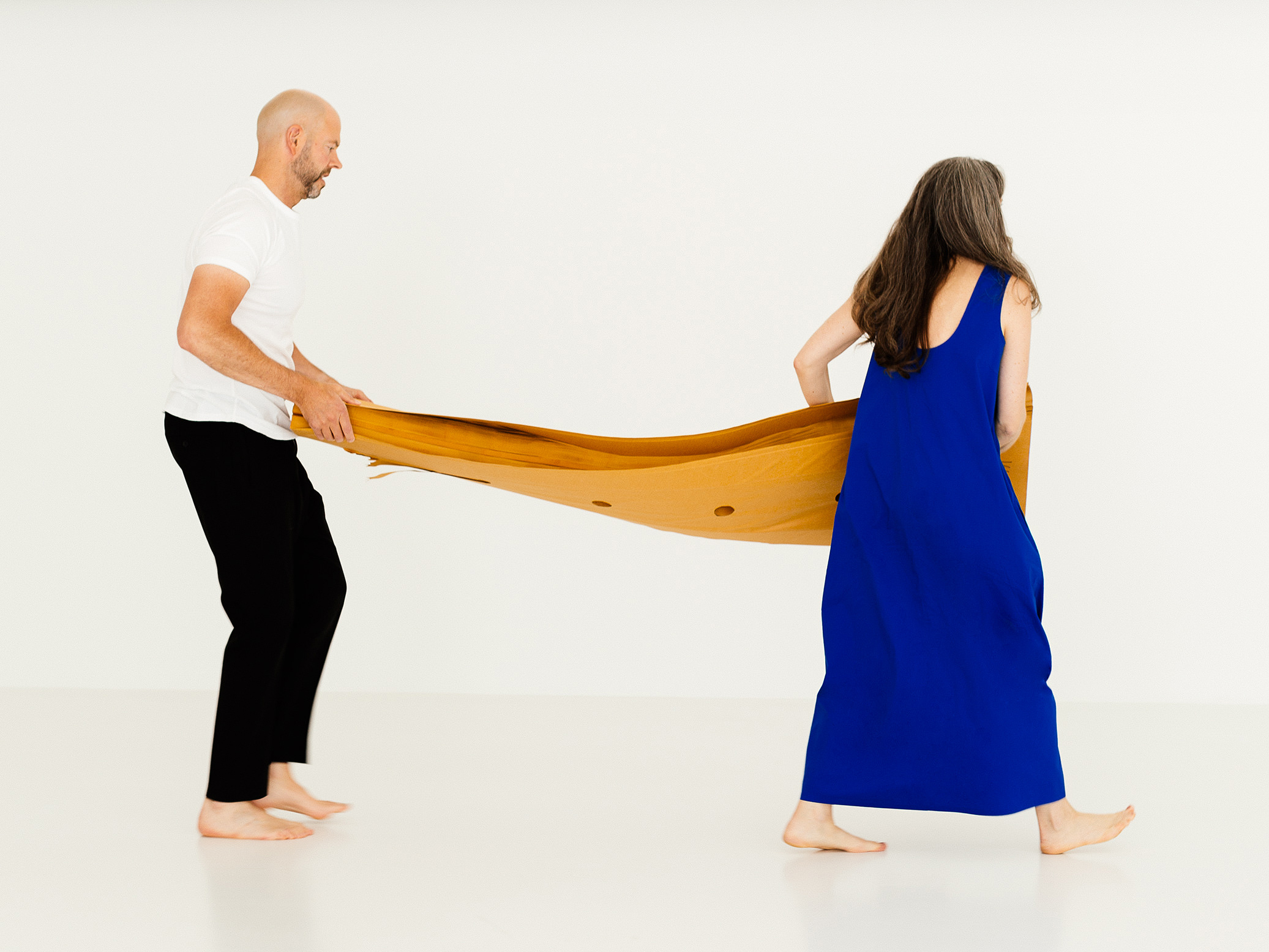
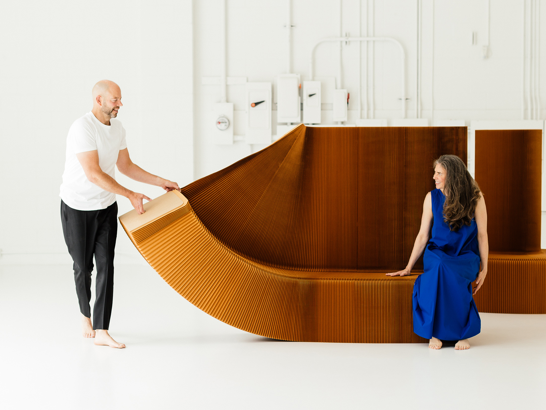
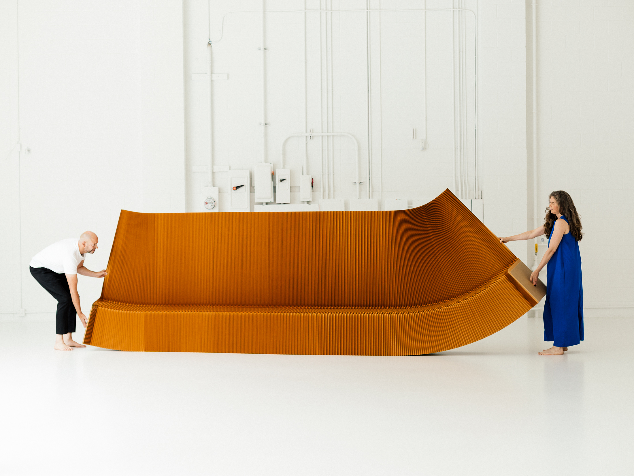
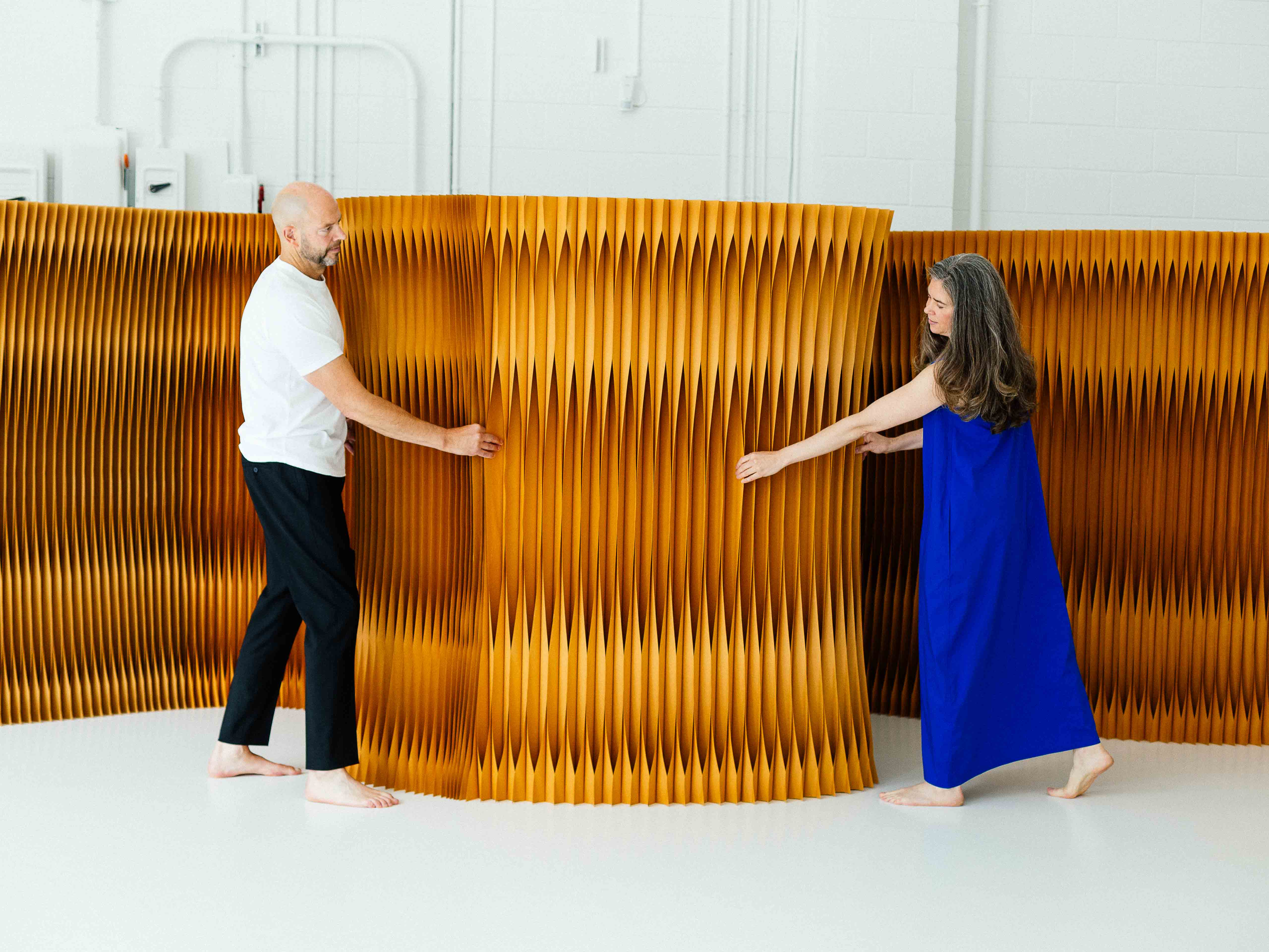
molo’s softwall + softblock modular system is the design studio’s signature innovation.
-
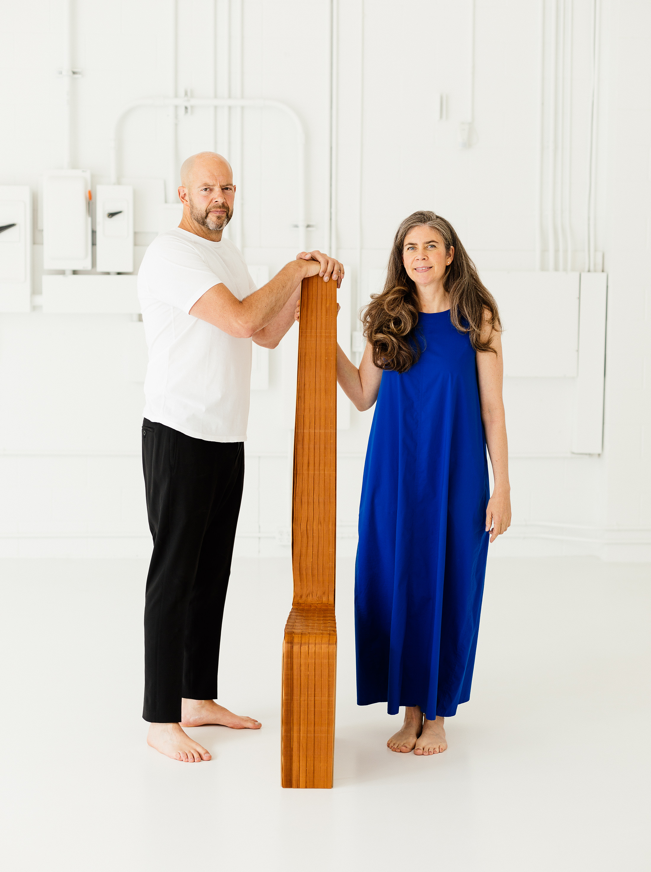
Partners in design and life, Todd MacAllen, left, and Stephanie Forsythe, right.
-
-
-
-
Molo Design
Elemental twist.
Admittance into molo design studio + workshop, located just off Vancouver’s dusty trucking byway Clark Drive, is instantly transformative. Bearing little connection to the mattress shops, low-rise office buildings, and wholesale warehouses that surround the space, you come into the visceral vision of molo founders Stephanie Forsythe and Todd MacAllen. Classical music plays, its temperamental whispers and booms having the effect of further enlarging the sparsely furnished room. Molo (stylized as molo) is a multidisciplinary studio that was established in 2003. Best known for its softwall + softblock modular system—a honeycomb structure that unfurls like a fan and then compresses—the design practice also creates lighting and glassware, and even works on architectural projects, notably the Nebuta House in northern Japan.
Forsythe and MacAllen’s personal design ethos is strong and unwavering. The couple (who are partners in design and life) follow certain principles of design—the material of light, the value of instinct—with religious zealotry, but there is no overarching, guiding scripture. To them, design is as much a process of discovery as it is a matter of intention; it is a way of learning about the world. The duo is dedicated to the white cube model of austerity—removing pieces from their immediate contextual associations—but the more abstract, elemental aspects of environment remain at the centre.
The two met in 1994 in architecture school at Dalhousie University in Halifax. As they explain, their personal connection and collaborative design ethos were first forged through an architecture project in Colombia, directed by one of their professors at Dalhousie, Essy Baniassad. “We were both interested in how people were living [in Colombia],” explains MacAllen, “how the family structure worked and how it all came together, how the homes created a community and how these barrios created an even bigger community.”
Studying in the townships of Villa San Juan and Tumaco, both located on the southern coast of Colombia in the province of Nariño, Forsythe and MacAllen became familiar with the ways in which these communities (made up largely of indigenous and West African–descended people) were built in response to their environment. “It was like watching something that would grow in nature because it was built with no master plan, yet it was such an effective plan,” says Forsythe. “All of the houses were based on boardwalks over the ocean, and they usually had a public part—someone may sell bread at the front, someone might have a deck that they do welding on, and so it created these really public streets.” The city planning in Tumaco—derived from thousands of years of community, trade, and government—rejected the imposed, ineffective plans of Spanish colonization found in many other South American cities. Contraction and expansion, they observed, were based on necessity and easily facilitated. Private space was flexible—growing when new members were added and repurposed when the family unit changed. Public space was built with elemental considerations, water being at the centre as it is critical to the fishing industry.
For molo founders Stephanie Forsythe and Todd MacAllen, design is as much a process of discovery as it is a matter of intention.
In establishing their architectural practice in the years that followed, MacAllen and Forsythe saw their work move away from some of these fundamental lessons. “We wanted to shape our ideas without the restrictions of a client,” MacAllen reflects. “When we were making houses, it was just the same thing—bedrooms and bathrooms and all the terminology we use—and it was taking away from that experience in Colombia where it was an abstraction of elements.”
They broke out from their residential architectural practice and began focusing on small aspects of designed living. In 2000, the couple received a $500 award from the Design 21 Competition (organized by UNESCO and Japanese merchandising company Felissimo), which they used for prototyping their first tea set. Then the duo won the AR+D Award for Emerging Architecture (put on by Architectural Review) for that prototype—an award typically given for building design and architecture. “There’s a bunch of things that are rolling together at this point,” says MacAllen. “We are realizing that we can make these objects, we can afford to make these, and we can be our own client.”
As with many innovations, molo’s use of paper (now a touch point in the company’s oeuvre) first came out of necessity. “We were sitting in our small apartment and when it came to making things, paper was the one thing we had,” says Forsythe. “We weren’t thinking of it as a building material, we were thinking small maquettes [preliminary models].” Their ah-ha moment came when the models transitioned to full-sized mock-ups, and the paper was sturdy enough to be used as a structural building material. Variations in the series such as loungers, stools, tables, building blocks, and lighting are playful, retaining the intrinsic inventiveness of paper. (The paper molo uses is a blend of new and recycled fibres that is treated with a non-toxic fire retardant. Another main material they use is a paper-like textile made from non-woven polyethylene fibre that is dust and tear resistant. Both materials are recyclable.)
The use of paper in molo’s soft collection has garnered international acclaim, and two pieces from it are part of the Museum of Modern Art’s permanent collection: softwall (in 2003) and softseating (in 2006). The pieces are bold as objects of design, but also function as utility objects, perhaps due in large part to what they are made of. Paper is a material that molo’s founders are drawn to now, perhaps due to comfort and ease as much as curiosity. “We are always discovering things, but the greater piece of that is now it’s just a part of us,” Forsythe says. MacAllen continues, “It’s like a pencil—you can reach in and use it, and it’s a very familiar tool.”
The soft collection’s most inventive expansion is to lighting objects. The urchin softlight, made from the same paper-like textile material as other items in the soft collection, invites moulding and shaping into new forms. The fluid, responsive material takes on a biological curiosity, evoking ocean creatures that glow from within. The pieces invite touch, asking us to feel and engage with artificial light.
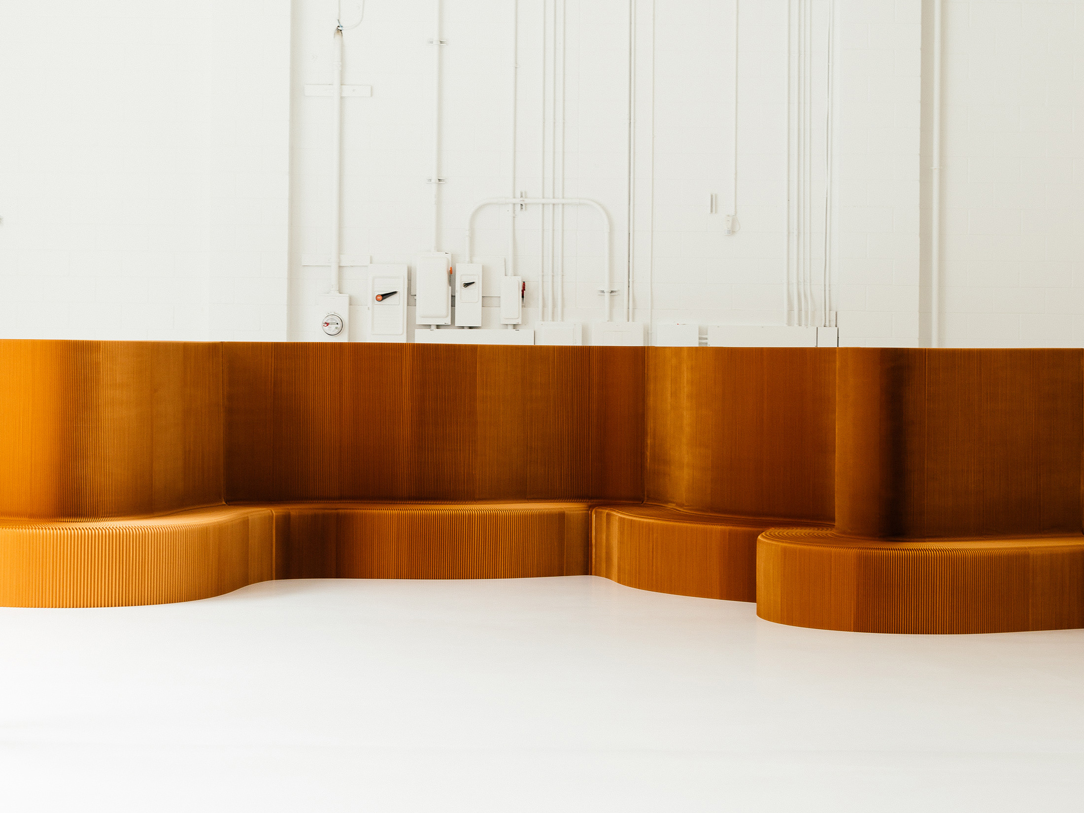
The flexible nature of the soft collection is directly influenced by what Forsythe and MacAllen gleaned from their time in Colombia. The structures, which were first conceived in 2003 as a tissue paper wall, are currently made using a honeycomb structure of either paper or the paper-like textile (the series even includes a gilded version with edges covered in 24-karat gold leaf). That honeycombed geometry strengthens the material as well as allowing the partitions and seats to be flexible and light, yet durable enough for continued variation. The structures, which have been used in a range of spaces, allow for divisions not just between areas, but between labour and rest, public and private, to be adjusted throughout the day.
At the pinnacle of their design careers, Forsythe and MacAllen see no division between design and life.
For Forsythe and MacAllen, the concept goes beyond convenience and aspects of a well-lived life to larger concepts like creating effective models of sustainability. “If there was a way to design spaces that were designed for continued flexibility, that would be sustainable because the building has a longer lifespan,” MacAllen explains. “It also allows for different uses that could change if the tenant changes—it’s not about tearing out materials. We’re not trying to come up with the ultimate solution, but this is what we’ve been doing, this is what suits us.” Molo’s softshelter concept project, derived from the company’s Nebuta House museum, stipulated that the building must also be capable of serving as an emergency shelter. The softwalls were modified with accessories for various aspects of daily life and were made smaller than usual so that they could be moved easily from shelter to shelter. The forms also give the end user the ability to move them, to make the space their own or open it up to the community.
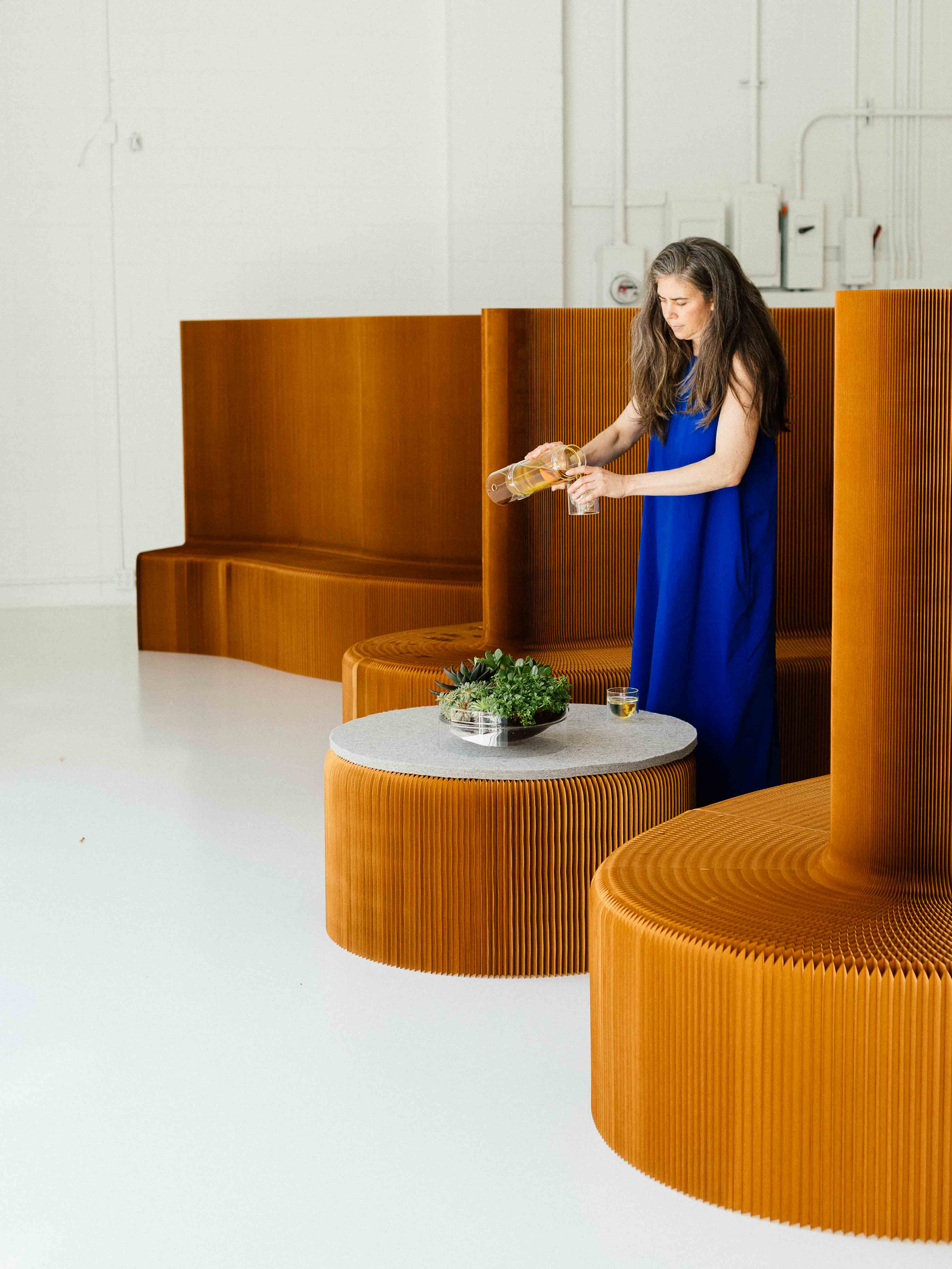
Though the forms have not yet been used in a disaster setting, the concept illuminates an intrinsic, humanistic thread that connects each of molo’s disparate designs. Touch isn’t just invited, but is required to pour the tea, to move the wall, to change the light. Activated by the senses, there is a unity between the user and the piece. “We aren’t selling lighting and furniture. We’re selling kind of life-sized bricks [that people] can create their spaces with,” says MacAllen.
Larger, more elemental principles also direct Forsythe and MacAllen. “Light is always the most important material. We’re like plants—we need it,” Forsythe says. “With these,” MacAllen adds, gently patting the benchwall (as pictured) he is sitting on, “we were looking for a way to provide utility in dividing a space, but at the same time when we make space with these objects, we are really interested in abstraction with light and form, or even a way to create a backdrop that heightens a sense of occasion for everyday life.” Furniture, light, objects—these are the accessories of life. In molo’s work, the fusion of our environment and objects is seamless. This is a truth that Forsythe and MacAllen extend to their own lives. They spend about a third of their time in their studio in Tofino, B.C., where they renovated a small wooden building in the rainforest, adding an outdoor cedar bath. As MacAllen explains, “We don’t want to live in anything other than the forest.” At the pinnacle of their design careers, Forsythe and MacAllen see no division between design and life.
_________
Never miss a story. Sign up for NUVO’s weekly newsletter.

