The Yard House
A Jonathan Tuckey design.
Lordship Lane is a high street in southeast London where new coffee shop chains have been subsumed in a mashup of traditional butchers, fishmongers, independent book shops, organic grocers, and gastropubs. Its residential cross streets, green and red with the lawns and brick terraces of Victorian houses, also happen to be the site of what many believe to be the last surviving 19th-century concrete residence in England. Now it has a rather more subtle companion nearby: into a derelict lot behind the high street, Jonathan Tuckey Design has tucked a luminous—yet partly concrete—house that is home to a couple and their two children, two whippet dogs, and a pair of generously sized ateliers.
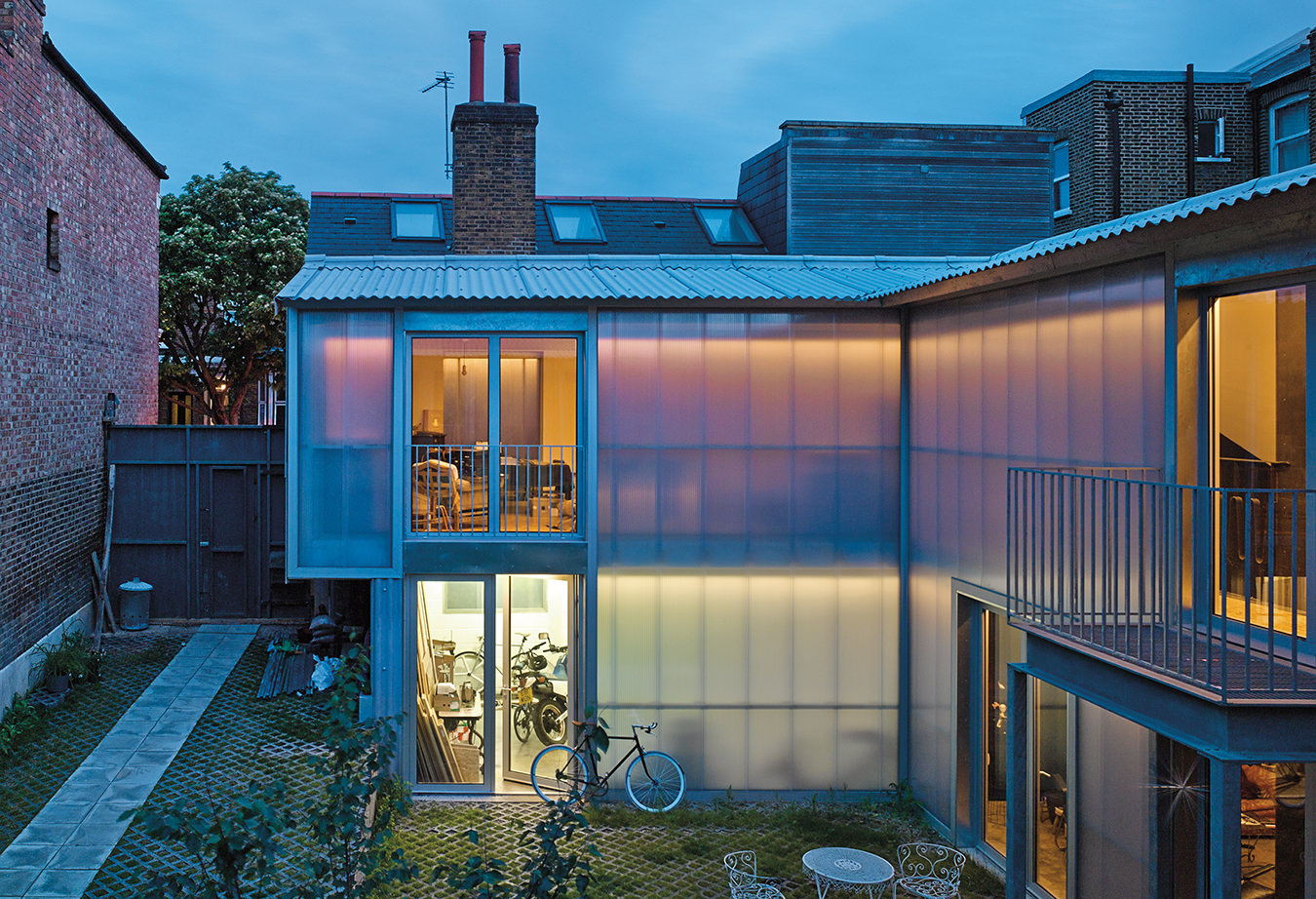
On this irregular, interstitial lot, the architects drew the house around a light and air-embracing courtyard that faces the gardens of adjacent houses, its irregularity offset by the orderly face of the new building. The owners are a creative duo, and the home complements their multidisciplinary needs. Set decorator Steve Fox—who works on film sets in U.K. studios but doesn’t bring his work home with him—maintains a motorbike garage of sorts in the ground-floor workshop, while his wife, Tracy, keeps an upholstery studio on the second floor. The Tuckey creative team, led by Peter Youthed, placed the workshop wing of the house next to the street, with the bedroom wing opposite, uniting the two with a double-height series, or enfilade, of living and dining rooms. Collared by these wings, the courtyard becomes what the architects imagined as an outdoor room, around which they organized the 3,068 square feet of interiors. “When the weather is warm and the doors are open on the ground floor, the courtyard becomes the central hall for the house,” Youthed says, “and you can walk from wing to wing through the garden.”
The Foxes wanted not an Eden, however, but a “warm[ly] brutalist” house. Both clients and architects agreed that industrial materials suited this sensibility, as well as the house’s surroundings, so Jonathan Tuckey’s team took cues from that context—the robust character of nearby brick houses and the former shabbiness of the lot—when choosing materials. The rear of the house, facing the once “scruffy” alley behind it, is now clad in matte corrugated fibre-cement board sheeting, while the façade looking onto the yard is smooth and translucent, dressed in a polycarbonate walling system by Rodeca that, under shifting light and weather conditions, constantly animates and gives texture to the entire courtyard. By applying these industrial materials precisely and with minimal detailing, the architectural team elevated their rough finishes, creating what they call “a noble shed”.
That feeling of nobility is communicated first and foremost by the formal qualities and orderly structure of the courtyard and the faces of the house that look onto it, as well as the gutterless “impluvium” roof treatment. Arguably, however, the materials also contribute to this perception, transforming light into an architectural element of the first order. Tuckey designers used materials that simultaneously appear enduring and gossamer, solid and deep, matte and luminous. “The materials we were really keen on were ones that had a [visual] softness even though they were cheap, rough-and-ready materials,” says Youthed, “[because] the dirty brick of the Victorian surroundings has a softness to it as well as a grittiness.” The architects used physical models and extensive sketching to explore how to unite the courtyard façades and kept large chunks of Rodeca floating around the office, usually on windowsills, in order to observe the changes it went through depending on the time of day and quality of light. Because nearly every room in the house faces the courtyard through this material, whether outside or in, an inhabitant’s perception of the interiors is always influenced by the courtyard and the changes to which it is perennially subject.
Tuckey designers used materials that simultaneously appear enduring and gossamer, solid and deep, matte and luminous.
At the rear, the corrugated cement, which is typically used to build cattle sheds and barns in the English countryside, is durable and inexpensive, but in this context looks delicate. “When working up the design we talked about how Palladio did lots of projects where he basically turned farm buildings into palaces for the emerging merchant princes in the Veneto,” Youthed explains. “We thought of the house as a mixture of the very utilitarian and raw, but also as having a classical presence that followed from the choice of [using] a courtyard plan.”
The architectural materials also suggest textile layers. The polycarbonate panelling appears blurry and out of focus, and Youthed compares the cement fibre sheeting at the back to moleskin fabric. “Together the rhythm of the polycarbonate and the wavy profile of the cement seem to echo each other. We tried to accentuate the fabric-like qualities of these materials by sticking to a simple palette and detailing things simply,” he says. With a sheer façade they could hang large curtains for the sake of privacy while also reinforcing this vision of the façade as a semi-permeable fabric and of the courtyard as having unexpected depths. “Sometimes the translucent walls feel very thin, especially with the doors opened up to the garden, and the courtyard feels very present,” Youthed explains, “but you also feel that there are many layers between you and the exterior.”
With Tracy being an upholsterer by trade, one might have expected the interior of the house to be full of actual textiles subtly twinned with the strong complexion of the architectural materials. Instead, the interiors are relatively bare and sparsely furnished: quality over quantity. All the furnishings, objects, and art—including a text painting in the bedroom by Frieda Munro—were found by the clients. Furniture and fixtures, like the vanity table and chair in the master bedroom and the bathroom fittings, were reclaimed and sourced by the couple in the U.K. and during travels abroad. Tracy upholstered all the seating and designed the second-floor metal balustrade, and the stainless-steel kitchen was built to their design. In fact, many things in the house were made by them or their friends. The couple also chose to use very thin mortar joints in the blockwork walls flanking the brass-detailed dining room stairs in order to amplify the sense of a homogeneous block solid enough to (seem to) root the house in place.
Admittedly, views out of the house are somewhat limited. On the second floor, above the open living and dining room, a skylight beams down and windows open each end of a 22-metre walkway, the north-facing window offering a long view out over neighbouring houses, while the southern window frames an abstract composition that time has worn into a brick wall next door. The walls of the house are made to shelter its occupants from the city outside, but they also connect them to it. At times, those walls appear to be made of light.
Originally published on July 19, 2016.

