Light & Dark House
A Gianni Botsford design in London.
Formerly planted with vineyards and occupied by Carthusian monks, the Bloomsbury neighbourhood of London is embellished with some of the city’s finest parks, formal squares, and architecture. It has also been the home of culture makers like Virginia Woolf, Charles Darwin, Charles Dickens, and even for a time, Bob Marley. Fittingly, last year it also became the home of a listed five-storey Georgian house, dating from 1770, but revived as the Light & Dark House. The home is augmented by a detached private gallery (the Layered Gallery) and was designed around specific works of contemporary art.
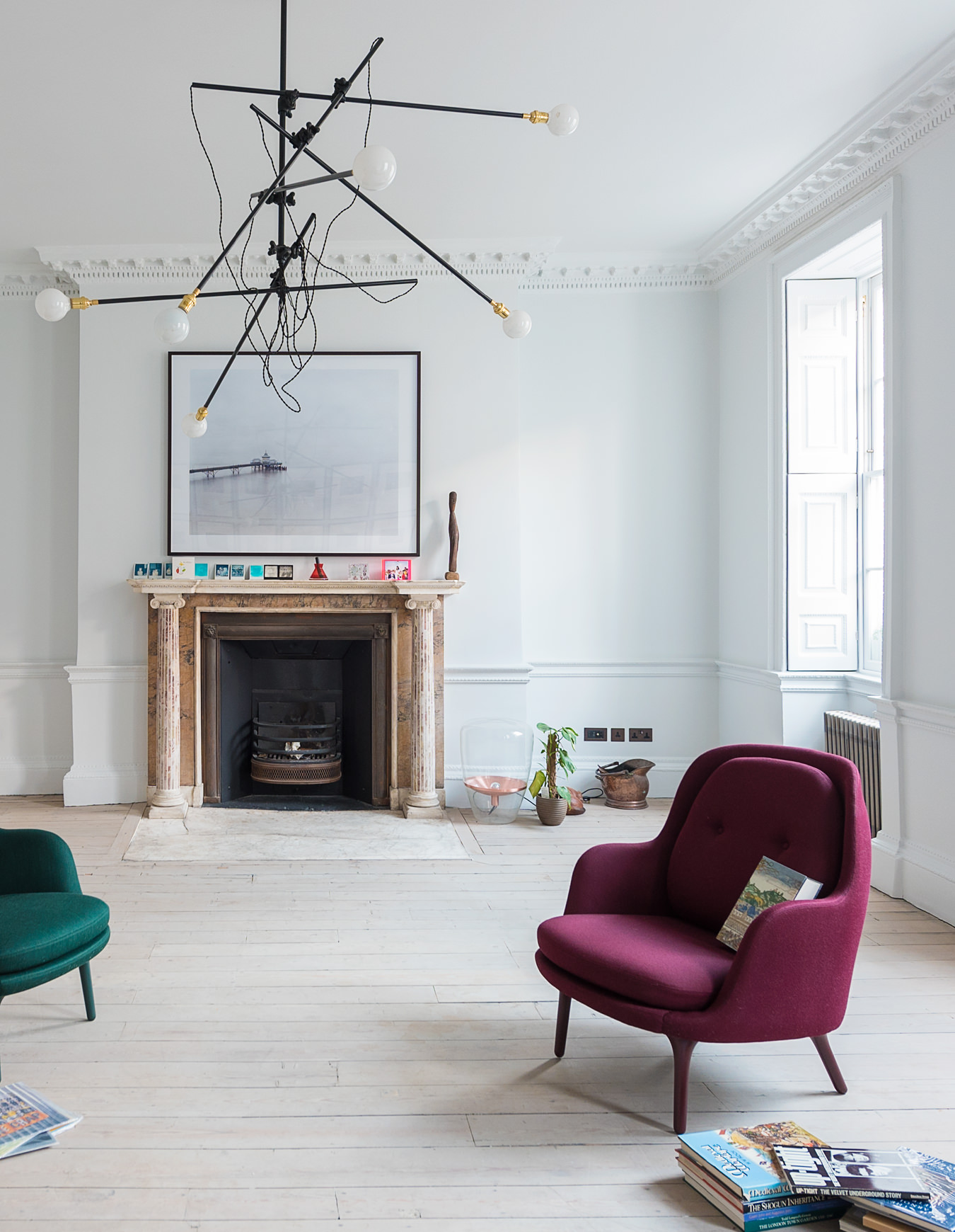
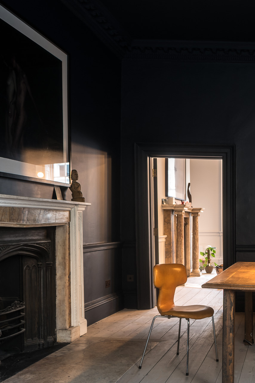
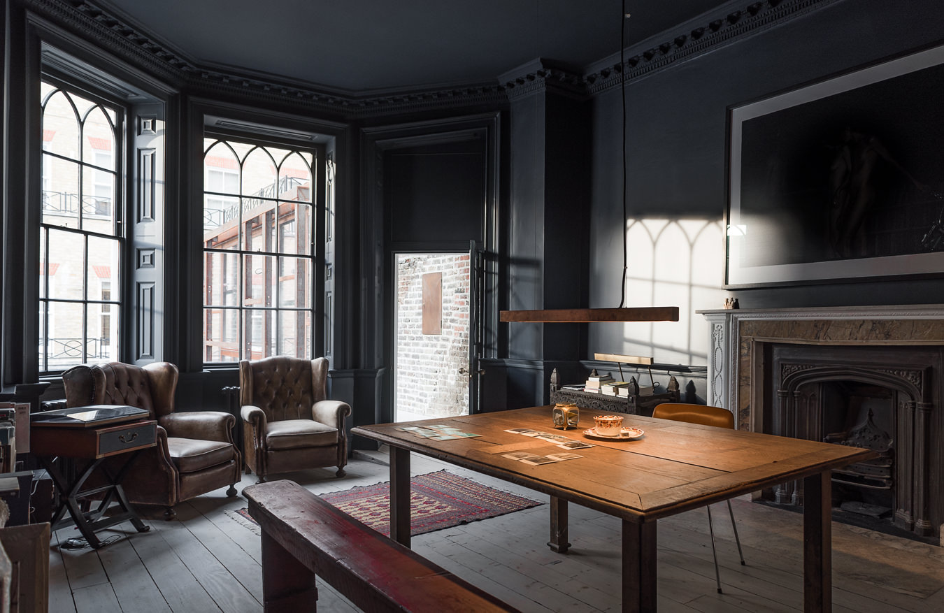
In a sense, architect Gianni Botsford’s design of Light & Dark House strikes a balance between old and new, light and dark, while focusing each of the most significant interiors around a single artwork selected from the client’s 200-piece art cache; this collection, gathered over 15 years, ranges from documentary photography to early 20th-century British figurative painting. The interiors, in service of these pieces, are predicated on deft combinations of natural and artificial lighting, and a matte monochrome colour palette that runs over walls, windowsills, architraves, doors and ceilings, abstracting historical interior elements like skirting boards and cornices. Each of the 12 colours used in the house was chosen by considering the artwork, orientation, and function of each room, and was tested through extensive full-room samples.
“Whilst unusual, the fact that some rooms are very light and some rooms very dark feels entirely appropriate in the finished house, and yet this idea came from working with the colours of the art collection at the very beginning,” explains Botsford. “Knowing what some of the art would be allowed us to imagine how domestic activities would coexist with the home. In a sense, the art is part of the furniture, but also part of the family,” he says. “The pieces all have stories and relationships with our client.”
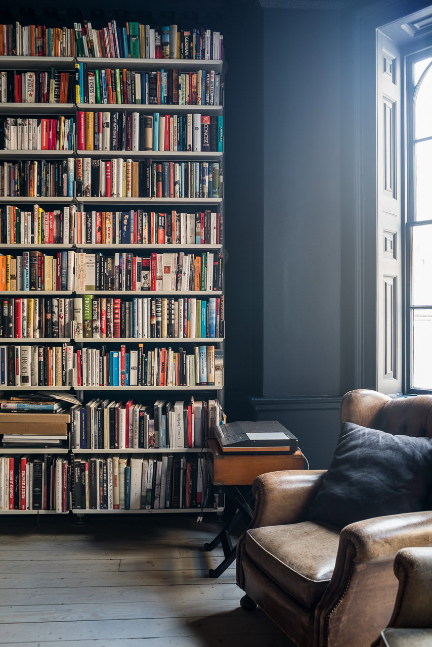
In the library and the master bedroom, two of photographer Bill Henson’s large nudes, shot in very low light against deep black backgrounds, also hang in low light; the rooms were painted in dark tones, adding to the works’ sense of disorientation. A Simon Roberts print from the series Pierdom, depicting a traditional pleasure pier on the English coast, hangs in the living room, the largest room in the house. Botsford’s team imbued the room with a sense of the outdoors, painting it in a sandy colour and anchoring it with a bespoke contemporary chandelier by Workstead.
Each of the house’s significant interiors are focused around a single artwork from the client’s 200-piece cache.
“There was never a conversation about it being museum-like, as the domestic and the art were always to be enjoyed together,” says Botsford. “Each room has a specific use, and the clients move from room to room depending on the activity they are undertaking. This ‘voyage’ through the house was particularly important as a way to get the most enjoyment out of the different spaces.”
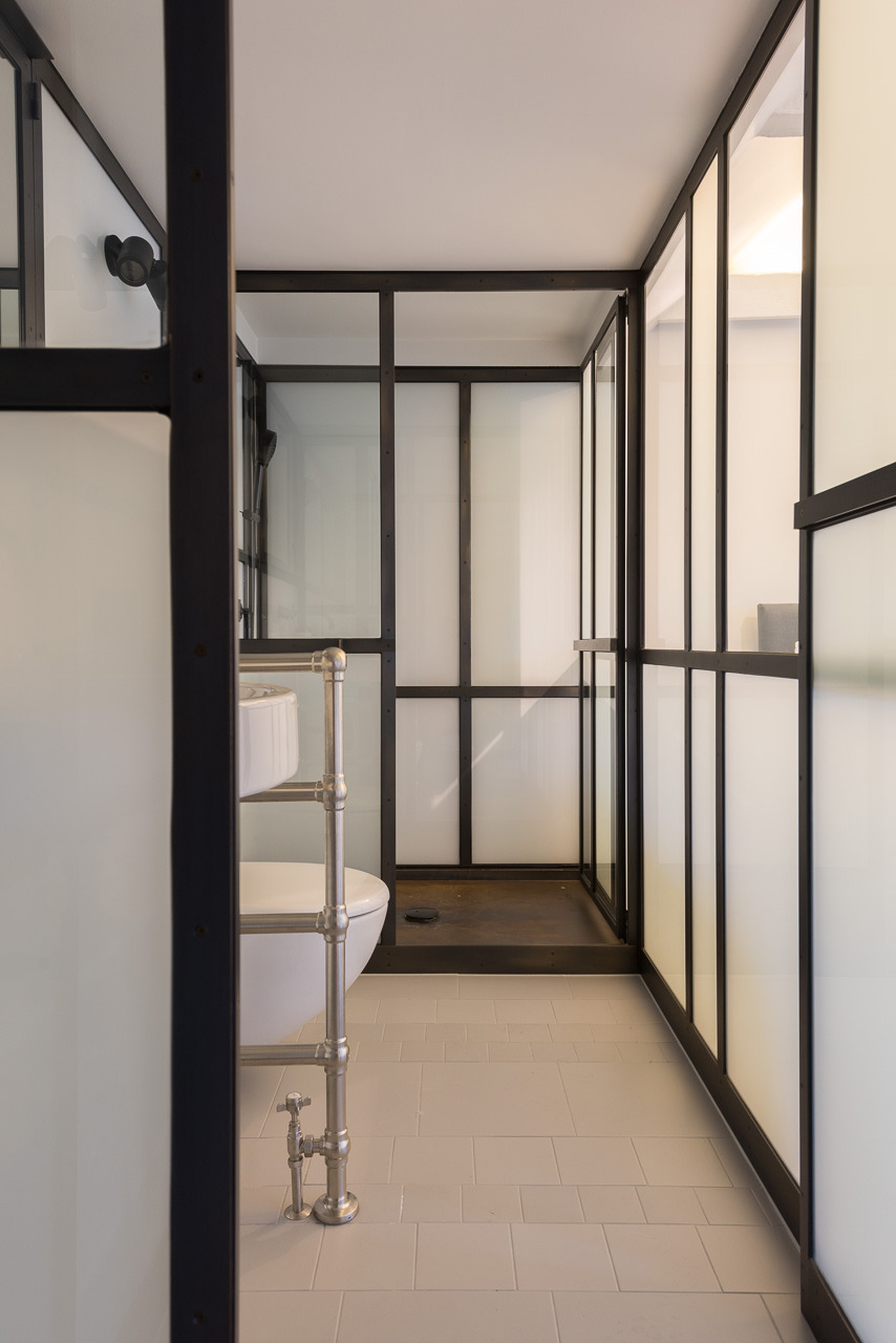
Botsford’s team kept much of the historical architectural detail intact—floors remain unlevelled; Victorian radiators, along with some ceiling beams, are exposed; and columned fireplaces and mantels have been cleaned up. To this, they carefully added contemporary artwork and design, which generates enriching contrasts with the old. “There is a pressure in this country to mimic historical structures, but we and the client resisted this,” the architect says. “The approach taken is that the house can always be put back to how it was originally, but the modern insertions we made to follow the logic of how the house has evolved over 300 years, and the structures reflect these volumes.”
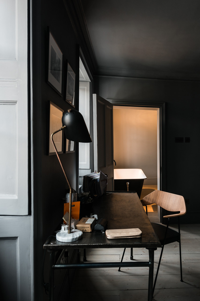
The palette of lighting fixtures—a rich mix of metals—ennobles the concept of light and dark throughout: in the study, a copper pendant light by Anour, an entrance hall pendant and dressing table lights in antique brass and Carrara marble by Lambert & Fils, and, in the living room and kitchen, hand-blown Balloons table lamps by Lucie Koldova and Dan Yeffet for Brokis. Because the house is listed and is vigilantly guarded by conservation authorities, the architects were unable to use recessed downlights or add lighting points to walls or ceilings, so they decided to assign a “significant” pendant light to some rooms and use contemporary chandeliers in spaces like the living room, plugging all other fixtures into the walls. The lighting design works to simplify and clarify the house while ensuring that it still feels true to itself.
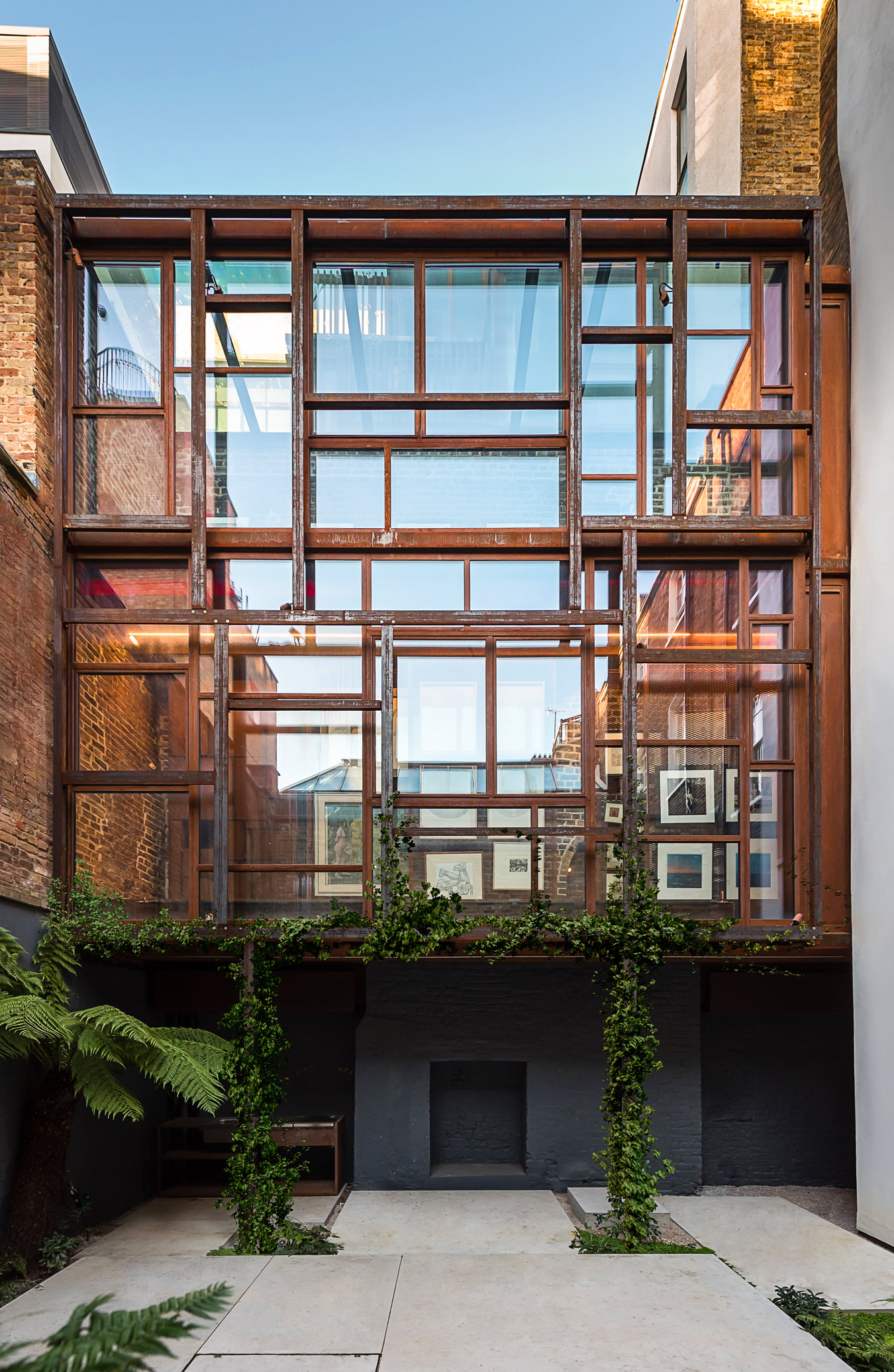
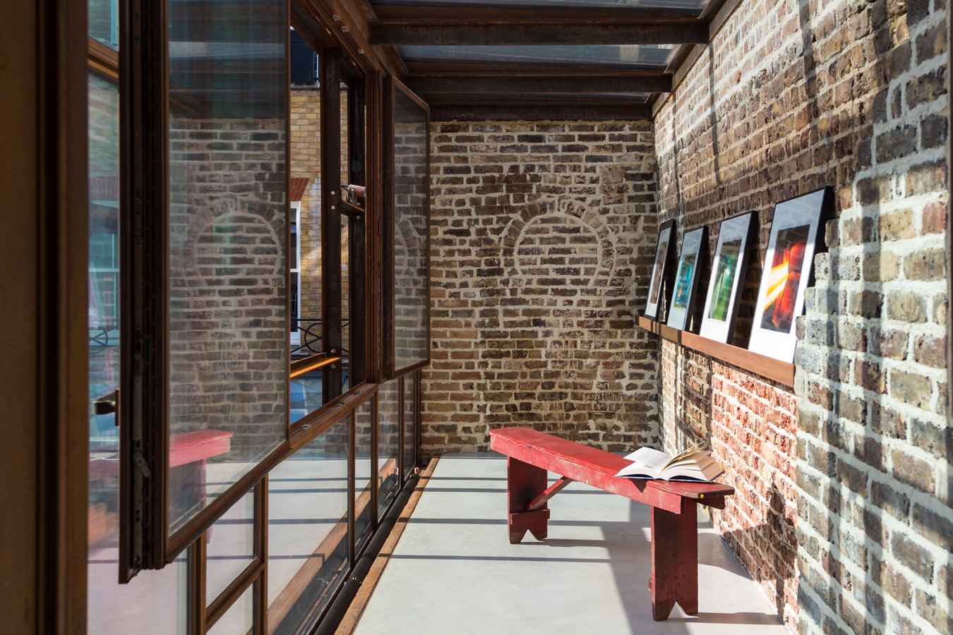
More obviously a newcomer, except for its time-worn brick walls, the Layered Gallery features a filigree of layered screens, windows, and frames. The goal was to house a private collection of contemporary pastels, lithographs, prints, and photographs while creating an enclosed garden-like courtyard and a “retreat” in which to contemplate the artworks. “It is a beautiful, calm space, meditative and sacred feeling despite being in the centre of a major city,” says the client, who declined to be identified by name. “We use it practically every day.”
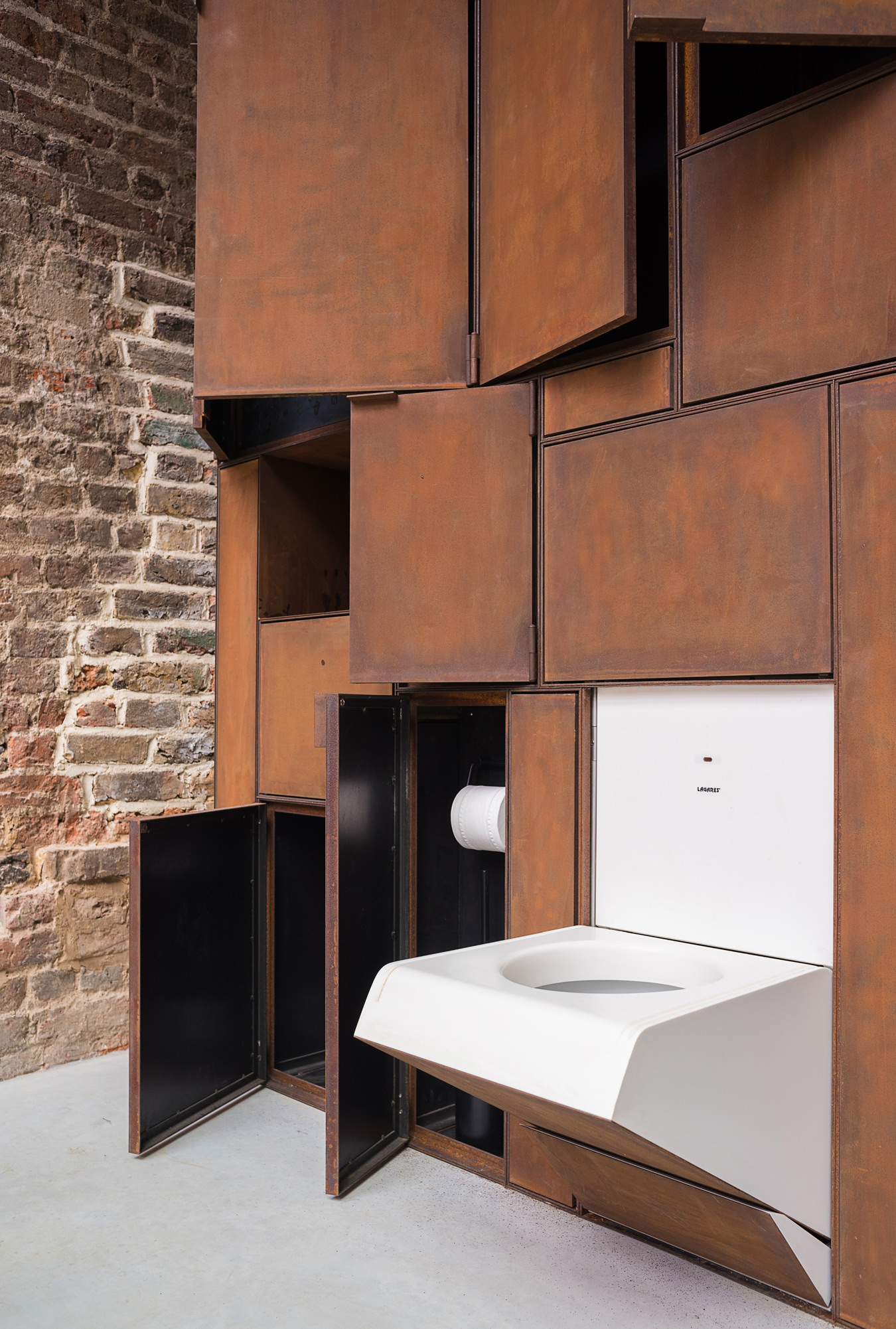
The exterior screen of the gallery is made of Corten steel, which lends the architecture a sense of the ephemeral as it oxidizes over time. Behind it is a Corten-framed, museum-quality, UV-treated glass screen that fronts red blinds; this contributes to the layered impression while sheltering movable Corten screens hung on rails that are used as both storage and display. The layering, especially because the structure is twined with plants, emphasizes the relationship between interior and exterior spaces. Inside, the industrial finishes allude to the warehouses and shops from which galleries are so often converted. “The gallery extension, an entirely new building, was one of these layers that, in a sense, is modern, but also timeless,” says Botsford. It’s also cheeky. On the ground floor, the existing exposed brick wall contrasts with a Corten cabinet designed by the architects to conceal a folding WC—paying homage to the traditional British outdoor lavatory and, not least, being a play on Marcel Duchamp’s “readymade” Fountain.
Photos by Luigi Parise.
_________
Never miss a story. Sign up for NUVO’s weekly newsletter, here.